-
Posts
21,649 -
Joined
-
Last visited
-
Days Won
119
Content Type
Profiles
Forums
Events
Everything posted by Rodney
-
Here's a try with four (almost stacked) plates. (I like using the new Duplicate option via Right Click in the Chor. Duplicate and then move slightly to new postion... Duplicate. Ditto. Duplicate. Ditto. etc.) Note that my creation of the plates by lathing with 5 cross sections has limited the breaking points of the plate. Lathing with more cross sections or building the plate some other way would result in better breaking. Same drill. One Chor is pre-simulation. The other is results. Ball and 4 Plates.prj
-
Here's a project file with two Chors. The first is the pre-simmed setup and the second is the results of running the simulation. Assuming I'm not way off track... there may be some settings that help get things set up on your end. Ball and Plate.prj
-
Oooo.... you can try having one of the objects have a weight of zero. The object with the weight will fall into/through the other object. Have the other/falling object have a weight of 500. I'm sure I'm not doing this right but in trying to recreate what I think you have set up I found that having one part of the explode object set to zero weight helped to keep the object in place.until it was hit. Thereafter everything broke apart. The downside of this is that once hit all the pieces *except* the one with weight of zero fall to the ground. A workaround for that would be to add a part to the object that can be made transparent. That transparent part then stays in place while the rest of the object falls away. Like I said, I'm probably doing this wrong on my end. I've posted some examples of two objects crashing together and then breaking in the Alpha/Beta forum so I know it's possible to keep the object in place. Perhaps it just requires a keyframe.
-
You are able to get Bullet to simulate right? It's just not breaking? Two things come to mind but much will depend on what is in your project. For instance, if objects are passing through each other... consider the density of the mesh. Settings for weight can be important. For instance, in a dense mesh built with Rebuild Explode plugin I weighted some groups very heavy but left some at default (low setting). What this does is create an imbalance so that when impact occurs the heavier parts keep moving while the others stop... this then leads to the breaking. *If* the simulation is just not running at all, remember that at least one object in the project needs to have a Bullet Body constraint applied to it. I would apply a Bullet Body constraint to each and then assign a lighter weight to the plate. At this point I think we need more info or a project file to examine.
-
That's definitely a classic.
-
Outstanding work Rodger. Wow! As good as it looks in a still image it looks even better in motion. I felt the sudden urge to say, "Staff Pick!" but... we don't have a staff so I'll just say, "Bravo!" and "More please!"
-
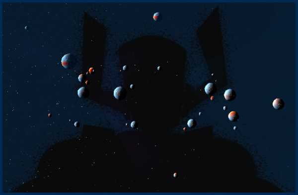
Hmmm... meethinkis we need to have several planets crashing together... This'll have to do in the short term.
-
A really cool thing about simulations is that changes can be made after the simulation with relative ease. One such change is that of texturing. A quick assignment of new groups to create striped patterns for instance. Or materials. Or material effects. Or Hair. Or Cloth. Etc. Etc. No need to re-simulate. (Assuming no need to simulate further) :
-
I confess that I haven't used the Explode Rebuilt plugin much before... why... I have absolutely no idea. Bullet Physics is giving me an opportunity to use that! Attached are two projects. The first is the project prior to running the Bullet Simulation. The second is the result after the simulation is run. Fun stuff. (I looked at Steffens 'Fracture' example first before trying this and had to remind myself how he created the explode model) ExplodeRebuildBulletP.prj
-
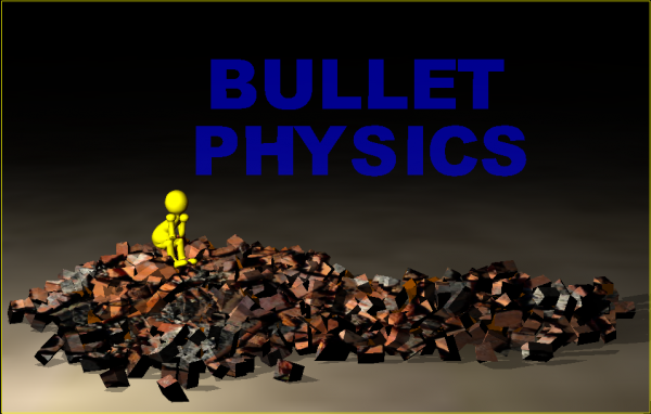
Here's a still from my first 'real' test of Bullet Physics. I was wondering how useful Bullet will be in creating rubble.
-
It originally came with the standard A:M CD (the one that had to be in the CD drive in order to initially launch A:M) but eventually made its way to the Extra DVD. As I recall, there was a purge of copyrighted/trademarked content from the A:M CD circa v10/v11 timeframe. Other cool project files like 'Toys' that featured Buzz Lightyear moved off the A:M CD as well. The underlying issue with CG on the rise in companies like Disney was surely that of a potential perception of official endorsement and companies tend to want payment for such endorsements. I recall seeing a shot used by Greg Rostami in one of his demos that convinced me that PIXAR might have secretly been using A:M to create scenes in Toys2 and such... the quality was exactly the same as what was being seen in the theater. At a guess I'd say the folks at Disney/PIXAR were getting tired of being asked if they used Animation:Master and the success of Victor Navone's 'Blit Wizbok' short was upping the ante.. I remember the camera work alone from this project file really capturing my attention. The simplicity of the project file... that actually confused me.... with me thinking, there's got to be more to it that that!!! Nope, just another fine animation created with Animation:Master.
-
-
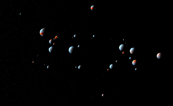
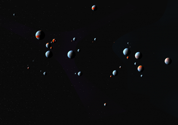
Random mass of planets... (The stars are a bit hard to see in the thumbnail... developing an approach to creating easy stars was a goal in working on this piece and while it doesn't quite hit the mark I found an approach I want to explore further) Attached a second screen capture that adds a little color to the starfield.
-
That's me to a 'T'... minus the really awesome dog collar.
-
With that setup I'm thinking you should be able to get Keekat rendered in less than one second! In other news: I'm zeroing in on a possible render benchmark that derives from/includes sound/audio. The audio is the cartoon mix (combining all the audio effects from the old A:M CD into one wav file) posted to the forum elsewhere. This equates to just over 2 minutes worth of screen time (approx. 4000 frames). The minor benchmark (0.0 in this set) might be to render that length out to a 1x1 image (PNG sequence without alpha channel) with all the various settings turned off in render options. This would give us the absolute lowest boundary (read: unrealistic) expectation for rendering that 2 minute sequence on our system. *If* we ever beat that benchmark in production we know we have succeeded beyond our expectations.... and very likely need to create a new base benchmark to better inform future production planning. From that foundation we then build additional benchmarks that measure projects with increased (read: viewable) resolution, fill space with interesting objects and target the outputting of pretty images.
-
In revisiting this topic... I note that in the referenced image above concerning the four shapes of shape note singing there are these words: "Jump in and sing 'la' if you aren't sure. You'll be right 25% of the time." This underscores the reason a lot of lips can fall into sync even if ideal matches aren't always present. This also relates to why those muppet mouths get it right often as well; namely, an open mouth will often an uttered sound convey. In the four shapes of shape note singing I further surmise that more than a hint of direction is conveyed: Fa - is conveyed with the jaw jutting downward (and possibly to the side considerably in breaking up symmetry when striving for the character in caricature) So - the lips move outward - more horizontally than vertically (capturing and containing the echoing sound of the 'o' inside the mouth) La - is the extension up and down (perhaps even extending to the raising of the head via the neck) to especially accommodate the movement of the tongue Mi - is the pursing of the lips and extending them outward (mostly in vertical orientation) to capture/direct the higher note at the end. Fun stuff that lip sync. Mostly unrelated: For a little inspiration in audio syncing challenges check out the Cartoon Mixdown!
-
After clean install... Keekat rendered to 100% in 16 seconds. It then took another 20 seconds for the image to appear and UI to release control back to me. Total time: 36 seconds That's still too high so I'll be investigating some more. This has me wondering if writing to disk is gobbling up the majority of time as the numbers would seem to be finished crunching at that 16 second mark where A:M displays rendering at 100%. I further assume the rendered image gets displayed in A:M immediately after success of saving to disk and never before that so that delay from hitting 100% to finish is surely that of confirming success of the image being written to disk. Added: v18 Testing Total time (including write to disk): 10 Seconds Update: Reducing variables* v19 now appears to be rendering at the same rate: 10 Seconds *The primary variable is always going to be the user's preferences and this would appear to be the case here as well. Making sure A:M is set to render using the Camera (and not Render Panel Dialogue) in all tests eradicated the majority of variables and appears to have been the culprit in extending the Keekat render from 10 seconds to 1:57. That's pretty minor for a single frame but can prove to be a significant difference when rendering large sequences. I still think I should be able to get Keekat to render in 1 to 3 seconds.
-
I'm revisiting the subject of Benchmarks in light of reviewing the exercises from TaoA:M. As such if anyone else is interested in benchmarks I'm interested in their feedback. As Robert mentions above most benchmarks are technical in nature and follow the path of hardware testing. That isn't my focus here... although hardware testing is certainly seen as the most important part of benchmarking. But that is only where the hardware is changed. The benchmarking I am most interested in removes (or at least isolates) variables introduced by hardware. The benchmark then becomes a tool to explore 'software' with a goal toward user controlled optimization. Bottom line: For those that don't want to change their hardware benchmarking can still be useful. An example of the type of benchmarking I am interested in might be demonstrated by a recent render of Exercise 1 from the TaoA:M manual. The render got to 100% rather quickly but then spent the better part of an additional minute finishing the render. Odd. A frame that normally would take mere seconds took 1:57 to render. How long should that frame from Exercise 1 take A:M to render? I suspect with all of the various installations and programs running as well as recording my screen while A:M was rendering that very little memory was available for the frame to be rendered. Potential suspects include: - A heavily customized installation of A:M (best to get back to a clean installation) - A system that hasn't been shut down in longer than I can remember. (lots of stray stuff still lodged in memory). Taking that 1:57 second render as a loose benchmark it should be easy to improve upon and refine as a personal benchmark for my current system. I anticipate that I should be able to get that frame to render in 1 to 3 seconds. Watch this space and we shall see.
-
Thanks for sharing these characters with us Mark. Because folks are likely to miss it, I've moved this topic from A:M Reports to A:M Exchange but left a link in the A:M Reports area for historical purposes. There is great character in these characters!
-
Thanks Matt! I'm going to tackle some more fantastic four stuff in the future because it's got me feeling creative again. That and the general skeleton of the 'Jack and the Beanstalk' storyline has conjured up specific moments that can be translated into FF imagery. Of late I have been distracted by finding my Extra DVD. It had been missing in action for quite awhile and I unearthed it while cleaning. Some of the resources contained thereon really need to be shared with the community so I'm trying to get them posted and into more general circulation. Doing that has made me want to work on areas related to A:M Exchange and press toward the future of what can be realized there. In contrast to diving in and just modeling stuff from scratch, exploring the works of others is always inspirational. So the trip is rather cyclic... and feeds the beast of creativity. And... hopefully at the crossroads of creativity and inspiration converge motivation and patience can meet. Fill in your own words for those four things.
-
Steve, Most excellent. The cross pollination of ideas is exactly why we are here in the forum hanging out together. While particle fire has long been of interest to me I certainly have no great insights into how to get to the results we (collectively) want in fire effects. There are a ton of different effects that all fall within the broader category of 'fire effects' not to mention the other effects such as smoke that accompany fire and sell it to an audience without taking them out of the moment on either extreme... not looking at all like fire or looking too much like real fire when the style of the story doesn't call for it. My experiments with fire and smoke suggest that fire effects can largely be achieved both with and without particles... not to mention through the use of actual fire footage/video. As is usually the case, much depends on what the end goal for that effect will be... dragon blasts of fire toward a given target I must presume being somewhere in the mix. Yes, most definitely, let's get Robert thinking about fire effects so we can put a focus on that during a Live Answer Time session!
-
John, That's very cool... evidence you were tinkering way back in 2002. Simpler times for sure in many ways. So exciting to be splining with A:M... and perhaps best of all... not unlike the feeling of connecting CPs today. It's still great fun, isn't it? Thanks for all you do and have done as the Tinkering Gnome over the years. I've neglected you too much my friend. We still need to put together that tinkering workshop to get all your project files into one collected place and I'd love to get as many as reasonably possible all collected into one humongous Tinkering Gnome's Workshop Project File**. That, and I want to find/remodel/animate a tinkering gnome amongst all the bells and whistles, doodads and thingamabobs lying about all over the place. **I need to run some tests to see what the practical limitations are of collecting files into one project and also make note of the upside and downside of single file organization. I suspect that a directory structure where a single Project is the entry point but each resource is externally linked would be ideal. The Project File then would take on the role of 'storyteller' as it directs the user through the sprawling workshop. And yes, I need to make this a priority because I am so easily distracted. Keep on tinkering!
-
Those would be his thumbs. I ran across a project on the Extra DVD (one by Andy Gibbons) that has some flame work. I'll try to post that here in the forum sometime this week.
-
Holy yikes! I was rummaging through the files on the Extra DVD when I ran across a file named 'rbRobo'. The name sounded oddly familiar so I was anxious to see what it was. Low and behold the 'rb' is my initials and the robot was one of the very first things I modeled in A:M (after coming to this forum). Not much to see here but it sure brings back memories. I've shared this model several times before... but I'm officially doing it again. I don't know much about modeling now but I SURELY didn't know anything then Memories flood back about that timeframe and the project called 'My Robot Movie' that I had decided to share with the forum. The robot is a security series robot with 360 degree view and unicycle locomotion. When these guys start tracking their prey it's not a good day for that target. My Robot Movie's basic premise was about a wheelchair bound boy whose interest in watching the stars through his telescope soon finds him transported light years from earth into a world controlled by mechanized automatons. Attached is a quickly modified project file to try to get at a decent render. rbRobo.prj
-
Very nice. You have an eye for capturing detail while keeping everything simple.


