-
Posts
21,630 -
Joined
-
Last visited
-
Days Won
114
Content Type
Profiles
Forums
Events
Everything posted by Rodney
-
For those of you with some experience with this feature perhaps you can elaborate on the snapshot feature a little more so I can better incorporate it into my workflow. First, let me say that I am fascinated by how this snapshot feature can do more than a standard Print Screen of the current screen. I do wonder however if I am missing something so let me postulate the following and see if it matches with what you know: - Snapping a Shot will grab a wireframe or shaded wireframe image of the current window (what you get will depend on what View settings currently being used (Wireframe/Shaded Wireframe) - Control Snapping a Shot will pull up the dialogue to allow higher image resolution and specify location for the file to be saved. - If we want an actual shaded view then we should use the keyboard Print Screen or Alt Print Screen function (This seems to work at odds with the first so I'm wondering if I'm doing something wrong on my end) - The snapshot feature saves a snapshot with Alpha Channel intact. (Now that is very impressive and I need to leverage that soon!) I guess what throws me off a little is that I'm not getting snap shot images that match what I'm seeing in my working window. What I seem to be missing is how to get a shaded snapshot without wireframe. What say you all? Edit: Hmmm, I changed models and now am getting a shaded view. More experimentation...
-
And what's amazing there is that Brian created most of his highly acclaimed works long before any modern day rendering came into existence.
-
That would only be one part of the solution. Faster rendering is mostly a hardware issue. In my view, the goal at this point is primarily to make the process 'artist friendly' and I should add 'director friendly' too. Hair to this point has largely been a technical dance that only a few highly trained and knowledgeable folks could wrangle. Where the money for research is currently, is where they are pushing hair toward physical animation that behaves as real hair would. At that point it just gets directed and tweaked by the artist and director. If the style itself is wrong then alter the physical environment to suit. In A:M's case this isn't as big a deal because the artist is usually the director too. But the big companies with corporate looks cannot have hair behaving in one way for a two second shot and another way for the next two seconds, and another for a third, etc. So this is largely an issue of control. The director says, "The hair needs to be more curly and flop to the side like this(motions back and forth)." The animator then sets up the scene and it works. The physical part of the equation is to create space (reality) for diverse voices to communicate. The part without the solution still seems to be that of controlling hair in a predictable way (in this case apparently with inverse kinematics). As always my view is considerably naive. If I could read the math I might have a clue.
-
A problem with many renderers (Yafray included) is that very few animation sequences are ever rendered with them because they aren't designed for such. They are generally designed to optimally render still imagery. Is this a shortfall of a particular renderer (perhaps) but more likely it is a constraint put in place by the user. There is sometimes an issue with some renderers in that almost all images look the same (they bury the users' style under their own) Here is a sampling of a few folks who were once new to A:M. No slight on any A:M User not represented intended!!! They all discovered they could render still imagery and animation too: Marcos Rezende (Xtaz): Stian Ervik Wahlvaag (agep): Malcom Zinzan: Eric Camden: Noah Brewer: Dark Jedi: Marcel Bricman (ZPiDER): As Martin Hash once said, "There are a million things Animation:Master cannot do. No wait, now there are a million and one things A:M cannot do." Don't let that stop you.
-
From one of the authors (Florence Bertails-Descoubes): I'm thinking this translates (naively) to: Efficiently recreate curved and variable styles of hair... and um... vines. Starting place: . Here's a paper from that author that details 'the problem' they are trying to resolve, namely that of issues with maintaining curvature (and specifically piecewise affine curvature) when using inverse kinematics: http://hal.inria.fr/docs/00/65/89/96/PDF/s...lothoids-EG.pdf She has some more of her research/papers posted here: http://bipop.inrialpes.fr/~bertails/publis.html While there is a whole lot to read there at that last link... it's very interesting stuff.
-
As Robert has mentioned folks do use other renderers and have since long before I started frequenting the forum. The usage of other renderers tends to ebb and flow depending on the popularity of the renderer and how proprietary the pipeline/workflow. Those who solved the major issues in the past tended to keep the pipeline quiet because of how that impacts budgets. While an external render may not be plug and play almost any renderer can be shoehorned into A:M workflow. If you look through the forum you'll find posts where folks have exported and rendered to just about all renderers Is there any particular renderer you are targeting? Knowing that will let those who have a similar interest know you have a 'need to know'. One of the most recent external pipelines that caught my attention was that of Soulcage Department who often lights and renders shots created in A:M in other software. I'm not sure if we have any Renderman experts hanging out but knowledge in that arena is always going to be useful. One of A:M's goals has long been to keep the render process accessible to folks who don't want or need to master volumes of technical data. But for those with the interest... But perhaps you don't need all that? If your needs are more basic, don't forget that A:M now comes standard with it's own external network renderer... Netrender. With Netrender, we can cue up batches of renderings on one computer or over a network. There are some guides and such for netrendering on the PC and Mac (or both) in the Netrender forum.
-
This isn't a Modeling Tutorial but in this short video Robert demonstrates how to Model detail without actually modeling the detail: d4uRDzDMEXE
-
Speaking of thinking ahead while Modeling... Here's Robert's (very brief) tutorial on "Thinking Ahead When Modeling"
-
Here's a tutorial by Robert on Modeling a pop tab on the top of an aluminum can: Modeling a pop tab of an aluminum can The core of what Robert covers isn't modeling per se but rather how to approach modeling by thinking ahead.
-
The following link is NOT to the modeling tutorial Robert was referring to but I sure have been enjoying the walk down memory lane and the tutorials I'm finding while searching for it. In the meantime: It's a nice intro for newbies and old timers can refresh their memory on the basics of modeling courtesy of Robcat! Basic Modeling Tutorial (Modeling a Rocket) Direct Link to Tutorial This tutorial is designed to precede the basic approaches to lathing, extruding, etc. in a Modeling window.
-
That's still a must see classic for the holidays, Robert. (It and you are) still awesome after all these years.
-
Hi Steve, One of the great things about our community is that we'll build you custom tutorials based on your queries here. There are just too many things that could be tut'd to create a tutorial that covers everything for every possible situation. After all, you don't really want a tutorial... at least you shouldn't... you want to create something cool with the info you'll discover in those tutorials! So don't be shy... just point us in the direction of your interest. Welcome to the forum!
-
It's always interesting to see how tech folds back upon itself. The latest buzz word in cg hair is something of a convergence between hair and cloth. Super Space Clothoids Whitepaper SIGGRAPH 2013 There is tech/math going on here which I don't claim to follow but when I suggest folks consider using geometry for hair this is the general idea and when one considers the possibilities much of what is outlined can already be created with A:M.
-
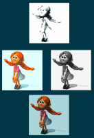
A:M is full of surprises. Most people use other programs to manipulate and convert images but A:M can do it's fair share of image manipulation too. (apologies for using your images as an example below... hey, what can I say... she's a very cool character) You may find in the long run that images such as Targa and EXR are best for usage but those formats aren't viewable in most browsers either. There are a lot of knowledgeable folks here in the forum so if you've got any questions just let us know. Edit: Hmmmm... the girls eyes going white in the grayscale image on the right... I think I accidentally dialed up the transparency or perhaps I forgot to turn off the transparency keycolor.
-
I like to use a freeware program called Irfanview to convert images (I see they've recently released an update too!) When in doubt though you can use Animation:Master to render to internet friendly image formats such as JPG and PNG. Your version should have a fast way to convert is that you can open an image in A:M and Right Click on it's name in the Project Workspace listing and select "Save Animation As". You then select the format you want and hit enter. You don't have to save a series of images... you can convert just one image as well but... this is a very fast way to convert dozens or hundreds of sequential images. What format you want to use will depend on your desired results. For instance, if you wish to have some part of your image show through (transparency) then PNG is a good format to use (JPG images don't store transparency). I'm pretty sure there is a video tutorial describing this process but in the meantime I've attached a screen shot: Well, drat and double drat. Still, very fine looking characters!
-
Looking very good Jack. Your style hits right in the middle of the old Rankin Bass and Davy and Goliath stop motion characters... and boy is that a classic look if there ever was one. Nice! I like them all but those green and red characters with the guy with the glasses... very intriguing. I"m looking forward to seeing and hearing more about your short film. Please pardon my editing of your post. I converted your bitmaps into internet friendly jpeg images so that others can more easily see your characters. (Hopefully I didn't miss any) And... welcome to the forum!
-
Hash Inc is virtual... no one there on weekends... or weekdays. Send an email to jason@hash.com and he'll get it regardless of the day. (Jason is a machine. He never sleeps) FWIW... messages posted here only show up on their radar when someone in the community emails the forum link to Jason. So either way it's best to email Jason.
-
Gerald, Thanks for this info... very useful indeed. I'm rendering a test AVI to the Techsmith screencapture codec in 64bit A:M as we speak.
-
Paul, Let me know when you'll have a free moment and I'll be there. Friday, Saturday and Sunday are the toughest times for me... Monday night, Tuesday (all day)... Thursday (all day) are optimal. Getting to Springfield will give me a good reason to visit my Mom as well. 6th of January... you don't say... that's a Monday! Monday the 6th through the 9th eh? Launch me an email (rodney.baker@gmail.com) with specific time/place and I'll be there! Pie in the sky stuff... perhaps during a later visit we can try to get a few more folks in the area to get together. I know there is a least one spliner that lives in Springfield (haven't met him either). Since I work the night shift my internal clock is always messed up so I can meet any hour of the day. We can swap sad stories of sad stories not told indeed.
-
Congratulations Malo! I too was wondering who put that image together as it didn't have any tell tale signs of who had splined it together. Very impressive work!
-
I like that approach. Let us know how it works out for you! And the added benefit... you've got a comic book to go along with your movie.
-
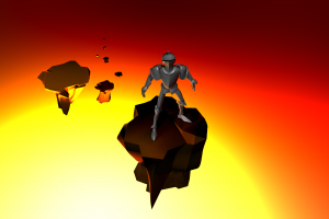
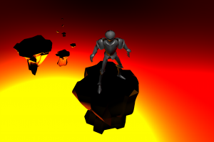
I didn't care for the blackness of the top of the rocks so went back in and splashed a little light there. Not sure if it improved anything but at least it's no longer black there. (adjusted the rocks and knight as little as well)
-
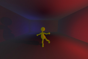
Here's another random lighting test that just came out of the renderer. Basically the same setup as the previous one with the lights moved around and color altered. The box room was replaced by a cylinder room.
-
There's not much of anything in that render. Thom, a box room, three lights; two of which contribute to the shadows.
-
Despite the nasty banding in this rendering, this is another random lighting test that I like. It's the muddied painterly quality that appeals to me as shown in the back corners of the room. The spill-over of color into shadows is something I'd like to study more too.


