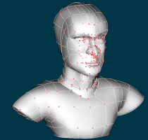
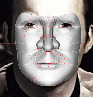
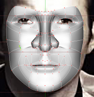
-
Posts
2,708 -
Joined
-
Last visited
-
Days Won
1
Content Type
Profiles
Forums
Events
Everything posted by Darkwing
-
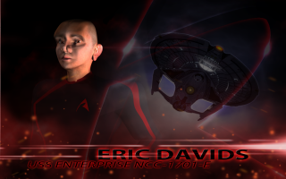
Thanks! I think I should also show you guys the beautiful render Chris K did of the Enterprise (which is what was used in the Eric Davids wallpaper) as it's a very "brilliant" render in and of itself
-
-
-
I think when I re-render it, that I'm going to enhance it more as its application is as you say, not so noticeable. Here's the original shot straight from AM:
-
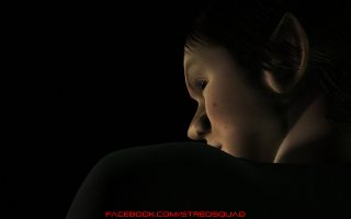
Still a WIP, I may have gone a little overboard with the post effects..... Still need to rig and pose the faces for this shot and need to fix up some of those model intersections around the neck, but tis getting there! PS: This is what the volumetric thread was about, so that I could implement it into this image
-
Here's a work in progress shot. I think I'm going to attempt to install the FACE rig on the models as soon as I get a chance so that I can pose their faces for this shot
-
Well, it only took a few years to get around to it, but we now have an actual Youtube Channel! You can check it out here http://www.youtube.com/user/STRedSquad Please Subscribe and/or Become a Friend of us on Youtube! And also also, please Like us on facebook (facebook.com/stredsquad)
-
-
And I close out the day with a teaser wallpaper! 1600x1200 1440x900 Also, my previous question about the SimCloth still stands for anyone willing to lend some advice in that direction
-
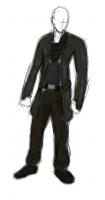
Ok, I have a question now, it's more directed at Robert than anyone as he appears to be our SimCloth master. Deitrix wears this somewhat long coat which will obviously have to move around like cloth. Here's the concept sketch: So I know with cloth that it needs a bit of distance so that it can "fall" onto the model when simulated. My question(s) is should I rig the coat or should I have it simply hanging on to the body model, with the arms fully modeled underneath?
-
After redoing the textures, here's where Deitrix is at so far. I'm not quite sure if his eyebrows go up high enough for them to look Romulan, I dunno, will play around a bit more before settling on a look. EDIT: I'm cruising today!
-
It;s quite fun watching each of the episodes because you can see where he started off with his skill and then when you get up as far as that test render, how much he's improved. The cool thing is, a lot of what he does with Max, I see as fairly easily translatable in AM, so quite a few techniques he's picked up, would work for us too. The big plus for him though is the mass amounts of free Trek models out there that he can use
-
I started modeling my face, I play Deitrix, the primary villain for Red Squad. The face has just been CFA'd, so no tweaking has been done. Due note however that I am actually a Romulan and therefore my brow and forehead are going to be a bit different (ie higher eyebrows, ridges in the forehead)
-
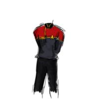
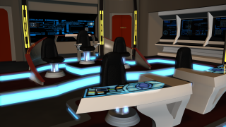
I know, doing fan stuff of Star Trek is quite fun. Redesigning some of the stuff that's already seen in Trek is pretty cool too. Like basically, the Pegasus is a Galaxy Class ship (like the Enterprise-D) except the bridge from that galaxy class looks very...eighties. So it needed a modernization. So I modernized the galaxy class bridge to make the Pegasus bridge! Same goes for the uniform, we're kinda treating this as our own version of the universe, so the uniform design is sort of a halfway mark between the TNG movies uniform and the Star Trek Online uniforms. In fact, here's some of the designs we went through before selecting the one you see on Henderson now! <-- The chosen one
-
All righty, I've been meaning to do this for sometime and am only now just getting around to it. As mentioned before, I am assisting with a project known as Star Trek: Red Squad. It's a 4 episode web series that is on its final episode. The basic premise is after the destruction of Romulus, Starfleet is training the cadets of Red Squad aboard the USS Enterprise (which is beginning to near the end of its tenure.) Suddenly, Red Squad is thrown into saving the quadrant from a mad man Romulan by the name of Deitrix, who is using wormhole technology to wipe out the Federation and all of its allies once and for all. Red Squad simply started as a test sequence of animations by Chris Kroznuski (Earth Link Zero creator) a few years ago, back when he first started dabbling in 3DS Max (oh, I should mention that stuff made in Max will appear in this thread as I cannot only show you half of the project). Over the last couple of years and 3 episode later, his skills have much improved and episode 4 is branching into things not seen in Red Squad before. As they were tests, Red Squad was simply animated using Star Trek game models and the like and lacked any sort of character, other than text typed on a screen. Episode 3 however was supposed to incorporate actual character animation and voice overs, however due to time constraints and the release date continually being pushed back, that was scrapped and voices were recorded to go over the usual text (in somewhat of a rush I should add). This is not the case with episode 4 though! Episode 4 is still early in its pre-production phase. The script is written and I've been working on building the characters and sets. We're looking at a release date of fall 2012 for this final installment which should prove to be considerably better then the previous episodes combined! So without further to do, pics vids and stuff Episode 1: Incursion at Sagan Episode 2: Kosack's Tears Episode 3: The Charge Our Facebook Page (Please Like ) And now for the current progress on Episode 4 and then all progress from here on in will be posted Stuff by Chris K: Music is 100% original and not currently released, so please don't redistribute Red_Squad_Main_Titles.wma Training_With_Red_Squad.wma Test Render Ambie_Final_Small.mov And now some stuff by me! These two pics are the new logo via Photoshop, I've yet to make an AM version And Captain Henderson of course Aaand his bridge. These pics are a bit older as those forward consoles were remodeled Well, that's about all I can think of to show right now, I imagine there's more, but as I said, I'll be posting at least my WIP stuff in this thread from now on
-
I would say for optimal and most accurate results, build the shards yourself and piece them together(?) and combine it with a particle emitter for the smaller shards/dust
-
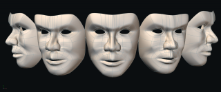
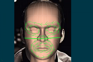
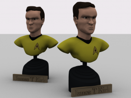
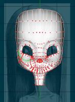
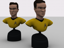
Generally it's a good rule of thumb to treat the eyes and mouth as two separate entities. See here: Note how the eyes are individually their own ring, but there's a larger ring that encompasses both eyes. The mouth is comprised of its own concentric circles and at the halfway mark of the face, a spline runs through it (usually defining the inset curve of the nose). Treat this line as the division of the eyes and the mouth. The eyes connect to the mouth in a vertical sense, however their concentric rings should in most cases not join with the mouths concentric rings. And again, keep the density as low as possible, only where definition is needed. Note how there's only a couple splines defining the cheekbones as that's all that's needed really. EDIT: Oh and another shot of kirk who is close to being done.
-
I somehow missed your post earlier From what I can tell, part of your problem is because of your eyes. Instead of having the concentric rings around the eyes separate from the mouth, they merge with the mouth and subsequently the neck which is giving this added and unnecessary density. One of the key things to not just face modeling, but any modeling is only lay down a spline if you need it to define something. You have quite a bit of splines that aren't defining any shape and would be better defined by the natural curve that splines make when they're farther apart. Here's a quick pic I threw together, kinda hard to see some of you splines because of the res, but you should get the idea. Red lines are splines that can probably just go as they're not defining anything and the green marks a different layout that will most likely reduce density
-
Different. So what, do you do it like a poly modeler, model the larger shape and then start pushing and pulling it to get to your face?
-
And this is what I;ve accomplished after coming home from work. I probably won't get to anything until Wednesday now again due to work
-
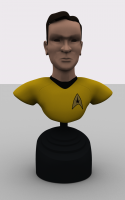
Well, a cool trick that looked pretty good on Captain Henderson was to keep the hair density at about 2, have 3 control points, use the brush tool mostly to shape it, then set the base of the hair's width to be about 1cm and the tip of the hair 0.01cm. This also saves on rendering time This is my quick start on hair modeled, needs lots of work still but yeah, it's a start. I still can't seem to get quite the right shape for the Shat's face though...
-
Realistic 5 point Studio lighting video turotial
Darkwing replied to jason1025's topic in A:M Tutorials & Demos
I have a simple skakey cam in the contributors cue I do believe. It worked pretty good for me, though I still prefer to do any skakey cam in post http://www.hash.com/forums/index.php?showt...8&hl=shakey -
A quick question, I'm trying to actually model the hair for this one, to keep with the whole statue look of the model. Any ideas on how to go about doing this?
-
-
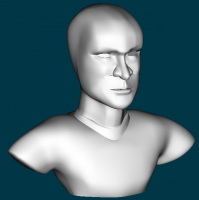
Oh, that reminds me, this isn't a face to be rigged, it's going to be modeled in the pose that it's going to be in, so I'm not so overly concerned about how well it will respond to lip movement and things like that. That being said, I'll see what I can do to reduce those splines just out of good practice. Part of it is because of him having a denser nose as I've gone and attempted to form some sort of nostril on him EDIT: Reduced the splines some:


