-
Posts
1,137 -
Joined
-
Last visited
-
Days Won
1
Content Type
Profiles
Forums
Events
Everything posted by thejobe
-
oops how did i miss that lol
-
thx yeah i like the mouse too bad i didnt model him lol forgot who made him but kudos to whoever did. ill try the nose curve thing ill try animating him later maybe give him a voice.
-
hey just felt like modeling a cage and puting a mouse from the extras cd while i was sitting around over the weekend thought you guys might enjoy it
-
yes thats a really nice model very good detail this was a shotgun i made a while back its nowhere as good as yours just felt like showing it off i was wondering if i could take a look at one of the bullets just wanted to see how you got that metal look
-
sorry i havent replied in a couple of days my art director said he wanted me to work in a diffrent program so i guess im not making a game with AM but somehow i will find a way to encorperate it. this was the last thing i worked on friday before the weekend
-
same video as above try this video diffrent codec
-
-
hey guys havent been around for a while been busy with life and stuff but now im jumping back into this with both feet! i have been given the privlige to work on a space type game. so far the game producer wants me to show some concept models for the game and tweak as as i go along. so i started with making a ship some floating rocks and space station (the earth was from a project i did last year just threw it in there) i was hoping you guys can give a few tips for designing for a game which i have never done before and i know its going to diffrent. so take a look at some of the stuff i have now and tell me wht you think video
-
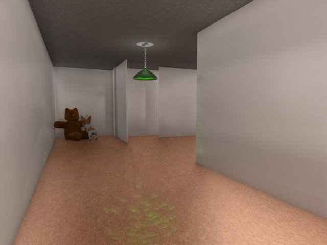
i was playing around with hash today and decided to try to make diffrent sets and lighting since im still not good at making people just decided to throw a chracter in there from the cd took about 8 mins to render used volumtrics with particles for the dust was trying to to get kind of moonlight night type of thing not sure if its the color or something else but something just seems bit off any helpful hints? [attachmentid=14456]
-
thats awsome looking!
-
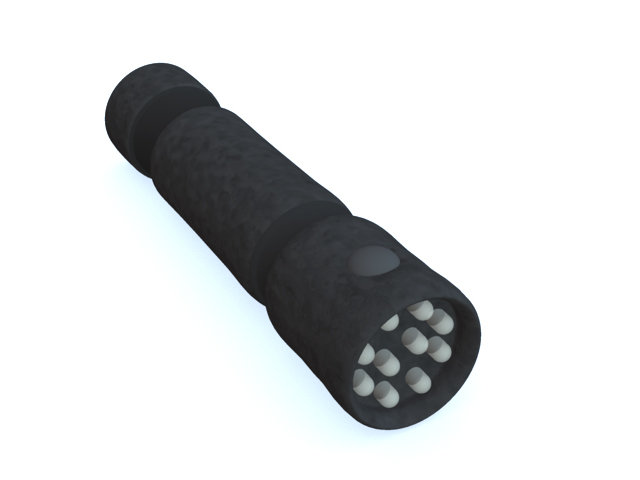
for some reason the shape of the LED doesnt look right to me LEDs are shaped kind of like a pill when they are pointed out think i might be able to see it from a better angle
-
i belive that it would look better if there is some kind of texture on the road surface just to give it a bit of diffrence from the window also vern my kitchen is diffrent it doesnt have a stove or a table
-
well he just decided that this one is temporary and i wll be fixing it up anyway the website is well use to be just for fun but now he said he will be selling some computer parts and other computer gizmos so i got to look and see what would be good look for the site since it will be completely revamped anyway. i will trying lighting the scene better next time around and do you mean ambiance to the acutally letters or whole ambiance for the scene?
-
well i was able to get the logo uploaded to the sever just got work on making the file size smaller for easier loading splash screen
-
oh yeah it will the actucal one will be 640x480 but since it was 1.6mbs and my sever was down i counldnt post it ill try again later today
-
hey guys me and my friend have been running this website for about 5 years now (hes been running it for about 7 then i jumped on board) since now its going to be start bringing in revune i thought it would be a good idea to make a splash screen to enter the site tell me what you think of the logo i have setup so far and if it needs anything i would be more than happy to know i will be using a flash splash screen [attachmentid=13718]
-
defintly better than my first model i made a blank soda can it was white didnt know how to changes colors back then
-
wow nice work so far scott cant wait to see this one finished also this is one of my favorite cars hehe
-
i forget who made the skylight rig but it has 8 lights ill go back to the other bump map but not sure how to make a diffuse map ill see what i can do about that
-
ok i tried the displacments on the rock im not sure about those new ones your talking about but i got these results [attachmentid=13376]
-
ok i got v13aipha installed so ill give that a try and see what turns out from that i scraped the grass and the mushroom since it just messed up the scene too much this time around going to try a light rig to give it better lighting
-
nope i like my pizza with thick hearty crust made got to have spinich on it hehe also while i was at it i made this little dude move [attachmentid=13366] little_bomby.mov
-
i was online talking to my friend who a really good 3d artist and he uses 3d studio max i was telling him about hash and he was just thinking that it could never be as good as 3ds max so he showed me a picture of a model he made from the game gunbound this guy [attachmentid=13356] i bet him i could make the same guy in 1 hour with almost the same textures and colors i think i proved my point [attachmentid=13357] he owes me a pizza now
-
ok cool thx ill see if i can fix the second picture but what about the first one with just the land and the rock
-
ok i added some grass and a mushroom if you see anything that looks off in the picture please tell me im just trying to get texturing to look right [attachmentid=13288]