Korken
-
Posts
312 -
Joined
-
Last visited
Content Type
Profiles
Forums
Events
Everything posted by Korken
-
Very lazy looking guy! A too short t-shirt, long hair and looking very selfconfident. Keep it up! //Korken
-
This is my latest... I should might not work with letters? Might try just a "cool" looking thingie. //Korken

-
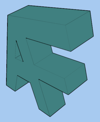
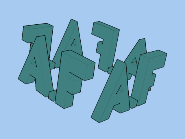
Hi all! Now I'm making some logos for a clup called ArbogaFreeriders and I'd like some ideas for more examples for their logo. I've made one (see pic) but I need more styles. Any idea helps! PS It is a bicycle club but they don't want any bicycle looking logo (too much used already). DS //Korken
-
That looks great! How did you add the "spots" of mautain? //Korken
-
It looks very good! But I think you should round the corners abit else very good! Keep it up! //Korken
-
I'd say it's a great start! Keep up the good work! //Korken
-
Critter/Creature for my next Mini
Korken replied to pixelmech's topic in Work In Progress / Sweatbox
Ohh how cute and what a great look on it! But you must attach the ears! //Korken -
Yes, I used a wide angle camera. Now, I've remade the scene and I think it became much better. Crits are welcome! //Korken
-
Well, it was really easy or I had some luck to get it good. I made it with a bumpmap and a one attribute Material. If anyone want it all then will I post it all. Wireframe is not needed. The only thing you see is a plane square for the water and the wall of the dome. //Korken
-
Hi all! How do you guys think this looks? Crits are welcome. And yes I know about the line at the edge of the dome. //Korken
-
Thx for the pics! I had only memories to go on. I'll begin with the bill at once. //Korken
-
I'm not sure what you mean but if you've see the original model, it has like a stretched dome (?) as a head. //Korken
-
Back.. //Korken
-
Hi all! This is my begining for the Road Runner in Coyote & Road Runner. I need crits on the shape of the head. Or if you like it just say so. In time will I add more pics of progress. //Korken
-
Then you must put up a pic with the pupils! I'm dieing of exitement! //Korken
-
Thx for the awnsers! I'll get right on it! //Korken
-
And wireframe.. //Korken
-
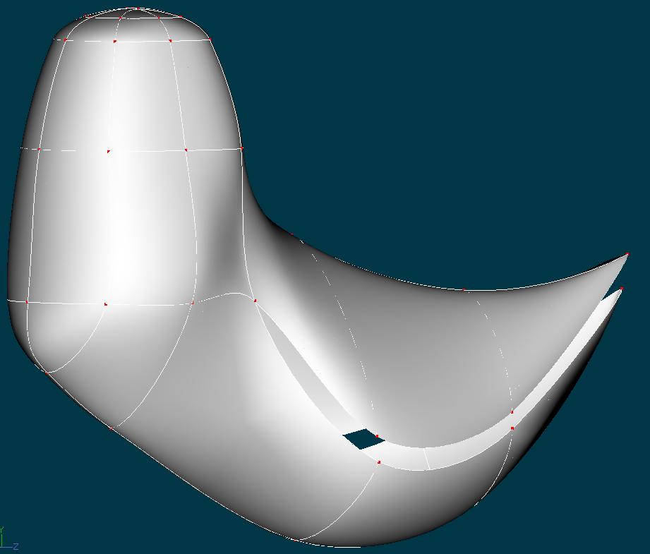
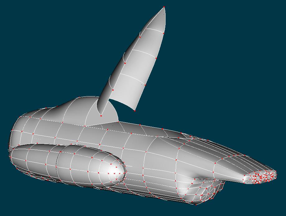
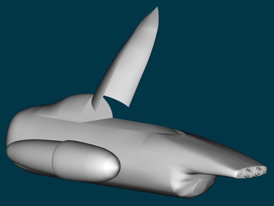
Hi all! Well, I've made alot of changes now. But I still got some patch problems, if you guys got any ideas on how to fix'em all then just tell me (see pic). And I'd like something to add/change on it too. It looks too futuristic. All ideas are welcome! //Korken
-
Thx for all, dude! I can tell that we missunderstod eachother. This spaceship is suposed to be 99.99% fictional. So how it's propelled dosen't matter. If only it looks good! //Korken
-
Strange, I can't find it. Is it on the 2004 cd? //Korken
-
I think I must study harder on my english. Lets just say I'm not so well educated. Exept maths. //Korken
-
Huh? tatumrk.. No offence but, do you feel well to day? //Korken
-
Thx! Hehe. Those allways mess things up for me. Where can I find it? //Korken
-
The closure was very helpful! But what is the secret to smooth sufaces? It allways becomes abit "bumpy". I intend to make the center cone in the exaust black and the ring around it blueish (electro like?) collor. Not just some old rocket. //Korken
-
Thx all! I'm just a beginner though i want to become a great animator/modeler. But I'm so bad at making smooth sufaces. //Korken