-
Posts
3,827 -
Joined
-
Last visited
-
Days Won
31
Content Type
Profiles
Forums
Events
Everything posted by largento
-
ROFL! If that guy had been really sharp, he would have unlocked your car and then quickly locked it again. :-)
-
LOL, Vern! How much you wanna' bet he's forgetting to bring something he needs to unlock your car? :-) I too have the wallet key. It came with my car and is housed in a credit-card shaped pouch that fits nicely in the wallet. Luckily haven't had to use it.
-
Well done, Kat! I really liked your staging in this section.
-
Wow, thanks guys! I REALLy appreciate all the words of support. (I sort of expected a bunch of posts telling me that I was insane for doing this.) :-) You are so right, Myron. This is a burning thing inside that I have to get out. Entering my 40s, I've really started to be aware that I don't have forever left to do all of the things I've wanted to do. I went to a memorial for an illustrator a few years ago. He had worked on a ton of things over his years and he was already an older guy when I met him years before. (I was at an ad agency doing production art on the Tuesday Morning retail account. We used line drawings of the products for the newspaper ads and he was the main source of them.) Afterwards, I was sitting at a table with several of the people I used to work with, including a senior art director who told me about visiting the artist on his death bed. Cancer had sapped most of his strength and he told the art director practically with tears in his eyes that there were so many projects he still wanted to do and the worst part of this was knowing he'd never have the time to do them. That's something that's stuck with me since. [EDIT] Hey Rob, I remember your icon and webcomic from the Half Pixel forums, too. Have you started working with A:M? [EDIT 2] Well, my adventure just got more adventurous since my engine light came on and I'm having $600 or so in repairs made. Luckily that's not a dealbreaker, but I figured it was best to take it in while I still had the option of taking back my resignation. :-)
-
Thanks, guys! It's a little scary, but I'm really excited about having the freedom. I'm really anxious for the two weeks to be over.
-
Cool! I've had something similar happen before and solved it by selecting those patches/control points, copying them, deleting the originals and pasting the new one. (Make sure in your settings that you have it set up to paste in the exact same place.
-
VERY true words, Gene! Thanks, Stian!
-
Thanks, guys! Al, that's exactly my thinking. If I don't give it a try now, it'll be too late and I'll regret it. Vern, I think I'll have to find a way to work in Flemm falling off of something into the story, just because of how hilarious it would look with the ragdoll physics. :-)
-
Let's hope it never comes to that, Nancy! :-) Rob, I've got enough put aside to go 5 months without anything coming in. Hopefully I can keep most of the buffer in tact. Thanks for the words of encouragement, everybody!
-
Thanks, guys! I've been telling everybody that I already learned how to get by when I was starving when I lost all that weight a few years ago. I've packed on some since then, so that should help me along. :-) Thanks, Ken! Activity should pick up by leaps and bounds in May.
-
Well, it may be a decision I eventually regret, but I put in my two weeks notice at work today! In the worst recession in a couple of decades, with a super-huge unemployment rate, I'm walking away from my job. And I *think* I'm still sane. :-) Money can't buy happiness and I'm ready for a change. Luckily, being single, I don't have anybody but me to put through the lean times. Going to work on getting freelance jobs to get me by so that I can put The Wannabe Pirates as my main focus. Keep your fingers crossed for me!
-
A great addition to the project! Really impressive!
-
Thanks, Kat!
-

The original NCC 1701 Enterprise
largento replied to Eric2575's topic in Work In Progress / Sweatbox
Hey, Eric! Sorry to hear about your lost drive! I've become pretty obsessive about backing up since I lost that drive last year. It's still biting me. Just last week I was looking for some video tutorial files for another application that I had bought only to realize that I had bought them right before the crash and since so much time had passed, I had to repurchase them. What do you think of the new Enterprise design from the movie? I'm trying to like it, but I don't think the changes were positive or necessary. The nacelles are too close together and I don't like the giant numbers on the saucer section. -
Thanks, Rodney. I thought the film was decent, but have liked the series much more. The producers like to point out that they've been getting better as they go, so they think it was kind of unfair to use their first efforts as the feature. The blu-ray of season one is due out in the fall and I'm looking forward to it. My local cable doesn't broadcast the Cartoon Network in HD.
-
One the nose, Rodney. I was going to put numbers on all of them, but it was very late and I was tired.
-
Thanks, Ken. You are right, but I blame lack of consciousness at the time. :-)
-
As you've said yourself, Gene, the more you do, the more those will go away. I think you've got to be setting some sort of record here. Not sure that anybody on these forums has produced so many short animations this soon after first picking up the software.
-
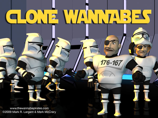
Thanks, Rodney! I've been really busy at work for the last few weeks and haven't been able to do much, but I'm slowly crawling out of that. Mostly I've been working on the story, gradually going from the broad general stuff to the specifics. Just to have something to show, I'll cross-post this image I did for the Wannabe Pirates blog of Errol Flemm as a Clone Trooper from Star Wars: The Clone Wars. Just a quickie, so I tried to get away with having to do as little actual modeling as possible. Mostly just changing the colors of patches, deleting some things and re-shaping others. The only real modeling I had to do with was the helmet.
-
That's very cool!
-
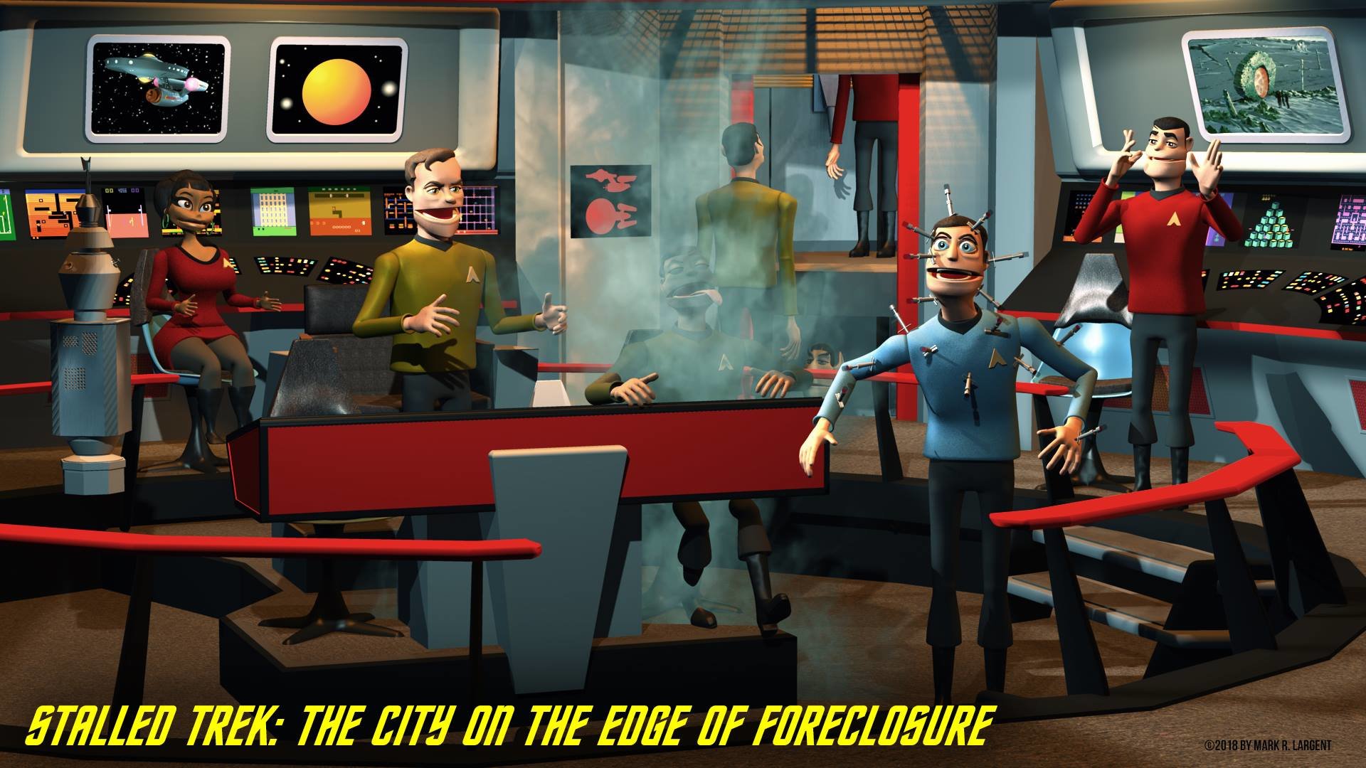
I played with creating the transporter effect from Star Trek when I was working on Stalled Trek. I used A:M and Photoshop CS3. Post #76
-
Al, looks great except those flat sections on the primary hull (on the fore near the sensor dish) aren't inset like you have them. [EDIT] Nevermind. :-) I guess I never noticed that before...
-
Al, the application I used is called "Comic Life." There is a windows version. The Enterprise is looking great! You're modeling it really quickly!
-
Hey Al, looking good! This might also be helpful: It's from the fan-produced series and shows some decent detail and color reference.


