-
Posts
3,827 -
Joined
-
Last visited
-
Days Won
31
Content Type
Profiles
Forums
Events
Everything posted by largento
-
Another great job, Matt!
-
Thanks, Matt! That would be cool! I've considered taking a couple of pages and submitting them to some of these online coloring book places. There are tons of sites that have coloring book pages you can download and print for your kids ...most of them violating copyrights... but I thought it would be a good way to plant a bit of advertising. I've got a few things going right now and am hoping they will all add up to a bigger audience and awareness for the Wannabe Pirates.
-
Thanks, Jim! Ken, for all your help with modeling characters for the next story, I will happily mail you a couple for your niece and nephew. Email me with your address! Also, I don't want to jinx it by saying too much, but let's just say in the very near future, you may be able to buy the graphic novels for your mobile devices (iPhone/iPad/Android, etc.)! I'm very excited about this!
-
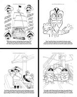
Thanks Gene & Ken! I wanted to set it up so that it told part of the story (then the last page is the hard sell to get them to go to the website and read the complete story), so I picked out relevant panels and brought them into Illustrator, gave them 50% opacity and "inked" over them using the pen tool as if the panels were pencils. To give it the look of Coloring Books I remembered from my youth, I made the backgrounds look like they were inked with a pen and the characters like they were inked with a brush. It really makes the characters stand out and it did help simplify the process. Drawing all of those lines on the ship was hard enough without having to try to imitate brush strokes. :-) No toon render or anything like that. Everything you see is vector art.
-
Here's something different! I talked with Rob Tracy on the phone last week and he had an idea I really glommed onto: doing a Wannabe Pirates coloring book! After a whooole lot of work and a lot of checking around for printing, I sent the files off today! There's a Webcomics Expo coming up next weekend in Dallas and I'm going to attend and have them for sale. Here's a tiny peek at some of the pages! I'm really looking forward to seeing the finished book! It's a pretty cool thought to think that there will be little kids coloring Wannabe Pirates pages! :-) On a tangent... when I was working on the page with Doc Bokor's Voodoo Mask, I suddenly remembered the inspiration for it. I can't imagine it's obvious to anybody but me, but I was thinking of Dr. Venture from The Venture Brothers when I first designed the mask. :-)
-
Render time for Mac Pro, 2x2.8GHz Quad-Core Intel Xeon, v15 3:12 Since I can render 7 frames at the same time, it will be the same as 27 seconds per frame.
-
This is an interesting idea. If I've got this right, the plug-in would create the spline (bones and geometry, pre-weighted) then you would just adjust the shape of the splines to fit the rotoscope. An arm or leg could be defined by the number of joints and generated the same way? I could see where many people would like something like that.
-
Exactly, Nancy! Although I should say that I do not condone the killing of parrots for any other reason. :-)
-
Starting today, I'm going to be running a tutorial of sorts for how-to make a 3D webcomic (which is really just how *I* make a 3D webcomic.) It's going to be in comic strip form, so that I can still have a gag a day, but I do plan on covering most of the things I do in actually creating the comic, so that might be of interest to some folks...
-
Yes, it's like those old wildlife documentaries where the mama bear makes her cubs climb up a tree and then runs off and never comes back. We're all cubs sitting up in a tree asking WTF? :-)
-
Photo of New York converted to Anaglyph 3D
largento replied to agep's topic in Work In Progress / Sweatbox
Astounding! -
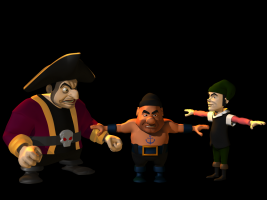
Thanks, Gene! This is the first time that I've created a character with no neck. Ken, I was thinking more in the sense that he was dumb and heavy. :-) He's based on a generic pirate character that I drew for one of the original title cards for the home movie version of The Wannabe Pirates. It's in the very first post of this thread. The one with Flemm being forced to walk the plank. McCrary drew a version of him in the webcomic, too, but he put a shirt on him. I liked the idea of him being bare-chested with the cliché anchor tattoo. The other crewman, Nash, is indeed skinny and was modeled back in January of 2009. You can see him in this post. Once Nash is rigged and textured, he'll have a scar running down his face and his left eye will be permanently shut. I think Nash is the only character I've modeled based on a character that McCrary designed. The parallel would be that Nash is Cutthroat's Mr. Sneeze and Ballast is his Poco Boco. Nash is more weaselly and Ballast is the muscle.
-
Ouch, Gerry! Modeled a new character today! Here's one of Cutthroat Jacques' crew ...I'm calling him "Ballast."
-
Not to mention that the bus could stop (presumably to pick someone up and drop someone off). That would not only give enough time to wash the palette, but also (like Will suggested), the ads on the bus could change each time... possibly to be a title and credit for the next segment. I really like the bus stop idea and Mark has created a great looking set.
-

Photo of New York converted to Anaglyph 3D
largento replied to agep's topic in Work In Progress / Sweatbox
Stian, that is incredible! My head hurts thinking about how much work that was, but the results are amazing! -
That's a good call, Gerry. Thanks! I'm still not sure how I'm going to handle the credits on the cover, but the "present" is a good idea. I'm actually now considering reformatting all of the strips into comic book pages to try the graphic novel route. If I do that, the cover will be oriented portrait rather than landscape.
-
Thanks, Jim & Ken!
-
Extremely nice! Something to look forward to seeing!
-
Thanks, Gene & Myron! I doubt I would've gotten this far without the encouragement and support from this forum!
-
Wow, I'm careening towards the end of this story! It's sort of tying up quicker than I expected, but once you get to the climax, there really isn't a point in prolonging the ending. Which means there's only two more days of strips before the end! It seems crazy to think that the end is here! I started working on the first strip at the beginning of August of last year. It's pretty much consumed my time for most of a year now. It's weird, too, that I'm almost a little depressed that it's coming to an end ...but of course, it's not really ending since I'm moving straight on to the next story. But I've been almost dragging my feet working on these last strips... like I don't want the end to come as soon as it is. I'm going to give myself 4 weeks to get ramped up for the next story. There are new characters to create and story elements that need to be sharpened and/or figured out. After all of this space stuff, I'm really looking forward to getting back to the ground again. To keep the website alive during that time, I'm going to run little making-of/how-to's/behind-the-scenes strips so that the space won't be empty ...and of course, new pages of Greyhawk will continue on Saturdays. One of the fun things I'm looking forward to in the new story is getting to make use of Cutthroat Jacques. There just wasn't room for him in Curse of Greyhawk Island. He's the only major character that I haven't gotten to really "act" with. I'm going to add a couple members of his crew (one was modeled a long time ago) and give him a new ship. This new story is basically the one that I was previously working on for the animated version and means I'll finally get to make use of the characters that Ken H. modeled for me last year! September 1st will mark 3 years since I started working on the Wannabe Pirates! It's hard to believe it, but I have this thread to look back at and remind me of all of the work I've put into it. I'll have more to update since I'll be getting to model new characters again!
-
Thanks, Jim!
-
Thanks, Ken! A valid crit (as usual). I may paint some in. My initial attempt to actually include the ship in the render of the water didn't work.
-
Thanks, Rob! Let's hope potential buyers think the same! Thanks, Myron! I really appreciate your saying that! Yes, right now there's very little validation for my effort, but I persevere hoping that will change down the road. I do think the CD cover is a little too risqué for the Wannabe Pirates page, but I'd have no problem with an ad that just showed the racked pool balls. We sell our ads through Project Wonderful. It's fairly easy to set up an account and they are sold via an "infinite auction." Which means, you put a maximum you want to pay and for how long, etc. and as long as someone doesn't bid higher than you, your ad is displayed there. It's pretty cheap to advertise via Project Wonderful and you can set up "campaigns" that will put your ad on as many websites as it can. Our ads start at 5 cents a day. I would say that you will get a lot more hits on your ads if you do show the girl, though. :-)
-
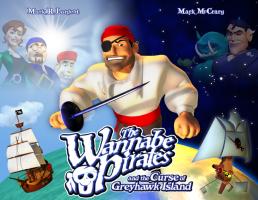
Thanks, Gerry! I worked up the cover art for the book version of this story. I think it came out pretty cool:
-
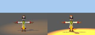
This is just my personal way, but I use 3-point lighting almost exclusively. I set the rim light behind, above and to the left of the character and usually bump up the intensity to 200%. The point of the Rim light is to help separate the character from the background. That gives you a nice "rim" of light on the character. The key light is from the front left, but not as high above the character. I make sure cast shadows is turned on in the settings. This is the main light and it casts shadows onto the opposite side of the figure, helping to give it depth. The fill light, I position front right and below. I turn on specularity in the options. The fill light works kind of like the rim light in that it breaks up the shadows cast by the keylight. It's meant to be reflective light. Normally, I like to give everything a warm look, so I use an orange rimlight, a white keylight and a lighter orange fill light. However, if the situation calls for a different mood, I change those colors to accommodate them. Here's a quickie comparison of the default choreography lighting and a quick example of how it looks with the lights set up the way I normally do.) A basic demonstration of 3-point lighting was shown in episode 8 of the video podcast Film Riot. Film Riot is about real world film making, but the concepts apply to 3D, as well. Plus, it's entertaining. This works great when you have a single character, but can get more complicated when you have more characters. Still, more times than not, I use only the three lights.


