-
Posts
401 -
Joined
-
Last visited
-
Days Won
2
Content Type
Profiles
Forums
Events
Everything posted by LeeAnderson
-
Hey guys! I've been impressed with your work lately, keep it up! Do you have a plot for this movie, or a script? What's it about? Good luck! Lee
-
Hey Connor, how's it going man? Got any cool projects in the works? Jimmy is a character I created, real name is Lee, you can call me whatever, though

-
Hey thanks for the models! Here are some things that I would do, it's just my opinion, but maybe you'll find something you like 1. Replace the crown molding with cieling extrusions. I'm not sure how to explain what I mean, but often times you'll see intricate "boxes" in this type of architecture. Does this make sense? 2. Maybe try some light colored tile with contrast grout 3. How about a glass coffee table? 4. Try a different wall color 5. Finally, I think that the chairs, fireplace and plants are all great models and would benefit a lot from so more realistic lighting (are you planning on changing the lighting?) I'm excited to see what happens with this! Lee
-
Hey neat! I like where you're going with this! Modern interior design must be appealing to artists... Keep it going! Lee
-
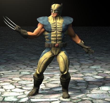
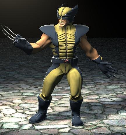
Wow, are people's heads really all the same size? That's interesting. Who says who don't learn things on the forums? Oh wait, no one said that. I didn't make the head larger in the normal version (it looks good to me). Thanks for the interest, though. So, here are two renders with a simple rig in them. One is the normal (went back to blue) and the other is the cartoon style. The cartoon style is turning out well, but there is something wrong with his face that I just can't seem to see. Anyway here they are: [attachmentid=23097] [attachmentid=23098]
-
Colin, there were a few things that you had going on that I really like (aside from the anatomy changes that I would agree with). The way you expanded his hands reminded me a lot of Olivier Couston's work. It would almost be fun to take this in a totally new direction and just make it totally stylized. As soon as I get the more realistic version done, I may end up distortion-boxing the heck out of this guy. Sorry mister mage, I guess I'm still not seeing what the problem is. If you're talking about the way the boot kind of "flares" at the bottom, I'd have to disagree. I think it adds weight. It's like: "This guy is so huge, his feet melt when he walks!" Just my opinion. I have another TWO assignment so I should start working on that for a while, but Wolvy is in no way on the backburner! Thanks everyone
-
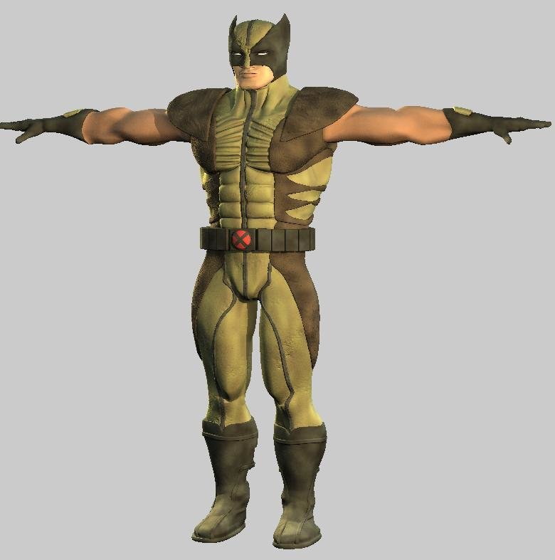
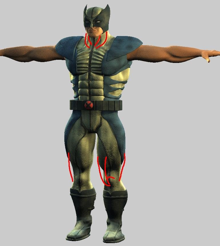
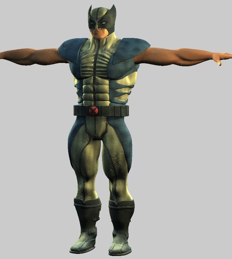
Alright, I enlarged the head in the new one, just a little bit though, I think that superheroes should have smaller heads. Samuel L. Jackson said that the supervillains had bigger heads in "Unbreakable" Who says you don't learn anything from movies? That's probably true and it wouldn't be the first time I've done it either, that's what I love about this! There's a Hero themed contest coming up, I figure that would be a good start. I already have the 2001 rig in him, no bells or whistles or anything, but that will probably work. Thanks again for the help [attachmentid=23023] Here he is with some changes to the anatomy. I think it's getting better, He seems to have lost some definition in his arms, though. I'm planning on adding in veins with bump maps, but maybe they're needs to be some modeling to get some of that back. Also, the sides of the legs look wrong to me. Maybe it's just the costume Oh yeah, and I tried a little something different with the colors. Tell me what you think Lee
-
Colin, I was about to abandon this project, there was a lot of things that I really couldn't figure out on my own. Thanks for taking some time aside and really giving me some really valuable tips. I'm going to start using it tomorrow.
-
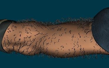
It will be unless you explain what you mean a little more [attachmentid=22943] Vong, you and me are thinkin' along the same lines! Here's an early arm hair test. Any tips on making the arm hair more realistic? I think you'll also be pleased to know that my Wolverine is scaled at 5' 2" But hey, compared to Halle Berry as Storm, Hugh Jackman didn't do too bad Any more comments?
-
Ahh yes...I really dislike rigging anyway Don't forget the claws Thanks for the serious critique Satyajit! Okay, so I checked out these places. The Ribs have me stumped. For the stomache muscles, I was really going for that formed abs superhero costume look. Here's the solutions to the rest of the errors according to my primitive understanding of anatomy. Please feel free to mark the image if you have the time, I would like this to be as accurate as possible. [attachmentid=22904] Thanks also Case, for your support! Lee
-
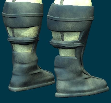
It's funny you say this, right before I posted my progress last time, I got rid of the old crack, because I didn't like the way it looks. Maybe it's just...uh...preference You might be right here. I think the seams leading up there make it look a little awkward I agree with this. The head just doesn't work for me all around at this point, except the mask. I made him some boots, at this point they look like they're straight out of a bad sci-fi movie, and I really like it that way [attachmentid=22849] Also, I started on the arms and put him in one of Yves' skylights to see how he'd look under some good light. [attachmentid=22848] What do you think all?
-
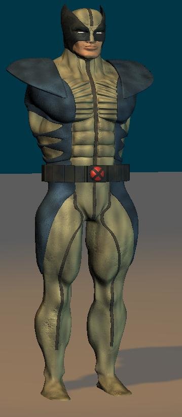
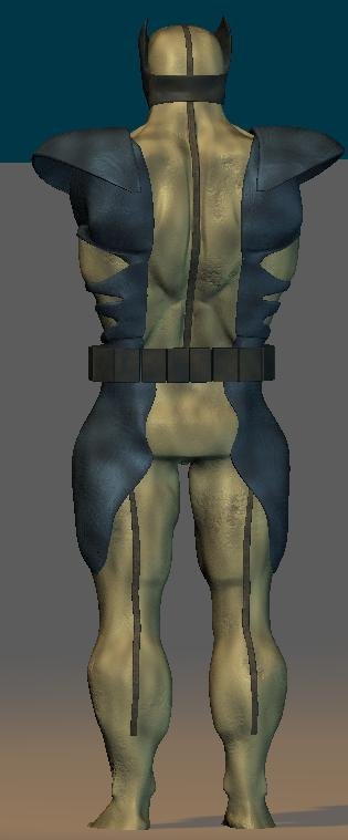
Here's an update with legs and updated shoulder pads. I think it's coming along pretty well. I'm still not satisfied with his face. It needs to be meaner, I think. [attachmentid=22797] Here's a few from the back [attachmentid=22798] Is there anything that could be better about this model? Lee
-
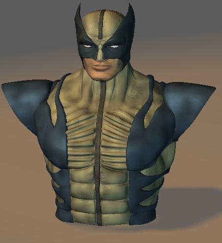
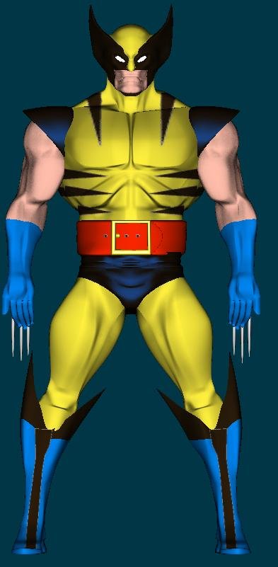
Thanks Trajce. I think that it's possible too. I'm not sure I'm there yet, but I'd really like to see more people try for that look. Well I started on the mask. The face itself is probably going to be redone, but there needed to be something in there to fill up the space. [attachmentid=22737] Just for fun, here's a model from 5 years ago that I did of wolverine. Yes, I was a nerd five years ago too, it's nothing new [attachmentid=22738]
-
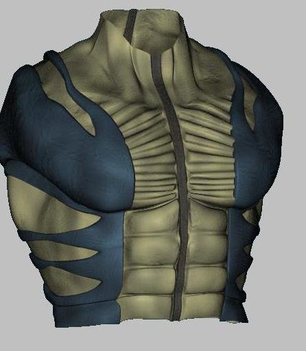
I should be working on TWO stuff right now but... Okay, so I happened to come upon a picture of this action figure of Wolverine and decided that it really needed to be modeled Here's the torso so far... [attachmentid=22727] again I really want to get that cool look that Blur studio gets. Is that kind of look achievable for A:M? What do you think? Lee
-
that I did for my church, it was one of the times I really enjoyed going to an activity (maybe it was the good feeling, or the animation, or the ego petting afterwords, not sure which). Anyway, it was mostly made with A:M, more as a presentation than an animation, but I think you'll agree that it's entertaining and has a good message. By the way, sorry about the narrator, he sometimes forgot how to read
-
Awesome! I loved that game! What are you making it in? Great work, keep it up!
-
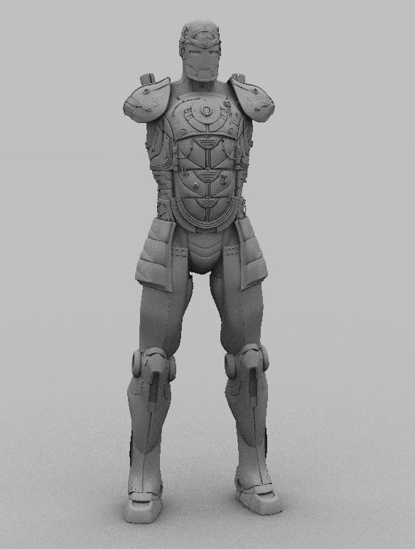
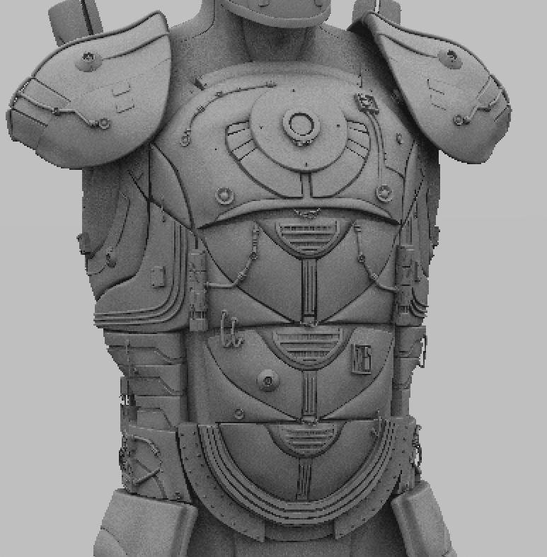
Hey Gary, I hope no one else sees this... Here's Iron Man's legs (sans detail). I was hoping I could get your opinon on them. They look a little bit on the heavy side to me right now. What do you think? Here's a shot of the back of his legs. I decided to model in the treads on the boots And finally a low-quality chest detail. I think this would probably be the max distance I could shoot him at and still have him look like he has many details. I would love to hear your input! Thanks a lot man! --PM me though...don't post here...lol Lee
-
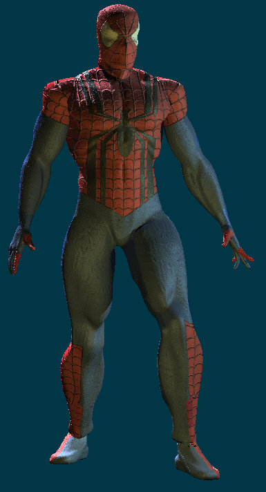
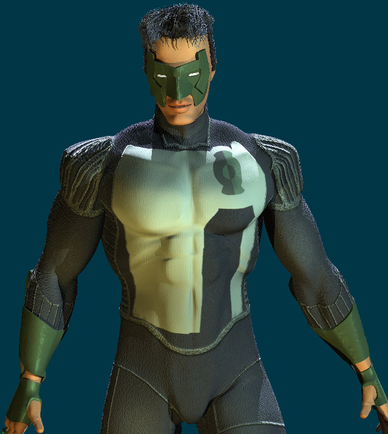
I can totally see robot chicken odins, good call! Thanks case, I appreciate it, comics are so much fun! About once a year, I just get into them, and they take over my life. Well, I don't want to spend too much time away from TWO when working in A:M. But here's another load of pictures I've done. First is a test of Ben Riley spiderman that I did. The webbing texture isn't mine, but all it is is red and black with the same texture applied as a bump map, it would be easy to duplicate, I thought it looked cool. [attachmentid=21868] and another [attachmentid=21869] Next are two models that I made in hopes of having them fight. First it's our old pal the silver surfer--the planet and stars in the back were done in photoshop by me [attachmentid=21870] Next are two different versions of Kyle Rayner Green Lantern--don't know which one I like better. It's also my first attempt at giving someone hair. I really wanted to get the same look that Blur studio gets in their superhero models. [attachmentid=21871] [attachmentid=21872]
-
Thanks again Martin! That was a lot to take in at once there. Well...as far as the rigs go... The Russian Superman model does have the 2001 rig in it (modeified to his pose) and Russian Batman doesn't have any rig in it. The plans were pretty much this picture. So if I were to donate these I'd have a lot of work to do...but if it's for the good of the peoples...I guess I could I'd love to make some poster size renders. If you could give me a resolution, I could get on that too. Do you mean for display at comic-con (I think I just soiled myself)? I would like to work on TWO. I could give at least a couple of months good work (I'll give you more details) Thanks thejobe, my server is being slow today, so I'll try and post some wires later, okay?
-
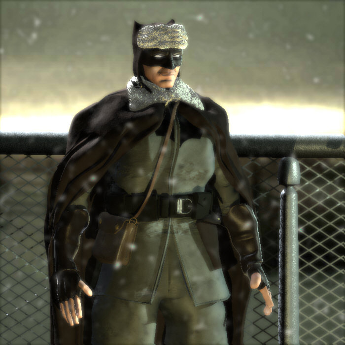
No comments or critiques? Well, I just did another render of the Russian Batman and I'm calling this one final. Again, everything came straight out of A:M. The snow is a rotoscope of blurred noise is PS with an alpha channel. Add a little bloom for fog, and some fur for the hat and collar and there ya go! Hope ya like it! [attachmentid=21390]
-
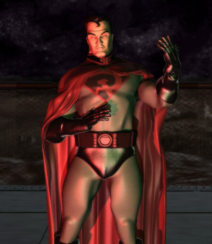
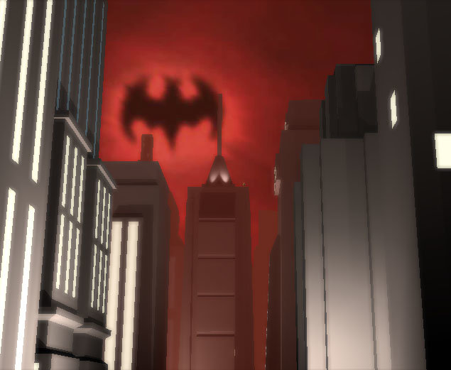
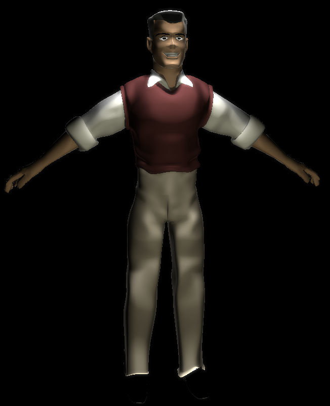
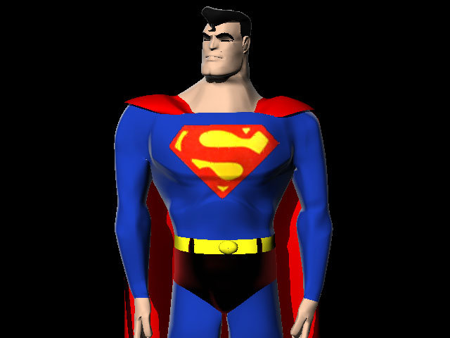
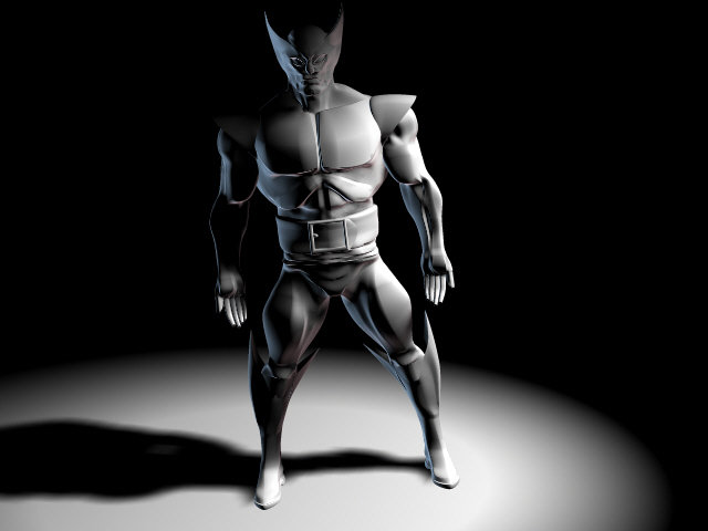
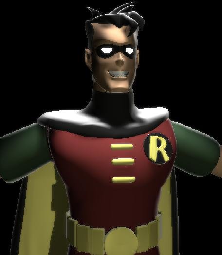
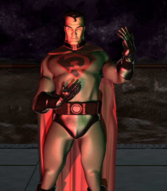
Whew! I mean, all I do is post pictures of guys in tight spandex and now people are questioning about my preferences...oh...waitaminute... Either way, stud (gay or not) is high praise from THE man himself. Thanks, Martin...and to the rest of you too. I'm glad you liked them. Here's the next wave, First is an alternate version of the red son superman [attachmentid=21358] Here's an early model I did, but it looks cool anyway, of Wolverine [attachmentid=21364] I decided to make 2 blocks of Gotham City from the cartoon, only a little of it can be seen here. [attachmentid=21360] Also, I made a model of Dick Grayson from the cartoon, for the same abandoned project [attachmentid=21362] And another cartoon-based model of the man of steel [attachmentid=21363] Lastly--here's the Batman from said Red Son comic book, and no, he didn't steel superman's cape [attachmentid=21357] Hope you enjoy them, thanks for the support all!
-
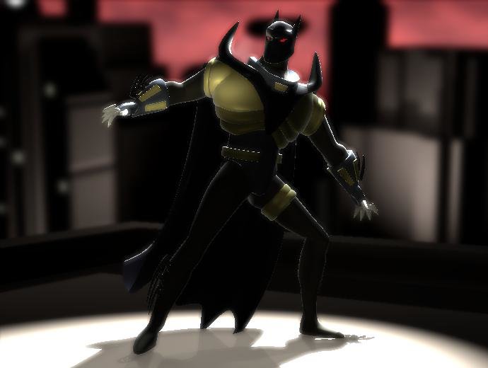
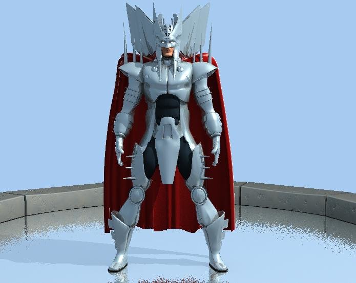
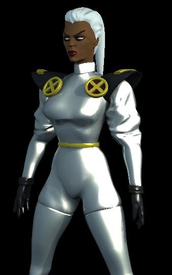
Well, I know it's been a while since I've been really visible on the boards, but I just wanted to show you guys some things I've been working on. First off, I was inspired by the Batman Animated series to create this 4 minute animation that I posted on youtube: Here's a quick environment test I did afterwards: Next is a test I did involving the Batman animated series style again. This time, I imagined what the "Knightfall" Jean Paul Valley batman would look like in this style. [attachmentid=21318] I also made models of The Riddler and Robin from the Animated Series. [attachmentid=21320] [attachmentid=21319] Third, I found some great reference of Marvel Comics characters and decided to model Stryfe from X-men, and then I got a little daring and tried a female character: Storm, with my own costume design. [attachmentid=21321] [attachmentid=21322] And Last of all are Two pictures of the soviet superman model I did from the graphic novel "Red Son" [attachmentid=21323] [attachmentid=21324] All images come straight out of A:M with no post work of any kind. Enjoy!
-
Hey Stuart, thanks for your suggestions. This image is photoshopped too far at this point. Here is the image as it is rendered in A:M. It's funny you said something about the letter. The first time I posted it, people said that something needed to be in the foreground. [attachmentid=14600] Hey Rob! You're the one that really made me decide to bring this in to PS and have fun with it! Good to see here from you again. Here's a different version of the first picture I worked on...I think adding green makes the color scheme work out better [attachmentid=14601]
-
Thanks for your comments! I forgot one! This is another where the front model is done in A:M and the background is a Matte Painting I put together for school with some photos I took. Any crits?[attachmentid=14427]
-
Hello! I haven't posted in a long time...but I thought that my friends at Hash would like to see some old stuff that I recently revamped. The first you may remember from a while ago, but I recently went crazy in Photoshop and I think it turned out really well. The second is a newer one that I think turned out really well. The figure was done in A:M and then put onto the Photoshoped clouds. Tell me what you think![attachmentid=14353][attachmentid=14354]


