


John Bigboote
-
Posts
6,562 -
Joined
-
Last visited
-
Days Won
55
Content Type
Profiles
Forums
Events
Posts posted by John Bigboote
-
-
That looks great Tore... looking forward to your next 'absurd theatre' episode... what a style!
I had to Google shadermap 4:
Needs further investigation... might actually get me to start using Normal Maps!
-
 1
1
-
-
Very cool- thanks for the sequence!
Your smoke looks good... my eye likes to see the particles continually expand and lose opacity over life, with a random factor controlling the lifetime/size/opacity so they don't all follow-suit. I'll have to look at these new settings!
-
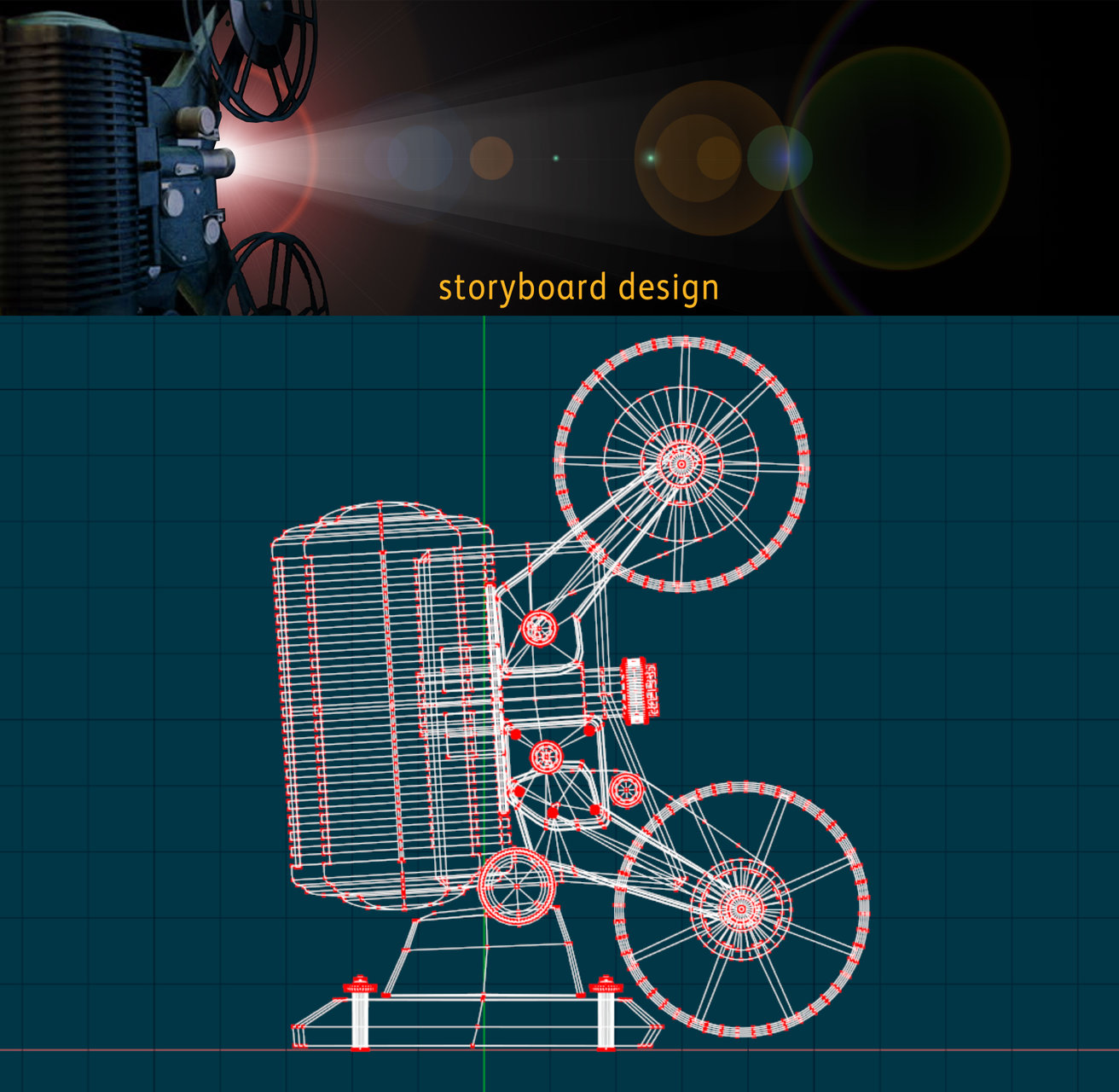
Re-visiting this old thread... kicking some life into it because I am excited about this. Had another 'A:M to E3D' job this week, where I needed footage of an old-timey film projector and the client was sold on a certain look and style... the resolution was above HD (some 2500 px X 700 high for a corporate presentation before some 5000 employees) The popular consensus was that I could just 'find some footage of that style projector' to use... which I knew was a million to 1... and- I am an animator, not a google-researcher... so I modeled in A:M and exported as .obj to E3D within After-Effects and animated the camera doing exactly what was needed for our establishing shot. With all the After-Effects lens-flares and additional effects added... full resolution renders are taking less than 1 second per frame- with full shadows/reflections/AO/DOF/fog and PBR materials. LOVE!
-
2
-
-
Once you see how cool it is to render with 3 nodes- you will want more. Hash has them affordably priced too.
-
Crescent shaped beams of light coming thru the mottled tree.
-
1
-
-
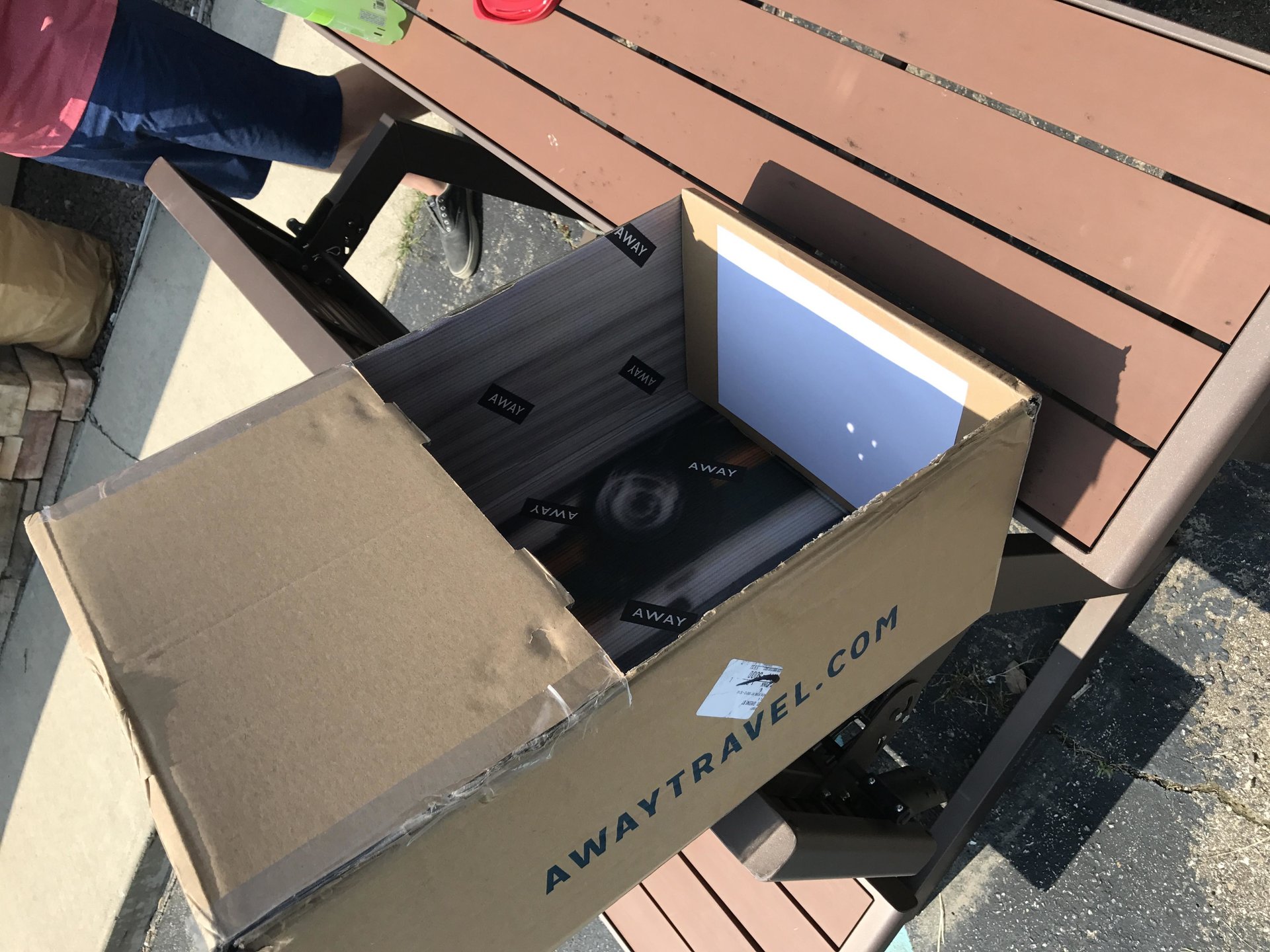
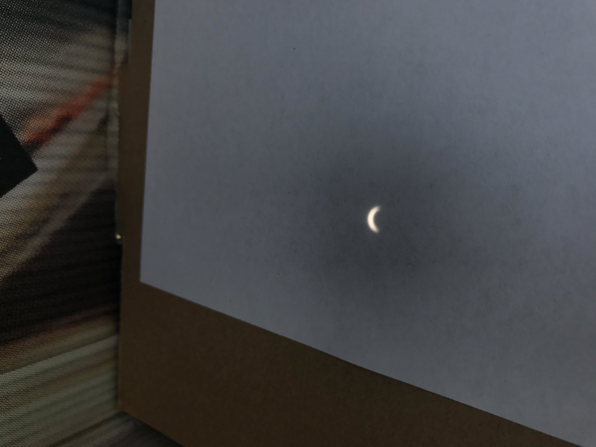
My rig. Fun day! Getting very little work done. Looking forward to professionally shot pics of the corona.
-
1
-
-
I keep shortcuts to both on my desktop (Render Messenger and Render Server.) Maybe you need to try starting-up Render Messenger first to open some cores...? (guessing)
-
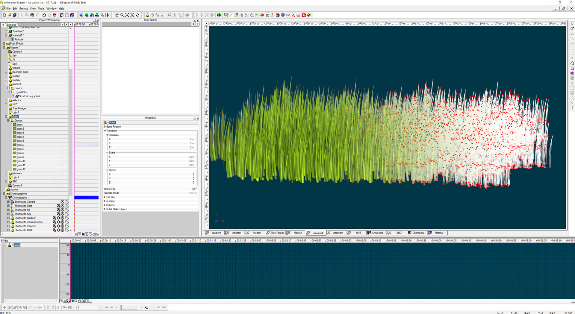
STEP 4: The Background and Composition. 3 GRASS (MODEL INCLUDED!)
As I did my test renders I felt like the building at bottom of frame was still not grounded enough... so using the same copy-paste-copy-paste technique as above, I made a low-patch blade of grass, and made sure there were variations in size and angle as I pasted... and also made multiple color variations as I went.
-
STEP 4: The Background and Composition. 2 TREES (MODEL INCLUDED!)
I have a repository of trees, I recommend collecting them any time you see a free model, grab it- save it- use it. SO- I added my trees to my scene and test rendered... NOT was I was after. SO- I went online and googled 'free tree obj' and downloaded a bunch of OBJ's... they didn't look right in my scene either... I was seeing too much branches and trunks and not enough foliage. SO- I modeled some tree foliage. Starting with 1 patch, I copy/pasted over and over- building up a nice full volume of leaves in no time. Then, multiplied them once again by bringing 7 instances into my chor/composition and placing/sizing them behind the hut...
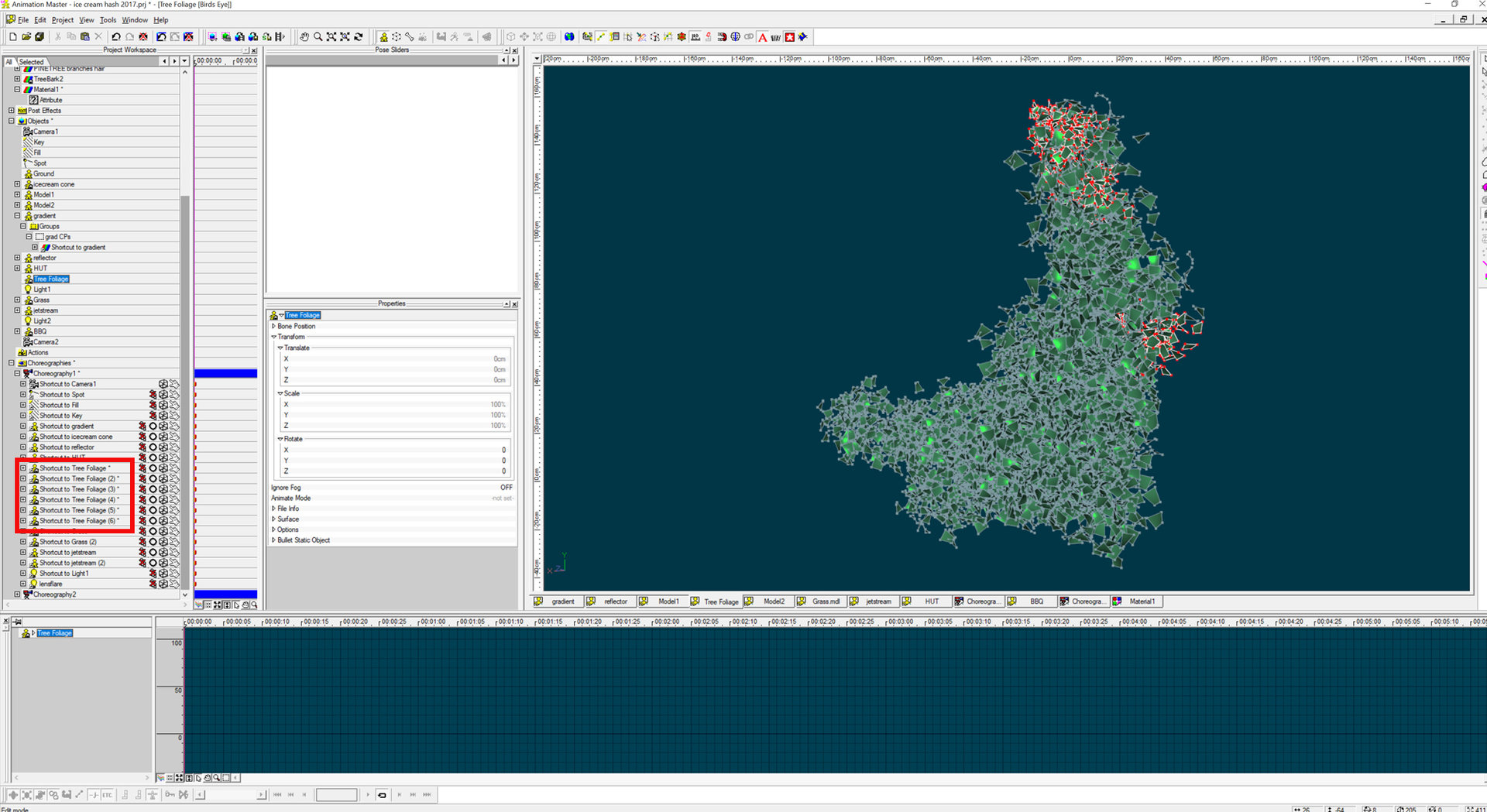
-
thanks for the comments!
STEP 4: The Background and Composition. 1 The SKY
At this point, I will make a new Choreography and drag my Cone and Hut in- and adjust their size and Z depth position, as well as start playing with lights. I will be working in a 'portrait' 9 X 16 resolution, so I set my camera to 960 wide by 1280 high... later I will double or triple these numbers for final render- but this is good for working previews.
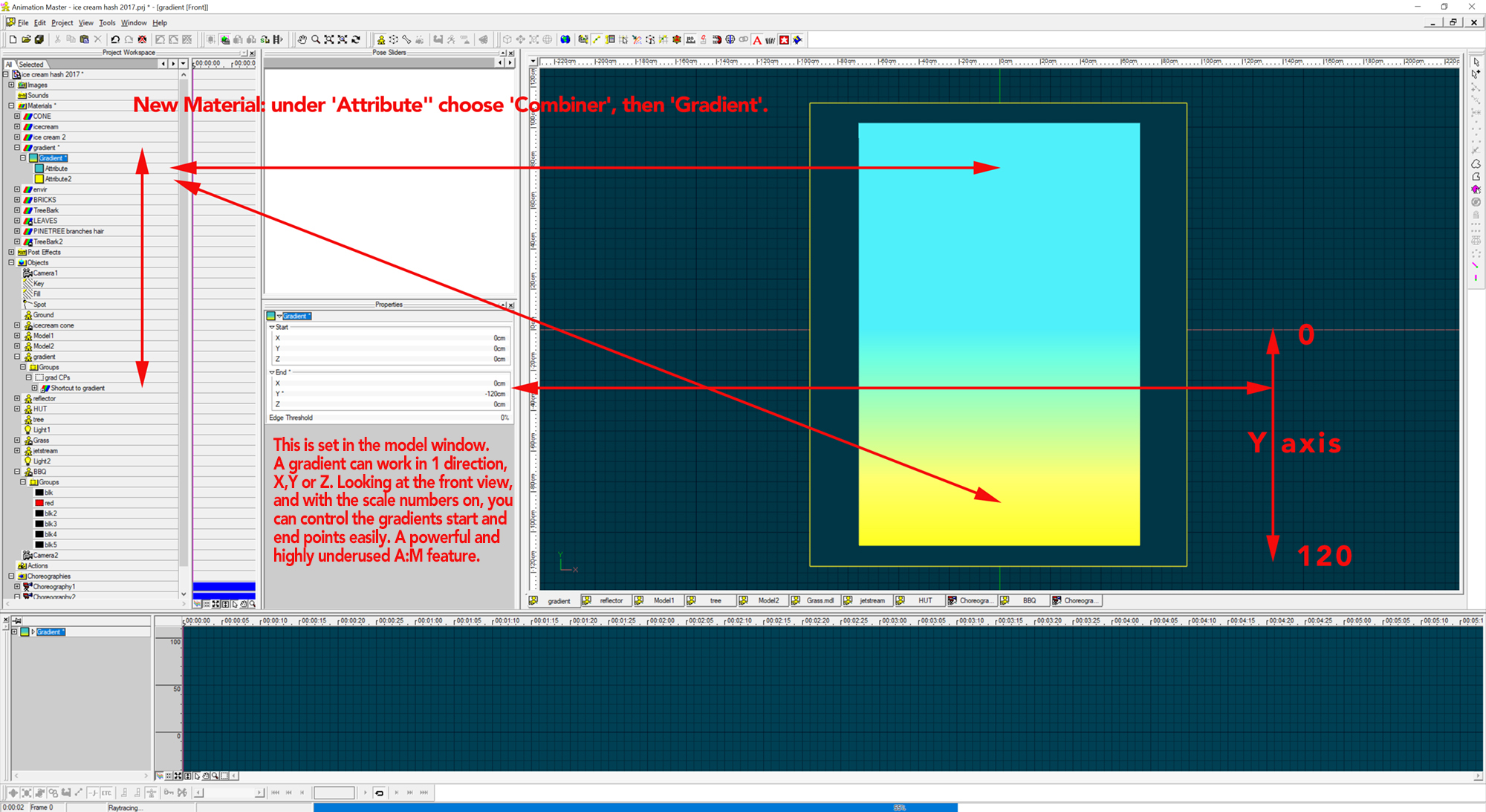
My sketch indicated some background greenery which I think I will need for my image. So, working like a painter, I will paint from the background forward, so I will need a nice sky first. Lots of time, a simple 1 color sky will suffice, but I want my scene to have a sunset or sunrise kind of feel to it, and for that I used a gradient material and set my sky blue and hotter horizon color. I then modeled a simple 4 point patch and added the gradient material, and added it to the choreography and placed and scaled it so it filled the camera and did test renders to adjust colors.

-
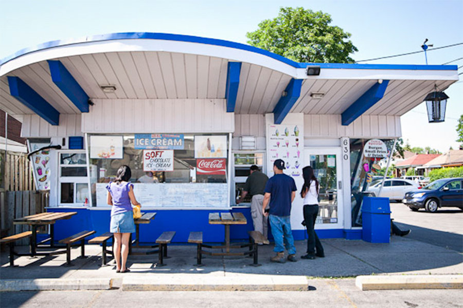
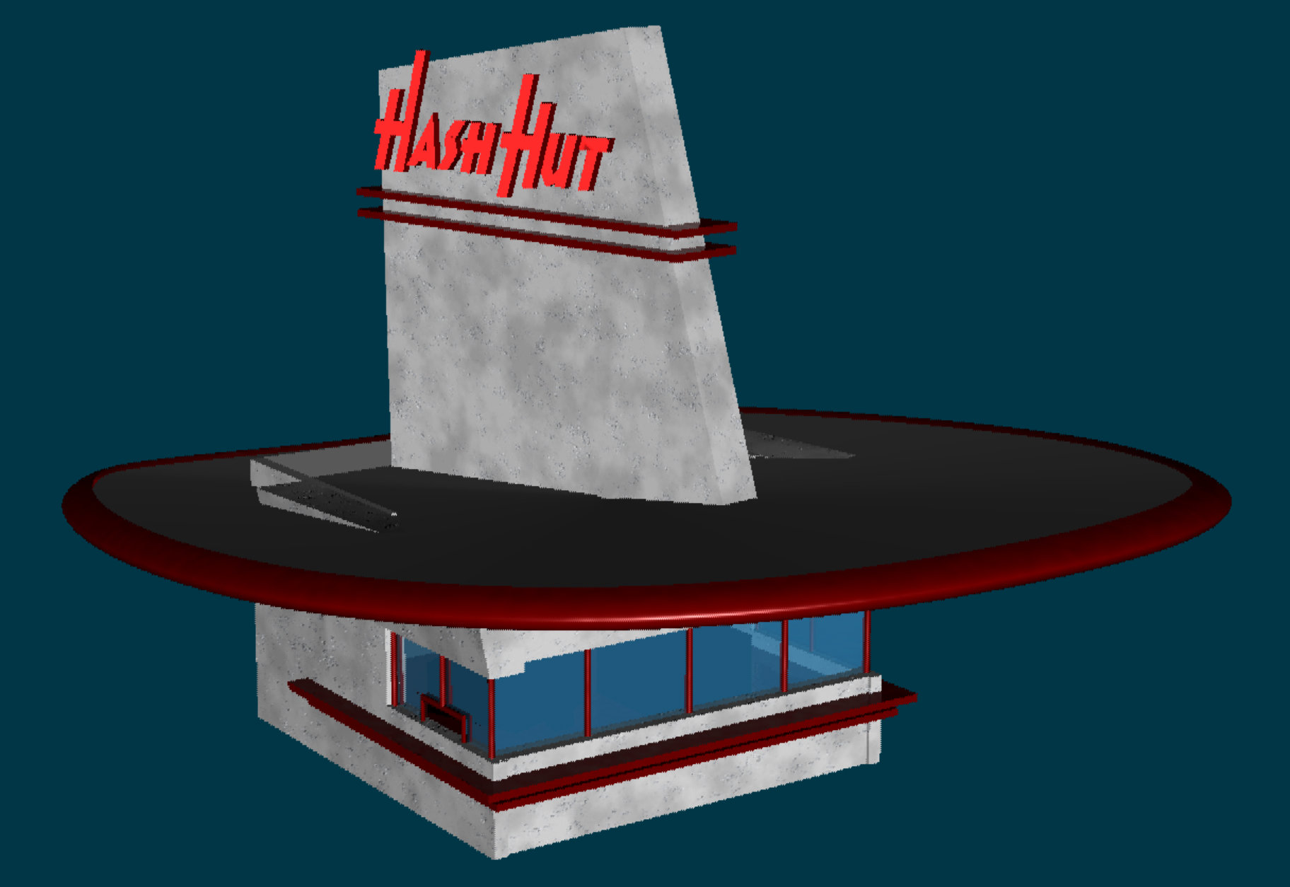
Wow- this is the building I was channeling! Next up... background!
-
Yes! Popular with cheep hotels, shopping center marquis, bowling alleys, drive-in theaters, hamburger stands... a 'Google' image search on googie architecture provides a pleasing eyefull! Very 'art-deco'(in the 1950's definition, not the 1920's...)... bring ON the boomerang formica!
-
Hi Simon- Bulls blood. Really! Seems that might turn brown with time.
As far as criticism... Is there a reason the eyes are that blue? I usually use a decal on the eye... i'll send it along- feel free to color correct or not use. Have you considered using real A:M Hair on top of your hair areas to add a little extra shag? It could be groomed (brushed) in the proper direction and might help add realism...
-
Also added... Rule 5a Pre-voting Exhibition Gallery
Good move! applause!
-
and then... a tip-of-the-hat to Martin!
-
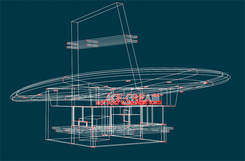
STEP 3: the STAND
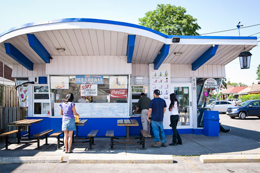
Using my rough building sketch as a guide, The simple 'Hut' is an homage to all those ice-cream joints we have all seen and frequented. Once again, Simbiont textures will add a nice Stucco texture. The 'Fin' on the top was an added detail, and rotated once I added a sign so the text would read better. Simple black shapes (cubes) added inside the building give the illusion of equipment and hide the back wall- Text was quickly added using the Font Wizard, and the font 'Honest John' which I believe was made to look like the old Howard Johnson's logo text had a nice 'food-stand' look... classic!
-
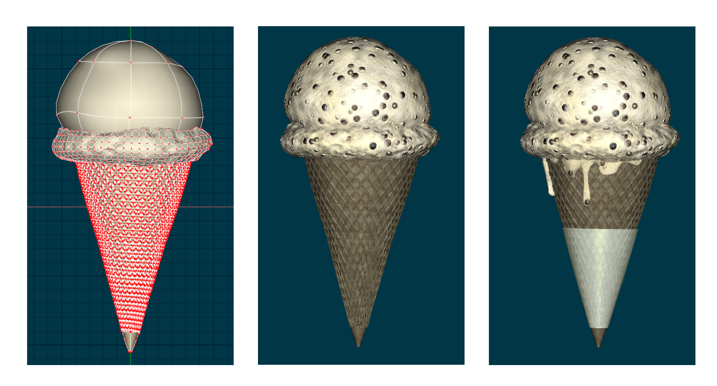
STEP 2: the ICE-CREAM
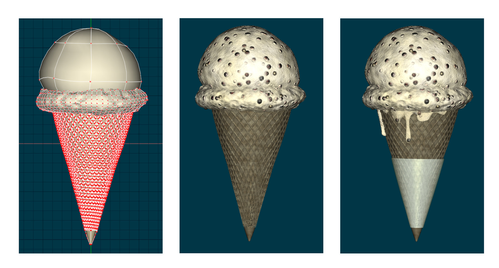
First, I did a Google image search on 'ice cream cone' and came-up with a lot of reference.... what flavor? I hadn't even considered. Vanilla would be easiest, I suppose... but I was hungry for something more. I played with many Simbiont AM textures and finally found one that looked ice-cream-ish... and it was the tx-Bio Alien Skin texture. I played with colors and settings and got a nice 'submerged chocalate chip' or maybe they are pistacchios... I don't know- looked good and was quick-n-easy.
For extra detail, I added a plastic/paper transparent holder, and along with an upside-down small cone added at the very bottom the cone's problems were mostly hidden. Some drips were added as well. Also- I added some extra 'chips' to the ice-cream surface that served to break-up the smooth outline nicely.
-
2
-
-
My next move would be to see if it is a V19 problem, open up 18 and try it there...
-
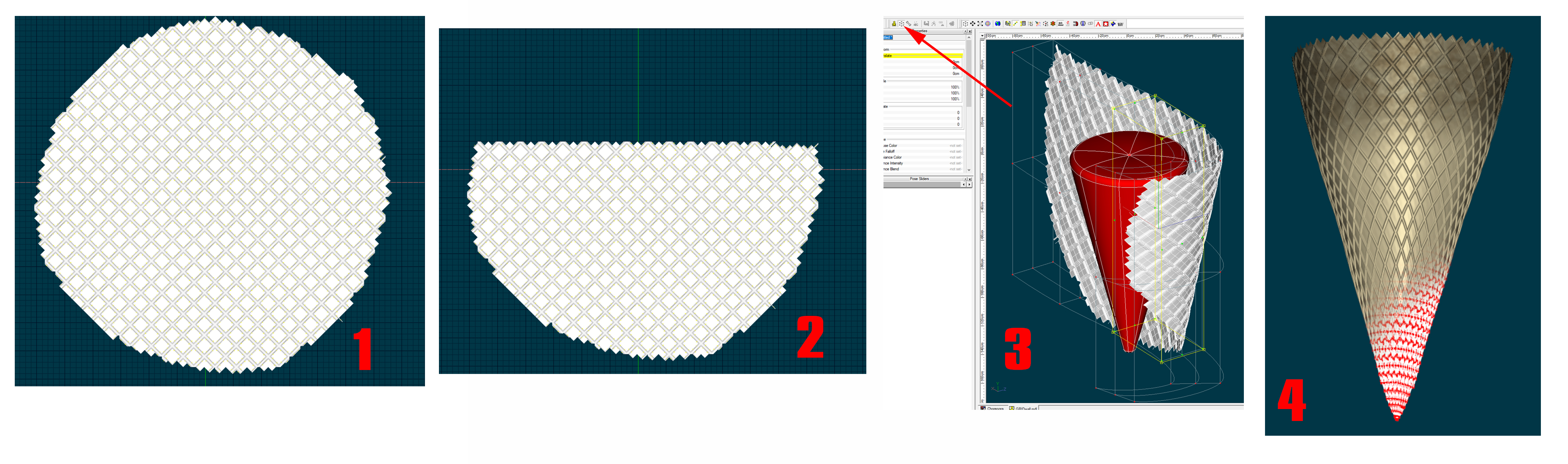
But I still had a ways to go. I realized I was making my cone like the Youtube video I had watched...
at 1:30 in the video I noticed the round shaped waffle goes into a cone where it molds it's shape... I had to do that, so I:
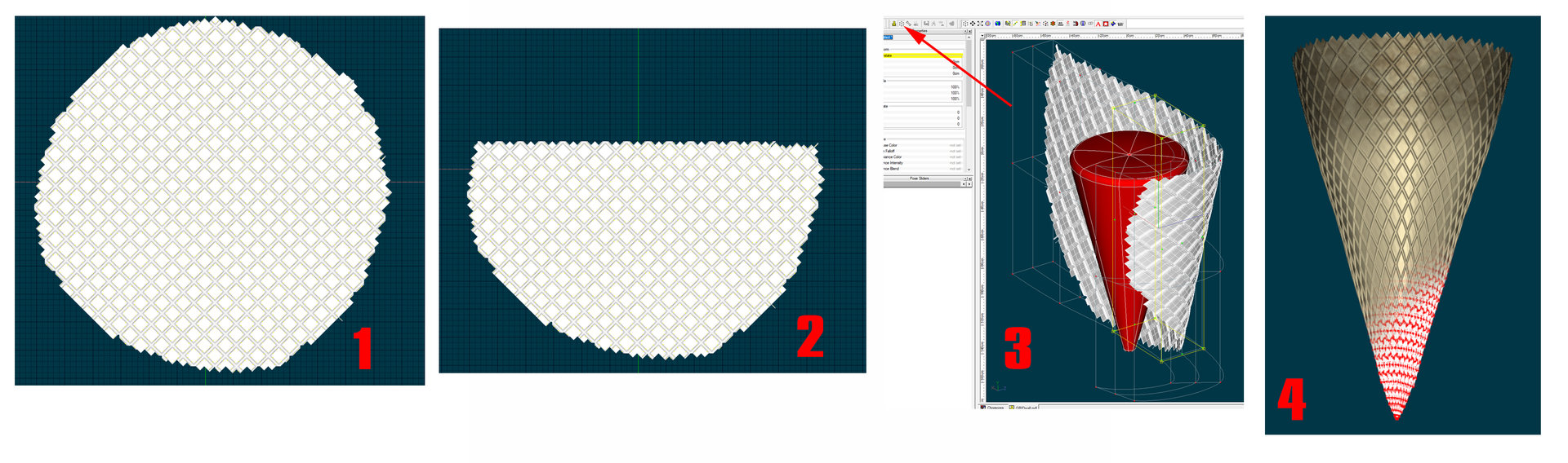
1- made my grid into a round shape and tilted it 45 degrees.
2- cropped the top off so I would get an even top.
3- used Distortion Mode to meld and form my waffle to a primitive reference cone shape (red)
4-Final result... I now added the color and a celturb material to give a little variance and texture.
Looks nice, but there are still 'problem areas' that would need to be dealt with. Mainly, the top was jagged and rough- an easy fix once I put my ice-cream in, will cover it up nicely. But, at the cone's bottom- the grid is over-converging and comes to a non-uniform crumbly tip. The solution? Stay tuned.
-
STEP 1: The CONE
I began by attacking the cone of the ice-cream cone... still not knowing if I was working on an idea I would scrap- or ever finish. I figured this was a good starting point, something I literally love to sink my teeth into... and I told myself it would be an easy start. Right? Wrong.
I initially lathed a cone and then started playing with materials to get that 'waffle grid' look I was after. Materials let me down in the mapping (spherical, cubic...?) and in the bump/displacement (I wanted to be able to 'feel' these ridges...) I scrapped the lathed cone idea and watched a Youtube video on how ice-cream cones are made for inspiration. I could'nt believe I was 'stuck' at such an early point in the process... so I went 'old-school'. I used geometry (CP's and splines) to make my waffle pattern.
I modeled 1 grid-unit and then copy-paste, copy-paste, copy-paste... and via the magic of exponentialism I was quickly there.

-
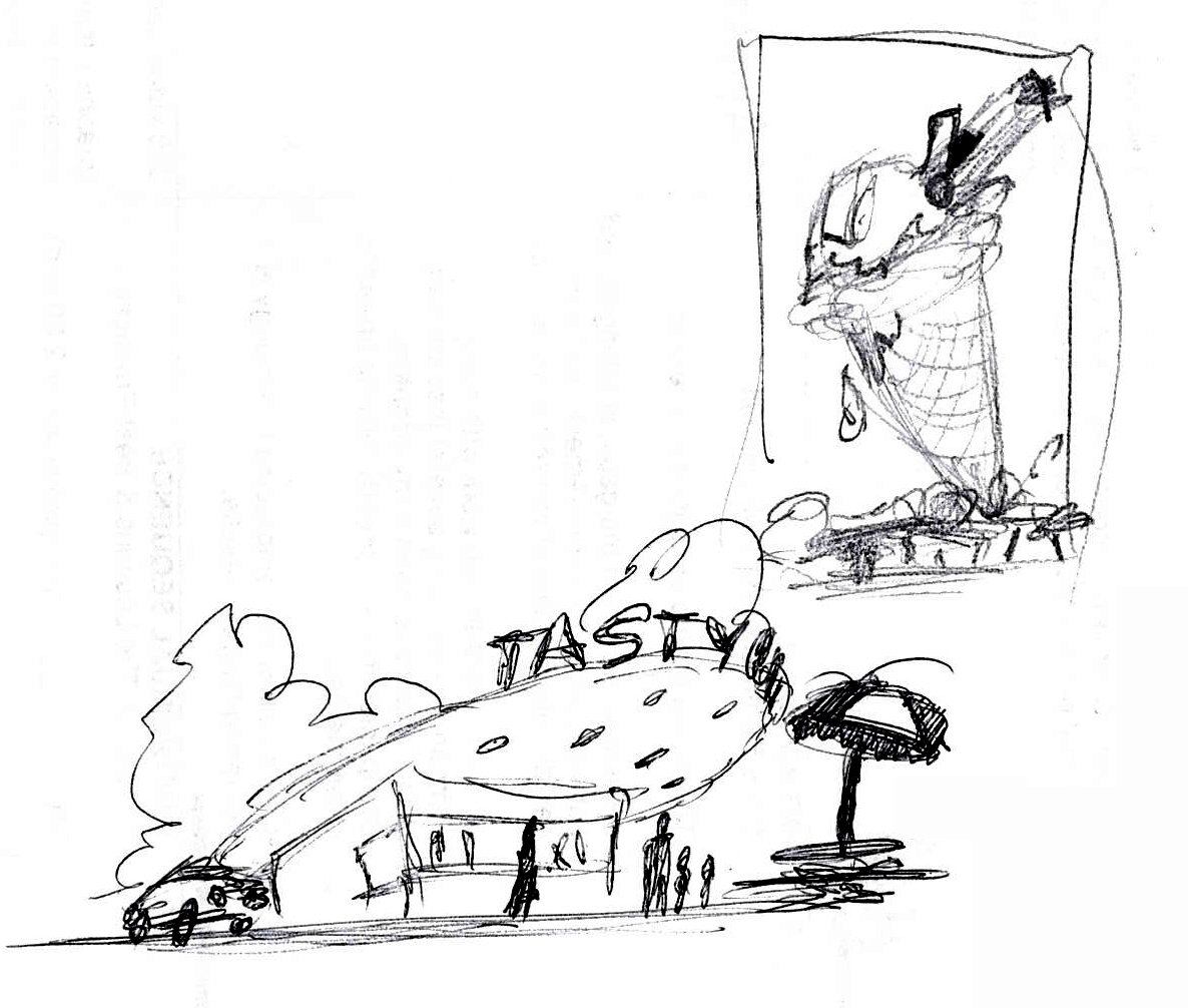
It was just a crude doodle made while on the phone... but I liked the way it seemed to catch the spirit of summer. It had the whimsy and composition of an advertisement you might see on a marquis while deciding if you should get a slushy or a cone. I liked the way the 'shack' sat at the bottom of the frame, and I immediately redrew it with more angled perspective and added detail. With the right colors and textures- this could make a nice image!
I read recently that in the name of not being 'overly-ambitious', when you start a project with a design like this you should reduce some of the elements, so ultimately I would 'nix' the ice-cream scooper, the car, people and picnic table and just concentrate on the building and cone.
-
I'll be posting some images, files and explanations about my 2017 SUMMER Image Contest entry here. I am sorta working backwards, seeing that my entry is already submitted. I worked on it for about 8 hours, 4 on 1 day and another 4 the next. It all began with a simple sketch that I was able to get excited about:
-
That is odd... guess you will need to re-apply that one?
-
Ha! I like the way the pink dots took reminded you of a little story for us, Simon. Maybe time to paint your house pink!
I feel your pain on this--- wish I could be more help. My approach to UV'ing has always been to simply apply a decal... maybe take a screen capture of the particular view I am looking at... take it into Photoshop and paint to that angle. I was very excited to start learning C4D with it's 'Bodypaint' feature for UVing... but found it quite convoluted and many other users feel the same way and recommend expensive 3rd party UV-ers... Lately, back in A:M, my approach is to use less imagery and more materials- tho that would'nt help you here- sometimes you need paint and imagery. I appreciate this thread and will follow-up on the knowledge here when I can.
Let's go for a pint at the Shadingfield Fox!


You'll cry for Cassini!
in Off Topic
Posted
We got our moneys-worth out of that one! Way to go, NASA!