heyvern
-
Posts
5,210 -
Joined
-
Last visited
-
Days Won
4
Content Type
Profiles
Forums
Events
Everything posted by heyvern
-
Good grief! I just realized something... I think Steven Spielberg's movie directorial debut was a TV movie called... Duel I loved that movie... This looks great Raf. I can't wait to find out why they are fighting... he cut him off in traffic... spilled his beer... or... tastes great... less filling... polygons vs. splines... so many options... Vernon "Splines taste great!" Zehr
-
More stuff! Some "beauty" shots of some of the items in the project... probably should have just focused on a few things in a tighter image instead of like 50... These were a bit "out of place". I had intended to have a creature partially climbing out of the Wonder Womb... but... it was too much... besides everything was fresh out of the box... unused. The scissors got "bumped" before the final render so you don't see much of it in the big picture. So my thought was... you would need some sort of medical instruments to work on these creatures... like clamping off the embilical cord... or snipping open the artificial placenta in the Wonder Womb... Scissors and clamp I always try to put stuff on these things even though it will never be seen. I know it's there... so it makes me laugh. The text you can't read is just lorem ipsum... greeking. Most of the text on the Quick Start Guide is just lorem ipsum... so no... you can't actually read anything about maintenence. Like AM... Creature Creator 7.5 is Mac and PC. You can't see it... but I did put a special warning at the bottom of the CD for the EvoSim application... for those of us with different beliefs... Sorry Dan! I couldn't resist! It's all in fun! It was our powerful discussion in the rants and raves (R.I.P.) that sort of inspired this idea in an indirect way. Junk DNA... that was the first thing. I kept laughing thinking of a bag of junk DNA with a big caution label... Creature Creator CD-Rom I had intended to use red dye for this as a contrast to all of the blue. I couldn't find any photos of red DNA stain. Apparently it may be more toxic... or expensive. It also doesn't give as accurate results. The references I did find all had cool names like "Azure Blue" or "Mystic Blue" stuff like that... so... for the kids... Concentrated DNA stain bottle If anyone would like to have any of these models, just let me know. I don't know how often I will ever be using a medical clamp (that sucker is very accurate as well). Vernon "Nurse... clamp..." Zehr
-
Hey! If you get this done... it would be great to do a scene from watership down! I keep thinking that is one book that could be re-done as a CG movie. Looking good so far. Definately has the spirit of a rabbit in it. Vernon "Spirit of a gerbil" Zehr
-
Wow! So many people staring at my image all day... every day... I will warn you... I did that as I worked on it... it gets kind of old. I have spoken with my agent and he feels some remuneration is due. I think that a reasonable amont would be $500.... ...$50? ...50 cents? Okay! Okay! No charge! But this is the last time! p.s. I'm kidding! I don't really have an agent. Vernon "Thank you!" Zehr
-
More info on the "bent" bag against the box.... After I had the original bag of goop created, lying down flat. I boned both the bag and the goop with an identical set of bones. they were exact copies. I then used an action with orient likes and "bent" it into position. When I decided not to use the boolean cutter on that bag... I just saved it out of the "bent" action as a whole new model and THEN I cut the top off the goop and made it into a "standalone" model without a boolean cutter. I did the same to tweek the plug on the right. I used bones to get the rough positioning... saved it out of the action as a model, then tweeked the cps to get it "just right". Vernon "!" zehr
-
The Mini-Cooper has always been my favorite car. I am not impressed by Jaguars, Lambergihiniinis, Mustangs...etc... Give me a Cooper any day... that is one cool car. I believe it started when, as a child, I saw the ORIGINAL movie "The Italian Job"... I was completely mesmorized by the stunt work... I was in awe by all those tiny little cars buzzing around.... "Dad! What are those things? I've never seen one before." And now... they are everywhere here. There are at least 3 in my neighborhood.... I think they are breeding... like rabbits. This could become a problem. Since they aren't native to the states... they have no natural predators... -------- Great job Colin! Distortion maps on the door handles! I am impressed! It takes guts to pull that off with confidence. I used a distortion material on the styrofoam in my entry... not the same I guess. Vernon "!" Zehr
-
Thanks for the comments! I really appreciate it! Makes the effort really fun. The bag of goop is fairly easy in construction. I created the bag first, made sure there were extra spline loops at the ends. I duplicated the bag and scaled it carefully using the omnidirectional scaling thingies. Can't just scale the whole thing 97%... have to scale a little bit on the x a little more on the y... etc. So Now I have a perfect copy that conforms to the shape of the bag... just slightly smaller to give me some bag thickness. then delete those extra spline rings on the end and close the shape. Change the attributes. On the boolean version I just add a flat shape that only cuts the goop. The cardboard boxes are VERY realistic. I love how they turned out. I started the cardboard box in 2001 with my first entry in the toys theme. I have managed to include it in some way tweaking along the way in two other image contests. That first one had all kinds of rips and tears and packing tape on it. The base box model is based on a box model I got off of the Animationpitstop site a long time ago. I am sorry to whoever created it... I can't remember who it was. I added all the decals. The box is all decals... even the edges. I took real cardboard and just scanned it in. The inside texture... if you zoom really close... you can see the paper fibers (I go way overboard on this stuff). I think the edges really sell it. They do look modeled! Just a decal. Pretty small. I just change the repeat to match the slight corrugated bump on the surface. The box is modeled "assembled" except for the top and bottom flaps. These are adjusted depending on the size of the box. Then an action is used to fold the flaps in. I went a little further this time with the box. I made extensive revisions. One of the things that was tough was the flattening decal pose... those splines on the end that get stretched. I actually "cut" the box and detatched it at corner just like the real thing. In the image you can see inside the box how the edge is wrapped around and "glued" on the inside. This made decaling a total breeze. I was able to decal all the edges with 4 decals... two for the "end grain" and two for the side edges (Need two each to get the opposite side)... yeah... I have a different texture fo the side edges that get cut along the corrugation. And just one decal for each flat side. really nice. Even though all the boxes are different sizes and shapes... the flaps all fold together with the same action. Bones are used to rotate them into shape... so... as long as the bones on each box are in the right position... the action always works the same for each. I added some muscle motion to the corners so that the flaps can be opened and closed and still look good at any angle. I had to create a completely seperate box model for each box because for some reason I can't change the image used for a decal in a choreography. It just changes all the instances of each model to the same decal. Have not tested this problem in v11... hope it gets fixed... that would have been very helpful. I used v10.5 for 99% of this image. Minor tweaks prior to rendering in v11 on my PC. Took 14 hours to render at the resolution above... I have a slow machine.... or too many reflections and transparency and raytraced lights... Vernon "!" Zehr
-
Thought some of you might like to see some more detail in my contest entry. Dandy DNA Mechanical Image contest entry. JPEG format. 2000x1366px 2mb Please check out the bubbles on the surface of the goop! That is my favorite part of the whole image! Goop bag detail Just a decal but it looks pretty goopy. I bet that stuff stinks! Anyone who has seen previous bags of goop know that I have been trying to use booleans to cut away the goop but leave the bag. This worked great. I used that technique on the two bags in the box. However I was not 100% satisfied with the final results. I wanted to simplify my project and add more detail to the surface on the two bags up front. I used a copy of the booleaned bags and added splines to the goop that lined up with the cutter and snipped and connected... making a complete goop shape. Of course this removes any potential for animating or changing the level of goop in the bag... I would go back to the boolean version for that. It is totally acceptable in my opinion... I just wanted more bang for the image contest and make it easier to decal. Decaling a boolean is doable... just tricky. You need to render the cut surface to use as a decal template. then decal the cutter surface. Booleans transfer materials and decals onto the surface being cut. My trouble was that I moved my cutter all over the place in an action... so I had to decal in the action to get it lined up... I did it once and decided I would prefer a solid goop shape without a boolean for the other two bags. I also couldn't get a nice "edge". Where the goop hits the bag... it is this absolutely razor sharp edge completely flat... I wanted to slightly curve the edge to catch a highlight. ------------------------------ The research I did was a lot of fun. Allthough the "science" is not 100% accurate... it is pretty close. The electronic multipipette in the foreground is waaaay off. It should be as wide as the row of 8 large pipette tips in the blue holder. Oh well. I am missing some components like a centrifuge, autoclave.... a few other items.... I figure those things are "still in the box". Fascinating fact! You could do DNA sequenceing and PCR DNA "Cloning" in your kitchen with your kids on a rainy saturday afternoon. You will need to purchase a few things from a "specialty" shop... looks pretty straight forward. I found images of highschool kids creating DNA "gels" of their own DNA in a simple classroom using cobled together gizmos hooked up to batteries... very low tech. DNA cloning seems pretty easy as well. You just need to get the temperatures correct and it can take a long time... the complex machines the big labs use cut the time down considerably. You do not need complex equipement. Kind of freaked me out. I found a web site that described in painful detail the entire process of extracting plant DNA to be inserted or added to other plant DNA... lots of tech stuff I didn't grok... but still like putting together furniture from Ikea. I predict the Dandy DNA for kids will exist in 20-50 years. The biggest problem are the extremely flammable and toxic chemicals involved. There are new ones now that are completely non toxic and much safer to work with... cost more of course. Study hard. The final exam will be 50% of your grade.... Vernon "ActivoMoto Toys CEO" Zehr
-
Sorry Pengy! I haven't forgotten about that material I created. I will post it very soon. Got busy with something else... and writing all of these posts takes so much of my free time! As for the seams on the leather... Man... in a perfect world... doing it with geometry would be great... and not as scary as you might think. It would mean of course breaking apart the helmet and extruding some extra splinage and folding it over... or... You could "reorganize" the splinage so you have at least 3 or 5 splines close together on a seam and then "bump" the middle one down. Use a bump map to accentuate it... ...okay that does sound scary... I did something a tiny bit similar in an image contest a few years back... the theme was toys 2001: http://www.hash.com/imagecontest/Sept01/19.jpg I used a bump and displacement map for the seams. the fabric was a texture... I... uh... I scanned the actual doll on a scanner by rolling it as the light moved along the glass. It worked quite well. The tricky thing with leather is that it is very thick and really needs to have the geometry altered to look "photorealistic". I suppose you have seen David Walkers winning entry for the mechanical contest? Man now that is nice leather... that creep... just kidding Dave! If you have enough patches (I think you do) try using a displacement map along with the bump map. This works very well. Just a subtle displacement with finer detail in the bump. You really just need a suggestion of a raised area. Also, to make it look even better, you should have a different color or wear pattern on the seams since they would get "rubbed" more. Here is the displacement map I used for the doll image: And this is the bump map: Vernon "!" Zehr
-
...uh... I did? I didn't think I did... did I really say that? John... I didn't mean that. I really didn't. In my Happy Bear childrens story I kill a rabbit... natural causes of course... p.s. I know your character only feinted of course. MM, you seriously misinterpreted my post... somehow... Vernon "Oh boy..." Zehr
-
I think it is great! Great story.. great concept... On that note however I will indulge in "constructive criticism" which you can have for free! Today only! Only two things... 1) the grey painting... I got it... but... For a moment I wasn't sure if you had maybe planned to add another painting decal... or ... if it didn't render properly... obviously this would only be imagined by someone familiar with 3D stuff. A suggestion... Instead of just a flat gray... make it look flat gray.. but have some brush textures... hard to explain... if you took flat gray paint... over a period of days or weeks... and "painted" a totally blank painting... it would have characteristics of a painting... maybe just ever so slightly "lighter" feathering around the edges... or brush stroke darks and lights... very very subtle but it would give a stronger clue it was intentional and not something "missing". 2) Last scene... I mentioned this before... kick me for bringing it up again... but... I would like to see a cross fade... from the painting to the face or visa versa... something NOT subtle... a blatant one for one cross fade that shows exactly how the painting looks like the character. This is just my humble opinion! You almost got it at the end but the painting was in a wide shot and there was a cut to the close up/fade in of the unconcious character... These two things are minor. I tend to watch it as a whole and don't really notice any "funny" floating animation. If the story and idea was total crap I would probably notice that stuff more. Sort of like only seeing mistakes in Toy Story after watching it 50 bazillion times. Too caught up in the story to notice. Vernon "!" Zehr
-
You see? You see!? Another person who needs an AM feature that activates a coffee maker via an ethernet connection whenever a render to file will take longer than a predetermined length of time (mine would be set at 1 minute... but that's just me). I don't think there is any other 3D application with this feature. p.s. By the way... excelent animation. I am looking forward to the completion of your project... WAWA has 64 oz. coffee mugs now... that's a whole pot of coffee in a easy to carry insulated mug. Vernon "!" Zehr
-
God bless you Paul! I don't think I want to see my likeness in an animation contest entry with the Her model from the CD doing... stuff... with Homer Simpson... in front of an audience... (worse case scenerio obviously). Granted, it could be more fun then I have ever experienced in real life but it might be disturbing... and could possibly hurt my reputation.... ...Okay! Stop laughing! It would be disturbing though. Vernon "!" Zehr
-
I have never worn white shoes with black spandex.... black ANYTHING in my entire life.... I would never wear shoes in that style of any color... In college I did wear white converse sneakers and Vans.... but I always airbrushed them with wierd animal skins and stuff. Other than that... looks just like me... I won't make it to Europe any time soon though. Vernon "Am I really that fat?" Zehr
-
Paul, It is absolutely amazing how accurate your portrayal of me is. Have you ever actually met me? Did we meet in San Diego? Granted, I never wear spandex... as you can clearly see from these fanciful illustrations, the results would be tragic... but still... the resemblence is uncanny... ...which is sad now that I look at them some more... MAN! I need to stop eating all those doughnuts... Could there be an alternate version of my costume? All in black... I wear a lot of black... makes me look thinner and cooler... Vernon "Z-Man" Zehr
-
Patch images!!! I never ever knew you could do that with patch images... fascinating... Thanks Jimbo! The Jim man... the Jimbolator... makin' patches... pullin' splines... talkin with the Vernolator... givin' out tips for the Zehr man... makin' copies... Vernon "Shut me up already!" Zehr
-
Could you elaborate on this just a teeny bit? I have never used this image technique because I never got good results and didn't like the lack of control. How exactly can you rotate these image patches? Is this something new in v11 with the UV editor? Vernon "!" Zehr
-
You are the MAN! Nice job so far... there has been a discussion in another thread about materials (procedural textures) vs. decals... I am glad I am not the only one who sticks odd things in a scanner! Is the shirt a material or a scan? I'm guessing material... it has that kind of look but I could be wrong. Just be careful... when you put her on the scanner make sure she doesn't sit on it too hard... could break the glass... Nice...round... boobies... very... tight... sweater... just had to mention it. ... I need to get out more.... Vernon "!" Zehr
-
Very nice... uh... screenshot... um... er... maybe if you made it bigger. ----------------- Okay! There it is! hah! I like it. I think the bright specular highlight from the lamp is blowing things out a bit. It looks great from about 1 quarter in or a 3rd from the left. The fade of the light from that point to the right looks very nice. Lowering the intensity of the lamp would also give more focus to the ballerina in the box. Softening the falloff of the spotlight on her as well would make it look less "intentional" if you follow me. Is the lamp casting a yellow color or is that the specular color? I think that is what is hitting me. I would like to see just a subtle detail of texture on the macrame doily... you don't have to weave splines or use cloth... just something to soften the look of it.... it needs more smaller holes.. Sorry if I seem overly harsh. Someone mentioned somewhere that we are too nice overall in our critiques in the WIP section. I like it... but if that was all I said... no one learns anything! Vernon "Smart a**" Zehr
-
Do one with motion blur! Do one with motion blur! Pleeeeease! It really needs motion blur... Very funny. I step framed through it and love that look on his face just as he gets hit. Happens so fast you never see it... maybe subconciously. Vernon "!" Zehr
-
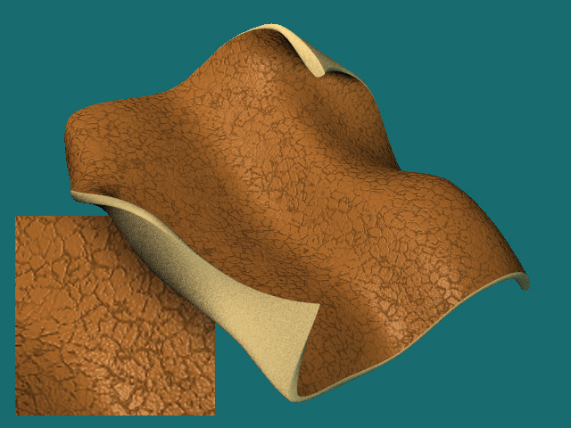
Didn't spend to much time on it... it started coming back to me why I use image decals for this stuff! So much more control. Plus it takes much longer to render than decals with the same result. Anyway here is my quick test. I have two materials, one for bump, and a modified one for color. I used a kind of complicated material with several levels of cellturb combiners. I have an overall turb combiner (I forget which one I used) at the top level scaled very large that sort of "blends" two (actually four) slightly different sets of cellturb combiners to create a less regualar pattern. That is one of the things about materials I don't like... very hard to put non fake looking subtle variations in the texture without a lot of effort. I mixed two sets of cellturb/threshhold to get the wrinkles. I then nested a cellturb/webbed in reverse in one of those combiners to get the pimply bumps on the skin. So the wrinkles and bumpies are in the same bump material. There is pretty subtle detail in the bump which is hard to see in this image. I am not very experienced with nested materials, and just couldn't get those fine multiple wrinkle lines characteristic of leather. You know... the lines that are like "sketchy" right next to each other. Well... at least not so I was satisfied... I get to obsesive about realism with these things. Normally I could do this in photoshop much faster... and better. The inset is not a larger render... I cheated and just scaled up a section in photoshop. The main render took 18 minutes (slow machine)... I didn't feel like doing another one. I will post the material if you would like it. Need to get some sleepy sleep. Vernon "!" Zehr

-
My suggestion would be to add some of those "lined groove" things as a bump. These are not exactly wrinkles but those subtle patterned "grooves" that are characteristic of leather. I would use that cell turb thingy, just as a bump. a reverse bump. Use black and white as the two attributes and play around with the settings. These lines would go "in" to the surface and be very subtle. I am fascinated with this and just might give it a go myself just for fun. Vernon "!" Zehr
-
Actually, the wood end grain issue is a bit of pain with hand painted textures. It is a little tricky if you do a close up and the grains don't "match". Since most wood projects hide the end grain any way... doesn't come up that much. Vernon "!" Zehr
-
Put it on a scanner! You get more overall lighting on a scanner plus you can get some really high resolution images. I rolled a tomato on a scanner once... keep some paper towels handy. Good luck with the leather material Pengy. Vernon "!" Zehr
-
Well... Closer detail would be needed to make a good critique. If however you wouldn't see it any closer than this... I would have to say it doesn't look much like leather yet. If it were me... I would probably use an image decal rather than a material especially if you want it to look worn and used. With an image you could create the wear patterns and bump map from the texture. You could probably find some photos of leather on the web, or you could even photograph some if you have a digital camera. This is just my opinion. If you like how the material works than go for it. Does need some more specularity and a slight bump. You may want to also use the same bump map and modify it for specularity... to break up the highlight as it does on real leather. Vernon "!" Zehr