pdaley
-
Posts
971 -
Joined
-
Last visited
Content Type
Profiles
Forums
Events
Everything posted by pdaley
-
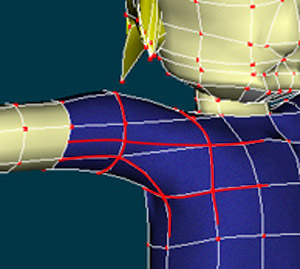
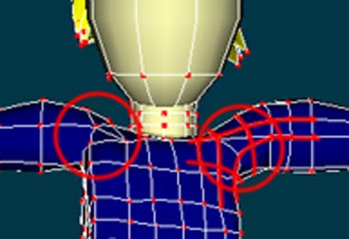
Do this and you'll be set. Do you know how to make a 5 point patch?

-
I circled what you want to focus on. Spline continuity is a big deal in AM. If you have come from another app, this is a point that will take a little getting used to. Splines must have a reason for their placement and must flow into each other as smoothly as possible. I attached a quick idea as to how you might layout the splines and make use of a 5 point patch.
-
More online Demos (Please Help with DL times)
pdaley replied to a topic in Work In Progress / Sweatbox
About 1 second, maybe 1.5 on a T1 at work. Win2k and IE6. -
Tinwoodsman and Scarecrow, tincastle in background
pdaley replied to zandoriastudios's topic in Work In Progress / Sweatbox
Scale it down a little Will. I'm almost starting to think we're working on a real movie with stuff like that . -
wow. you may never get another critique related comment on this entire thread now.
-
awesome, AWESOME work! I really love that 'you know it wouldn't work, but looks like it could anyway' kind of technology here. Texture is going to round out the boards for the hull into looking less like... pillows (I mean to say they appear soft). Another idea might be to make the edges appear a little more irregular, like aged wood. Maybe a patch-job here or there. This looks like a well-maintained craft, but you can't go adventuring and not acquire a little wear and tear. You've modeled a lot of detail here. I bet you could make use of the new displacement mapping to really push it. Go, go, GO!
-
You might look at the Bradbury thread on using semi-transparent spheres and the spinning llight trick -or- Yves new IBL feature. Then, since it's a still, add an environment map texture to the whole model. That would at least give the thing another look and you may be able to build off it. It may take 6 years to render though.
-
Odog, Come and go as you please. The door is always open. You shouldn't feel conflicted about using any tool to express your art. So, bubble away!
-
don't fear AO, roger. Yves has done some great work.
-
Hi Mike, What's with the weird flicker? Is that part of the shadow testing? The flicker I'm talking about doesn't seem to be very near to the shadows...
-
Roger, You always had the detail and a pretty good grip on lighting. I bet you you using the new ambient occlusion, aren't you? If you have the time, for the love of god, please get in tough with Alain for some TWO set or prop building. I'm not sure to what extent Frank H is still involved, but he was considered our ace in the hole for building the architectural sets (not that the current crew is crap, just thinking out loud(in text actually)). I haven't heard much from him in a while. This is an area where you have been, as long as I've been around, a major leader and with TWO, you could probably get to work on some stuff that you wouldn't normally work on and add that touch of fantasy design to your strong real-world talents. Really cool project here, Roger.
-
David: Are you assigned to an animation team? That was good.
-
Hey Mike, Put in a couple more frames of anticipation when he plants his hands on the table. It's almost a cartwheel right now, but I think you want more of a spring-type action. And of course that is one of the smoothest bending models I've seen in my life.
-
i think dust would have a faster expansion/emission than what you are showing. Your example looks a little 'steamy' to me. Also, the turbulence looks to obvious to me.
-
Troll, faerie fly-fishing...
pdaley replied to zandoriastudios's topic in Work In Progress / Sweatbox
Love your stuff as usual, Will. Not sure about her feet. They look out of scale for her waif body. But I noticed her hands were a little big too. Is this related, coincidence or am I seeing things? Is this going to be a story out of your brains or some other less potent source? -
Exercise in lighting, v13 with Ambient Occlusion
pdaley replied to TacoBallZ's topic in Work In Progress / Sweatbox
what he said -
Exercise in lighting, v13 with Ambient Occlusion
pdaley replied to TacoBallZ's topic in Work In Progress / Sweatbox
Mark, Do this: Work up this image a little more. Maybe make the pose, lighting and camera angle more dramatic, but don't kill yourself with it. Now, take it and post it at CGTalk and let people start asking 'what did you render that in?' They WILL NOT believe it when ou tell them AM. That will be some satisfying sh!t. -
his feet and legs are anticipating the crouch pose a little too much. they shouldn't bend at the knees before impact. Offset the keyframes of the head and the hands in their followthrough at the beginning of the crouch. He needs to wind up his body more than he does before the jump. That might mean not taking his body as far as it can go downward following his landing. Once he's wound up, hold that pose a frame or 3 and then let him blast out of it.
-
I think he should hold his pose in the crouched position a few more frames and then really jerk out of it faster. This way you can show the weight of landing in the crouch and then maybe more of the spring it takes to launch his body.
-
Well let's see. This piece was in my top 6, but ultimately I did not vote for it. AM seems to get a lot of these still life images where we've caught a glimpse of someone's desk. I don't say that to clump you into a style, but to point out that there have been some awesome pieces in this style, so there is a really high bar. There is a piece in this style that Vern did that Martin actually used as his desktop wallpaper for a while. People like this style, but as a community we've been groomed to look for detail and maybe some kind of clever joke. You have an uneven amount of detail here. The hat has some well made textures, but is missing any indication that it has ever been worn. No creases, no stains, no asymmetry. I can't say for sure, but I think you were trying to go for realistic, not really 'sort of' realistic. The press pass is pretty neat. It looks more believable that it has been around for a while. Ideas to push it might be a rip or coffee stain. Looks like there is a weird intersection on the right side of the pass where it mights the band though. The newspaper could be improved with more distressing. I don't know about the papers of the era you are representing, but papers these days have that saw tooth cut on the top and bottom of the pages. I would try a cookie cut map and see if that would work. The layout of the text is decent, but there is a subtle difference in your piece and real papers. 1. column width is uniform -and- 2. text is justified, not left aligned. The desk surface needs a lot more work. More or less it is a gray background. Gray is not very compelling. If it's supposed to be some sort of desk, we need more cues that we are looking at a desk: pencils, paperclips, sunflower seed remains... The gray desk compounds a lighting problem. Rather than sitting on top of a desk, even in the new version, the items look like they are floating. The lighting is confusing and generic. One light is casting a hard shadow. Bright lights do this, but your objects don't show any other effects of being under a bright enough light to make a hard shadow. Then there is a softer shadow which starts to connect the hat to the desk, but again seems out of place and somewhat random. Finally, I guess I didn't get the joke. If the joke was further down in the column, then you might consider re-imagining the joke so that a viewer can see the piece and get it more visually. A little reading is ok for the visual arts, but I've found that if someone can't find something to like or otherwise compelling about a piece on first glance, then they will move on. I think you can take this piece where you want to go and I think you should. Take or leave my comments, but I am really just trying to help.
-
Microsoft Producer 2003 Here's one I just learned about. It's free, but you need at least Powerpoint 2002 in order to install it. Maybe not exactly what you are looking for, but still interesting aspecially since somewhere in the feature list it claims to be able to create and use screencap movies. Another tool I use at work is Macromedia's Captivate. It's more of a pro tool though.
-
Jim Talbot did that Leopard Quenn deconstruction that is excellent.
-
I like it. A lot of character in the little guy, even though we can't see much. Great detail in the clothes (wrinkles and folds and such).
-
-
3D in the real world? Worlds are colliding! Nice work, Will.