-
Posts
394 -
Joined
-
Last visited
-
Days Won
2
Content Type
Profiles
Forums
Events
Everything posted by Heiner
-
Here is the next step, a cargo hatch on the front end of the ship. Bentothemax, you are right, currently, the ship looks a bit like that, but it is developing in my imagination, and after the next two or tree steps, it is going to be a homogenus piece of hardware. As you may have allready guessed, it is part of a story, in which it is the mobile main base of my main character, the "Dark Hunter" (i am going to post some drawings of him as well in my next addition of this). Therefore it serves the purpose of a mobile home as well as beeing a laboratory and and armory, and an hideout and, and, and ... It could be described as a mobile bat cave with a living room :-) Ok, so much for now guys, thanks for your interest. Heiner
-
Hi, Mr Jage, you where right, the solution with the trusters was not very satisfactory. I got rid of them, and try to attach some more organic looking round viewport section like things, and some more tubes. I am not sure at the moment, how the edged and jaggy main body of the ship goes along with the round side section. What do you think guys? Regards, Heiner
-
Hello, a little spaceship i am working on right now. It is bout 60 meters long or so. So it is not one of these large leviathan like spaceships. Cheers, Heiner
-
Hey, really cool charakter , what i am missing a bit is that wild hair which he has in the comics ... waaaay cool ... Franquin would have loved it for sure. What i like best is him (Gaston) playing on his selfmade instrument ... here in Germany it is called "Brontosaurophon" ... Go ahead, keep up the good work! Heiner
-
Hi folks, thanks for the input, it gave me quite some ideas where i make my mistakes. In fact i am using "real volumetrics", not only geometry which simulates the volumetrics. Hi knbits, that theather of yours is quite cool, and it gives me the feeling, that the image which i have in my mind can be archived with A:M (i never had real doubts about this, but sometimes one gets unsure). I guess the trick lies within the balance of Light strength, fall off, Quality, brightness and contrast. Thanks all! Heiner
-
-
Hi there, this is a project i am working on, it is for a little comercial, which should go into the local movie theathers. As you can see, the volumetric lightning is really out of controll, and till now, i dont have a clue, how to arcive the desired effect. Any suggestions on the volumetric settings? Thanks Heiner
-
Nice, good feeling for anatomy. If this is your first model, you are going to have abright future :-)
-
"Little Space Cop rides again". Here i another still coming out of one of my animations with this character. At the moment i am quite happy with the shading of the charakter, but i am still not able to get some real shadows into the scene ... doh! How do you like him? Heiner
-
Here one more pic, on which you see more of my "Little Space Cop" character. I am working on him quite a while now, and stll, there is a lot of work to do, but hey, they did not build rome in one day, or did they? Cheers Heiner
-
Hello, i am doing a cartoony animation at the moment. I am pretty happy with what i got so far, but there are still some things, which need to be sorted out. For example, i can not get the renderer to give me manga toon shading and shadows ... doh ... and i used square, flat elements, to decal my soundwords on them (since i have no sound, this is a must). But even set to cookie cut map, the give me these nasty edges, which i can not get rid of. No, it is not the picture file, having inconsistencys in the key colour, i doublechecked this! How do you like the crude style? Heiner
-
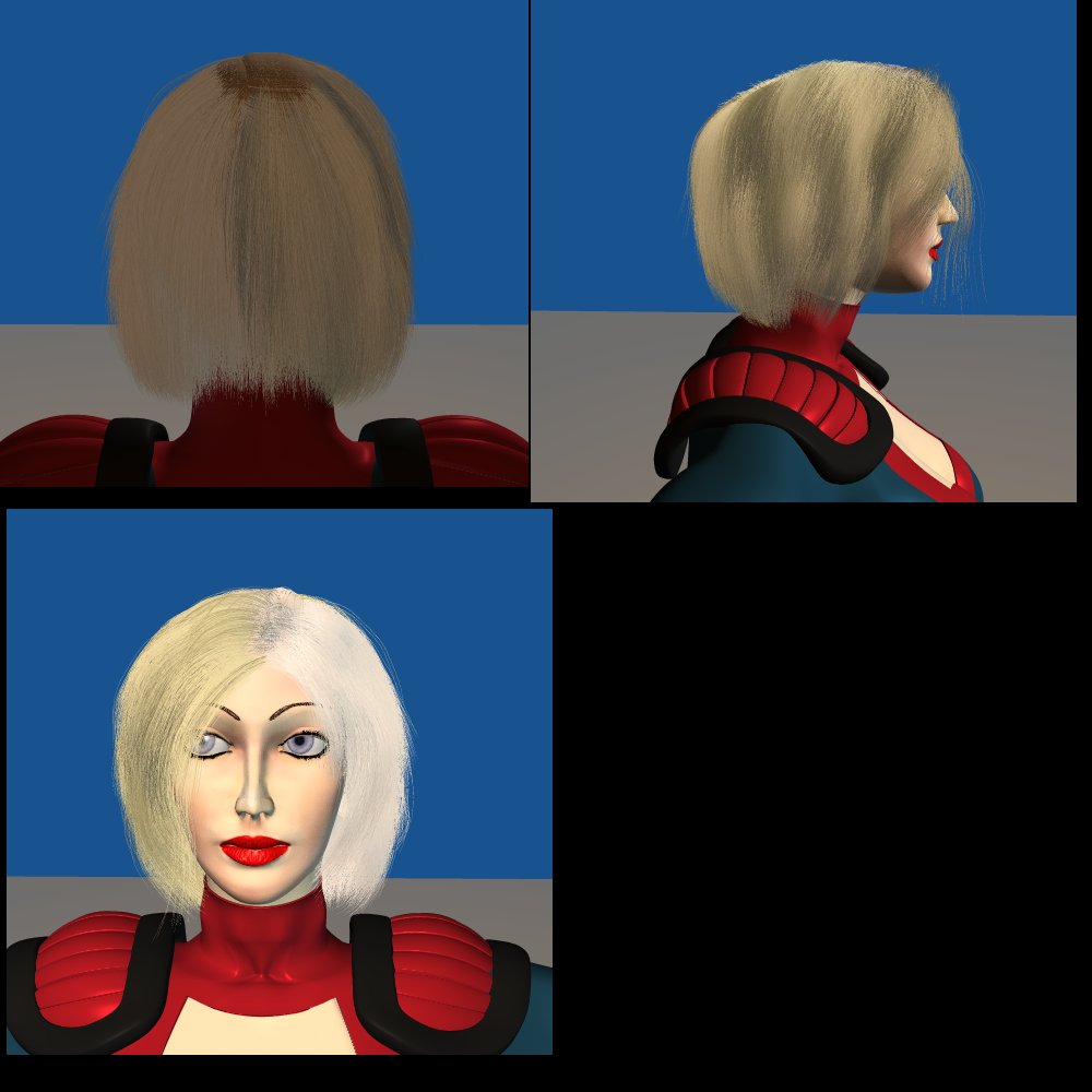
Latest news, a major change of hair color and some tweeks in the face and head geometry. Cheers, Heiner
-
Nice, i guess, if yiu can add some bur to the hair streaks, you have a quite usable effect! Heiner
-
Hi, the hair is getting its colour out of an decal. Currently i am quite happy with the hair, but i am sure, there can be done more. The problem is the render time which is getting bigger. 500x500 in full quality with all the bells and whistles now takes about an hour to render :-( Cheers, Heiner
-
Just another update ... as usual comments welcome ... By the way, i got my decal/coloring problem solved, thanks to another post in the forum! Cheers, Heiner
-
Basicly it is like this: You model in AM, put your decals onto your model (empty pictures), then you export your model as OBJ, which is imported into zbrush. In zbrush you assign the image, which you used as decal, as a texture and paint on it. When you save your work (the image, which is used as decal/texture) you just have to go back to AM, update your Decal image, and what you painted onto the model in zbrush is in AM, without reimporting the model. Just recently in this thread the issue of importing models from zbrush into am popped up, but this is (in my opinion) more a sidetrack ... hope this helps Heiner
-
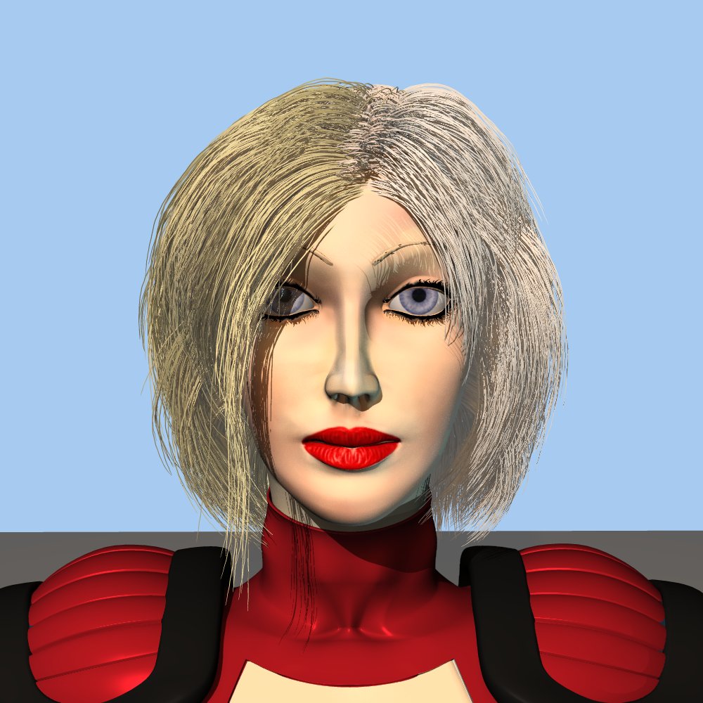
Gettin better and better ... ... now it quite looks like real hair, unfortunateley i still have the problem with the coloring of the hair ... anybody out there who has an idea how to solve this problem? Thx ... Heiner
-
Hi Pix, i am using 4 cps on the controlsplines. No, no decal to control length. Here the latest result, slowly my client seems to be satified ... but still, waaaay to go ..... Heiner
-
-
There are no new CPs. The Decal is applied to all of them. I will go and dobblecheck this, but i am pretty sure, that is not the problem ... Heiner
-
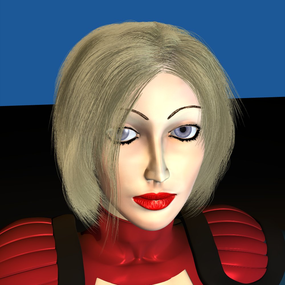
Ok, step by step it is getting better ... as you hopefully can see :-) Now i have a problem, and i dont know where it is coming from: I am getting the color for my hair from a decal. The hair emitting geometry is divided in two Groups which have indepedent, unconected geometry. The one group for the main hair has two overpaling, but unconected groups of geometry. I did this to gain mor controll of the hair, and where it is going ... Now the problem is, that on the main hair, only one part gets its color from the Decal, the other side does not :-( ... it is in the same group, shares the same material shortcut, but does not show the color ... Any ideas how to fix this? Heiner
-
Slowly i am getting, where i wanted to be ... Thanks for the tip, jim, it helped a lot. Unfortunateley this means, that i have to move even more cps, i am sure, i will have a sore mousehand when i am done with this :-) Heiner
-
At the moment i have a problem: The hair seems to be not elastic enough. In some places i can not bend the guides enough to create to look i want to have. How do i make the guides more "elastic"? any idea? Heiner
-
Hihi, no, there is no transparency. I shaped the hair to be thick at the start and slim at the end. Here is the next version ... this time the hair got out of controll a bit. Heiner
-
Hi all, just wanted to share the results of my current project. Color of hair in generated by a bitmap. The Hairsystem is so cool, but after working a while with it, i would love to have som additional tools/options: It would be great to group/hide control splines. Brushing seems to affect only tle last controllpoints on a spline :-( If i highlight a cp in one view and change to another, the selection is gone :-( aside from that ... cool stuff! Cheers Heiner


