-
Posts
875 -
Joined
-
Last visited
Content Type
Profiles
Forums
Events
Everything posted by Dearmad
-
Funny funny. And the understated reaction of the goalie is what cracks me up the most- man knows his post.
-
Short Film in Production: Ballet Pour Ma Fille
Dearmad replied to Dearmad's topic in Work In Progress / Sweatbox
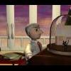
Good call on the cat's head. I might rethink that angle- it is a moving camera shot with the cat walking too, and this is where the cat and camera come to at the shot's end. Oh, that's a bench, the cat just walked in front of its support legs. Now that ya mention it, you're RIGHT! The bar (on the right, that's a bar) should be higher up. The girls aren't supposed to fit perfectly into the world they occupy. Oh... I love things that are easy to change and still benefit the film. Thanks for both crits! Consider both fixed. Heh.. the story. Well, suffice it to say, it's a film I want people to be able to watch once and be satisfied- feel they completely got it... but after the second viewing they go: wait a minute... play that again... And then the third time they watch it, they go: oh, THAT'S what it's about... And all three times, they're right! -

Short Film in Production: Ballet Pour Ma Fille
Dearmad replied to Dearmad's topic in Work In Progress / Sweatbox
Lighting took 3 days of work... balancing the sunlight from a wall of windows with the reflected sun from a wall of mirrors, and dealing with the shadows. And faking the pink radiosity that would occur... shew.... Anyway, something about this frame is evocative for me... thought I'd share it. -
Yeah, I'd add a light. But not coming from a lamp or anything. Before all the light "realists" post on this, let a light "fakist" give his 2 cents: I'd have a sunlight style light outside the windows. Shadows, spec, everything. I'd add what I call a sunlight radiosity faker: a bulb style inside the room near the main reflecting wall. Drop it to about a third to two-thirds the intensity of the sunlight, and make the color a little richer than the sunlight. I'd toy with making this light a spotlight and using z buffered shadows to soften these secondary shadows, but make sure the spotlight is large enough to encompass the area of your shot that needs illumination without it becoming obvious it is a spotlight. This light *may not* need specularities turned on- might be too much, maybe not. Then I'd go through a process of scrutinizing my camera angle shots (because I'd have had the shot planned out, naturally) looking at shadows/highlights and adjust what I need to by using those two lights first- positioning, angles, intensities. Add a third or more light ONLY IF you cannot get those two to work first... be frugal. In my opinion, lighting isn't about mirroring reality, it's about heightening the drama, the beauty, and the color scheme you have going for the shot. It's about getting the exact highlight to shade ratio you want on the surfaces you see through the camera. It's about getting the shadows to fall where you want. And about allowing the audience to see your story. I now return you to the regularly scheduled posting of sky rig, radiosity, global illumination, raytraced softshadows(50+ rays per pixel) and render time's of one hour per frame enthusiasts:
-
Looks neat. I can't wait to get my hands on cloth, dynamic constraints, and hair... keep playing and posting, in the mean time. BTW: What would mocap data look like from an unreputable place?
-

thom tries on a v12 clothsim shirt
Dearmad replied to johnl3d's topic in Work In Progress / Sweatbox
Instead of increasing the fps of the project can't you just increase the samples per second for the simulation? Or is that what you're saying? -
I don't know if "depression" is often conveyed in "slowness." It is often conveyed by actions that let gravity win after a pause. One holds one's head up like anyone else for a moment, then it drops. One's hand is poised to take the glass of water, then it drops to the glass and swipes it up quickly, then it's poised again before the lips... then it's slammed back down without concern for settling it into place, just enough to not break it. The lethargy of depressed people I've observed is in the initial getting things in order before they decide to move or take action; once in motion they tend to get whatever they're doing overwith real quick and sloppy like, then it's back to rest mode. So a pause before he sits, then a drop to sitting with lots of secondary type actions in the body as pieces settle into place without too much concern for posture. Now, tired and achey is a whole other thing- and that's what this clip looks more like to me. Much more. Slowness, carefulness of moves (to avoid sore muscles), carefulness with balance as you may not be able to recover it by exerting slow muscles, etc... Anyway, wicked, kick-ass model, and yeah you're going to be fighting in the uncanny valley with this animation... which is tough. EDIT: You're WWW link is broken, is that supposed to be so? Wanted to check out your site but got Comcast not found site page.
-

thom tries on a v12 clothsim shirt
Dearmad replied to johnl3d's topic in Work In Progress / Sweatbox
Does it need any time to settle at all? -
Is that the best DOF blurring available at a reasonable speed? Grrr. If that's true the renderer needs some serious help in that area. The DOF in 8.5 trumps that, IMO. The DOF shown above isn't acceptable. It looks like a bunch of image layers with alpha channels all average-blurred a bit and then combined. None of this is a reflection on you, Brainmuffin, please don't take offense at all. The stuff you did for this image looks nice. Maybe there are some other settings to smooth out the blur? What's the non-multipass DOF setting look like?
-
I admire the effort. What is with the blurriness or- murkiness to the image? I can't quite describe it- it's almost like the whole image is motion-blurred or something. Is that what the latest DOF in A:M? Something in the render can't be right....
-
Hey, wow... that's anice clip. Good appearence of thinking in that animation. So you worked on that with them for awhile and they paid you then they yanked it out of yer grasp halfway done? That seems like a bad idea when you want tocomplete a production...
-

Short Film in Production: Ballet Pour Ma Fille
Dearmad replied to Dearmad's topic in Work In Progress / Sweatbox
Pixelmach and Paul: Thank you both for the comments. And yes, without my wife to help, this part of the film would frankly suck. I animated a simple "balance" move which is a 3/4 step- a waltz step, before I had her help. It was hilariuos how many errors in *basic* ballet technique I commited. I had completely misunderstood how the move executes. Zaryin: The null is for aiming her head occasionally. The enforcement is only 100% for the few frames she holds it still in her turns, then released to an identical keyframe, and animated through the turn. And alos toward the end I use it just 'cause. Her head actually has a geometry bone (of course), and then a more conventient control bone, but that control bone is beneath the chest bone in the hierarchy so moving her chest moves her head- in order to break it out of that I use a null in some shots (like when they walk) to stabilize the head more naturally. -
That's nice lip synch. Works really well. Will you be adding in body movement- er- marshmallow movement- er- whatever movment too?
-
Looks really good- you gonna add some jaw action to it as well, you know teeth nashing... I just wanted to use the word nashing, I admit it.
-

Short Film in Production: Ballet Pour Ma Fille
Dearmad replied to Dearmad's topic in Work In Progress / Sweatbox
Both points are perceptive of you. She is a little girl... but all the girls in the film (3 of them) have something sorta going on with them that pulls them out of the world of the film. Their design is based on an old model I made in Polyray, and I liked it enough to want to use it again. So when I crafted the story, I had a reason to keep them deisgned differently from the other characters that are more "in" the world. I was totally happy with that initial weight move- and then you comment on it, and WHAM- it's totally obvious what needs to be fixed. Trust me however, in ballet, the answer will never be bending the head/chest forward unless it's for a purely dramatic reason... my wife'd kill me if I pulled that. Thanks, though, I do see how it can be improved. As to the design of the dress, versus how its animated- yeah, I tried a ballet type design and it ruined the look I was going for. I'm torn between both looks. However, the model rig is the exact same for either, so swapping her out later if I change my mind will be no problem. -

Short Film in Production: Ballet Pour Ma Fille
Dearmad replied to Dearmad's topic in Work In Progress / Sweatbox
Well what was your initial impression on the dress, let me know. Tell me specifically. I have my concerns and resons, but what a viewer thinks is very important, IMO. -

Short Film in Production: Ballet Pour Ma Fille
Dearmad replied to Dearmad's topic in Work In Progress / Sweatbox
More ballet dancing- since this clip is longer, there's no sound attached- wanted to keep it below 1mb. A ballet variation comprising quite a few moves. Not to piss off Luckbat but again, this is not a final render, just 90% completed animation ready enough to face critiques. Camera angles will be different in the film etc... 3 days of animating, 2-3 days of planning and arguing with my wife about how to interpret the music through ballet choreography: filmmaker vs. dancer = filmmaker wins. husband vs. wife = wife wins. YOU figure out how that worked itself out... This time I made sure feet are visible for the test I share with you guys. The pony tail and dress is hand animated, as 8.5 has no dynamic constraints, etc... but I find that I enjoy animating the follow through a lot- though all the soft bits like the pony tail and dress take at least a day to do in a clip this long. This clip is at the speed I animated it as an Action- however in the film it will be about 30-40% faster depending on how I want her to hit the counts. That's a part of the "puppet" look I'm going for. What I'm happy about: This is REAL ballet dancing I managed to get into the film. I never thought I'd pull it off, but it looks like I might. Her anticipation and sense of weight given that this is ballet. Foot positioning- my RIG HELD UP! What I'm unhappy about: Some of the extremes are a little hard- want to smooth them a bit, especially her head. Her anticipation and sense weight, given that I suck and am learning too much with each new shot- wish I was a better animator. Some of the elbow positioning... grr.... And luckbat, I am just kidding, pm me if I piss ya off, though... 8_bar_ballet_variation.avi -
This reads as sarcasm though.... sans smileys and all. "Yeah I confess. Odd the idiots paid me though..." meaning they wouldn't have paid him if it was fake- and it implies he didn't fake it. The next post is oddly countering that one though... What an interesting thread this has been, however.
-
Overall I like it- nice attitude. Full of character. Curious why you didn't go for a cycling action?
-
Very nice. I like the color balance you use, the stylistic poses which lend a certain sense of "craft" to the pieces, the ease of motion between poses is stylish too. Very nice sense of weight in balance to the boy, considering how smoothly you go in and out of poses- that's not easy to maintain, I think. Of course the framing and sense of how you pieced together your visuals in balance with one another is beyond reproach. Maintaining that kind of visual balance and narrative is quite easily beyond my skills- I admire your talent there. Um... you didn't ask for any crits, and consider you sequence done, but there's something I'd like to comment on (SKIP the remaining if you mind a nitpicker): There's something about his run at the end that I can't put my finger on... it's a subtle enough cycle you have there that nothing obvious stands out, but here's what I thought: (NONE of these crits would be a for sure thing, as I said it's well beyond me as it is). There's not quite enough bounce to his body when his forward leg comes up- a few frames after it is up. I looked over a lot of your stuff over time and noticed that you sometimes drive the leg motion with the hip. In other words you have the hip move preceding or going with the leg motion. This isn't quite right and is not a natural walk; at least I've never observed anyone do that in their normal ambulation. What I've observed happening when in walks is, while the hip will sway with the leg, the hip doesn't go in advance of the leg, it follows, and accentuates the motion- especially in women. While it can certainly be true that the hip is eventually forward on the forward leg it is NOT forward until after the leg is planted. So that it is safe for that weight to follow and be on top of the supporting leg- that's how the physics of it seem to work anyway. This moment for the hips to be over the leg is abbreviated a lot in a run, but still I don't think it should preceed the placement of the leg in space (if not on the ground). I think, though the video is small, that you have the boy's hips moving slightly in advance or in synch with the legs, when in fact they should lag behind just a tad. Try that, if you like. Otherwise your walk cycles rock to my eyes. Loads of character to them.
-
Looking promising, man. I'd keep the base on the floor a little longer so it looks like the weight of the shade is really contributing to the lift. I'd lock it in for about 4-5 frames longer to see how that looks; assuming your cycle is 24 frames- looks like it is. Start with that.
-
MUST SEE ANIMATIONS: http://www.cgtalk.com/showthread.php?t=232773&page=2&pp=15 these bears are SO expressive, and their facial animation is pretty minimal- but critical to their inner lives. Obviously they may not be the same style as the calico cat, but they're jsut further proof of expressivity coming from places other than eye moves- they sorta blink and the brows move and that's it; most of the rest comes from head position and pauses.
-
Comments on rr54: I see a lot of good motion in this clip- I like the way wrists and forearms generally drive the hands, and the chest drives the arm, nice job for the most part throughout on that. Some things that may improve it even more: Don't show the hit frame when he slaps him. It weakens the "punch." Readjust so there's no keyframe there. A keyframe before the hit, and then one after it that shows the results- very close to the extremes. (straight out of the animators survival kit, pg. 280), The overshoot when he points should involve some overshoot from his hand that is NOT in synch with his body, make sense? It's as if his arm is locked in position the entire time. When he lowers his arm after the point, lead with his elbow, don't keep the arm so straight.
-
I guess a few points to remember about lip synching that a lot of people forget are the SAME dicta we ALL KNOW about animating in general: 1: Anticipation. 2: Follow-through. It's very true for our articulators as we speak, even though it happens rather fast.
-
I love lip-synching- for some reason it's really fun to me. I'd look in the mirror a little more on "poopy." In the context it is found in your clip. A lot of people when they move from the labial /p/ into a rounded vowel /u/ "oo" maintain some of that rounded posture on the immediately following sound during the return of the lips to non-rounded posture. So in your case that forward vowel /i/ "ee" most likely won't be brought into the lips much at all, but will maintain a more flaccid lip posture, especially given the third /p/ coming around so quick- most speakrs don't want their lips so far apart when they know they gonna put em back together again as quick as the speaker in your clip is- had there been more time between poopy and pants, then maybe some emphasis would be called for, /p/ with some prerounding for the: (In fact I would begin the rounding right at the tail end of /r/ in "mr." since the speak knows where he is going. /u/ as you have it /p/ more rounded /i/ not extended much at all into the lips- still looking maybe rounded but lips retracted more- so not as much pucker as on the /u/. This will also allow the lips to slow down a little in that section and not look so force "scripted," as they do now. LOVE the "nts" in pants- that seems about flawless. ALL IMHO. No real crit, just what I think could smooth it out a bit more.


