


Dearmad
-
Posts
875 -
Joined
-
Last visited
Content Type
Profiles
Forums
Events
Everything posted by Dearmad
-
I wonder. Those look like classic antennae. I used to always end up bending one... and then it would snap sorta and hang there...
-
Yeah... patience... years of patience is what it's taken me... Anyway, have fun when it arrives!
-
Looking nice. "Ran out of sky"
-
Very cool. Interesting sense of framing, I like it. Going to use some DOF in the final renders? Is that even possible in toon render? The burgeoning water drop made me poised to listen for the drop.
-
Incredible stuff. Left sorta speechless...
-
Heh... it's just a background bit, and the sound of the horn going again and again and again, should be a little clue. Not to sell the animation short- but he's an angry man who honks his horn a lot. I considered having him lean over and go at it with both hands fully focused on the horn, but thought that was overkill. Indecent? Not all, given some of the other things I've written about this piece (little girls' dress controls, etc...)
-
No, start an argument, we're SUPPOSED to abuse him. And confusion is part of that abuse: I liked the understated reactions as well...
-
It just so happens I kept a copy of this animation on my HD, so let's have a look... Beyond the details already mentioned above: A little more fluidity in his wrist in the non-cycled actions. Also, inclusion of some finger motion- just general bending, nothing articulated, instead of straight fingers- it distracted me a little. Faster set-up of the Verizon or whoever that is guy; that joke is set up in about the first 15 frames of seeing him for me; the title card slams it home; I had too much time waiting for the punch moment. I'd delete the "Good argh" card, in favor of the visual joke of his phone bouncing. The rhythm seemed a little off there. Shot from behind the "excessive" to where the car swerves out of its way seems a little too long, too much set-up again, the pace could be faster to keep up with the chaos Shaggy's creating. Instead of disappearing, the restaruant patrons should get up and walk away disgusted when the waiter drops the bill on shaggy's table. (Maybe I'm reading that camera angle wrong though) Compliments section (skip if you want): There is so much that I like about this animation you made, even after viewing it again and again. It just fits together so well. The music, the musical punches, the overall timing and pace, use of shaggy (I told you already there's just something funny about him when you animate him- don't know what), your extremes seem just right, the background character reactions (especially in the restaruant), the jokes are funny without all being on the same level (like how the bank robbery isn't focused on but the verizon guy is), choice of b&w, amount of film noise. Shoot, even the wheel-bounce on the dump truck, man, you worked this thing for light mood! One more specific compliment: The way you seperated the hold-up victim from the robber and bank sign so we have time to be confused and wonder, "WTH is that guy holding up his hands for?" before the reveal, was PERFECT! Clearly you thought about how to time the visual jokes!
-
Gotcha. Thanks.
-
I don't know why, maybe it's really late, but this little bit cracks me up. This guy gets run off the road by Ravel in his ambulance and is pissed, so he goes to town honking his horn while Ravel drives off oblivious to what's happened. Something about the squeezing to honk the horn is too funny to me. I'm thinking he needs to honk it about 5 more times. The car isn't animated yet, it'll be rocking and stuff. Clip: DiVX 900Kb. test_anger_b_divx.avi
-
Are you going to do the white/black color changing? I'll be interested in seeing how you go about doing that and what it looks like. Also, if it's a time saver, or one of those things that you *think* is gonna save time and... doesn't in any way save any time no how no where... (a few of my ideas end up like that).
-
Those shoulders kick ass.
-
Nice shapes, they seem spot on. Though I'd time the extremes a tad (like 1 frame) earlier, they seem to hit right as the sound is made, which reads as a little late, to me.
-
Vern hit the nail on the head for me too.
-
Huh? The *easy* standard then, because I figure perfection is off-limits too, and strive for just: "It isn't making me too antsy to look at, so it must be fine!" Anyway my reaction, even after scrutinizing it a bit, is: wow. Looks sooooo nice! I like the way the upper part (shoulders) moves without too much clothiness to it, yet rotates with the shoulders, then gradually the cloth frees up as it goes down- looks just great! I really have no crits this time. My only concern would be how much work it is for you to animate- a constant thing you have to balance when you're a one-person show. You're going for a good deal of realism with this cloak (putting things into scale that you don't have a technical animation department and are just one person doing your film). While it'll hurt ya time-wise a bit, it'll pay big rewards in how things look, I bet, once you're done. I imagine there will be a few desinged shots in your film to take advanatge of the cool look possible with a cloak like that, and you're setting it up well, I think. BTW: I love the idea of skin-tight mummy wrap... she's an attractive character everywhichway. Oh, one edit: Not a crit of the cloth, but in this cycle, just a glimpse of her hand or arm underneath might help with the illusion of the cloth, since then the eye has a concrete connection with what's driving the cloth's motion and then the mind goes along with it- so your "illusion" of cloth" doesn't have to be as close to perfect as it might otherwise need to be. Does that make any sense?
-
Short Film in Production: Ballet Pour Ma Fille
Dearmad replied to Dearmad's topic in Work In Progress / Sweatbox
Don't worry. In the context of the three preceeding shots (one of them 30 seconds long) you'll know too that she is not there to be seen. Also there are shots 3 scenes back that mirror these and let you know something is up... she literally disappears in front of hs eyes in one shot. He knows at this point she is sorta like a ghost- but he's not happy with what that means to his art and to her and her mother. And he's not yet willing to accept his relationship with her on the plane in which it has to take place. But, having said that- PLEASE continue to post concerns like this- things that confuse you, etc... It is valuable for me to know. Do NOT assume it all makes sense because you're missing such and such scene or haven't seen the film. It's better for me to hear confusion than silence. -
Short Film in Production: Ballet Pour Ma Fille
Dearmad replied to Dearmad's topic in Work In Progress / Sweatbox
Oh you want proof I take you guys to heart? No, but seriously, here's a quick update- just the latter half that got the heaviest crit. Got it out at 800x448 since it's a shorter clip Changes: Added in rounded edging to building, per Robcat (looks MUCH better now)- thanks for tagging me on laziness there. Head dips a tad more in last turn. Looks up at marble source briefly (remember he already knows no one is there, so this is just further confirmation for him). A little more "thinking" in his look away. Now this is the part I kow people are gonna jump on- as everyone has their way of imagining how one looks at a moment like that. And in fact I may change it yet, so fair game people! I WILL be changing his eyebrows a bit there. Less head wobbly during camera change to over the shoulder shot- forgot a cardinal rule to NOT have characters making subtle, telling movements in across cut- it looks wrong unless the move is broad enough. A few other minor timing changes to eyes and other head turns. Unchanged: The crack in the sidewalk is noted down for a change- there are other reasons for it being so wide, and I'll need to recheck some other stuff that goes on with it and how it looks. Ravel's position on steps- an easy thing to change- just haven't looked at how it reads when he's moved yet. Conclusion: THANK YOU! Seriously, you guys are critical, kind, and to the point- a rare mix, and I appreciate it! More crits welcome, but I won't be posting any updated changes, they'll be written down in my notebook for when I go over the film at the end and push 90% complete to 100% complete.... need to move on to Section 7 now. 0604o_divx.avi -
I like it- it reads as teeth to me- you could add a sparkle or two too! Now I wonder how black would read in comparison. Also, the transition from black to white might seem like a flashing light without the white coming in from top and bottom, as if it were teeth. At least when I imagine it happening, that's what I think.
-
Short Film in Production: Ballet Pour Ma Fille
Dearmad replied to Dearmad's topic in Work In Progress / Sweatbox
Quick update: THANKS all for the suggestions. The little glance I've added, and other changes made really do work better. Luckbat: I rendered out that appearence moment with the Focal Plane changes that go on- forgot to also mention the camera blurs the girl heavily until Ravel turns to see her, then she's in focus and he blurs out. So overall, with the added glance, new clarity to his "thinking" moment, it works MUCH better! Thanks again, all- wonderful crits making really good improvements; now I know why you're all paid the big bucks for this! -
Short Film in Production: Ballet Pour Ma Fille
Dearmad replied to Dearmad's topic in Work In Progress / Sweatbox
Luck: Even given the context, he needs to give a quick glance tohis left, to clarify there's nothing there. He does this in the previous shot, but it could be strengthened by a quick glance here- he's expecting nothing there. What do you think if he: follows the marble. quick glance to where it SHOULD have come from (this would be new) then disbelief- so he looks at the case then I'll try to make clearer he's looking straight ahead but his eyes lose focus as he's just "thinking" about what the hell could have thrown the marble since no one's there... then in the cut to over the should for thegirl, I'll have her do a *quick* fade in to existence, she's simply not there until he turns to look, knowing she is there now. Modern: You mean the little wheat-like plant growin at the edge of the cement? I could tone down its action a bit to make it more still... If you meant the greenery behind Ravel toward the end,, I might reframe the shot a little to get Ravel in a better position. -
Short Film in Production: Ballet Pour Ma Fille
Dearmad replied to Dearmad's topic in Work In Progress / Sweatbox
Darn good catch on where he should look given the context of this clip! I didn't post the previous shot though, where there's a long shot (from futher away) and it's clear no one is around, so there's no girl for him to see. And he was looking in that direction for a long time, scrutinizing something on the sidewalk, just before he drops his head in his "sulking" position- looks like he's sleeping almost, but the previous shot has him drop his head down to that position and you know he's awake. Still, a quick glance in that direction might work better. Also, a *quick* fade in to existence for the girl on her over-the-shoulder shot might clarify it even more... You've given me good stuff to think about, though! I'll look it over carefully in sequence with the shots surrounding it and make sure it's clear. Thanks! Excellent crit! -
Short Film in Production: Ballet Pour Ma Fille
Dearmad replied to Dearmad's topic in Work In Progress / Sweatbox
That edge juuuust started bothering me tonight... -sigh- and with your comment, that's it, I'm fixing it. Also where the streetlamps meet the sidewalk too- those were bothering me as well. I'll push his torso turns a bit more, they're too subtle. Head drops, yeah, yeah I *know* that, I know that... didn't do it at critical points... LOL.. Too busy staggering the inbetweens to make him decelerate nicely to a stop... agh, details, details. I settled for a wrestling match between the Strav. and the Rav.- such a funny scene it is too with one 5'3" composer taking out another 5'3" composer! The overhead spinning move Stravinsky pulls is truly unsettling when translated to CG. -
Short Film in Production: Ballet Pour Ma Fille
Dearmad replied to Dearmad's topic in Work In Progress / Sweatbox
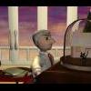
The still. And yes, it's only now I notice that the railing supports need to be repositioned... -sigh-. Well, easy fix to one model that'll track through every shot.
-
Short Film in Production: Ballet Pour Ma Fille
Dearmad replied to Dearmad's topic in Work In Progress / Sweatbox
Why have I been such a loiterer in these forums lateley? 'Cause I been working hard at animating... wierd but true direct (not inverse) relationship. Here's a little clip and still from the latest shot after about a day's worth of work on it, it's pretty much "done." With the completion of this shot, I'm HALFWAY done animating! 6 of 12 sections completed. In the clip, since it's quick rendered, it's tough to see, but the object that comes flying in is the little girl's shooter marble- it's a clear marble with a gold ballet dancer statuette inside it. God, but AM made it easy to have the marble roll and spin just right in flight *and* when it hit the ground... And yeah, it's a BIG marble... and she throws hard... I'm a LONG way from feeling good about my character animation skills, but I think things are starting to improve. This scene, like the ones just before it, are tough due to all the "acting" that takes place- facial expressions, characters regarding each other, looking like they're "thinking great thoughts..." (yeah right) etc... Tough stuff for me, but I think Ravel looks reasonably expressive without being cartoony. Here's the clip (.9 MB, DiVX): 0604g_divx.avi -
Neat lookin bug. Nice transluscencies too. Overall nice lively color to this still. One light? BWAHAHA! Rocks! Is this a real type of beetle? I'm no bugxpert.
