-
Posts
21,630 -
Joined
-
Last visited
-
Days Won
114
Content Type
Profiles
Forums
Events
Everything posted by Rodney
-
I just ran across Jeffrey Katzenberg's letter to Disney executives back in tougher times at Disney. The letter is a long one and well worth reading but it has one section that applies to some of what we've been discussing here. In a way it's more fodder for the debate on what is most important character/story/idea/fill-in-the-blank. I should say that I agree only in part with what I've quoted here from Katzenberg and find the whole prospect of 'new ideas' to be a bit of a misnomer. As important as they are, new ideas are just old ideas presented in a different/unfamiliar/fresh way. Ideas cannot be kings. Neither can stories. Characters can. In order for an audience to make a connection there must be some characteristic in a story-line such as a compelling emotion, a point of interest for contrast or comparison, or a thought provoking message worth expressing. We connect to these because when present we see ourselves. In the dizzying world of moviemaking, we must not be distracted from one fundamental concept: the idea is king. Stars, directors, writers, hardware, special effects, new sound systems… all of these can have a role to play in the success of a film, but they must all serve as humble subjects to the supremacy of the idea. If a movie begins with a great, original idea, chances are good it will be successful, even if it is executed only marginally well. However, if a film begins with a flawed idea, it will most certainly fail, even if it is made with “A” talent and marketed to the hilt. People don’t want to see what they’ve already seen. So, we need to be bold enough to stretch bounds, push the envelope of creativity and follow our hearts along with our heads. When we fail, let it be because we tried to innovate, not emulate. And, by so doing, I am convinced that we will continue to reap success. This is the key for controlling our destiny -- to have the courage to search out authentic, great ideas… and then have the steadfastness to control the material that is subsequently developed. If the idea and the screenplay are strong, then it is possible to hire a less established star and a less established director and as a result be less of a hostage to the marketplace. Or, conversely, an idea and a screenplay can be so great as to attract major talent, who will be sufficiently excited that they will agree to terms that are acceptable to us. Of course, this idea of internal development runs counter to the actions of many of our competitors, who have been paying $2-3 million for screenplays. While their willingness to pay such sums may be a sign of financial strength, it is also a blatant admission of creative bankruptcy. In a world where we can come up with our own idea and engage a young writer for $50,000-$70,000 or a proven writer for $250,000 to develop it, it is hard to understand how the amounts being paid for spec scripts can be justified. Creative studio executives should be in the business of developing ideas, not buying them. To be sure, after having worked so hard and achieved such considerable success at Disney, the temptation is to kick back and spend our hard-won profits on a “Basic Instinct” or a Richard Donner in the hope that their mere acquisition will lead to continued success. It’s a temptation we’ll keep having to resist. It’s our job to find the great idea, then nurture it and manage it until it has a shot at finding its audience. It’s not easy. But whoever said it was. As I said, the letter is a long one and it can be read in its entirety here: http://www.lettersofnote.com/2011/11/some-...r-business.html
-
Sweet. Looking great John! I know you have limited time to apply but as a request can you slightly darken/lighten the surface color/skin of the reindeer to differentiate them. I'm thinking of your grandaughter who I know will get a kick out of naming each one. Of course you realize you are going to explain to the kids why Rudolf isn't pictured in this one. Note also: If you make them move I don't think you need to offset the reindeers' legs. They are trained to fly in synchronistic rhythmetric (and if that for the jingling bells... amazingly silent) harmony. Ah, the joys of being the Tinkering Gnome *and* a grandfather.
-
Yes, and the Easter Bunny would make a good villain also. The real question is can you characterize them as such and more importantly is she essential to your story's plot. To really be able to answer that question we might have to know more about where she fits into that plot. If at any time you could easily swap out Cleopatra for some other villain... she isn't the right villain for that specific plot. So the real questions to ask: Who is/was Cleopatra? What is Cleapatra doing in your plot? What does her presence add to the story? What does the story lose if she is taken out? Now having said all of this Cleopatra might be useful in your story even if she has no particularly prime role in the plot. For instance, she might be just hanging around, someone you run into from time to time. "Hey Cleo, what's up? How's Marc?" Sometimes, especially when the story starts to tell itself and the characters themselves lead you around, the secondary characters may rise to become essential to the plot. For instance, after many repetitions, one day she may unexpectedly snap when you ask her about Marc! Give her a motivation to act out. Note that I assume that you already have ideas that could hinge on Cleopatra... this is just to add more into the pot.
-
That looks really nice! The ambiance/lighting is definitely more important than the glow. I'd say as much as possible to reserve glow for times when you need to heighten the mood or present changes in the atmospherics. It may help to think of that as real lighting from the perspective of the crew and someone has turned the dimmer switch down a notch or two. Something that is really important, such as a blinking light, might then be better able to brighten/glow larger to temporarily draw attention to it. My thought when comparing the two images (higher glow versus lower) is that in the darker one things are going smoothly but in the brightened one all hands are on deck and at high alert! (Probably need some more red in there for the latter though) Edit: In looking more... I'm not convinced that you need much of any glow. That may be Jason's point.
-
That looks really nice! The ambiance/lighting is definitely more important than the glow. I'd say as much as possible to reserve glow for times when you need to heighten the mood or present changes in the atmospherics. It may help to think of that as real lighting from the perspective of the crew and someone has turned the dimmer switch down a notch or two. Something that is really important, such as a blinking light, might then be better able to brighten/glow larger to temporarily draw attention to it. My thought when comparing the two images (higher glow versus lower) is that in the darker one things are going smoothly but in the brightened one all hands are on deck and at high alert! (Probably need some more red in there for the latter though)
-
The forum area for this project is being created and subject to any changes it is titled 'Rear View Window'.
-
Looking great John. I see Blixen has joined the crew!
-
With regard to storytelling and 'bashing ideas around'... right on cue... Mark Kennedy just posted a related topic over on his blog and as usual he can say the words better than me (he should be able to he's got the experience!): Here's the opening paragraph from his latest blog entry: Note: The above paragraph is more about our current discussion than the rest of the blog entry which focuses more on continuity and consistency throughout a movie. But it's a good read anyway. Choices Create a Believeable and Consistent World There are a group of blogs I visit regularly and 'Seven Camels' is one of them.
-
Not probably. It is! (Although note, the probability of one person accomplishing a feature film on that scale is directly proportional to their continuing interest) The first thing everyone does is come up with stories on a grand scale... epics in the making. This is a very good thing but almost without fail becomes overwhelming. It can help also to think in terms of three. (and of eating elephants one bite at a time) Split your over all story/epic into three parts (films usually have three Acts... more on that controversy later). So with that you've got a Beginning, a Middle and the Ending. Unless one of those is overly compelling and must be told, its best to first focus on the middle. (like George Lucas did!) Now look hard at that middle Act and break it down into three parts again. How is the Act set up? How does it end? With those end points known we can then begin interpolate/understand what lies in between. ...and of course we are back focusing on a new 'middle' once again. Good stories are often found in the the middle of things. J.R.R Tolkien set 'The Lord of the Rings' in Middle Earth for very good reason. Balance is found midway between things. Want to heighten the tension of Act 2? Reach for elements you've considered near the extremes of Acts 1 and 3. While we are stuck here in the middle hope still springs eternal. Perhaps from the mere thought of the love of a Father and a Mother even as darkness falls to encompass all things. Reaching the end is not our goal in storytelling... it's the anticipation of reaching that goal that carries us forward. Similarly, we would never want to fully define and demonstrate the unstoppable incarnation of pure evil; that is something always best conceived in the audiences imagination with which we cannot compete. Somewhere in the middle between bad and good storytelling are the themes that entertain us. They also can be broken by threes. Don't forget, if you want to pursue this or any idea you can always create a WIP.
-
(RE: Robert's modest proposal) Hehe, illustrated so much better than I would have ever been able to. Although, now that I look again that 'really fake AO' has a nice color to it.
-
Look at him go! I'm guessing that is Dasher.
-
I like it! About a zillion times more than I would probably like a zombies from outer space epic. There was some very interesting imagery flowing through my mind as I read your latest so it was definitely sinking in. There are some very good ideas in there. If interested I'd be happy to post more general thoughts later. The real underlying question is: Do you REALLY want to make this? If you do you should put some prime effort into further development. If still unsure or tempted by something else, start two folders (for this project); one physical and one virtual to collect your ideas related to this project. Of course, you should start folders like this regardless... collect anything and everything related to your story/stories in them. Eventually, even with it being a side project, you'll open that folder to find you've got a whole lot to work with. The more you can nail down on this yourself the more you will (in theory) retain of those ideas as the project progresses. The more input you get from others the more your ideas will naturally drift. Both for the worse and for the better. Steady progress toward the finish line will win the race. The most important thing at this stage is to get those ideas out of your head and into the real world where they have a chance of being fully 'rendered'.
-
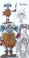
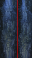
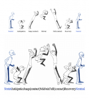
I recently posted a link to the public domain program ImageJ. The program has the fortune of being associated with a good many utilities one of which deals with a process known as seam carving. Many may have seen this feature in action via demonstration where images are magically transformed to alter over all size but maintain the main features within the image. Plugins for Photoshop make experimentation easier. Looking into ImageJ allowed me to find a link to a java-based seam carving utility that I've noted for possible use in processing my images. The downside of the utilities I've seen thus far is that they can only be used to shrink images. I'll have to look further to see if an utilities are readily available for expanding images (inserting imaginary space between essential elements of an image). Moving beyond these utilities I can't help but think of how this seam carving will someday work in three dimensions. I'd guess that someone already has a working application somewhere. Here are a few examples where I've let the seam carver utility go to work. In the first instance (from Disney's Black Cauldron) I specified that most of the critters left arm (screen right) should be removed from the final image. We do this by painting on top of areas to designate whether they should be kept or removed from the final image. In this case some pretty substantial changes are effected in the final image. Note that the character's expression has actually transformed from 'confused' to 'worried'. This is largely caused the horizontal stretching when both images were added together with the same width and not an effect of seam carving itself. In the second instance (also I believe from Black Cauldron) a background is altered with instructions (overpainting) designed to maintain key features. Note that the fidelity and accuracy might not be adequate to maintain registration without some very careful calculations. For instance, if a character's feet were to seem to be firmly planted on a ledge in the original that contact might not be preserved in the altered image once it is rescaled. The original is on the left and the seam-carved results on the right. In the third instance (from Richard William's book) I painted the areas in between the poses green (remove) and painted the character and wording below as red (retain). In this case the results are equivalent to moving each of the character poses and works together as if by hand (very similar to simply removing the empty space). It should be noted that because the entire image is processed there is some degradation of the characters and text even though those areas were specified to be retained. One way or another the program will fit everything into the required dimensions. For more information about seam carving and to download the java utility used in this exploration visit the authors website: http://www.ulfdittmer.com/imagej/seam-carving.html
-
Looks like too much fun. I'm glad to see you guys are on the cutting edge.
-
Computer Animation sure has come a long way since 1988! This is a must see, especially for fans of Martin Hash who changed the face of computer animation when he brought affordable CG to the industry. http://amfilms.hash.com/video/60/Martin-Ha...nterview-Part-1 ...and don't forget Part 2: http://amfilms.hash.com/video/61/Martin-Ha...nterview-Part-2
-
I'm not aware of any release dates as of yet. After squashing a few more bugs and some more thorough testing the Beta cycle should be heading for general release. With cool stuff like this on the way, I say let Steffen have some more quality time under the hood to further perfect v17!
-
I'm glad I read this because I was surely going to keep confusing everyone by calling it the Retopology tool. Snap to Surface works for me.
-
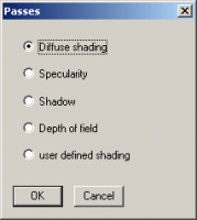
It could be a feature request but keep in mind that the Null Shader was programmed by Marcel Bricman. There is a topic where he shares it with the community and we (or perhaps it was more me...) leap on him to push it one step further toward knocking out/setting up the Alpha channel. Edit: Whup! Found it: Null Shader Topic by Marcel Bricman In a way this Alpha Shader may not be necessary because the same thing can be accomplished simply by making the Object 100% transparent. Adjusting the On/Off setting does something similar but the transparency gives us a little more flexibility. There are several other ways to disappear objects as well. Material Effectors is one. This works especially well if there is an area or zone that something will pass through as it will disappear when entering and reappear when exiting. Dynamic interactions can be used to force objects to react in various ways upon getting closer to or farther away from another object. There is a Tech Talk that demos a basic setup for creating switches that drive actions/reactions. Expressions could be set up so that if a certain value is exceeded the object will become fully transparent or inactive. Steffen also programmed his Render Passes plugin for v11. We yammered on about A:M having this feature so much back in the v12 timeframe that we really should be exploring and documenting the heck out of that. I confess I don't know enough about it. If the plugin does in fact render everything separately then no clipping would be necessary, we'd just have to tell A:M what to render out of all the variously rendered passes. The images below show the options available in the plugin/wizard Render Passes: Edit: I tested the Render Passes Plugin and it does work in current versions. I'm not sure the extent to which everything works however. The main deficit with the plugin appears to be the ability to adjust the surface transparency although this could probably be controlled through a decal. Info on the plugin can be found here: http://www.sgross.com/plugins/old/plugin3/index.html (Apologies if this is straying too far off topic but as you can see when it comes to 'clipping' objects there are many approaches and attacks)
-
It sure sounds like this situation may warrant the use of Boolean cutters. Specified Boolean cutters in A:M can also 'disappear' parts of a model based on the heirarchy of bones in the model while leaving others intact. It can also be used to texture objects that interact. For instance, applying all the areas of a model to a bone outside the heirarchy would leave that part visible while everything else is removed from view when the objects interact. The trick in most complicated scenes might be to make each object that will interact (clipping each other) part of the same model. I'd guess we can have separate models cut through each other but if possible I've forgotten how to do that.
-
I don't think that has anything to do with retopology as the texture itself is not used. That'd be more for the Import plugin. The Retopology feature just uses the existing Import AFAIK. Have you added a report to A:M Reports?
-
Yes, you've angered me greatly! Actually... the pip counting was recently adjusted (that is what those things are officially called... pips) and should now align a little better with the user levels that are currently displaying. For instance, one can now be an 'Apprentice' and have 1, 2 or 3 pips. In this way (at least theoretically) some sort of distinction could be made regarding apprentices. For what it's worth, because everyone is able to change their title at a very low post count that isn't a distinction that is very likely to be made. Just be glad we can't change your pip to red... um... yet! Added: I suppose in an ideal world the pips would keep regressing toward one solitary pip. That is to say, as the user base and posts increase in the forum the ratio of pips available would largely stay the same. This would (in theory) reward those who contribute to the community in significant and incremental ways. So it's not a matter of quantity over quality or quality over quality. Everyone is adequately and appropriately rewarded for playing. And if we could sell our pips... CHA CHING! (kidding.. mostly) Regarding Gwenn and the wings... that was a little spooky. Like a very pretty angel of death was coming on Christmas to take me away. Tech and the guys helped me recover okay.
-
Very Nicely done! If that was actually your voice (which the credits seem to indicate it isn't) I am impressed. If not, that's some impressive Karaoke lip syncing! Edit: In looking at the date of your first post, I'm not sure how I missed the first release.
-
The indicators point to you being correct there. It's important to understand however that this is a foundational release of the Topology tool in A:M. While there are many things we can do with retopology there a are few are explicitly intended. From my little knowledge of it's design the primary intention appear to be: to quickly create new forms from existing (polygon or spline) objects, templates and surfaces. The real genius in this implementation is that it doesn't narrowly restrict usage merely a bridging A:M to polygons and that alone extends its usefulness considerably. As a for instance... one thing I've noted is that we can model with changing surfaces over time. I am still not exactly sure why we would want to do that (short of tracking/forming/reforming/conforming objects through space and time) but the fact that we can do this at all means that as modelers we can lean forward and create our own innovative new ways of splining. In short, blending further the conceptual framework of animation and modeling by means of drawing and animating with splines.
-
As we approach 2012 I want to remind everyone to do two things to make your experience better in the forum: 1. Introduce/Reintroduce yourself 2. Update your Forum Profile Introductions Introducing yourself lets others know your interests and focus. It also helps to break the ice, as it's a lot easier to interact with someone you already know. A reintroduction is always appropriate when you've been away for awhile as it lets everyone know what you've been up to and that you are still active even though you might not post often. Of course you don't have to post that in this topic... feel free to add a new post in the New Users forum if you are new and the Animation:Master forum if you are returning if that works best for you. Forum Profiles Keeping your profile up to date not only allows other to get to know you better but can help others communicate better with you. And did you know... when you first setup your profile you can conduct a quick self assessment to let others know your current skill level in modeling, rigging and animation? Everyone is looking for information but by keeping your profile and this assessment up to date the information you are looking for just might find you! See you around... I'm off to update MY profile! Note: To edit your profile open up 'My Controls' up at the upper right of the forum and look for the Personal Profile section on the left. Under it you should see various categories to edit: - Edit Profile Information - Edit Personal Portal Information - Edit Signature - Edit Avatar Settings - Change Personal Photo To update your self assessment select Personal Portal Information Best, Rodney
-
There are two (preferred) ways to mirror a model. Of course there are other ways such as actually making a surface 100% reflective. The first and most commonly used is Copy/Flip/Attach (CFA or C/F/A for short) With this method you what to have your center line aligned then Right Click. In the menu you will see Copy Flip Attach Select that Do this a few times and you will start to see when and where the process works best. There are a few 'tricks' to getting C/F/A to work best. The second method (often preferred by seasoned modelers) is to drop two instances of the same model into a Choreography and scale one of them to -100% on the X axis. This will produce mirror images of the model and update as you change the original. Where necessary you can export that model and use that. The reason the second is generally preferred is that you don't need to actually build both halves of the whole model but it does help to see both halves in place. Anytime you feel like seeing the whole model while Modeling, just look at the Choreography. When you are completely done either C/F/A or export the Chor as a Model.


