-
Posts
21,630 -
Joined
-
Last visited
-
Days Won
114
Content Type
Profiles
Forums
Events
Everything posted by Rodney
-
The A:M Forum is a rarity in many ways as most forums don't allow anywhere near 100MB uploads. I believe A:M Films, Youtube, Vimeo etc. etc. are more conducive to posting movies and short films. Many sites (including the A:M Forum) then link to those sources via BB Code. I'm not sure who is the POC for the A:M Youtube Channel but I'll guess... Jason.
-
Jirard, I believe you are talking about Shade? The problem there is the same as with other/similar software. They usually do polys. They can often use a form of splines. But the two are not compatible enough to easily move back and forth without some loss of data or manual reworking. If there has been a breakthrough recently I'm not aware of it. Edit: We've gone a bit off topic here but... just soze ya knows. Shade 3D for unity is a free program that you should be able to use with A:M to get OBJ files into Unity... not necessarily FBX however as it appears to only import and not export. Linkage: http://www.mirye.net/shade-3d-for-unity-overview It is free so could make a nice addition to the toolset for getting A:M models ported to Unity.
-
Bruce, It may be that for a 155MB file it is the server itself that prevents the upload. This is likely the case because there is no limit to the filesize that can be uploaded for you or the permissions group you are assigned. A quick check shows that 94.92mb is the largest attachment that has ever been uploaded to the forum. When in doubt I suppose larger files could be split into parts and then uploaded.
-
Hello All! While assisting a forum member with a posting issue I noted a few other Profiles where a required entry was blank (or at least from my perspective they appear to be blank). It is my understanding that this Spam Reduction Field was created as a means to keep spam out of the forum. If you answer the question wrong then (presumably) you are seen as a spam bot. If for instance that question is "The Sky is blue. What color is the sky?" The answer should not be blank. The answers to any question can be selected from a drop down menu to prevent spelling errors. Note that upon registration this field is required to be filled in. To edit Profile information, and to answer the Spam Reduction Field question proceed to "My Controls" at the upper right of the forum and then look on the left of the screen for the link to Edit Profile Information. While I haven't investigated this fully, it is possible that anyone who has not answered this question may have some difficulty in posting. We'd hate to see anyone not post simply because their Spam Reduction Field was left blank. As always, if you are experiencing problems of any type in the forum forum please let us know and we'll get it fixed. If you don't feel like posting your issue in public my email is: rodney.baker@gmail.com Thanks! Rodney
-
Yes, indeed. That is exactly what I'm seeing on my end. Thanks for the confirmation Mark!
-
I've been testing out some keyframing issues and turned to Baking Actions again only to discover something isn't quite working as expected. Trivial example: Create a new Chor Open Thom or other model and put him in the Chor Apply an Action (such as Stagger from the library) Bake Action with a tolerance of 0, 1 or whatever In the Timeline, note the first and last frames of the sequence are not baked as expected. The first and last keyfame always seems to shoot off in unexpected directions for me. Perhaps someone can confirm this on their end? I've noted several issues with forcing keyframes that seem to be off today. I'm not sure if it's related only to v17d but that is what I'm using here. As I get time I'll reinstall v17c and check to see if it is also happening there.
-

oops have maybe render as line issue
Rodney replied to johnl3d's topic in Tinkering Gnome's Workshop
Too much eggnog... (the snowman... not necessarily John) -
Very strange.
-
Dan, Just for clarification purposes do you mean you 'saved' a whole bunch of time or you 'wasted' a bunch of time by rendering the characters and the background/foreground independently? That sentence can be interpreted either way. The word 'lost' usually is a negative connotation so I want to be sure I understand. You seem to be indicating that you had to discard the previously rendered frames. Thanks!
-
I confess that I do not know enough to even hazard a guess regarding hyperthreading. From what little I do know I'd say that seems to be the clear road ahead. The problem we face with the 'always on' approach is that it is seen as wasteful. But this assumes several things: 1) That what is produced is often waste-full 2) That "waste" cannot also be useful One thing that can help is for the end user to define what they consider waste. Sometimes (more often than not) is can be assumed that they don't know. So how do you deal with waste that isn't defined? We can project and predict. With projection we make educated guesses on what we will encounter (or need) in the future. With prediction we define and refine the next projection. There is a method of texturing that saved a lot of time (from earlier attempts) in that rather than paint each pixel separately the programmers used a method more like throwing a can of paint onto a wall. Instead of painting each part of the wall increment by increment they covered the whole thing in an instant. (Masking would keep parts of the paint from sticking to the wall). Similarly in rendering we have a problem in that we (as users) don't often think about how similar one frame is to the next, nor do we consider that we often rerender the exactly same frame (or nearly so) multiple times because we have animated no change there. I'm not sure how we can get a renderer to determine what has changed from one frame to the next but it seems to me that working from the view that nothing has changed is a good start. If we can eliminate what will not change from the process then we will have optimized our processing. To me this means that we should endeavor to apply the same (or similar) methods found in animation to rendering. Specifically: Key -Inbetween --Breakdown -Inbetween Key What is the difference between the first key and the last? What is the difference between the result from that and the Breakdown? The inbetween is an algorithmic process (i.e. on a sliding scale it's relatively easy to figure that one out) So we need to go from 3 to 2 to 1 in the process of creating the optimized instruction. Then we reverse the process to engineer the rendering algorithm: 1 to 2 to 3. Of course it's considerably more difficult than that but it's a place to start. What is that they say about Actors/Acting? Perform (Do) this until something causes you to (Do) perform something else? A renderer can certainly do that. Here's a key component: - Observe - Orient - Decide - Act The OODA loop is as good for renderers as it is for pilots and animators. What targets do we observe between our key parameters? (Know your Environment) How do we best orient to engage? (Point of Contact) What is the best Course of Action (CoA)? Are we decisively Acting? (An incorrect action at this stage may be better than no action) So what does this have to do with a renderer? Most of us have a general idea of what we want but we don't know how to get that idea rendered out. We mostly go by trial and error (we smile and frown a lot). We usually forget what we've learned in the past and this effects our future outlook when we find ourselves on similar ground. We are more likely to make the same mistakes often (twice is usually enough to avoid repeating that course of action unless risk allows for it) We have too many options so we often hesitate to act. We second guess ourselves. We become even more cautious because the result weren't what we wanted or were lacking. We avoid commitment. Want to win the rendering war? Formulate a smaller OODA loop than the one you've currently got.
-
Thanks Robert! --------------------------------------------------------------------------------------------------------------------------------- DISCLAIMER: The following is some theoretical stuff about rendering from a view of the renderer constantly working for the user. Don't take it too seriously. It's not coming your way soon. It's just theoretical. --------------------------------------------------------------------------------------------------------------------------------- One thing I've long wanted to explore is something I might call a hungry renderer. I'm sure there are better names for such a critter but the idea is that the renderer is constantly on the prowl, very proactive, waiting to grab a new batch of instructions to render. If the renderer encounters an image that has already been rendered before, it places the instruction to render the image again at the bottom of the cue and nominates another instruction to render. *If* there is ever any idle time the renderer smartly deals with the set aside instructions in turn, pluses them up if allowed to, or improves the quality of the image (or as dictated by custom settings). The goal would be to have the renderer always rendering. If the render stops rendering it is out of optimal parameters (i.e. something is wrong with the settings... either default or customized). The first thing that would be targeted would be a stack hierarchy mentality where a stack of instructions are executed in linear order *unless* there is another instruction of a higher priority, in which case the higher order instruction would pop up to the top of the stack (or the bottom if using that hierarchical methodology in a similar fashion to many of A:M's approaches to priority). The second would be the cuing process itself which would have to be optimized so as not to be re-reading the listing/index too often (wasting cycles of processing for no good reason when they could be used for rendering). My initial instinct would be to give every instruction a numerical value that assumes 1) A new instruction is a higher priority instruction 2) the new instruction may allow itself to enter the cue at a lower priority. It might work like this: - Publish new instruction - Write/Append old instruction to (end of) new instruction - If new instruction priority is lower than second line priority then sort cue listing (This would place the new instruction into the correct order hierarchically) So how would you modify the priority of that instruction? Let's say that instruction was: 7 Do this and that The current cue listing includes: 10 Render this 8 Render this too 4 Please render this fast 2 Whenever 0 When all else fails do this So the modified cue listing becomes: 7 Do this and that 10 Render this 8 Render this too 4 Please render this fast 2 Whenever 0 When all else fails do this Since 7 is less than 10 the list is sorted, resulting in: 10 Render this 8 Render this too 7 Do this and that 4 Please render this fast 2 Whenever 0 When all else fails do this But what if you want to interupt and modify the priority of that instruction because you see that it isn't high enough in the cue? You simply add a new priority: 9 7 Do this and that 10 Render this 8 Render this too 7 Do this and that 4 Please render this fast 2 Whenever 0 When all else fails do this Since 9 is still less than 10 the cue knows that this new modification is not of the highest priority so it sorts the cue listing again, resulting in: 10 Render this 9 7 Do this and that 8 Render this too 7 Do this and that 4 Please render this fast 2 Whenever 0 When all else fails do this Since we haven't removed the old render line item it remains in the cue but is now on a new tier, a quality rendering cue. When it is cued up again it will execute the instructions of the secondary cue. Let's say that the secondary cue's instructions are to create a JPG thumbnail image of any existing images in the secondary cue. *Here's a rendering timesaver* All images that exist already are not rerendered but bypass the renderer and are simply copied to the targeted format. Once complete the secondary cue looks for something else to do. If all instruction are completed then it moves on to the third cue (or as customization dictates). Let's say in the third cue the instruction there is to compile any like named image sequence into a .MOV file. The converter might kick in and begin to convert the smallest files first (yielding the greatest throughput) or as dictated by customization. As the converter need not be a 'renderer' much time is saved in rendering. There is no need to render an image sequence to .MOV because as long as it is in the cue it will be automatically converted. The third tier cue would need to be smart enough to know when a sequence is ready for conversion or it would need to be able to append multiple .MOVs. In the abstract this would be trivial because the interface would use thumbnails as proxies. Manual concatenation of images or sequences might be dicated by On/Off (push down on all the images to be converted) or by selecting and Grouping images into separate cues. An equivalent in A:M would be that of selecting multiple objects in a Model or Chor and Naming that Group. While the display name of that Group might be whatever the user finds useful that is just a label, the true 'name' of that Group would be the priority and instructions that set it into the cue(s). Each time a user issues new instructions those instructions go into the cue. After awhile there might be hundreds if not thousands of things for the renderer to do, assuming the renderer ever runs out of things to do. In time the best rendering instructions (for each individual user) get run first. In this way the render continues to learn. Perhaps the best part of this approach is that it is scalable. It can work with one user or everyone in the entire world. It can work on a single computer or over a network. If an already image already exists it need not be re-rendered or it can be modified. The project file + the instructions are enough to establish what the image will look like once rendered. In many cases most files might never need to be (the highest quality) rendered because the best solution will already be rendered for you. Seriously though... renderer... always rendering. Not necessarily at the peak of using all available resources but understanding and executing it's instructions perfectly, constantly, continuously. Of course, you could always override the default and put the renderer manually into sleep mode. When needed again simply wake it up. It already knows what it needs to do.
-
If Netrender works like A:M itself you should be able to skip the selection of the image format by typing in the extension. For instance, if you want to render to TGA in A:M you can type "image000.tga" and A:M automatically knows you want TGA images. Need EXR format? Type "image00000.exr" and A:M will render out to EXR format. The only thing this cannot do (as far as I know) is set specific settings within the file format. Aside: It'd be cool if we can pass A:M parameters ... but I don't know that we can do that. (Example: "Image0.mov -compression") I half suspect that A:M uses such parameters to talk to it's renderer. The render has to get its instruction from somewhere. In a perfect world perhaps "image000.tga complete.mov" would render the sequence to both tga and mov sequences.
-
Does the entire 2395 frame sequence have/require particle hair? I would say you could isolate those frames that have it and render out everything else separately. When in doubt duplicate your Project/Chor and then tweak the copy. While those other frames are rendering focus on optimizing those remaining that have hair.
-
Dan is struggling to meet a deadline over in another topic so I'm starting this here to collect general advice. For those that feel they can assist him in getting his job rendered please comment over there: Dan's topic Meanwhile... we''ll collect some thought, theories and practices for faster rendering here in this topic so that we can bravely face the next deadline.
-
I'm about to head off to work but... perhaps some of us can render some frames for you as well. (I'll be starting another topic to collect general rendering advice not necessarily related to your topic/deadline)
-
As 6 minutes per frame is not very long in rendering time this can be hard to judge. Add in the many variables there are with regard to your specific project and we've got a recipe for extending the render time even more. The bottom line would be to turn off everything you don't need and render to an acceptable resolution that still meets your requirements. *After turning off anything you don't require... Reserve the sequences you think can do without for the very last rendering. Any time left over you can rerender other sequences if necessary. How many of those frames can be rendered to a lower resolution? Set up a Chor with those frames (say seq 0-500, 1500-2000 and the last 500 frames) then launch a Netrender (I assume you've been using Netrender here) . How many must be rendered to the higher quality? Try to focus on those with regard to unnecessary settings (Can you render to 4x4 multipass rather that a higher setting)? Render these out separately 100-500 frames at a time. This is a subject I am very interested in by I don't want to waste your time here. I'll continue to post some thoughts but ignore them for now except those that work for you. There are too many variables at this point so any information you can provide will help. Are you using AO? Are you rendering with Netrender? How many different jobs are in the cue? Can you stop one or two and refine those? At a guess I'd say keep Netrender running as it is now and launch another render (via A:M) that renders that later frames to a lower quality. Render to another folder and add all of them together.
-

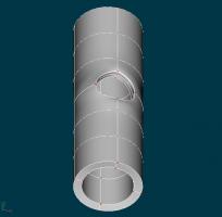
How to cut a circular opening on a tube
Rodney replied to detbear's topic in Work In Progress / Sweatbox
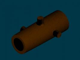
I'm pretty partial to the Boolean approach but the fakin' it approach can work pretty good as well. Just placing your shapes together and using a texture/material to blend them into one shape might work in some instances. Attached: Not the best example but an example of just placing shapes together. -

How to cut a circular opening on a tube
Rodney replied to detbear's topic in Work In Progress / Sweatbox
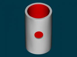
Depending on your goals there is another way to approach this... You could fake it! Here's a an example where I have just placed three objects together to make it look like there is a hole in the tube. What is there is actually two tubes and a 5 point circle (there is an ancient chinese recipe for that). Fakeit.mov -

How to cut a circular opening on a tube
Rodney replied to detbear's topic in Work In Progress / Sweatbox
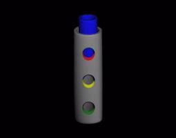
Okay... I couldn't resist. Here is a tube moving through a tube that has three different colored beveled holes cut out of it. The project file should have everything necessary in it. Keep in mind that you have to render to see the cutaway from the tube (that's the downside of booleans). I added a negative light just to add a little contrast to the scene. A few tech notes: The inner tube doesn't get cut by the boolean shapes because it is assigned to a bone that is a child of the bone that is set to be a boolean cutter. If it were higher in the hierarchy with the bone set as a boolean cutter as a child of it, it would cut through both tubes. The red, yellow and green colors on the beveled holes are driven by the surface color of those objects. If you applied a material to those groups it would display that material. All three cutting shapes are assigned to the same bone although they could be assigned to different bones that each had the Boolean Cutter set to On. Apologies for posting what you don't want here but it's one way to get at cutting holes in tubes. It might work on a different project some other day. booleanbeveledtube.mov BooleanBeveledTube.prj -
For video editors I've been trying to steer folks to Lightworks. It's just released a version for Linux and the Mac version is on the way. The code itself for the program is to be released subsequently. The difference between the free version and the Pro version is that the Pro version supports a few more high end codecs that the free one does not. As Lightworks is the only high end video editor on Linux it's sure to gain some support there. http://www.lwks.com/ You do have to have a pretty decent computer but then again any high end video editor will require the same.
-

How to cut a circular opening on a tube
Rodney replied to detbear's topic in Work In Progress / Sweatbox
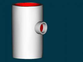
There are a couple issues going on with your model Matt. (I think) normals facing the wrong way were an issue. (I tried to repair them in the attached) The real issue however (and not necessarily related to why the 5 pointers would not close) is that due to the thickness of the tube you were in the process of creating internal patches. The way I got around this was to create a mid point spline circle inside the hole. I'm not entirely convinced but it's possible that these internal patches were related to why A:M did not want to create the 5 point patches. To fix the 5 pointers I just went back in and detached reattached so I'm not sure what the issue there was... Note: I didn't take the time to go back in and adjust spline biases so the tube is a bit deformed. tubewithhole_somewhatrepaired.mdl -
I really like your solution Robert. Since Radius and Intensity of Glow is best controlled in the Chor properties that makes having variation in glow size and intensity a little harder to work. If you are use to compositing one solution is to have a separate Chor for each object that will have different glows and once rendered composite those together. You can get a degree of this by controlling the glow through the intensity of the Ambiance Color on the Surface properties. What is nice about that approach is the glow intensity can be animated over time.
-

How to cut a circular opening on a tube
Rodney replied to detbear's topic in Work In Progress / Sweatbox
Just for the record here... I know you are trying to avoid booleans. If you assign part of an object to one bone and the boolean cutter to another the cutting will only effect that part of the object that the boolean cutter is a child of. In this way you can have objects inside the space created by the boolean cutter. -
That hair is tres fantastico! If you could get the eyes/pupils to be like those muppets where one eye stays in place and the other moves with motion as if it were lose that'd be impressive. I think Cookie Monster is the main muppet that has that particular characteristic. Added: If you click on the attached image you'll see that both of Cookie Monsters eyes bounce around... hmmm... maybe my memory is faulty.


