-
Posts
2,728 -
Joined
-
Last visited
-
Days Won
4
Content Type
Profiles
Forums
Events
Everything posted by Zaryin
-
I love it. Looking really good.
-
Fly for an animation i want to do
Zaryin replied to pixelplucker's topic in Work In Progress / Sweatbox
Haha, nice fly. -
Thanks for the help everyone. We'll see if I can get anything going with this. I'll probably work on it a little in between working on my Crystal Apple Image.
-
So I downloaded Camstudio and did a real quick tut on making a ball to see if it would work. It worked and lasted about a minute. But the size of the avi file is like 15 megs and the swf isn't much better. How do I get those file sizes down? I'll never be able to make tutorials with file sizes that huge . Thanks for any answers you may give.
-

My Animation Master Movie - Could take a while.
Zaryin replied to Gaduunka's topic in A:M Tutorials & Demos
Yeah, you are right about offering to pay me, but that's not my main issue. At the time it was my pc crashing. I would have felt a little indebted accepting help at the time. If I can I will see If I can work up something for a tutorial, but like I said I am really not good at teaching. I wouldn't even know where to start with a tutorial on any subject. Including what I think would be something I do rather well. I would do it for free if I thought I could do it. But like I said, I have know idea how to go about making it and making it good. I am really horrible at teaching, I am not kidding, haha. I mean I basically already did a "mini-tut" for SSS in my Crystal Apple thread by giving the settings I used. I'm also using 14c. I don't even know what's new in 15x. And I am definately not an expert in A:M paint. I painted a displacement map and some color and got lucky because it looked good. But I have no clue about the ins and outs of that program -- just that it's awesome. -

My Animation Master Movie - Could take a while.
Zaryin replied to Gaduunka's topic in A:M Tutorials & Demos
His comment might be a mild slam at me . I just suck at doing tutorials and teaching in general. If people ask me questions, I try to answer as well as I can. I also don't have money to get video capable software. Please don't take offense at this comment if you were not refering to me Jason. I just knew you wanted me to do some things before my pc took a crap on me. -
-
I said a little blue ~~~. I agree that's way too much blue. But it still looks good. The gray is better though.
-
That is freakin' nuts! I can't even imagine how you did that "out from the web" shot. Nice! How'd you get the texture on the left side of the face to look so good?
-
I am loving this image. I would however request a little blue in the sky .
-
Thanks for the comment If he looks green to you however, there's something wrong with the color on your monitor, he's supposed to look blueish.
-
Thanks for the comments . I know what you mean about the hooves needing a back indentation, I just like the fantasy roundness . Thanks again for the comments.
-
He's starting to look like my cousin -- sans the wings . I don't know what it is, but that front view look a little off to me. The shape of the wings I think could be more rounded maybe? I dont know. Looking good though.
-
Could we get a shot of those posed? They look real good.
-
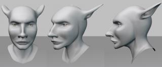
Thanks for the comments Ken. Yeah, I think I'm going to leave them alone for now, haha. But just in case, what hoof do you think should be brought forward? I am pretty sure I will not be making them more pointy. I am very happy with the shape of them as is, but with hoof placement I can always use more advice . And yes, hooves are freakin HARD! It's just, you're not used to seeing a dude with the freakin' hind quarters of a goat, haha. Here's a white render of the Pooka's head and a render of him with SSS in the scene. Is it just me or is he kind of scary looking ? Either way, I love the way the head turned out. Thanks for looking.
-
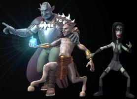
Ok, here is a quick render with the Satyr's rear leg brought more underneath the torso. I don't think I can get it any better without ruining the pose. I hope it's close enough. Now I'm going to start on the Pooka, haha.
-
Thanks for the comment Mark. Um, I tried moving the Satyr's weight to his back leg, and his front, but if I do this it just seems to ruin the feel of the image to me. So I guess in this image he has his weight on both feet . It might not be right technically, but for now it feels more right to me. That might change when I get all the characters in there though, haha. I might jsut go with a heppy medium on this one and move that back leg a little more under the body. Thanks again.
-
I did change the shape a little more to make it more narrow in the last images, but I don't want them to look to realistic. They'll be darkly textured and farther away in the final image so it might not matter. We'll see when I hit the end stretch . Thanks again.
-
hmmmmmmmm....Well most of his weight's on his back leg, but there is a little on his front, haha. I just don't know. I think I'll leave it with what I got now (below). I'll just keep picking at it until I destroy what I have so I think I'll leave it be. But this is what I got on the front hoof. Thanks alot for the imput Rodney.
-
Thanks for the comments. Rodney I think you mean that the shape of the fetlock area should be exactly opposite of what I have? If that's the case, and I think that's what you mean, I'll get on that, because according to that image you are definately spot on, haha. About the Sluagh, she's actaully looking at the Satyr, but it's not too important right now. I don't think I'll be making more of her whites show however. That would make her look more awake and caring than I want. Even in the middle of a battle she would look like she was nearly falling asleep . Thanks again.
-
I hate to keep posting pics of the same thing, but I finally changed the Satyr's legs. Now I'll get to the Pooka . Please, any comments on the newest legs would be appreciated.
-
Are you going to add an hair shader for spec in there? Looks good so far. Maybe some color variation.
-
Looking great! I love it! I can't even believe you thought to do this, haha.
-
Thanks alot guys. It means alot . I actually changed the pose of that leg slightly with the last render because I now had a physical thing he was standing on. I think I'm going to have to tweak it even more. I might have to go so far as to shorten that last section of leg to help him not break his leg, haha. Like I said in the first post. They're going to be in a "throne room" like area, but it's going to be outside. There will be a throne on the dais that the Sidhe has just left. That's where I'm going to have trouble, making a room out of nature . Thanks again.
-
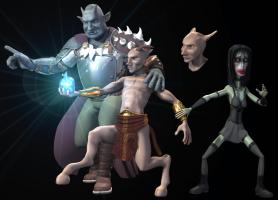
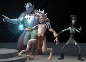
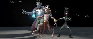
Ok, I started working on a final camera solution for the final image. I might be pushing it back a little farther for the final image. I just won't know for sure until all the characters are finished. This image is a 16 pass render. It took 48 and a half minutes to render at this size, who knows how long the final image will take to render with the final background and characters, haha. I also added names of the characters to show where all the characters will be in the scene. The ground is just a base to get an idea where all the characters will stand. I will probably work on the Pooka next. He will be a character who can tranform into a hare, or rabbit, or bunny, whatever your preference. So he will have alot of rabbit-like features. Thanks for looking .


