paradymx
-
Posts
155 -
Joined
-
Last visited
Content Type
Profiles
Forums
Events
Everything posted by paradymx
-
Wow that is nice! Even without textures that looks great. Did you populate the buildings using some kind of duplicator or sweeper? If not then, even more kudos to you.
-
Yes, the model bone is constrained to the path. I'm going to try those other two you came up with though. Here's a test cho if anyone else wants to try: ring_tester.cho
-
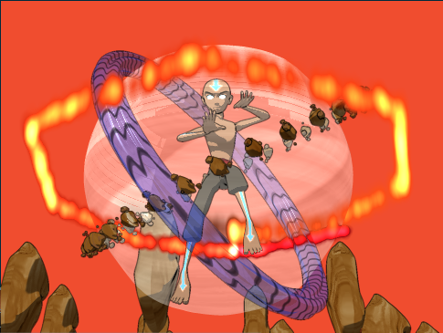
Been working on a commission for a friend and was running into a problem with the fire ring. I have created a circle spline path and attached a fire emitter on that path to create my "ring of fire". For some reason the path it takes looks like so: And the render: test2.mov I can't figure out why the streaks stay on a hexagonal path dispite it being attached to a circle. Any ideas?
-
I'm still at work so I can't look at the prj file, but do you have to even move the cable? I know in reality the cable would move but you just have to make the viewer "think" its moving. A ring or loop made to look like a coil in the cable, but attached to the moving chair would give that illusion.
-
I think that's a great idea! Can't wait to see it!
-
Arms look okay to me. They should rest naturally just above the knees on the average person. They need the move a little more though during the walk cycle though.
-
probably not really helping here, but I'm not seeing the "jerkyness". It does seem REALLY blurred though. I can't even make out details of the car and its not moving fast enough for that. Correction I looked at it again controlling the slider myself, is the blurriness the jerking you speak of. The car looks quite clear per frame.
-
Well, I finally think I have a good reel version of my best stuff. I'm a little weary of the reel( but I always will be, its my nature ) As I've went through I've tried to go by these standard rules: Your reel should be no more than 3-4 minutes Mine is running a bit over, almost pushing five with the long holds for the title cards (the version here has shorter ones for a small file size to upload) I'm pondering if I should shorten the opening segment; though I feel its one of my strongest. Music and sound track is secondary. I have a full music track going though the whole demo. In my older ones it was just music on top of everything. This one I decided to give my dialogue segments to ability to showcase by lowering the soundtrack to hear what's being said. Put your best work first This I've done, but as stated before, maybe to much. I feel like it throws off the pace I want to set by this being a compilation of my talents. Title cards and table of contents I'm on the fence about these. In every demo version I have done I have always had them. I'm leaning towards them being more of a distraction than helpful. Inside the DVD case I will have a printed table of contents, which will show the same thing just about. Am I just being redundant? Have a title card at the beginning and end with your name, address, phone, and email Done and done. As said before they are longer in the real version; about 5 sec at the intro and 20 sec at the end with a note that the full versions of each segment are on the the disc(if the viewer is interested) Show work that proves that you know what you did Wasn't sure if I could or if this one really applied to me. Sure I could have threw in some wireframe shots or some shading shots, but I animate. I feel I would be showing the same thing twice for no reason. Take the time to polish This is one of my weaknesses. I'm never satisfied. I always polish, which in turn leads to new ideas, which in turn leads to redoing a scene, which in turn become a entirely new segment and so forth. I have to force my self to stop often and say this can work and move to the next step with what i got. Show it to other people This one can go either way depending on who you show it to. We all have family and friends who will see it and go: "That's cool; You did all that? I like it a lot; You did a good job!" Then you have your Animation peers who can give you a focused opinion on what works and what doesn't. Both have their place. But you gotta have both to move forward. Enough of me dribbling on........ Here's the Demo web_demo_11.mov C&C always welcome
-
That dance scene looks great. I hope you don't "smooth" it out too much. I love the stop motion feel that it has.
-
Nice... I like the different colors in the layers of her hair....
-
sorry about that. Some how the web version had the sound off..... Let try again: Tech_Boogie_Redux_web.mov
-
Trying to finish this one off for the final DVD. Here's the latest: C & C always welcome The_Mirror_web.mov
-
Been feverishly trying to update my portfolio and I backtracked to an old project I've always liked. I've posted this one before ,but I did some touch up on certain areas and added a proper ending... C & C always welcome Corrected version Tech_Boogie_Redux_web.mov
-
Nice! Like the character style. Wondering about the cutesy heart on his cheek......
-
Maybe you should use slighty longer clips of some of your projects. I feel like just when I'm starting to see whats going on and how well you do it, the scene changes.
-
Thank you guys so much for your comments. The foot sliding will be corrected. I originally moved on from that issue cause it was driving me crazy. Mouseman- Thank you very much for taking the time to make that video. Having that "play by play" does give a very effective view of what you see(or don't see) in the work. The slap reaction was taxing. I think what you mentioned about the way he "catches" himself is probably what I'm seeing that just doesn't look right. Nancy- I see what you mean about anticipation before the slap with some realization to the character and the audience that SOMETHING is not right, which was a valid idea put forth by Mouseman as well. It works without it.... but it works better with it!
-
Okay here's pretty much the final version, save for some minor tweaking. Almost a full render save for shadows, which will be added. Added facial expressions and adjusted some of the holds. Would like to know if the "transition" (where the reflection becomes the model) is too harsh. Its like a sore thumb to me....but i put it together so.... mirrorfulltest.mov C&C always welcome.
-
Sorry about that....... This is a continuation from the first two. I just didn't FULLY render it with reflections. It was a quick SHADED render. Its his OWN reflection striking out at him after bulling him a bit...lol
-
Okay, here's the "finale". Tear this one apart guys. I've done the slap reaction over from scratch more than 8 times now. I still doesn't look right to me. Something is off. I feel good with the slap, but if you see anything shout it out. Thanks again guys!!! mirrortest03.mov
-
Nice conversion. That mane looks great!
-
Your stuff looks great!!! CIA huh? Is that the one over on Euclid? I'm sure your going to do well there. Keep it up!!!!
-
Those are "suppose" to be her leg seams...lol. I didn't want them to stand out as much as the other lines, but I guesss they stand out even more. Maybe I'll try to model them as opposed to using a decal since they are not translating well....lol
-
Zero Slope huh? I'll give it a whirl. I tend to to use linear for my foot holds and plants. And use Zero slope and spline for certain motion depending on context. Or am I thinking of the wrong thing? Zero slope is the 0 quick key under the spline selection right?
-
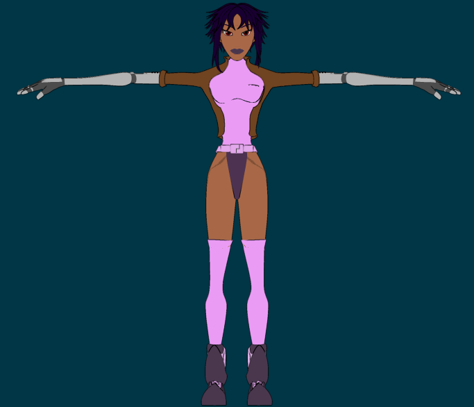
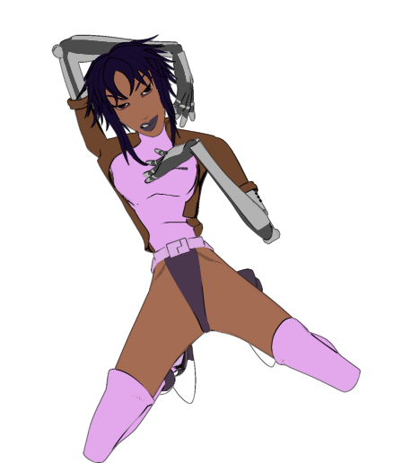
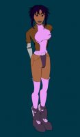
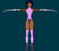
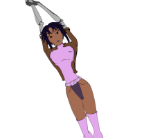
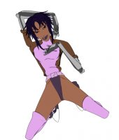
Thought I'd finally end out this post. I tend to flip/flop between to finish project to project to keep from getting burned out. This was the result from that torso, my first female model for my SCIFI High series.
-
Latest update to the overall scene. It's coming along but i'm starting to get burned out on ideas. I know how it want to end it, but I need to figure out the last 10 seconds or so. At any rate: mirrortest02.mov crits and comments always welcome......