-
Posts
3,827 -
Joined
-
Last visited
-
Days Won
31
Content Type
Profiles
Forums
Events
Everything posted by largento
-
Thanks, guys! Andy, I don't know that I'm entirely satisfied with them myself. I may yet mess with them again before they go online in December! As I recall, this set up had a white rimlight, a sort of lavender colored keylight and a light blue fill. I'm just glad I don't have any more night scenes planned for this story! :-)
-
Thanks, Kat!
-
Thanks, everybody! I gotta' say you guys are making me feel much better. I was really bummed out by this. Nancy, that "contract" is hilarious ...and painfully true! SO painfully true! LOL, Ken, I had a similar thought. :-) Al, I've always been hesitant to do a modeling tutorial because the way I do my modeling is the way I learned from Barry Zundel's training videos. So if I were to do a tutorial, I'd be ripping him off. 'Sides, I think he's better at explaining it than I would be. A lot of mine is still seat-of-the-pants, I-wonder-what-would-happen-if-I-did-this kind of stuff. :-) In fact, for this model I didn't draw any rotoscopes. I just kind of had an idea of what it would look like and drew out the front and side views with splines and went from there.
-
Thanks. That's the syndrome where the client can't decide where they want the six thousand pound desk so they want you to move it all over the room until they find a place they like it. :-)
-
-
Looks pretty good to me!
-
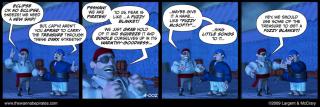
Strip #10! Four days and four strips! Not going to be able to do one tomorrow, though. I've got to write the next batch of scripts and there's some things I need for this next section that aren't finished yet. It'll be historic, though! Flemm's about to buy The Sea Anemone!
-
Hoping to become the major cranking machine, Nancy! Even though I'm trying to have 10 week buffer when it starts running, I'm still going to need to crank out 5 of these each week for ...well, forever. :-) Before we knew I was going to do the art in 3D, I started working out the basic story. Then a few weeks back, McCrary flew out here and we spent a couple of days talking out more of the details for this and another story we're working on. The process varies, but usually we're doing a video iChat to discuss the next section of the story, suggesting gags; and then I'm going and writing up 5 or so strips and then sending them to McCrary to review and make suggestions. Then I try to marry all that together into the final strips. So, there's definitely some back and forth.
-
Ended up working on other things yesterday and running errands, so today I made up for it by doing 2 strips! Finally the sun's back out! :-) I've got one more I written then I have to go back and write the next batch.
-
In the few animations I've done, I've done the lip syncing in an action (only using the pose sliders). It wasn't something I couldn't have done in the cho, but I liked being able to isolate that and I could render quick animations to check my lip sync before dropping it into the chor. I could also do multiple sections of dialogue (lyrics, in this case) in one action that I could use in as many cho's as I needed. The only thing I had to be mindful of was that I couldn't touch anything from the action in the choreography, or it would affect the action. That's why I just used the pose sliders. I animated facial expressions in the choreography. Of course, this wasn't about reusability, but about having a "clean" environment to concentrate on just this one part of the animation.
-
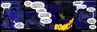
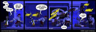
I don't know, I think the contrast is fine. I just think it's a tricky thing to read and the coverage of the panel precludes trying to give a dialogue explanation. I dub it successful in what it needs to get across... that Flemm has unintentionally given Doc Bokor cause to curse him. Whether people think he tripped on something or get the actual intention isn't important.
-
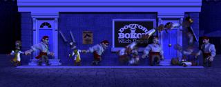
Thank you, gentlemen! Ken, there's a hitching post at waist level that Flemm has dragged the Doc into ...so he's spinning around that and then being launched from the spin into the bell and wooden sign. Flemm must have continued walking during this and thus ended up where he did. Admittedly it's cartoon physics. :-)
-
Thanks, guys! Don't think I wouldn't consider that gag, Myron. :-) The next few strips are gonna' be a breeze compared to this one. :-)
-
It looks like you can still order the DVDs from here, as well. The first one covers the interface and modeling, the 2nd one rigging and the 3rd animation. They aren't cheap, but they are well worth it. [EDIT] I just noticed that Barry has a couple of videos on his blog, talking about setting up smart skin and a pose slider. He doesn't go into a lot of detail (he's just demonstrating the capability), but they might be helpful to folks.
-
That was great, guys! Gene, they keep getting better and better!
-
Whew! This one was a lot tougher to do! I set it up as one choreography and I'd kind of been dreading it for awhile, but I liked this gag and wanted to see it finished. This was the first strip I came up with when I started thinking about the story. Here it is: And here's the actual render: I made a png file of the panel template and brought that into A:M as a layer to help me set it up so that everything would fall correctly in the panels.
-
Add me to the endorsement of Barry's tutorials. I bought the DVDs and went from confusion and frustration to actually being able to model a character. :-)
-
Thanks, David! I went through and finished up re-lighting and beefing up the backgrounds for the strips I've done so far. I set up a webpage here with all of them, so I can see 'em in one place and mark my progress!
-
Thanks, Nancy!
-
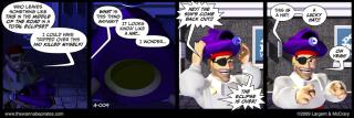
Okay, decided I didn't like that new one. Here's another stab, closer to the original (which I still like BTW), but not as contrasty and dark...
-
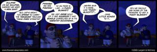
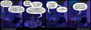
Okay, let's give this a try... :-) Here's a before and after of Strip #2: Before: And After: I did a few things, obviously, including using depth of field.
-
Wow! Another thing I didn't know about... doing a search for that right now! A lot of good info!
-
Thanks for the tip, Nancy! I may very well got back and revisit the lighting and backgrounds (I realized today that this isn't going to start running on the website until December 1st), but I can't fall into that trap of endlessly fiddling with these things. I just have to take the path that I'll learn as I go what works and doesn't and improve on the next one. Otherwise I don't have my 50 strips done by the start day. :-)
-
I do have a rimlight in there, Robert, but I lack the precision to keep it from effecting the overall lighting. I suppose I could render the figures with the rimlight in a separate render, but I've been been okay with the impression that it's dark. If nothing else, the contrast should be significant when the sun does come back out. :-)


