


Godfrey
-
Posts
908 -
Joined
-
Last visited
Content Type
Profiles
Forums
Events
Everything posted by Godfrey
-
Actually, if you're going for realism, the bright sun would wash the stars right out; check out some authentic NASA shuttle pics -- no stars! (Of course, the tinfoil-hat-wearers would have you believe that it's because all those photos are faked, and NASA just forgot to Photoshop stars into all those pictures.) (It's ironic, but Hollywood's unrealistic treatment of outer space actually looks more real than reality...) Comparing your image to the NASA pics, I'd suggest making the planet a brighter blue, especially the arc nearest the sun -- maybe even fading the rest down to blackness. Nice job on the Shuttle, BTW.
-
Uh... The Empire Strikes Back?
-
Very nicely done! I especially like the grunge. Do his little control arms pop out?
-
Weird... when I click on the link, it takes me to the image I intended to link to. I've edited the link to point directly to the image, rather than its gallery page.
-
Well, I might could do, but it's from a story I was writing set in the far future (the ship itself is several hundred years into its journey), so any support spacecraft on board probably wouldn't give the viewer a good feeling for how big it was (unless shuttles look the same in the future as they do today). At any rate, here it is with a Saturn V rocket sitting on one of the clamps for the (not yet modeled) supply section (which sits between the engines and the habitat section): Laser? Unfortunately, because of the way the model is designed, it doesn't really lend itself well to perspective: Since the forward asteroid shield overhangs the rest of the engine section, it doesn't look much smaller when viewed from behind the ship -- and when viewed from the front, the shield obscures the rest of the section! Mr. MM? Is that you? Just a touch. But I like the way you think...
-
Try as I might, I couldn't find a way to convey the scale of the model from one of my image contest entries. I tried several different camera angles, but none of them really said "this thing is freaking huge". Any suggestions? (For reference, here's a streaming QuickTime movie which shows how big it is relative to a human-sized object.)
-
Actually, that wall could be done with five boxes: two long ones on the top and bottom, which reach to the bottoms and tops of the windows, respectively, and then three more boxes to the left of, between and to the right of the windows.
-
If you're trying to get a more impressive glow, leave the ambiance intensity at 100% and bump up the Glow Intensity (and possibly the Glow Radius) in the choreography's properties.
-
Great soundtrack! (The modeling/animation's nice too. But an original soundtrack like that is rare on these forums!)
-
Well, the obvious answer would be "don't set your ambience above 100%". That said, what version of A:M are you using, and what are you using to provide the ambient color? (a material, surface properties on the model, etc.)
-
Do you have a light source attached to the torch? (If so, if it's in the flames, make sure the flames themselves aren't casting shadows.)
-
Part of it, I'm guessing, is the depth of field. The janitor bot is in sharp focus, but the little bot in the background, which looks like it's very near the janitor, is very out of focus -- as are the foreground rocks. This makes it look like a very narrow depth of field, which is the effect you see when you take a picture of a small model from very close to it. Try widening up your DoF so that the background spaceship is only slightly blurry, and see if that makes a difference. You could also try moving the camera about halfway down towards the ground, so the janitor looms, and perhaps scaling the distant little bot down a bit so it looks as far away as it is (the narrow viewing angle disguises the distance quite a bit; the closer you zoom, the less an object's apparent size changes with distance).
-
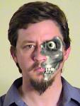
Óđinn (Odin, Oden, Wodin, Wotan...) plucked out his eye and cast it into Mímr's well in exchange for wisdom, so MixePix's sewed-up empty socket is quite fitting.
-
Actually, I suspect the ultimate purpose of these contests is for Hash to have spectacular images and animations which show off the capabilities of their product. In which case, if getting help on an entry or collaborating with others changes a viewer's response from "that's pretty good" to "holy cow, I've gotta buy this software", I'm betting Hash wouldn't mind at all.
-
I'll generally set them up in an on/off pose (which I set to default to ON). That way, when you drop your model into an action or a choreography, the fan bones are already activated. They orient like other bones in a chain. Say you're putting a fan bone in an elbow, to affect the spline ring through the center of the elbow. Both the forearm bone and the fan bone will be children of the upper arm bone; orient the fan bone like the forearm, with its pivot at the same place. Add the Orient Like constraint, make its target the forearm bone, and set it to 50%. As the arm bends, the fan bone will rotate in the same direction as the forearm, but only move halfway.
-
Sweet textures! Tripod forbids remote linking, so the only way to see a Tripod image from an external site is to copy the link and then paste it into a new browser window -- or disable the sending of HTTP referrer information, if your browser supports it.
-
I agree as well; perhaps if he were snarling at the camera and stretching out an arm as if to grab the viewer, with the other one pulled back for balance; and with the camera positioned a bit lower, looking up at the figure so that he seems to tower over the viewer. (Too late for the contest, I know.) Yup. Especially when you see a model in someone's avatar dancing around every day. But I vote based on a whole lot of criteria; the artist's identity isn't one of them. (Well, okay... I won't vote for my own work, but other than that I don't consider who made an image.) Composition, technical skill, originality, adherence to theme... those are a lot more important to me.
-
If that's how evil Óđinn looks, I can't imagine what you've done with Loki! Nice modeling, though.
-
johnl3d tries to model a character
Godfrey replied to johnl3d's topic in Work In Progress / Sweatbox
It may just be the angle, but it looks like his right arm is a bit longer than his left one. Otherwise, excellent! -
That would be telling. But of course. Thanks for the ear pointer. I knew it didn't look right, but couldn't stick my finger in it. The bottom edge of the jawline is slightly concave, but I think the effect is being exaggerated because the beard is altering the silhouette of the jawline; and in the second image, the head is tilted forward, so what you're seeing is the cheekbones instead of the corners of the jaw. Mind you, this is supposed to be a stylized character, not a realistic one.
-
Erm... I think that's perhaps a bit too shabby. A bit too long for what? I may add a bumpmap for forehead wrinkles, tied to a slider so I can fade it in and out with the facial expressions, but he's not really supposed to be terribly old (grey hair notwithstanding). (I know all you young pups think everyone over thirty is incredibly ancient, but sheesh...)
-
I use two decals for each hair group: one for density, and one for diffuse color. That's a deliberate thing. One of the inspirations for the character's features was the late Roger Delgado, who always seemed to be frowning even when he was smiling.
-
I threw this guy together in v12 over the weekend, and am now going through the laborious process of rigging. He's one of the main characters in an as-yet-unnamed project I've been planning for some time now. ...and after the rigging is finished, clothes. I'm going to try and do all of the characters' clothing with v12 SimCloth. Eventually, he'll use Yves' skin shader, but that's not working in v12 right now. I'm not quite as happy with the body; I was going for "gangly, with poor posture and a pot belly", but it ended up looking like a guy's head on a pregnant woman's body. Hopefully he'll look better with clothes on.
-
Going Photorealistic for the first time TARDIS
Godfrey replied to Elissa's topic in Work In Progress / Sweatbox
This is how I'd do grime on the TARDIS: Load up an ortho shot of one side into Photoshop, The GIMP, or whatever you like that supports layers. It could be a wireframe, or a toon render, something that shows the actual divisions between sections such as the recessed door panels. I don't have a model of the TARDIS, so I'm using a schematic I found on the Web for my examples. Create a new transparent layer on top of your background, and select the new layer. Make a selection or mask around a portion you want to dirty up. For instance, let's do one of the recessed panels in the door. Select a good-sized paintbrush with "soft" edges. Draw a thick line across the top of the selected area (the mask will keep the paintbrush from drawing outside the rectangle). Draw some thinner lines on the sides and bottom. Change to the smudge tool (usually looks like a finger). Set it to around 50% to 75% opacity, and choose a soft, circular brush, perhaps a little smaller than the one we used to draw the lines. Now drag it downwards, across the thick line at the top. Get a nice streaky look to it. Then pull the lines out from the sides and bottom, not too far. Now, reduce the opacity of that layer until it's just barely visible. I ultimately reduced that down to 8.2% opacity. Now create and select a new layer, and draw some random spots on it. Smudge those around, too, like so: Reduce the opacity of that layer to perhaps 25% or so. Do a couple more layers like that, experimenting with brushes. Here's one I did with an animated brush (I've started smudging it on the right). Perhaps do some scratches in a lighter color (I'm doing this as a diffuse map, so I'm only using black and white). I add an all-white layer in front of the background, which I toggle on and off as I work so I can get a good idea of what it'll look like (and which I enable before exporting, to remove the background image). For example: Anyway, just follow that procedure all over your image, masking off individual bits and dirtying them up. Play with the opacity levels of your layers until you get the look you want, then export it in a format A:M can read and apply the whole thing to your model as a decal. I like doing the grime as a diffuse map so I can tweak the color map without having to redo the grime, but your mileage may vary. Hope this helps! (Apologies for all the images.) -
It's a 270-kilobyte QuickTime movie.