-
Posts
5,210 -
Joined
-
Last visited
-
Days Won
4
Content Type
Profiles
Forums
Events
Everything posted by heyvern
-
-vern
-
Thanks Mr. Jaque, Actually... it was so cool how AM just fit right in. It was like a life preserver. It's always there when I need it. Even for small simple things I can throw something together under pressure. I tend to lean towards photorealism and this has always been a big part of my use of any 3D package. Can it render something that would be hard to tell was "3D". Sometimes more so than animation I need it to do photorealistic stills. I knew as soon as I did the first test rendering of the hand cuffs I would write this "case study". -vern
-
AHHHHGGG! Give a guy a heart attack! I had to go back and make sure there wasn't a typo. ------ Doug, I'll get you a "high res" PDF (it's 150 dpi so it might get fuzzy if printed REALLY big) soon as the client gets HIS copy. I just got final approval and sent the file to the printer today (approval shmoval... when I say it's done it's done! ). These people are so slow. They usually wait till the last minute to even ask me to do the poster. In the past my brother would ask me... then say he needs it in two days. He wouldn't ask me sooner because he doesn't want to impose. Then when he gets desperate... he doesn't feel so bad asking for the help. I lucked out this time and knew 2 months in advance what the play was going to be and that eventually they would ask me to do it... I had to wait for the official request of course. -vern
-
I get my name and contact info in the program. I should put my name on the poster... but... I love clean design... sometimes that bit of text just seems to get in the way. I have a hard enough time making it fit the way it is. At least with the program they take it home with them... I think some people have been stealing the posters which is really COOOOOL! I will make the effort on the next play to put in my name somewhere. I am thinking of getting some of the posters printed out in a large format and having them framed. My brother just informed me for this latest poster that he forgot to mention some "requirements". The disclaimer for the company that provides the scripts... that wasn't in there before... the author's name should be 50% of the size of the title... never knew that before... probably get sued now. p.s. Many people have asked if that was my shirt in the odd couple poster... no... it isn't. I may be a slob but that's going a bit far. -vern
-
Hee hee! Thanks! Uh... let's see... they are only printed on tabloid size paper (11 x 17) at the local "Kinkos" type print shop down in Harrisonburg (they also support the community theater by printing at cost). I could certainly send you the PDF and you could print it out and hang it up! I would love to see one of my posters printed HUGE someday. Here are the others I've done so far: http://www.vernsworld.com/vw/resume/images/poster-final.jpg http://www.vernsworld.com/vw/resume/images...oster-final.jpg http://www.vernsworld.com/misc_images/aol_poster.jpg http://www.vernsworld.com/harvey/harvey_poster_final-1.jpg -vern
-
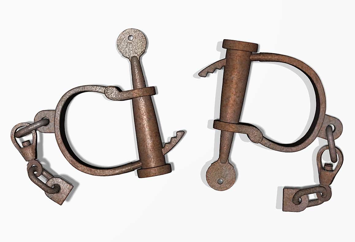
This is the final render of the hand cuffs. I had to do some minor touch up in photohshop. I used a displacement map which caused parts of the model to "bump out" kind of strange around the top of the key. I also did a bit of desaturation and levels adjustment in spots to make it look a bit more realistic. -vern
-
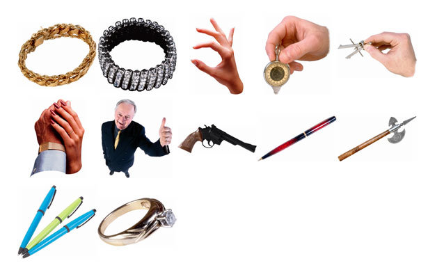
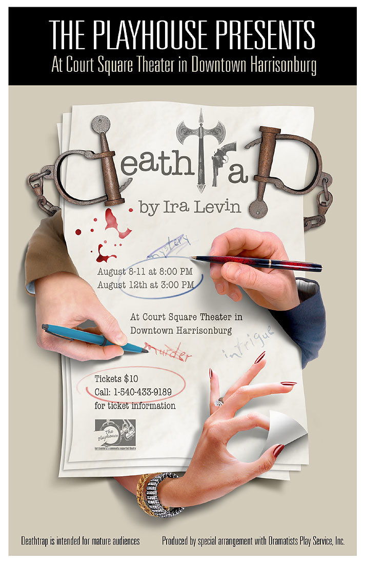
Thanks for all the comments! All the images came from a set of ancient disks from Hemera called Photo Objects Vol. 2. I couldn't even find those images online anywhere. I think they have been destroyed by now... they are very dated. Basically... the hands... not holding pens. I had to put the pens in there. The sleeves are from different images. The sleeves are a bit rough. Just couldn't find anything that matched perfectly and at the same resolution. The woman's hand didn't have finger nail polish or jewelry... I had to add that in from other images. I also had to extend the arm. I love that "Liquefy" filter! Here are the raw images: Martin you are so right! They put these up around Harrisonburg VA... I doubt 1000 people would see it, but they almost ALWAYS sell out all the shows. I keep saying to my brother... "The dang posters are better than the play!" But they are fun to do. I always tell the director that I get to do WHATEVER I WANT NO QUESTIONS... if they want to "art direct" they have to pay me. Whenever I start one of these I do a google search for posters for that play... and then I try to come up with something new... of course not EVERY production has their posters online, but I can usually find about 5 or 6. I like to hope these are unique though. As I think about it... it might not have been 15 hours for the A:M model. I kept stopping to search for a stock photo and work on paying jobs... it was definately in the 6-8 hour range though. Had to paint the rust textures. -vern
-
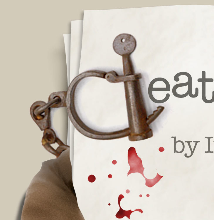
So here's the story... I do these play posters for my brother's community theater down in VA. The latest one is one of my favorites, Deathtrap. So I had originally planned to just do the whole concept for the poster using photoshop and royalty free images from my photo CDs. However during the layout and research stage I totally goofed up. I needed a pair of vintage handcuffs (if you know the play you know why) for the title on the poster. I found the perfect pair... ON THE FREAKING WEB! I used the darn thing through the whole creation all the way to the final and had completely forgotten it was a copyrighted image and I really couldn't legally use it. It was sort of in the back of my head that I needed to replace it but I completely zoned out. I searched for ages on every stock photo site I could find for those exact handcuffs... nothing! NOTHING! Couldn't find the darn things anywhere. If I had time I would have bought a pair of replicas I found for $26 and photographed them myself! The original photo I used was from a catalog of old west stuff. I needed those exact type to create the "letters". Here is a portion of the original photo as I used it in the poster. As you can see it is a bit fuzzy due to the low resolution of the original web image: At the last minute I'm agonizing over it. They need the darn files to get printed... I was torn. I could have risked it but decided against it. I chose to bite the bullet and try to model and render as quickly as possible a pair of antique rusty handcuffs in A:M. Here is the result which in my opinion turned out pretty darn good considering how little time I worked on it... well for me it was a little time, about 15 hours... with some more time I could have gotten the shadows done better in A:M. I chose to "fake" the shadows in Photoshop to save time: A:M to the rescue baby! Yeeehaaa! Here is the final poster. I'm quite pleased with it to be honest. -vern
-
Thanks Stilianos! Takes guts to admit a mistake like that... even if it wasn't entirely yours. You have my sincerest and humble apologies for coming on so strong and being such a smart alec. I hope you get your copy of AM and come here for help in the future. At the very least you won't need installation help with a proper CD. -vern
-
I think we scared him off. I hope I made the correct assumption. If not... I could have made a poor innocent young person very sad. I am torn by these conflicting emotions. What if my assumption was wrong? What if I permanently scarred the physchy of a young mind? I will have to just go with my gut instinct. Was I out of line? It was pretty clear right? I am too sensitive. -vern
-
Sorry David, that would be a "no". On the other hand... I think there were some faulty 2003 disks that had "loose" Data folders. They could become dislodged during shipping and would fall out during use. My Data folder rolled under the fridge and I had to fish it out with a broom. Probably... I'm going out on a limb here... the installed application folder was copied to a CD from someone's HARD DRIVE. A standard installation would not have the Data folder BUT it would have the other folders he mentioned. I could be wrong... but... I keep smelling fish... maybe it's my feet. Oh crap. My Data folder just rolled under the fridge again. -vern
-
You don't have a Data folder on the CD? Seriously? You searched the whole disk? Maybe it fell out. Check under your desk. When you find the Data folder you should be good to go. ... is it just me or does something smell fishy? Sorry. I guess I don't have anything constructive to say either. -vern
-
Yeeehaaa! How many bonus points do a I need for a free cup of coffee? -vern
-
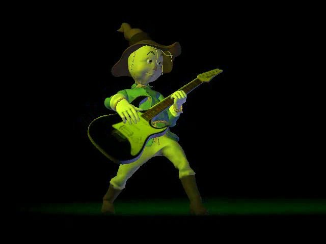
Found it! Like I said, very low quality down and dirty guitar. Just a few patches and a decal. electric_guitar.zip -vern
-
I have a real bare bones model I did a while back for the Scarecrow to play (I was goofing with early versions of the TWO characters and had the scarecrow playing his axe... or was it the Tinman's axe?) It is pretty much just a simple model with a decal. I will track it down and post it for you if you like. -vern
-
I would check what is going on on those frames that "stop". Obviously something in there is causing the problem. Have you tried turning off each model in the chor and rendering to see which one is the problem? Have you tried rendering a single image from that frame? It would be important to know exactly which frame is the issue. Also do you have any other fancy things like materials and a high multipass? Materials are resolution independent, the closer to the camera they get the more processing time to make them look good. Try a plain shaded render (not final) with multi pass at 1 (no anti-aliasing) Try doing a smaller final render with multi pass set to 1 shadows and reflections turned off. Try deleting materials one at a time in a copy of the file to see if that helps. If there are decals try deleting them one at a time and rendering each time. Sometimes a corrupted image when it comes into view causes trouble. Are you rendering to image sequences or to an AVI or MOV file? Try an image sequence instead. -vern
-
I have to check my schedule. Usually I am free for any time, but I have a rare family reunion in July... sometime. We usually only have them every two years lately, but someone in the family is visiting from out west and we scheduled a small reunion on short notice. Plus... one of my cousins won an educational award from Apple computer and will actually MEET Steve Jobs! I have asked her to beg... lie... do what ever it takes... to get me either a laptop or an Apple iPhone. They must have dozens lying around. I bet they hand them out like t-shirts. She already has a top of the line Mac book she got through her school as a teacher... she doesn't need two dammit. I need to be at this reunion to see if my plan was successful. p.s. I told her to tell Steve that I keyed Bill's car once and that I have a "Gates" doll I stick pins in... and I always wear black mock turtle neck shirts and I am also losing my hair and I think it looks great. Also that I am a poor Mennonite with only one leg who spends all my computer money on medicine and food for the needy. I can fake a limp, and I did give 50 cents to that drunk outside the Wawa once. My brother has a brand new Mac mini... uuuurrrrrrggggg.... jealousy... evil. He has had it for a week and it's still in the DAM BOX! After a week I would have reformatted it twice and have 3 gigs of porn on it. Just kidding about the porn. I only mention that as a joke because I've heard that some evil, non-Mennonite people download naughty pictures. There's no porn on my Mac... I keep it on a CD... dang! NO I don't! I don't have porn! I'm kidding! I don't even have pictures of Elisha Cuthbert as my screen saver... it's Stacy Keibler... dagnabbit! NO IT ISN'T! p.s.s. I never got my "secret" entry for the image contest finished. It was too much... too many "details" to work out in such a short time. Next month. -vern
-
It's beautiful! It tells the story perfectly. If they make you redo it they are total idiots. ---------------------------- Years ago when I worked at an advertising agency as a lowly past up artist one of our clients was the local Lottery. We would do these fairly big posters for new scratch off games two or 3 times a year. My boss would intentionally use "bad" designs and awful color schemes so they would appeal to the customer demographic. According to my boss people who buy lottery tickets are simple minded and aren't able to appreciate good design. "Yeah, but... don't you buy lottery tickets?" "Yes I do but that's completely different." "Really? Actually, almost everyone who works here buys lottery tickets." "There are always exceptions to the rules Vern." "I buy lottery tickets. So you think I'm too ignorant to appreciate good design?" "Let's drop it ok?" "Everyone I know who buys tickets is an intelligent professional." "That's just a small percentage of lottery customers." "Ok. If you say so... I think you're wrong though" "DROP IT!" It never did make any sense to me. -vern
-
Well... the "refraction" of the television is really the curvature of the screen. The image is projected onto the powdered surface of the back of the glass. The refraction would only be from the thickness of that glass. I would experiment with this using a simple image decal to see the results. Refraction in AM doesn't always behave exactly the way it would in the "real" world. Even small amounts could produce extreme results. Another key to make it look real is to get the glare and reflection on the surface of the glass OVER the projected tv image. Ironic that new tv's avoid all these problems. Probably been years since you could even buy a "curved" screen with glare issues. My thought would be to decal the back of the glass "thickness" or decal a matching surface exactly behind the glass. If you want exaggerated distortion make the tv screen really curved. I would use thickness on the glass. I did this with plastic doors on my "Wonder Womb" image contest entry. It worked out great. http://www.hash.com/imagecontest/Feb05/04.jpg The plastic doors have refraction and a teeny bit of density which gives it a slightly cloudy look. Plus some specular and a bit of reflection. You might even be able to put a bright light behind the glass to show through the projection decal to create that flickering tv image... depends how real you want it. All of this will probably require raytraced lights to work. -vern
-
Hee hee... I have this image in my head now of a photography studio in the "real world" with something like that. There would be warnings all over the place and everyone on the set would need to wear high powered sun screen and special glasses to avoid 3rd degree burns and going blind. "Put your glasses on everyone! We're rolling in the UberDuberXPCS3 light panel!" -vern
-
Oh wow! If you had done it with red tape and reduced the number of circles you might have gotten some advertising money from the Target stores. I think the original artist/designer made the correct choice. Those other design options looked great but would have taken much longer to accomplish. I really liked the 3 swirl design... but that would have been a nightmare to plot out. -vern
-
So... who got to put on the last piece of tape? Someone always has to put that last piece in. Was there a big ceremony? Did you wear hats? cool... very cool. I... uh... darn it. I can't say why right now but this is very relevant to me at the moment. That's all I'll say. -vern
-
I agree Rodney. Good idea. You can easily remove the lights as well. A second "version" of that technique would be to add the lights in the model and use actions to move them around and key them on and off or change colors etc. The bonus with action lights... you could change the light TYPE very easily... go from a klieg to a bulb by changing the actions... better yet just duplicate the action and change the light/action object shortcut (can you do this in an action like in a chor?). Another problem I've had with lights in the model that action lights would solve is trying to view the model in shaded view in the modeling window. The model lights over ride the "generic" model light making it hard to see what you're doing. I guess it's a trade off as far as effort. Lights added in an action will need to be constrained and may need additional bones in the model. Lights added directly to the model wouldn't need constraints and Since the lights ARE bones in the model not as many bones needed. p.s. The specific problem here was trying to explain one technique while LIGHTBEING was trying to do something else. -vern
-
Look at the PWS (Project Work Space). Expand the model triangle and the bones triangle... There is a "light" bone. It should be a light icon listed as a bone. Drag the light to the parent bone until the parent bone highlights and then let go. The light "bone" will now be indented to the right underneath the parent bone. It is now a child of the parent bone. You may want to review the tutorials and help files again. --------------- Here is what I started to do a long time ago... Create a new project in AM and just... play. There is no goal, no final image to create. Don't create anything serious. Just... play. Add bones... drag the bones around in the PWS... change the hierarchy... rotate and move bones around... create an action and test every single constraint... fiddle and experiment. Add action objects and see what they do and how they react. You would be amazed how much you can learn by doing this. Reading about it can only go so far. It is the hands on experience that locks it in your brain. Look at the help files. If you see something you didn't know... open AM and try it. If you have trouble with something and learn the solution DO IT 10 TIMES IN A ROW! Do it over and over till you could do it with your eyes shut. Especially something you have trouble with. This process would be the same as if you were using AM to do "real" work on many projects or doing a bunch of tutorials over a long period of time... instead you are sort of... focusing and speeding up the memorization process. I use to be frustrated using the mesh flattening feature. So one day I just did it over and over and over... changed the variables till I understood EXACTLY what was going on. Now I can do it with my eyes shut... well.. not quite shut... I can squint my eyes really tight and still do it. I did that with bone constraints... just applied and tested every single constraint (except that... motion capture constraint thingy) By doing this with an "unimportant" project... one that serves no purpose... you aren't concerned with results. You are concerned with seeing how these features work together and what they do. Often during a "real" project when I have trouble I open a simple project to "practice" or learn that one thing that is giving me headaches. Once I get the hang of it I apply that to the real thing. I do this with features I don't understand. I just fiddle and doodle and see what happens. I did this with composite when it was first added, and hair when I just couldn't figure it out. I actually loaded a project and did all the things I suggested to you in this thread. I tested all those things so I knew what was going on. Don't worry... you can't break anything. p.s. I still need to fiddle with composite some more. -vern
-
If I rub my magic lamp could I wish for a light? Seems appropriate. Thanks Rodney! You are a wealth of information. -vern


