JavierP
-
Posts
191 -
Joined
-
Last visited
Content Type
Profiles
Forums
Events
Everything posted by JavierP
-
Well I'm up late, so I decided to post this image. A while back I had posted a wip related to this image that looked like dark beer. I think I worked out some of the issues though Enjoy Image info: 6 separate objects Mostly procedural (except for text decal) using native combiners blobby emitter for water droplets and bubbles 3 lights( with NO shadows!) Javier
-
What does your alpha channel look like? I have a feeling that is what your problem is. Can you oost a pic of just the alpha? Javier
-
Hi Pengy, Just a couple quick suggestions before you move on to the other model; did you decal the labe directly onto the bottle? IF you did, then that is why it is becoming transparent in the render. After all it is an image applied to an already transparent model. To fix your problem, all you have to do is make some new patches and place them where the label would be and apply the decal to the new group with no transparency. The alpha channel will make sure that the label will be the right shape, and it will be opaque like a real label. My second suggestion would be to get rid of that 'default' lighting. Even if it is just one kleig shining on the bottle it would be a good start. Complex lighting always starts with one light, and grows one light at a time . Hope this helps. Javier
-
Hi Pengy, I recieved your message, but I decided to reply here so that anyone else that is interested can read the answer also. You asked if the liquor image I made used AM native materials. Actually, all the surfaces in that image are procedural, with the exception of the text on the label. The text is just an image with an alpha channel. It is important to note that at least 85% of the effect in that image is due to the lighting setup. For example I think that I had at least 4 lights shining on the liquid itself, controlled by light lists. I think that there are about 16 or so lights in the whole choreography altogether, with many lists. Intensities range from anywhere between 1500 and 10 depending on what I was using it for. It is really difficult to give you a short answer to your question, without writing a comprehensive tutorial, and unfortunately I don't have the time to do that. However, if you have any specific questions feel free to ask. Javier
-
Alright, Here's the first (hopefully of many) pics. This is a couple hours in, begining with the face. Javier

-
Hi Rodney, I haven't done much either, I did start on the face, but I'm not far enough along to show anything yet. I think by tomorrow I'll post a pic. Are you planning to make a tutorial book/let based on this little experiment? Javier
-
That's pretty good work! The only thing that doesn't seem to 'fit' is that initial gesture when he says "no one would have known". I tried to act that out myself and it felt very un-natural. Somehow having the hands outstretched like that doesn't convey the feeling I'm getting from the words. Also, I think that the way he brings his hands down after the gesture, then brings one back up a little later for another gesture, adds to the 'awkwardness'. Perhaps you could do some more with his fingers to strengthen the poses; you know have them contort in a sinister fashion or something. In any event, it is very good after only a few passes. Javier
-
Hi, Your film is very impressive. I'd like to know more about how you made it, as I'm sure all the other users would. Could you elaborate on some technical info? For example: What were some of the hardest shots to make and how did you solve the problems you encountered? Also, did any AM specific features come in extra handy, and what features would you have liked to have if you could do it again now? Thanks, keep up the good work! Javier
-
Here is a shot of the drawing before color. It starts with a pencil drawing, then I "ink" it digitally (using a tablet). I usually prefer to use real ink, but this is faster. The new cleaned up lines are done on a new trasparent layer. Then I just fill in the colors on a layer below. I color the lines to 'soften' the forms. You can see my palette laid out in the image (on a separate layer, of course). That's about it, I usually do this kind of stuff pretty quickly so it's a pretty simple process. Javier
-
Have to admit your gauntlet/rapier surprised me! I just returned from imagining the various possibilities and I like what I saw... It would certainly fits the character! The juxtaposition of hard metal versus soft skin and smooth curves is turning out nicer than I could ever have imagined. The other day I did a mental test of what I thought she might look like swinging a sword and how the swinging of (Keith Fay's) sword might flow and what the setup might be to achieve sword arcs in a choreography... a fun exercise! The stuff I came up with would probably work best with two heavy swords one in each hand though... The kind of sword she would select will say a lot about her character. In this capacity I REALLY like what the rapier says about her! The gauntlet/rapier adds a whole new layer of possibilities and opportunities for finese for a character that, as originally concieved, probably couldn't ever have. I say go with the rapier! The other sword(s) can go in the package with the action figure too. Bravo, Javier! I'm glad you like it Rodney. I wasn't sure if you would, since it seemed that you wanted to go for more of a samurai type sword. I'm gonna try to get something done on the model this week, but I can't guarantee it. As I mentioned before, work is a little rough right now( in fact I should actually be doing that right now! Javier
-
Thanks for the comments guys. Since you asked, here is another concept. This is an idea for a sword. It's sort of a combination gauntlet/rapier. Work is really eating into my modelling time, so it'll be a little while longer before I can post a model. Javier
-
Your problem is pretty simple. This has to do with the material shortcut scale/translate/rotate values. In this case it looks like you need to rotate the material + or - 90 degrees on the X axis. What you're getting in the render is the stretching of edge pixels. I say + or - because I'm not sure which direction will orient the map correctly based on your settings. Hope this helps. Javier
-
Alright! Alright! Keep your shirt on! A model will be posted soon. Javier
-
Aww-right, here's a cleaned-up color version. This is based on the red scheme you introduced. Of course others can be developed. Javier
-
Bjorn, She's was originally designed to have the ability of flight via her boots. If you check out the following link I think you have my "official" answer: Javiers rocket power demo! I can't speak for Javier... but my fingers are crossed... Wow, and I was planning to convince you to make them into rocket boots too! Javier
-
Ohh, you have AM 7.x . Your problem is due to the way AM handles projection maps. After you apply the mat to the model, you have to fiddle with the material shortcut offsets and scale to make the map 'fit' the model. the mat always sets the default map axis at 0,0,0. SO... to make it fit your model group: simply select the group and look at the properties panel. Take a note of the pivot location. This is the center of the group. Type in the offset in the mat shortcut panel. You might have to adjust this a little for odd shaped groups Now that the map is correctly positioned, you have to change the scale, either with the shortcut properties, or within the projection mat itself ( this only works for planar and cylindrical). I think after you do this, your problem will go away. Practice on a sphere in another project to get the hang of it. Hope this helps. Javier
-
Ok, here's the pic. By the way you will have to convert the extruded arm cps to 'smooth'. Simply select them and press the 'o' key. Javier
-
Hi Rodney, Here's my current version of Cybergirl. This is what I'm going to start working from. Let me know if you want to make any changes. I know I left out the mic going to her earpiece. Now that I look at it; I should have cleaned it up a bit ....mmmm smudgy Javier
-
Thanks Rodney. Now I think I know what you're going for joint-wise. I'll post an update soon. Zach: Thanks. The real work hasn't even started yet Javier
-
Rodney, Ok, here's what I have so far: Joints still need to be resolved but I don't know what you want to do about them. Javier
-
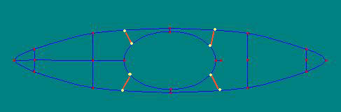
You're getting creasing because you are stretching the 5 point patch too much. AM likes the 5 pointers to stay more or less regular and symetrical. Using them seems like your only option in this situation. However, the solution is easy. Take a look at the attached example. Hope this helps. Javier
-
Hi Rodney, Seems like you're up as well . Here's an interpretation of her. What do you think? Are you going to toon render her or not? That may affect how I build her. Javier
-
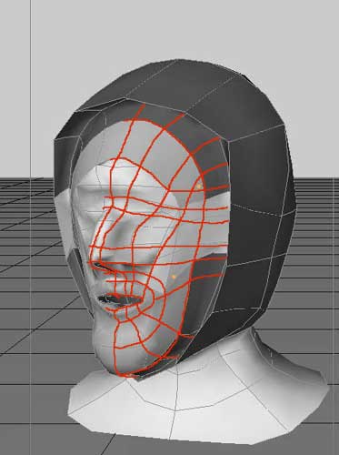
Calm down. No need for the red type. I am simply tring to point out that you need to be more specific about your problems to get some help. I am not trying to attack you personally. Nor am I tring to censor your opinions. This is just a message board for some 3D software, no need to take stuff so personally . Now, since you posted wireframe, some real advice can be offered. I can see the reason why you are having problems with creasing in your model. Your problems stem from the way you are connecting spines. AM needs the surfaces to be composed of regularly spaced and sized patches for a smooth surface. If you try to make the mesh as 'grid-like' as possible you will get better results. 'Grid-like' means: to have only two splines running through each control point. You are right, that AM's modeller is not the most intuitive, and it does require some pre-planning to do create good models. Here is a solution for your particular model. It contains a three point patch and a five point patch. These are patch types used for transitions from 'grid' to 'grid'. My solution solves the suface artifact problems, but if you wanted to animate the model you would need to add a little more detail (for eyes, etc.) I honestly hope this helps you. Javier
-
Many of your posts seem to have the same tone. You seem to be whining, or complaining about something. It is true that modelling in AM is not easy, I had to learn to do it as well. However, your image demonstrates critical flaws in your understanding of form in general. This has nothing to do with AM at all. I would suggest studying sculpture of some kind ( even if it is very basic, and of simple objects). If you provide some more information in the form of wireframes, I would be able to offer suggestions for improving your surfacing problems. I do not mean to sound harsh, but it would be easier to help you if your attitude was different. If you approached the list with a little more patience and a willingness to learn and adapt your approach, perhaps you would get the results you are after. I hopes this helps you. Javier
-
Thanks. You know, there really isn't a secret per se. The only advice I can offer you is: to pay attention to those things (ie. lighting, reflections, and colors ) as well as shape, texture, motion etc. If you make a deliberate effort to control the quality of these elements, you will invarialbly end up with a successful image/animation. An example that comes to mind is: all too often I see people making renders using the color chips provided by default in AM. I ALWAYS spend my time creating custom colors to find the exact value and color I need for my images, and I NEVER EVER use 'default' lighting. You should ALWAYS spend time choosing colors and a lighting setup that will complement your particular model, and one setup is never going to satisfy this requirement for all models. Another way to sum it up would be to say, never settle for what is given to you by default, strive to make the images your own, and the rest will follow. Javier