-
Posts
757 -
Joined
-
Last visited
-
Days Won
3
Content Type
Profiles
Forums
Events
Everything posted by gazzamataz
-
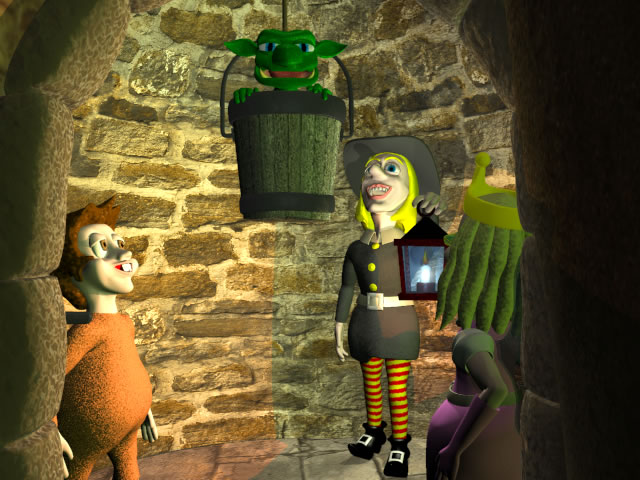
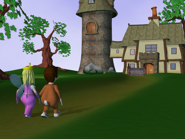
Yippee!!! I have finally finished the second story for 'Bella Bear' and I am over the moon! So I thought I would post another teaser for anyone who is interested. My next stage is to either get on with the final story, or just take some scenes from the previous two and breath life into the characters by animating those scenes. What do you guys think?
-
This is uncanny… I was always goona get around to modeling how I imagined gollum in my head before LOTR came out and this is exactly how I imagined him. Although, I wouldn't have given him the musculature and made his feet bigger with highly unmanicured nails Anyway I look forward to seeing how this model develops Ectohippy - looking good! P.S. Guess I won't have to model my version of Gollum after all
-
Crikey! It looks just like Sutton where I work... Mind you I would like one of those flying machines it would make traveling there much quicker LOL. Apart from that it's a lovely peice of work. You must have patience of a saint. Are you gonna animate it?
-
Greasy more like! I do eat them sober too... always feel I've eaten a tub of lard afterwards... Have you slipped a slightly newer version in since I last looked? This one has the changes in I was gonna suggest It's a lovely peice of work, thing is you could do variations to it like a space picture in the background, a martian watching etc... and it could go on. Funny that you have that spaceship in woking, we have a painting of one in Bromley High Street where Jules Vern was born - I'll photograph it next time I'm there I must admit watching your piece several times has inspired me to get me finger out on me own project. I just realised that you didn't sneak a newer version in 'J' was the latest - I must have eaten too many kebabs - 'BURP' - or was it something I drank…
-
LOL a man after my own heart! What a traditional English evening dish - a Doner Kebab
-
Oh no not another Londoner! I thought with a name like Parlo you'd be from Los Angeles or Mexico. Who would have believed…
-
Parlo TER-RIF-FICK!!! Yeah, you guessed it - I like it I love the character - he is quite refreshing and quite the opposite of the fluffy characters that Pixar knocks out. What a great dialogue to choose to - this guy is sinister but not too scary - if you know what I mean (like an adams family character). One crit I have is when he says 'no one could have dreamed...' you have him looking over to his left. Then when he starts the dialogue his eyes go to camera. I would have his eyes go to the camera first then he starts the dialogue (but hey! what do I know…) Also, at the start when his eyes flick to the camera they move quite quickly, perhaps if they were a tad slower. It might convey his unique character a bit more which I can see developing quite nicely. Are you gonna do the whole intro? Perhaps a martian creeping in behind him as he is narrating would give it an amusing slant
-
Graham mate! I just watched your flick and it's getting there (not that i am an expert at all). First off as far as the walk cycle is concerned his legs move fine but his abdomen and thorax need to move up and down a little - he's too stiff. He also covers the ground a bit fast IMHO. I know what it's like animating a creatre with more than two legs - I did a spider and that's got SIX! Also as he is walking towards the camera get his head to point at it. Perhaps, at the start have him kinda looking around and at the ground then noticing the camera, acknowledging it and heading towards it. You could make the mouth bigger and add eyebrows, but then it could look too cartoony, it might be better to give him more of a beatles mouth some nice mandibles, colour the inside of it to give it depth and make you look at it more. Perhaps make his head move tinty amounts whilst he is talking too. One final touch when he does get to the camera and rears up make his middle legs prop his thorax come up higher than the back ones so he stands up more to get more attention drawn to him. I like the antennae they really do look like a real insect. Well, that's my tuppence 'appeny
-
Well, I having been plodding on this St George's Day in the lovely English weather (it does happen) and I thought I would post another teaser for you to ponder
-
LOL! Would you Adam & Eve it looks like I'll be this working Friday but now I have a disgusting cold... someone up there don't want me to get on
-
Dalemation Forgive me for not replying sooner I feel a bit clapped out at the moment, the four-day week went out of the window last week cos I had to go in on my day off and work on a mad rush project - typical clients! Anyway, I just wanted to say thanks for the kind comments you made and I do have the book you suggested, but I ain't read it yet! I have done a few more frames on me project but I will have alot more done THIS Friday - I will most definately NOT be working no matter how IMPORTANT it is, my project is FAR MORE IMPORTANT!!! Did I sound grunty? Well I must be GRUNTY BEAR! Wait till I get to GROWLY BEAR!!! Oh god this projects going to my head... anyway sneek peak at another character who will appear in the next episode.
-
Gee fanx Guys. I must admit I am buzzin' with this project at the moment. i just keep thinking up stories and ideas but I ain't got the technical ability to pull them off - yet At the moment I am concentrating on producing a stroyboard lke the last story, but once that is done I will go back and add more detail, texture and my worst ability - lighting. Then, maybe, I will animate a little section... that will be fun! Now I only work four days a week (Hooray) I will have more time to craft me project - YUMMIE Thanks again chaps
-
Oh I am so pleased! I have finally refurbished my office and got back into my pet project and got the first frame done. So couldn't resist sharing it with you all. Unleash you comments please…
-
Nice Work! I like it quite errie. I love the murky background showing a the vague outline of the wrecks timbers. I have a couple of points though 1. Get rid off the shadows on the seatubes, being a diver and at this depth you don't really get shadows - well not as crisp as this anyway. More like dark areas. 2. Make the timbers look rotten and covered in algae, dead-men's fingers and stuff. If a ship has been down there long enough to get rotted to it's frames then sure as eggs are eggs this will be half rotten too. Looking forward to your progress - keep it up!
-
Grubber nice model! BUT!!! Wait for it... go... are you intending to animate this little puppy? Cos I think you might have some no-so-good deformations around the joints on the limbs - add some more geometry. If you don't believe me then just put some bones in for one of the legs and then drop it in an action and wiggle it about then you'll see what I mean. This is one of the things I love about spline modeling you can achieve great looking models and in less time than farting about with polygons - in the hands of a good modeler of course
-
Oh yes! Sharks in particular have a fantasti sense of smell especially for blood... you knew that already though didn't you. In which case I must stink! Cos when I go diving I always find the fish following me... no sharks though, well not many in the English Channel that I have seen anyway Anyway, I don't think it is Vern who needs the therapy... IT'S THE REST OF US - WIBBLE %^&&**(%^%^&$$£%*(!!!
-
Sean Wot? Are you talking about the bones for the wings or the actual fronds which you have modeled from which the wing skin hangs? Anyway could we have the picture again but lighter - can't see too much
-
Not that I am an expert, but it's looks as though your mesh is a little spline heavy... It might be an idea to try and reduce the number of splines and still keep the shape - its good to practice this anyway. I would also suggest that for a turtles head, it is a little too narrow. Try widening the head and giving him more of a beak - that's if you want to. The thing about 3D is you can create what you want to, and it doesn't have to bare any resemblance to what it is supposed to if you don't want it to... What did I just say ? Keep up the good work anyway
-
I take it back... you were gonna do that anyway - you sly old devil! I fink it looks bloody marvelous! I would love to see you making a texturing video for Hash, it would be on the top of my 'to get' list
-
It's a lovely model Javier - nicely balanced and styled. But please, what the friggin hell is it?
-
Yes! - I is now . I immediately got on to Steve after seeing this phenomenon and he made me a fellow, not quite sure what to do with this title or if I am exactly worthy but it does have a certain feel good factor LOL ... I have been working on this project on and off the since summer 2001, intially creating the characters and then working on the sets and stories. I feel bad since I should have much more to show for it, but I have been side-tracked with other software, computer games, SCUBA, learning 3D, LIFE and stuff. I didn't really get into creating the first story until the end of 2002. I am hoping to get the next stroyboard out before the end of March. After that I will either work on the next story or set about improving the texturing/lighting of the existing ones or animating parts of the existing stories or all of em if I win the lottery and can give the day job up Either way I intend on being more disciplined
-
Lovely Jubbely Jim! My only criticsm on this peice is that his skin does look a little plastic... perhaps a bump map or two showing pores and wrinkles would give it a bit more depth. Anyway the render is lovely and I gotta learn to do this meself. I am looking forward to some of your animations. I kinda did Hash around the other way, I learnt rigging and animation first and now I am learning more about texturing, mapping and lighting
-
Hmmm, I thought you might say that This means I got my work cut out now painting everything since I want a cartoonist feel... Mind you at the moment I am more interested in getting the storyboard finished then going back to texture more thoroughly. BTW Jim how does one become a Hash Fellow? Is it only for those who have won the image or animation contest?
-
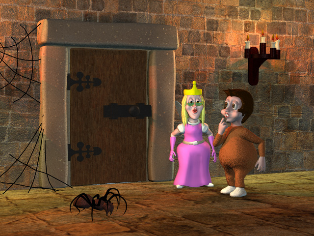
Well, (no pun intended) this is another scene from my next Bella Bear story that I am currently making a pig's ear of texturing. I am pleased with the candlesticks (need some smoke) but I am in a bit of a dialemma. Should I used real-life photos (the walls) in conjuction with shaders and painted textures, or not use real-life imagery and generate it all by my own fair hand? In this scene the stairs and doorframe are the wrong colours - they need to match the wall, which need the tiling removed. But you're thoughts fellow Hashers please
-
Nice! They look like seahorses from hell - they could even put me off diving Mind you it looks like they have lost there teef Looking forward to them in their enviroment under the waves. I am thinking of another underwater story for my characters so I might buy them off or you


