CRToonMike
-
Posts
205 -
Joined
-
Last visited
Content Type
Profiles
Forums
Events
Everything posted by CRToonMike
-
Nice exercise, Muff. As far as distributing it goes, I feel that any "mod" falls under the 'derivative' work clause in the DMCA; and because of that it's still copyright infringement, imho. Although I'm not a lawyer, my attitude is when there's some question, don't do it. To my eyes, it looks like this figure is based on the Aiko Model from DAZ3D. While you (as an individual) can mod something you purchased (again, if the licensing agreement allows) and use it in a animation/still. But as far as distributing a derivative work, you'll have to get permission from the owners of the model/object. As you wrote, it takes as much time to modify an OBJ as it does to create a new model in A:M; I would just create a series of drawings to use as rotoscopes in A:M and make a model from those. And since that model will be based on your orginals, you can do with it what you please. I don't mean to shoot down your good intentions, but I don't want to see anybody get into (possible) trouble. Again, I am just an artist who has studied copyrights and am not a lawyer, so if I'm offbase, I apolgize in advance.
-
It does help a lot, thanks again David. I did alter the Y and Z axis for the bones, thank goodness I have a version saved before I did that.
-
David, thanks a million for this rig. I've watched your video tutorials more than the TIVOed Hero episodes, and it's a bit intimidating, but not impossible. Any way, I noticed that in the videos the figure is posed in a straight "T" pose. If legs on the model are spread (inverted "V") and the arms lowered -- will that affect how the rig works? I'm using the rotate/translate/scale manipulators as per your instructions and adjusting them for the additional angle of the legs/arms. Just wondering if my modeling a "semi-relaxed" figure rather than the arms out at attention figure would be problematic. Or am I just over-thinking stuff... thanks.
-
Crazy Water -- WIP evolution
CRToonMike replied to CRToonMike's topic in Work In Progress / Sweatbox
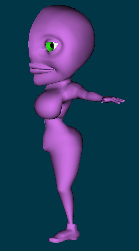
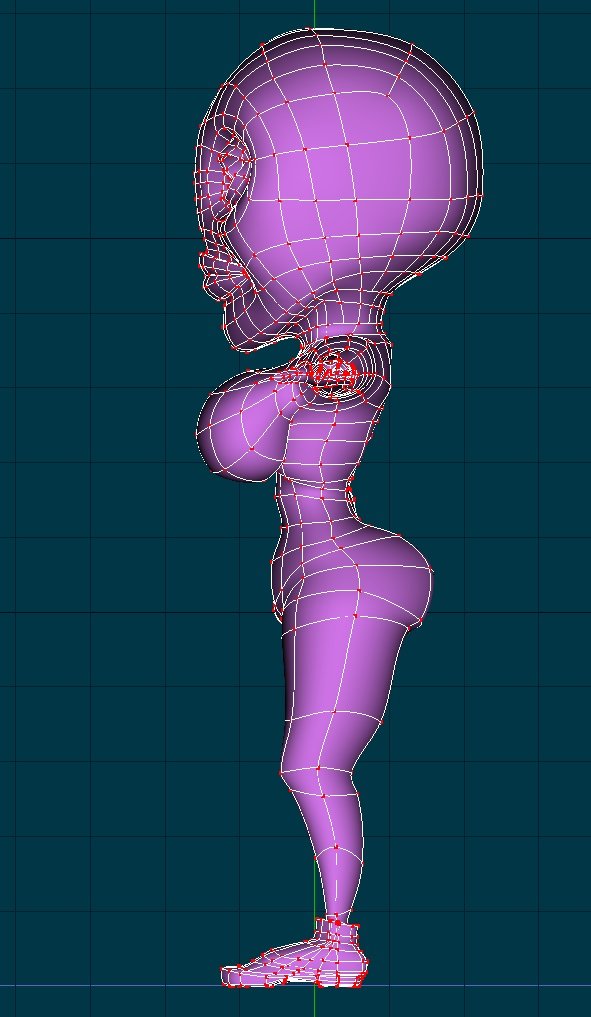
Yeah, Dhar, one Terrabyte. Back in the day 40 mb hard drive and 4Mb Ram was awesome. Times change. Anyway, been using A:M 13 universal binary on my new Intel Macintosh and it screams. Very stable. Neat version. So I've been modeling and getting back into the A:M flow of things. First off, the joints set-up tute by 3D Artz is worth every penny I paid for it. The best part about the tute is that the entire use of a mesh is concidered. It's helped me be a better modeler in A:M and (hopefully) make things nice when I rig the characters. Here's a set of 5 screen captures of the Nophia Character. Just the basic body and eye (looks too goulish w/o the peeper, y'know) for 1/2 of the figure (will cfa when I'm happy with the mesh). If anyone wants to, tear apart the mesh. I intend these characters to be animated, so critique with that in mind. If the mesh is too messed up, go ahead and tell me, I want to be a good modeler with A:M and if re-doing makes me better, so be it. The screen captures are a bit large, but that's so the details can be captured. If there's any thing else I can post (like close ups of areas) let me know, I'll have it up asap. Thanks everyone, for taking the time to look at this. m!ke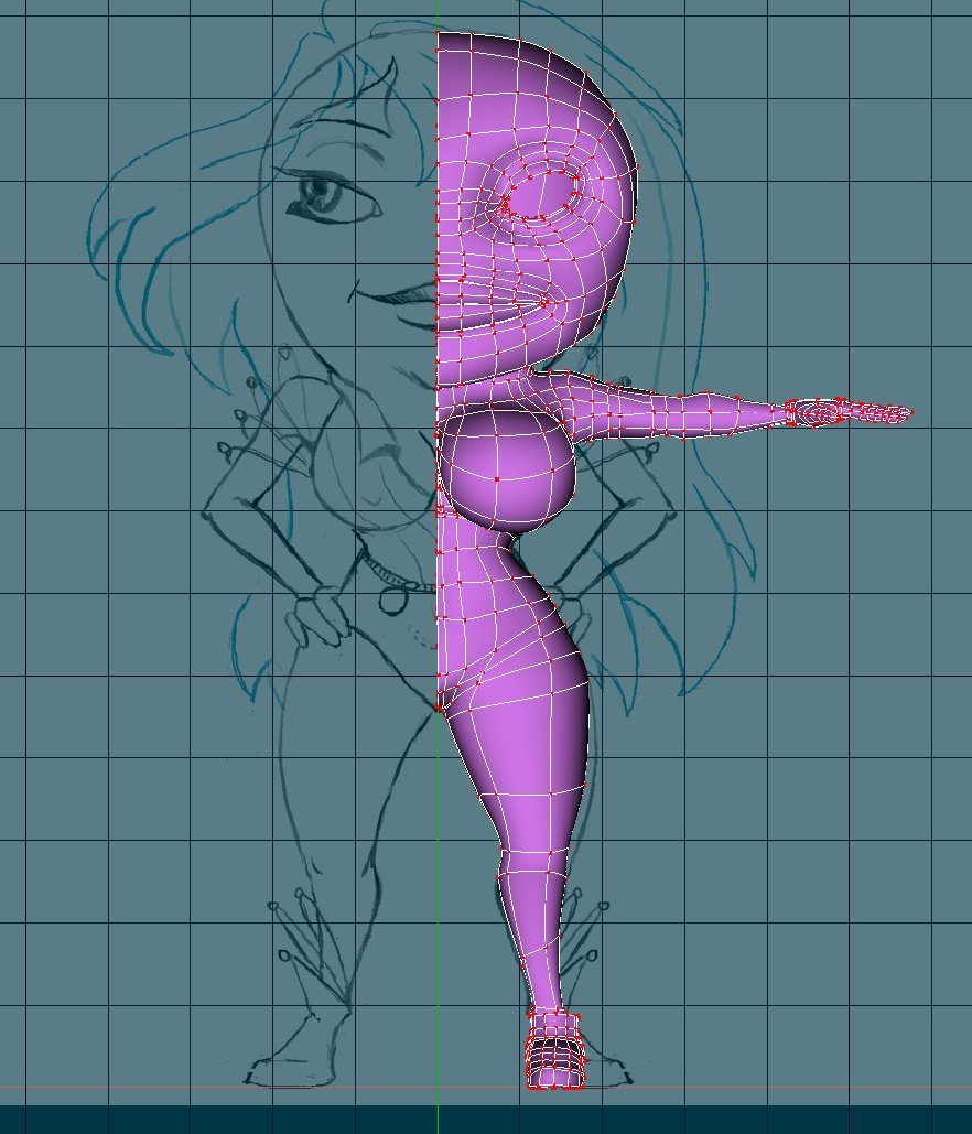


-
The Premiere of Dhar's first short.
CRToonMike replied to Dhar's topic in Work In Progress / Sweatbox
Great Movie, Dhar! I am simply bowled over. Great angles, cutting and wonderful use of the shagster! -
Cool characters. A couple of comments... On the green guy, it llooks as if he could use a few more rings around the mouth area. There's some pinching going on that could look better with more cps. On the Stop guy, maybe the shape and color will be enough to convey he's a personification of a sign. By dropping the text, you gain the ability to do eyes and maybe even make this series more "global" with no english titles? And it would help to keep some aspects of the characters simular, so they all look like they belong together. m!ke
-
What a cool character. The hat and shoes are what really makes it very cool. Would be great to see how this character emotes and acts. Great work!
-
Great work Rusty! I get a real good "hard" sci-fi vibe from the ship. It's a ship that Heinlein would feel at home on. I also get a slight feeling of the battleships from Babylon 5, but your ship is it's own thing. What a beast. Looking forward to seeing how this evolves! m!ke
-
Crazy Water -- WIP evolution
CRToonMike replied to CRToonMike's topic in Work In Progress / Sweatbox
Been way too busy, have to get a table of contents out for the book I'm writing and some school projects. But... I'll be getting one of them there Mac Pro towers on Monday (3Ghz, ATI 9100xt whatever card, 1Tb of HD space, yadda yadda). So I think that next weekend will be a time of a bit of work. Thanks for the comments everyone! -
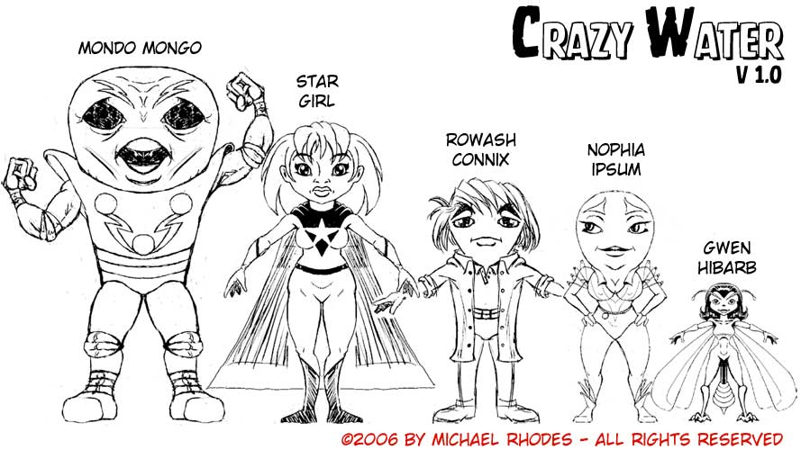
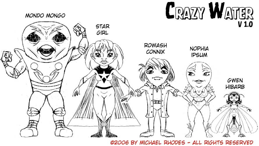
Hi all! This thread will, hopefully, document the development of my series that I've been working on for years and years. I've been drawing these grape characters most of my life and I had a storyline that I tried on many occasions to draw/model and animate. As hard as I tried, nothing really "clicked" with me. Until two weeks ago. I was sketching a grape character and suddenly had a Breakthrough moment when I adjusted the porportions of the generic grape person and had a drawing that clicked with me. And then I had a rush of inspiration of the world that these characters live in and its history.It was as if all these ideas were just under the surface and waiting for the breakthrough character sketch to come forth. It's often said that when designing a character, the artist should know the character's history and personality. When that happens the character becomes real. That's just what happened to me with this latest incarnations of this world and its characters. Attatched to this post is a character line-up where some of the major players are shown in context with each other. I'll be developing the individual character sheets in the days to come. I'm working on concept design and the storyboards/script for the first installment and will post progress as it happens. In this thread I'll be sharing the visual development and modeling/rigging/animation of this series. I welcome any and all suggestions, comments and especially criticism. I hope that by maintaining this thread, it'll give me motivation to make consistent progress with this project. One last thing, the character Nophia does have hair. I just haven't decided on a style yet. This drawing (and other 2-D drawings/sketches) was created Manga Studio 3.0 from E-frontier ( the peeps who bring us Poser). This is a comic creation software that I've found to be not only easy to use, but works excellently for character design and concept art. thanks for reading and don't hesitate to comment, Mike
-
Great rig, David! Thank-you for all your hard work!! Just a heads-up, I was told by tech support that the "installRig.hxt" Works only for A:M 2006 (v.13), not with any earlier version. On my set-up (Mac os X 10.3.9) running A:M v12 I get the "not able to install..." error msg. So maybe the hxt file could be dropped for the v12 squetchy rig. mike
-
Actually I live in Walnut Creek, but still tour neighbor. Good to be back
-
Hi everyone, My Name's Mike Rhodes and I am yet another "re-animator", meaning I'm back to using A:M by choice. I was using Carrara, but it seems like it's going to be forever before they get some decent character animation tools and I don't like it that it was bought and what the new owners did (and that's an entire topic by itself). 'nuff said. I have to say that Martin's comments, on another thread, not to give up on A:M struck a chord with me. I will hold Martin personally responsible for all the fun I'll be having! All the agony is obviously an user error and doesn't count I'll be going through TAoAM, already up to excercise 4. This book is a great way to refresh one's memory of this awesome program. The shiny new certificate will look oh-so-nice next to my Plaque I got from Trinity college for a BA in Graphic Design ; and the best part of that worthless plaque, is that my former boss paid for it. So it's worth exactly what I paid for it, iykwim -- diploma mill. I'm a cartoonist and currently enrolled in a BA program of Animation and Visual Effects at Ex'pression College for Digital Arts, just an incredibly short distance from the Pixar campus Good to be back! m!ke
-
Inspirational work, Mr. Sutton! Beyond the economy of spline, you really captured a character in the modeling. Hats off to ya, buddy! There's art in dem dare CPs! And in a eerie coincidence, today Faye Wray died. Cue twilight zone music "It was beauty that killed the beast." Faye Wray's obit in CNN.Com
-
Oh, I see it now. It's like how officer rank goes in the Air Force: gold bar: luientant, silver bar: first louie, two silverbars: captian, gold maple leaf: major, silver maple leaf: lt. Colonel, silver eagle: Colonel, stars: general... and so on... Think you have a good solution to this in the way you're doing it. I would only up the contrast between the ranking colors. But that's a quibble. Now get off this forum and get to work mister I wanna see more!
-
Great characters. I really like how different each are from the other. It'll be very interesting when you have an enviroment to drop them into. If the crew's ship is any indication, it should be fun. The expressions of the green guy are very nice, should be able to get some good acting from the character. I like the colors of the uniforms, could lend itself to some pretty neat visuals. Such as in a dark, very dark place, you could use the 'typical' eyeball white (like in comics and 2d 'toons) and add the white of the uniforms to this fx and have a totally black scene with only the whites of the eye(s) and the white of the uniform visible. This could be a good back-ground info, as the whites of the uniforms would make it easier to pick out the crew in the blackness of space if an accident happens. Too bad the acronymn (or OrangeWorld Legion) for the crew is "OL" instead of "OWL" -- that could add a bit of word-play and visuals that OL just doesn't have for moi. IMHO, having a symbol for them makes it seem a bit 'super-hero-ish." Some kind of graphic logo would serve the job better. Or if you look at military dress uniforms, the actual branches of the services distinquish themselves apart by the overall look of the whole uniform. If done right, you can have a look for the uniforms and give some visual indicators of the crew's status (rank) and job by tweaking the uniforms a titch. I feel that little things like this may not be overtly noticed by viewers, but add to a sense of 'realism' when the overall scene/series is taken as a whole. And you could take the visual look of the uniforms and extend it to the way the ships/interiors and such look. This could be really good if there's some kinda dog fight in space. Good luck with this project, I'll be looking forward to seeing how it develops.
-
Brilliant work Parlo! I'm also exaimining the Raf face rigging thread and came up with pretty much the same conclusions as you did. Only thing I added was to make the rough mouth shapes (upper lip up-down, lower lip up-down, et al.) from Osipa's "Stop Staring" book as poses and, maybe, use nested relationships to do a Blair set of poses. One implied thing about your interpetation of the rigging is that the movement of splines keeps the volume of the mass consistent. That is, it looks like skin/muscle moving over bone. Great job there! Good acting from the model and the expressions are just spot-on for what he's saying and it gives him an individual character.
-
Nice work there, John! I really like the acting the character's doing. And the voice ain't too shabby. But can he walk and talk at the same time?
-
Sharky: Glad I could be of some help. Attatched to this message is a Sorenson 3 quicktime movie of what I've been able to get to work thus far. The character isn't saying anything specific, it's just a test to move the lips and jaw around and to get a feel for Danise's "animated" character. And just for the record, it's not "my" system -- Raf created it and I'm just pounding pixels trying to recreate it... so thank Raf for what he shared with our community, I'm just the typist. danise_synch_test.mov
-
Way cool Brandon! Think you got a winner!!
-
Here's a link to a facial/lipsych rig description thread: Raf's new face rig read it and then come back here, else what's being described won't make much sense. It gave me a brain-ache trying to understand it, but then had a breakthough, it's just a fanbone constraint-system like sonofpat tutorials. Making a lipsynch is no trivial matter, as I'm finding out. This is where all the talk of "modeling for animation" really hits home. On your model, make sure you have several spline-rings around the mouth (including the lips). Ditto for the eyes. Having the splines echo the acutal muscles under the skin helps. I've spent about 12 hours just getting my character to open her mouth and do a half-smile. Take a mirror (as every animator pro or hobbist should have) and look at your face as you talk and make expressions. Pick out how there's some constantly simular things. When you create poses/muscle modes, keep it simple. In other words, if the cheeks get puffed out when smiling with the mouth open and closed, make a cheek-puff slider and use it in conjunction with the open and closed smile pose. You can have a practially limitless amount of pose sliders for relationships. So, for the open close mouth, I just move the jaw down (a bit more than I think I'll need) and then add constraints to the various bones along the radial splines coming out of the mouth and intersecting the circle splines around the mouth. There's about 28 bones for the mouth on my model. What you could try and do, is to figure out how to make your mouth open and close.Make a pose slider (relationship) of that and the following... Go wide and narrow (smile to pursed lips), make an "ahh" and a "ohh" shape (open and either wide or narrow). have the upper and lower lip go up and down (with no jaw movement, just lip movement). Now by adjusting these sliders in various values you should be able to come up with postions that represent sounds for your character(s). I created a circle that I squished down to a flat line in a pose, made it larger and smaller (also in a pose) and a wide to narrow pose. Using just those three sliders, I was able to animate a simple mouth to say words and it passed muster on the spousal unit. Also keep in mind that if you come close, usually people will "fill in the blanks." This is really a haphazard kinda post, sorry about that, but I'm also learning this and the Jason Osipa book is a big help for understanding what needs to happen, but it's for m*y* and not A:M and it's difficult for me to figure out how to do the things he mentions in A:M. But thanks to the Raf thread (above) I think it can be done and I'm going for doing as little muscle mode-ing as possible (if at all). I really hopes this helps, When I finish rigging up my character, I'll post something, maybe work up a "how I did it" kinda webpage. Dunno, depends on time and such. Good luck Sharky!
-
Agree with Justin here, Mike. The head is too small and the neck needs to be a bit longer. Keep in mind that the scarf was prob. added to the tiger in order to make animation easier ( the old why does Yogi Bear wear a collar and necktie thing). The tail looks much better and the pose is nice. The head is still reading as a punching-bag kinda thing for me. But that's not enough to ruin it for me, though. But it has gotten me thinking about the 'cheats' that 2D animators have done in the past. Espescially with the mouth. A lot of the time, it's easier to just do a head shape and then have the mouth be within by it. So now the tweener only has to do different mouths, instead of the whole side and jaw of the head. Like filmation of the 70's - the Superfriends jaws don't move. But that's all changed in 3D, ain't it? While decaling like you've done is a good solution, it does engender some form of visual dissonance. For me the only answer would be to just go ahead and model the face...but that's so easy to say. It's your work and your decision, just thought I'd wonder out loud a bit. It's really taking shape and looking better every time you post something new.
-
In his "SAYhed" tutorial, Young mentions that having an ear being a part of the 'body' mesh is a good way to get rid of excess splines because the ear is a junction where there are creases and such already, so splines can be hooked there. And the ear has so much detail, usually you'll use most of the splines that end up there. And he's totally right. I think that any advantage/disadvantage of having a ear be part of the body mesh is going to be dependent on what you want the model to do. If the character is bald (or folically[sp] impaired), I would think that having the ears be a part of the model would work best.
-
Nice job! I really like how the head bows down toward the end.
-
Nice face! What I discovered when I first started using A:M to model (and I'm not a pro yet) is that the more I model with it, the better I understand how splines work as a 'group.' There's a bunch of tutes on the ARM (in the modeling head and body section) that I found helpful. There's the SAY head, that you can d/l a project and see how Young did the head. The best thing about that tute is using the "wrinkles" that happen for you. I found that by hitting a CP and then the comma key allows me to see the whole spline and how it is placed and connected. With the models that I felt was going to be trashed, I kept working with them and learned how to delete a spline in a few steps (select a CP on the splne you want to get rid of, hit the comma to select the entire spline, then the period to 'reverse' [complement] the selection twice. The first comeplement will invert the selection, the second re-selects the orginal spline -- my mind uses the paradigm that the second time selects the spline's CP's in "both directions." Then you can hit the delete key and viola! the spline is totally gone. I found that by deleting and then adding CP's and splines really got me thinking about splines and patches and when to hook, use 5-pointers and such. Good Luck and I'm looking forward to seeing what you come up with!