-
Posts
2,708 -
Joined
-
Last visited
-
Days Won
1
Content Type
Profiles
Forums
Events
Everything posted by Darkwing
-
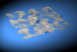
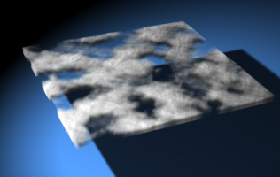
This is using the turbulence material. This is only pass 3/9. It takes about 6 min to render a single pass.
-
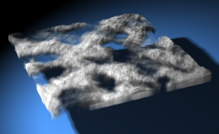
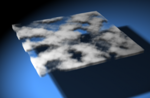
This is with a displacement map cranked up to 800% As you can see, it loses some of that fluffiness and looks a bit more like rock. @John. Thanks! I'll probably whip together a tutorial for it when I have found the perfect balance
-
Those are pretty good! How about making it a displacement map? I tried that, but it didn't really look any different than the bump map. In both instances I brought them up to 300% and it just made the clouds look more like, I dunno rocks instead of fluffy clouds
-
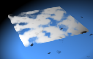
Well, after adding 7 minutes to the first pass, this is what the raytraced shadows did: As for adjusting the turbulence, currently it's just an image applied to the object, but I found a way to get the turbulence to render so I may play around some with that. I just had another idea which I'm gonna try right now EDIT: After applying another instance of the image and making it a bump map, I get this!
-
So I saw this cool Lightwave tut for making 3D clouds for a planet's atmosphere, you know, those really gorgeous shots of planets that you can tell have 3d clouds and not just some flat texture map. Well anyways, I decided to take a stab at making it AMified. So far it's turning out well, though I've run into a bit of a bump with it. The bump being that I kind of want the texture to 'taper' at the top, to simulate the 3d effect of clouds better. Now in lightwave, they used something called a weight material. Obviously AM doesn't have that, so I thought I could simulate it by doing some form of transparent gradient. Basically make the top more transparent than the bottom. So far that hasn't worked out. Another thing being that it casts a solid shadow on the ground instead of in the shape of the clouds. I was originally doing this with a turbulence material, but my laptop refused to render that, so I had to switch to using an image applied to the patch. The light's a klieg light and is there anyway for it to cast proper shadows? The image is applied as a transparency map BTW.
-
Now with eye action! take3audio.mov
-
Thanks for the input! I have like 6 variations on the eyes/Deitrix at the top, one of those areas I have been uncertain about from the get-go!
-
Okeydokes, this is my first time ever doing this sort of thing so I find it kinda exciting! So first lip synch test WIP. I haven't done anything to the eyes, blinks or eyebrows yet. Obviously could do with some tweaks, but please, I'll take any advice on this as like I said, I've never done this bit before! take2audio.mov
-
Currently it's static, but would only be a matter of popping in a keyframe and playing around with the transform numbers to make it animated
-
Happy Birthday Robert!!
-
Thanks everyone, glad you all like it It's a simple enough set-up which is part of what I like about it
-
Nope AM generated it. It's simply an fbm turbulence applied to a distorted sphere!
-
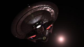
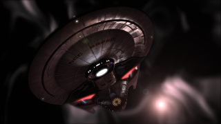
This started off as just a way to make the specular lighting more pronounced and then it turned into generating a nebula in AM, hope ya like
-
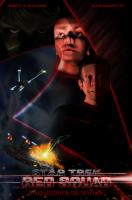
Well that's good Now a question which I can't really seem to settle on. What about the eyes at the top? Are they appropriate/fit? One's kinda green and the other red due to the intersection of the delta shield. Course I could maybe play with putting a mask over the top of the delta shield making that section of it transparent. Any thoughts?
-
-
Mmm, it has been a while since I took design and I only vaguely remember some of the rules of unity and stuff like that But you're definitely right about the focal point thing. My brother and I were talking some about the eye movement and that was one of the issues. I forgot to mention, the poster is roughly designed after these two posters Now following what you said and applying it to those two posters, there is a definite sense of direction and focal point but it's lacking in mine. I kind of like what you have suggested with the second poster there. I think I'm gonna go and re-arrange some things
-
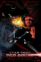
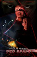
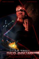
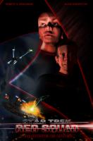
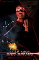
Ok guys time to put on your constructive criticism hats! This is obviously gonna be a little difficult (mainly on me ego ) but this is something that really needs to be picked apart. I know some of you here are graphic designers and most, if not all of everyone is a visual artist in some sense, so I'm gonna really rely on what you have to say next. So here it is, this is the first poster for Red Squad and the main reason I want it thoroughly critiqued, is because it's gonna get printed. The printed size is 23" x 35" so being that large any little mistakes one might miss on a 13" laptop monitor, is surely to be noticeable on a full sized printed poster. Obviously criticism can kind of go on infinitely and there'll be a point where I'm just gonna have to say enough is enough. But anyways, please pick this apart, everything from layout to rendering to colour balance, you name it! I'm supplying 5 designs to choose from but feel free to suggest alternatives that aren't there. The first thing I'm gonna note, is the overall levels need adjusting, it's too dark for print and that needs correction, but I'll do that on the final design. Also, if I seem to counter what you say, don't take it as argumentative, most times I'll just be explaining my reasoning, not stating that it's right or anything, otherwise I wouldn't be coming here for criticism!
-
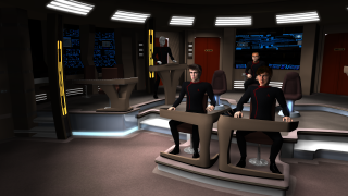
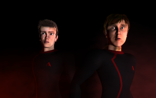
Been a little while since I updated anything here so here's a couple more pics! Still a few tweaks needed on these two characters plus I need to install my facial rig on them. Also, the bridge to the Enterprise is almost done! Also, there is something else that's being worked on for Red Squad and it's something that I'm personally gonna want some legitimate critiquing. I won't post it yet because I want all of the elements there so you all can have a good sense of what's going on, but it's a graphic design thing. But yeah, that'll get posted this week I imagine
-
I mentioned this some time ago in the Star Trek Red Squad thread and delayed opening a new thread up for it until now. So here's the lowdown. With Red Squad, it obviously has it's main and secondary characters with dialogue. The thing is, where this takes place on starships, these guys aren't the only crew members on the ships. So what I'm hoping/asking for, is if anyone has any decently "semi-realistic" heads that they're willing to donate to simply be background crew members who mill about, use computers etc. They could be guy or girl, though I don't have any female bodies built, so you may have to supply that as well, but if all you have is the head, I'll take that too. Also, this is Star Trek so they could be aliens too. If that is the case, you'll definitely have to supply the body as well because each alien is different! So yeah, if anyone is willing to donate some models they already have built (NOTE, I am NOT asking for people to go and model new characters, just supply old ones that are collecting dust on your harddrives!) it would be really appreciated! It'll save me having to build a bunch of new models. A second sub-request if you will, is that if you don't have any available models but might like to help out, if you would send high res rotos of your face to be built as extras (assuming the previous request hasn't been fulfilled). Anyone who does submit a model or rotos will be credited in either special thanks or as extras in the credits. I think ultimately I'm looking for half a dozen or so extras to populate these sets and I'll only use the face rotos if those half a dozen aren't met by people donating models. Anyways, it is definitely much appreciated should you be willing to donate a model or two and will definitely make Red Squad run a lot quicker!
-
That is spectacular!
-
With all that abnormal shaped lighting stuff Robert and I were talking about in a previous thread, what would happen if you made the light a klieg, applied a dots rotoscope to it and turned on volumetric and had it go along some crazy path? Am I making any sense?
-
Holy shmoley! $620 and it only took 24 hours! Congrats man!
-
Sounds good. Basically I'm just gonna make your existence known to the community that helped give Red Squad a bit of a leg up
-
A quick question, do you have a Stalled Trek site, or are you just sticking with the Youtube page or something? Cause I had an idea to widen your audience a bit, but didn't know if there was a central place to direct them


