Ilidrake
-
Posts
1,270 -
Joined
-
Last visited
Content Type
Profiles
Forums
Events
Everything posted by Ilidrake
-
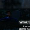
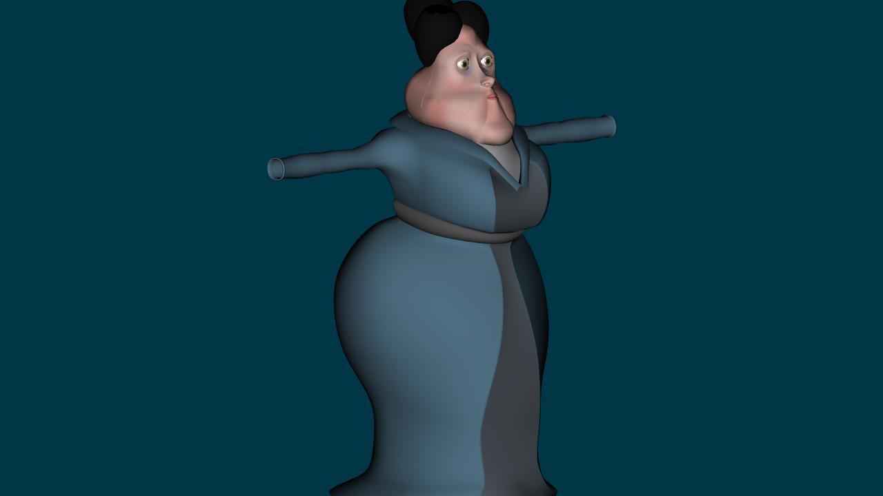
Okay been plugging along on assets for the first Act. I also started on the mother's body (pic below). I'm still not too sure about the Cleo model. As I read the scipt back to myself I get the impression that she is not young. I get the impression she is old and spiteful, and extremely conceited. For some reason this brings to my mind and old, skinny woman who doesn't realize that her glory days are over. Edit: Here's a side by side of Latimer and his mother. The mother is 100% modeled. She still needs to be rigged. I'll be moving on to the father and once these three are finished I'll be able to begin Act 1 officially. Still haven't started on the Death, Frankenstein, or Nora models yet. I will also be doing another Cleopatra model so perhaps I can get her closer to what I envision.

-
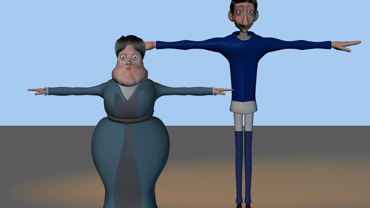
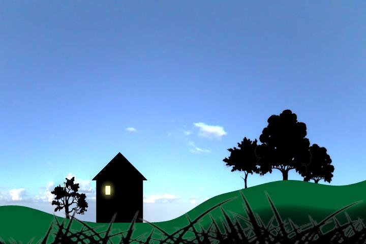
Thanks for the feedback Darkwing. Rodney, I was thinking about adding a fence or something to the foreground but I didn't really like the way it looked. I have the basic camera positions and such planned out already I'm just unsure about what to put in the scenes. I don't want to clutter the screen with so much that it detracts from what I want viewers to see. By keeping just the black shape of the house with the window highlighted your attention is immediatly drawn to it. After that you look at the rest of the scene. And Latimer's outline will be in the window moving so given enough frames people should pick up what's going on in the scene almost immediatly. I will be adding some small details to the house but will keep them low key as to not detract.
-
Nice. I had thought about doing some details like that but wasn't sure about the feel. I have also been considering doing the entire World of the Living in balck and white. But these are only thoughts and these renders are only experiemnts. I do like the look of the house as you have it. I thought the window too large as well but just didn't feel like shrinking it. This of course proves that my render is successful though Without giving any story or input, simply a picture, you were able to fill in the space yourself. Thanks for the feedback. I just wished a few more people on the forms would give me there opinions.
-
Alrighty. Thanks Nancy. Now how about this one?
-
Quick question! Is this is a good render or not? Does anything seem odd about this? Please post your thoughts.
-
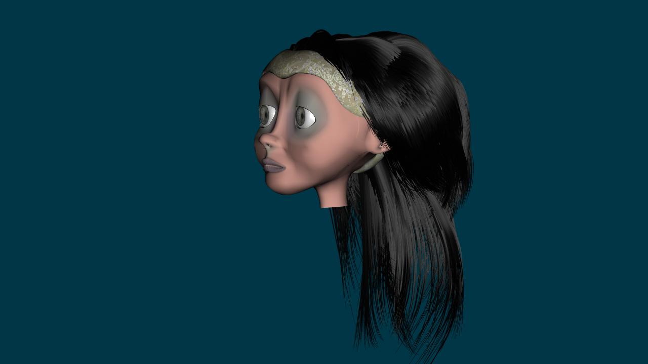
I went ahead and tweaked on Cleo. I finished up around the eyes so she has eyelids now. I also spent the time to work with her hair and get it styled the way I wanted. The over-all look is better I think. Still not too sure about the texture at this point but it'll stay as a placeholder for now. And if I can't come up with something else it'll be done
-
Darkwing thanks for the feedback. You raise some very good points. I have actually put a lot of thought into Latimer's parents but it's very difficult to write. I'll continue to tweak the script with your suggestions and see where it goes.
-
I've tried CeltX and all I can say is you get what you pay for. Storyboard Pro is pretty dang amazing. You can draw directly in it. Import pics. Template pics. You can import a script into your project for each scene your doing. Camera controls....the list goes on....
-
In the new script I sent you he actually explains what happened to his body, in the middle of Act 2. I was rather reluctant to have him explain it but in the context of his dialogue it seemed....appropriate. It is basically a symbol of how much he loves his wife. I look forward to seeing your render. Yep. I'm taking this serious. i'm working out a production schedule right now to gauge each step and give myself a little more direction.
-
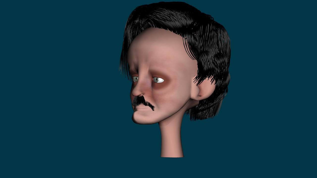
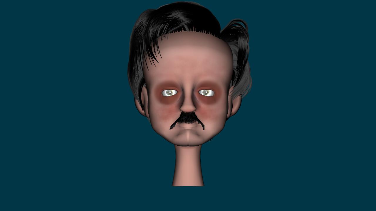
The good thing about my job is the time off. The bad is when it gets clkose to me going back to work my sleep becomes pretty sparse. So I stay awake modeling, drawing, and researching. It would be easier, but it sure wouldn't be any fun. I've been thinking about this set a lot the last couple of days. The scale of it will be immense, too big for me to model every detail. The first glimpse we get of it will be when Latimer first arrives and Gravedigger points it out. This of course will simply be a siloutte type shot with most of the detail going to the castle. The Raven flight would certainly allow us to present the entire city in a condensed controlled way. Show the audience small parts and then there own imaginations could feel in the gaps. So that's a definite yes! I won't update the script with it but I will be taking your flight path drawing so it can be refined when this shot comes up. As for me I have been doing a little editing of the script. I also purchased Storyboard Pro for my storyboarding and animatic And for your eyes I present Edgar Allan Poe!!!! Please be gentle. I'm not entirely sure about textures at this point so a little feedback on that is appreciated. The moustache(think I spelled that right)is the most difficult aspect to capture. His hair is really good IMO. I spent quite a bit of time making sure I got it the way I pictured it in my head.
-
Good points Rodney. I've been going over the script but I tend to concentrate on character growth and dialogue so it's nice to get these points. Out of Time: I would agree that some events like Cleo arriving at the Raven so soon. Perhaps it would be best if Cleo's little vision scene shows Death and Latimer's meeting on the road way before they arrive in the city? This would give her plenty of time to arrive at about the same time? I also like the idea of playing with the deeper dialogue. Much better than ripping them out. Not everyone will get it but the ones that do should appreciate. Me and you are both envisioning the Raven in the same light. Exact dimensions and layout are still under development but the lighting scheme works for me. I really want to see the pan shot. I've given some thought to what the city will look like and how it will be laid out. There is a look I want to accomplish but am unsure of how to accomplish at this point. On a side not I began Edgar's head today. It's not exactly where I want it at this point so I will not be posting images until I get it closer to what I want. I was thinking about skin tones today when I was painting his texture maps. Flesh tones will work but I was leaning more towards a gray to bluish tone on the fact that they are all dead. This would include Latimer. Or perhaps a more white to gray tone would work better. I will experiment and post examples as i work through it. I'm setting up to do a scratch track of the script at this point. I think it's getting closer to what I envisioned at this point. Your suggestions have been an immense help! So I'll be working on dialogue tracks and mix them later inside After Effects. Which is where I'll probably do the Animatic once I get to a point where I can start that beast.
-
Looks good.
-
That was a lot to take in Rodney but very well put. You've given me a lot to consider. The one thing that does concern me is the through-line of the story. I do not want the theme of my story to be as you stated "This world is a lousy place and death is a great way to get to paradise if you can quickly find your way out of it." What I was going for is that "life is tough in all instances but everyone can rise above it and find happiness". I'm not entirely sure how I can accomplish this with the way the story is currently, though I have been refining it in the last couple days. It also depends on viewer's perspective. You could also see it as, "Although Latimer's death is entirely an accident, not intentional on his or anyone else's part. Then his feelings follow over with him and he's forced to rise above them and become the person he is supposed to be. Ultimately finding happiness not through his life but with the friends he has in them." But I'm just ranting now I think I've been looking at the script and rewriting for about 5 days now so I think I'll put it away for a few days and concentrate on modeling. This should help me clear my head and give me a new perspective when I pop it open in a few days. On a positive note I'll be starting on Edgar, Franky, and Death in the next couple days. Once they are done that'll leave Nora and Marc. That will be the entire cast heads. I am having some probelms with Death. My original idea for Death was to have just a shrouded figure. No head. I didn't really have any plans to show his face to the audience and thus add to the mystery. But after writing the script I can see that this will make animating him more of a challenge because a great deal of the story hangs on facial animation. Especially with Death at the beginning of Act II. If i do model him a head I have no idea what he would look like because until now I hadn't considered the thought of him having a face...
-
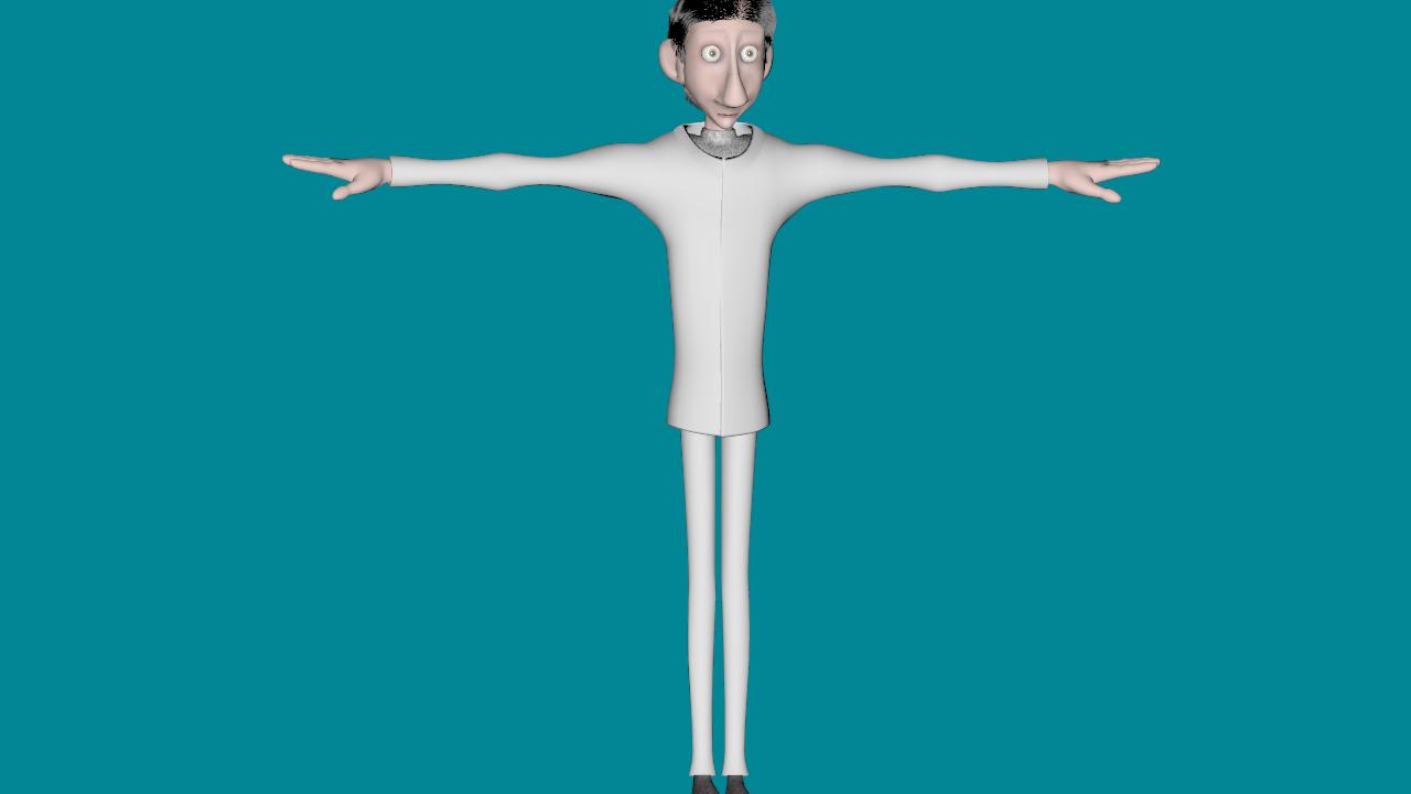
He is not. He is actually based off of my own father LOL....if he only knew. My dad has a rather large...er....um....nose so I simply took most artists advise and enlarged it. I realized after I created him that he resembles Linguini, but at this point I don't care. I like the look and the show must go on!!!! HUzzah!!!! Thanks for the feedback Rodney!!! I see what your saying but my main consideration when creating a color scheme for the land of the living is to make it feel less alive. My color scheme for the Land of the Dead was going to be bright and vibrant colors, more alive than its counterpart....but I'm considering what you say so please continue to comment. It really gives me alot to consider when I make my final choice.
-
Put a few props together just to break up the time. I also went ahead and did a cool down of all the set textures I have to give the scene a bit more depressing feel and to help pull Latimer out and bring attention to him. He really pops now which is what I want. I also tweaked the tone and color of the bounce lights to help the overall mood. I also reconfigured the window and some of the room textures. Right now I would say this set is 100% ready to go. I will not be working on more props at this time. Instead I will focus on the remaining 4 sets and the rest of the cast's heads. After that I will start on body, texturing, and rigging of the cast one at a time.
-
Good stuff. I like the thought of her fussing about her hair and really giving Marc some grief. Here's what I have so far. This is just one of a few styles I will be using for Cleo, because I agree that she should change her apperance as this would really drive home her conceited outlook. The colors are not final but I like the look and feel of this render. I will probably do about 3 or four more headresses, later. For now I have a basis from which to build and I will now move on to another head as my primary goal is to have the heads done because I believe that by doing them I really get a sense of who the character is.
-
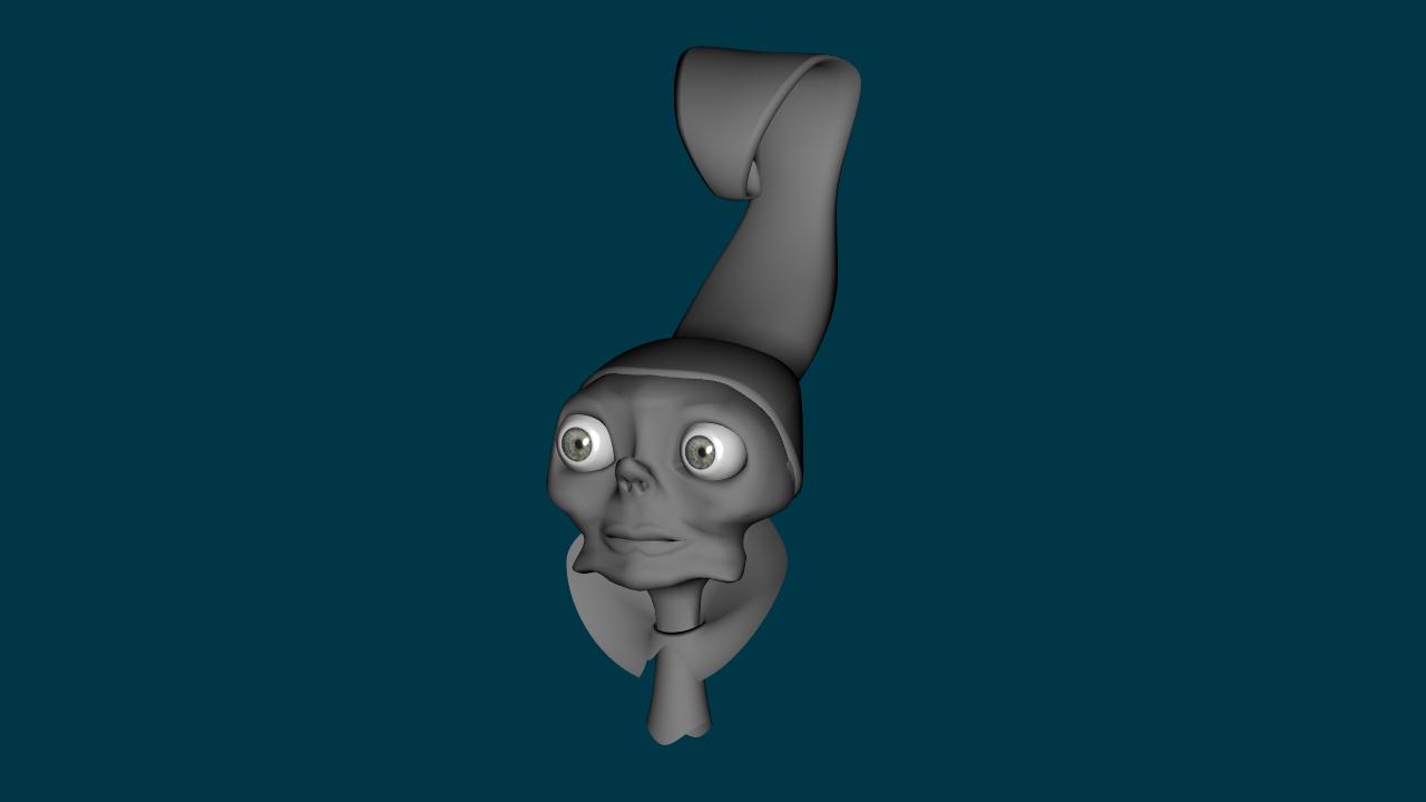
Okay here's Cleo Version 2. I'm honestly at a standstill on this head with the hair. I don't know what to do hair-wise. I'm totally open to suggestions. I'm not really that good with hair and the things I'd like to do I have no idea how to even begin much less accomplish. Suggestions???
-
I think I'll try a young and sexy version of Cleo. I'll keep this version and modify it. Then I'll have get the community's opinion on which one is the better of the two models.
-
Holy Schinkeys!!! I used ET's face for the inspiration!!! After I read your post i went and checked it out and your right...It never occured to me I was drawing from her!!! So I'll be changing that up then. I don't mind it being similair but it's a little too close for me. Thanks for pointing that out Rodney. I'll have to do some research into Cleopatra outfits through the years and use that to help me come up with a look more original. I do like the look of her face, I'll just need to modify the jaw as it is as you say too close to Yzma for my taste.
-
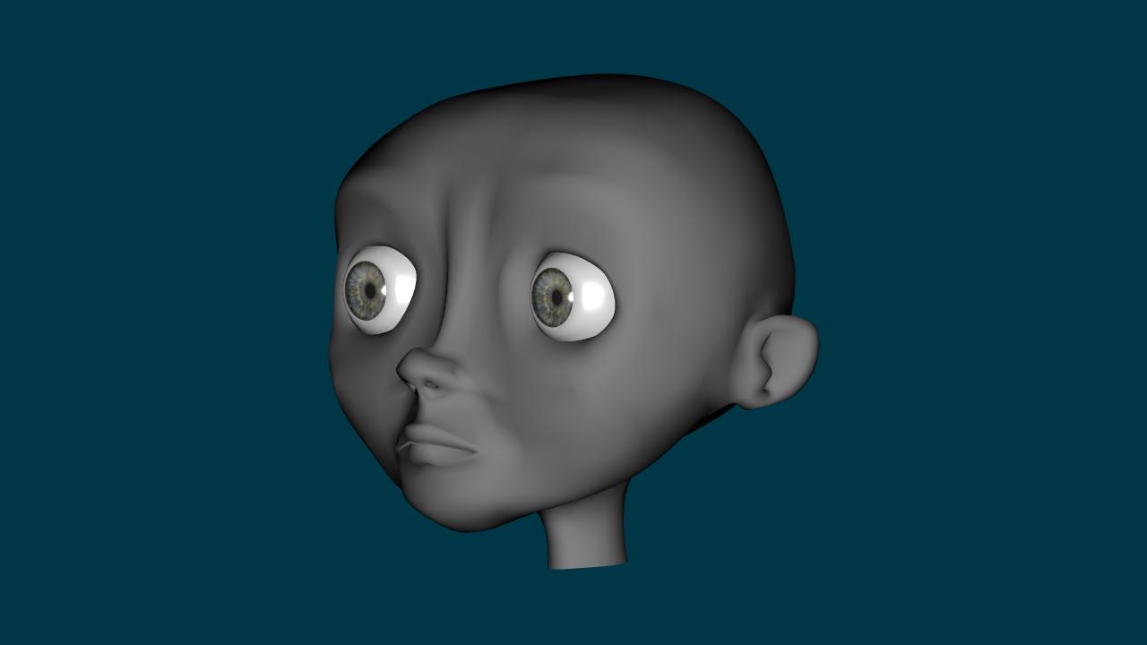
Modeling continues. As I said in a previous post I am attempting to get all the cast's heads done. I have three so far. I am working on the villan as of now, Cleopatra. This is the start of her head of course so try to look past the odd angles and what-not and see the finished product....I am myself am trying LOL. Anyway, 2 hours work so far.
-
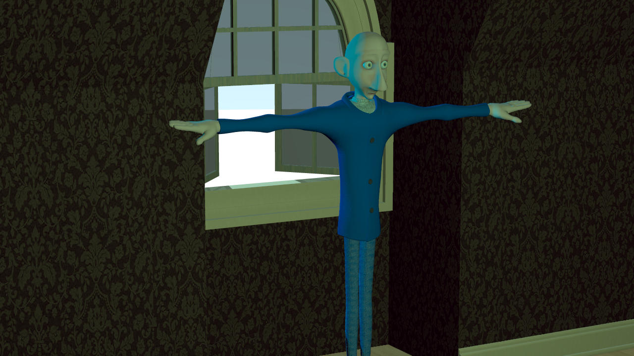
I've been experiemening with color schemes and lighting set ups. I purchased Lighting and Rendering by Jeremy Birn, and it's full of good stuff. So below is what I have so far. This shot includes both set and character lighting based on real world RGB values for lights. I rendered to a Targa, as OpenEXR is difficult to work with. I converted it to Jpeg for the web so some of the detail has been washed out a bit but the look is more of what I want. I think I will make a short document detailing what I have learned in the process. I'm sure someone will find it useful.
-
That....is......freaking........COOL!!!
-
The JPG is the left one and the right one is PNG. I'm also leaning towards PNG because it transitions better, keeping alot of the details. I haven't loaded after effects up but I'm sure it should handle the OpenEXR format easily. Love the sketches. They are alot like my own. I've taken your ideas from the last email and incorporated them into the script, so it's growing. I also added another action scene to the story. A real good scene that let's Franky, Edgar, and Death really shine. I've also started doing the storyboard. I'm using index cards so swapping them around is really easy. Soon as I get an animatic done I'll send you a rough draft.
-
So each day I continue to work on this, regardless if it's models or refining the story. Today I sat down and modeled out Latimer's body. I want to keep it simple and stylish. Here's my results after a couple hours. No textures for the main clothing parts as I am still considering the overall color scheme of the story. I am considering a gray and dull color scheme for the land of the living and a more robust scheme for the land of the dead. Sort of like a Tim Burton feel as I really love his movies and the overall feel from them. Edit: I've added to renders today in hopes of getting some lighting feedback. Lighting I believe is very important to the overall color scheme of the project. I rendered out both images to OpenEXR. Then they were loaded into Photoshop. The JPG is a 16 bit image. The PNG is a 32 bit image (thus the size. more information embeded in it). They have both undergone tone, contrast, and color correction. Both have there plus and minus effects. Which in your opinion is the better of the two renders? And how can I improve the look and feel of the lighting to give a more oppressive and depressing feel. Or have I achieved it? I thought about using radiosity but haven't quite got the quirks of that method worked out.
-
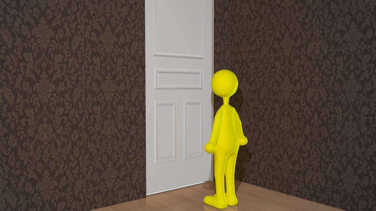
In between making character heads I'm working on sets as well. I figure as long as I do something each day I'm getting somewhere. So I divide my time between a character a day and a set or a prop. Here's a render of Latimer's room, near the door. I used Thom, though he isn't to scale and the room. I also set up some lighting to see how it would look. I would like a sort of gray and dismal look and I don't think this lighting works. If anyone has pointers on getting a nice depressing color scheme please feel free to drop a line. Thanks.