-
Posts
2,579 -
Joined
-
Last visited
-
Days Won
1
Content Type
Profiles
Forums
Events
Everything posted by ypoissant
-
Very nice image. I particularly like the feeling of motion even though it is not an animation. My own nit-pick is about the thickness of the clothes. For some reason, the clothes does not seem to fit her. Like if they were too loose. It seems to have to do with the beveled thickness and the uneven borders. Also I can understand why you used reflection for the skin. But the reflection kind of give her skin either a plastic look or a bronze look which is somewhat disturbing. Have you considered using reflection mapping with a very blured map?
-
I like that one. So the A:M song would go like: - Keep on hashin'... - Hashin' on down the spline... - Hey Hey Hey... - I said keep on hashin'... - Hashin' my blues away! EDIT: Changed "line" to "spline"
-
Well... Let me add some more. I like the animation style and look you've developed with your stolen child project. The fact that you are not going for the hyper-realistic look nor for the traditional toon-anime look. You've found a very personal style that matches perfectly with your drawings. It is unique, innovative and creative. With a style that personalized, your animation can be recognized immediately from the crowd just like a signature. I read your latest episode on your web site. I liked that you know how to use the camera POV to the story advantage and the fact that you can draw your characters on non-stereotyped framing, positions, attitudes and expressions. I can appreciate your narrative skills too and the way you ended the episode. I wanted to read more. Then I watched your Ebin & May "Something to remember" theater episode. That is cute. And then I whent to kiss my wife. Thanks. I hope that clip can be found on A:M films.
-
Have you set the Index of Refraction right? If you leave it at 1.0, refraction won't bend and the color filtering will not be what you expect.
-
That's a very nice low spline model. You've got the form right even with such low density. Have you considered using displacement maps instead of splines for the stomach muscles? This would reduce the spline counts but might increase the render time which would defeat your original purpose. One note, from the tests I did once, the number of patches in a model does not greatly affects the render time. It affects the load time though. But if your main goal was to reduce the render time, then getting low patch will not really get you there. But one more important consideration, as you also mentioned, is the ease of animating. I found out that a high density model is hard to animate due to the high number of CPs and splines that need to be tweaked in poses and smartskins. The good side of a high density model is that you can really get an almost perfect muscular morphology if you can spend the time to tweak. But a too low density model is also hard to animate, especially if you go for a realistic look, because it gets hard to find the right CPs/Splines tweak combination that will get you the just correct aspect. The real difficulty is finding the right compromise between dense and light mesh models. About that note on the bend, There is a clearly visible bending stress just above the lower part of the rib cage. The actual bend on the abdomen should be lower than that. One way to fan bone this part is to place a serie of bones along the back bone and have them orient like the bone below and the bone above in increasing percentage proportion. Lets say we have "Hip bone"->Back Bone"->"Cage Bone". Place a serie of small fan bones along the "Back Bone" such that each of them controls one spline ring of the abdomen. Each of those fan bones orient like "Hip Bone" and "Cage Bone". Then adjust the percentage to get the bends and twists right.
-
I've been following your project for some weeks now and I must say your are doing a fabulous job. I admire your persistance, your drawing skills and your imagination. And your little animation test is awesome. There is so much character in it.
-
Looking better and better. The sky bothers me a little. It is rather dark in the upper portion. Sky do indeed go from pale blue (almost white) on the horizon to dark deep blue at zenith during the day, but given your camera focal length, the zenith would be way above the upper border of the image. So at the top border, the blue should not be that dark. Something I did for my skylight is use one of the sky found on 1000skies.com. Since I didn't need high resolution because I wanted to use it as sky light filter, I picked one on the site, masked out the watermarks and added a lower half part then spherical mapped it on a hemisphere. This way, I get nice believable sky gradient and perspective no mather the camera focal length and angle. I would force the atmospheric perspective between the different layers of mountains. In particular, I would make the farthest mountain (so it seems to me anyway) at the right of the character, even paler, almost disapearing within the sky. The whole mood is very cool if not cold. That is probably the mood you are looking for though. Nevertheless, I would add some warmth to the light by turning it yellowish. This would make the character pop out a little more with the help of chromatic contrast. Rather than go into detailed technical explanation, I quick modified your image to show what I have in mind.
-
Removed the duplicate post
-
Rich, I think you are well on the way for a very good piece. Yes, I can be cryptic sometime. That's because I don't, a priori know what you (or anyone else) know and don't know. So I trow something and if it's not understood, I try again with a different approach. No hard feelings. Really. Keep up the good work
-
Rich, I'm not being technical for the sake of being technical. I wanted to try to explain what is aerial perspective because from your first reply, I had the impression that you did not understand my first comment. That's all. Aerial perspective is called that way because it adds perspective or depth to outdoor scenes. It's been understood by painters since renaissance. I think you already have a very well done piece compositionwise and a very nice model. I was only pointing to the fact that I, personally, missed this depth that is normally conveyed by aerial perspective. That's just my personal preference. Aerial perspective is also called atmospheric perspective or color perspective. Some aerial perspective related links: Aerial Perspective Color Palette Matching Pigments A little demo of different types of perspectives From aerial photography POV Musgrave on perspective (technical) En encarta definition with a nice example More definition and examples. In a landscape painting, atmospheric or aerial perspective is even more important for mountains. Otherwise, it just doesn't look far enough or huge enough.
-
Fake it
-
I was refering to the way far off objects takes on a hue depending on the dispersion color in the athmosphere. Clouds have little to do with that. Although in your last render, clouds add more texture and mood, they don't contribute to aerial perspective. Aerial perspective would apply to any planet. What is aerial perspective? First why is the sky color blue and the sun color yellow? When the sun light enters the athmosphere, the shorter wavelength gets dispersed in the athmosphere. Blue is the shortest wavelength of the light spectrum. Since blue gets dispersed in the athmosphere, the sky becomes blue. And the blue color which is dispersed is, in consequence, subtracted from the sun color which gives it the yellow solor. As the athmosphere thickens, more of the shortest wavelength gets dispersed. This is why, at dawn or at sunset, the sun looks orange because not only blue gets dispersed but also green. It is this dispersion of blue which contributes to the aerial perspective. The air around us is filled with blue light so to speak. The more air thickness your vision have to cross before reaching an object, the more of this blue light coming from the air will be present in the image of the object. That is why far away mountains take a bluish hue. This is called areial perspective. The fact that, as objects are further away, they take more and more this bluish hue. This would also happen on another planet with athmosphere. We could assume that a different athmosphere would disperse different wavelengths and thus aerial perspective would take a different hue, but there would still be aerial perspective nonetheless.
-
Nice composition and lighting. And globally a nice moody image. There is one aspect that bothers me is the absence of aerial perspective. The fact that as objects move at distance, they acquire more bluish hues. I understand that the scene in in desert and that there is dust in the air but if there were that much dust, we wouldn't see the mountain at all. If we can see the mountain, then there should be some aerial perspective.
-
As Jon wrote, dead-end splines are going to give you creases and they are not going to go away with porcelain either. Use hooks instead. Absolutely avoid dead-end splines and CPs with more than 2 crossing splines or splines joining like ")(". This said, I have the impression that you imported the model from a low polygon one which is why you get tons of triangles everywhere especially in the hair. That's OK. Just be warned that hand converting a polygon model into a spline one is usually not a trivial task. As you will get experience, you will spline your model following the natural contour of the face. When importing a polygon model, you endup with a bunch of triangles and splines going in all directions and it is very difficult to select which splines to keep and which ones to delete. But as you wrote, it is a damn good way to learn the mistakes first. May I suggest an alternative approach: Spline an independent face mesh following a good spline layout as given in Shaun Freeman tutorial for example. Then hand-conform this mesh to your model. To do that, you select the face mesh and click on "lock". Now, you can push and pull the spline mesh to conform your model's morphology. Remove the triangle at the mouth corner. This will only get you problems. If you need more resolutions, then extend the splines into the cheek. Another tips: To try to evenly space your splines as much as possible. Avoid peaked CPs as they will be visually OFF from the rest of the model. Instead, you can either set the CPs magnitude to some small value or use two nearby splines to create the join. Your model looks nice, I'm sure you will have fun animating her.
-
Looking good so far. I find it difficult to give detailed comments with toon shaded renders though. for spline renders, you can either capture the screem or render to file and set the quality to "shaded & wireframe"
-

Following a trend, a resurrected model
ypoissant replied to ectohippy's topic in Work In Progress / Sweatbox
It's a great improvement from the first version which was already great. God job. -

Practice Chanter Needs a Bump(map)
ypoissant replied to fae_alba's topic in Work In Progress / Sweatbox
For a bump map to work, the edges need to be blurred because the surface normal is modified according to the tone gradient in the bitmap. Sharp transitions from white to black won't work. You will need at least an intermediary gray between any black and white pixels. The best way to get that is by blurring the bitmap. Your current antialiasing grays are not enough. I applied a 1-pixel blur to your map (attached). -
If you applied the skin shader to a group. then in the "render to file"->"options" pannel, you should set "render shaders" to ON but set all the actual shaders, in this pannel, to "none".
-
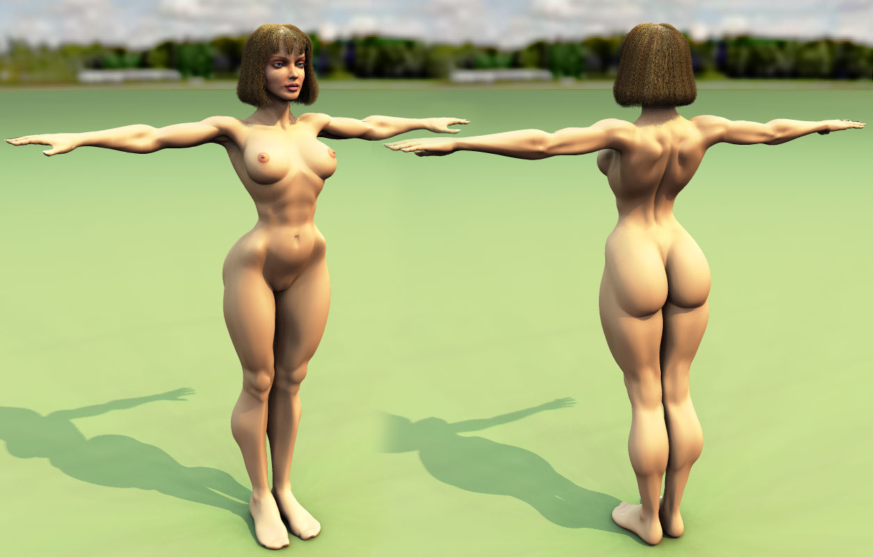
I know what you mean about the head size. The more I work on the model, the more I can feel what's wrong. I think I really modeled a 5'2" body. Not a 5'8" or 5'10" body. Taking the body alone, its height vs width and depth, it really have the 'petite' proportion. So an 8 head height does make the head look small indeed. I have two choice with this: 1) I resize the body relative height to width and depth proportion (that is I basically scale it on X and Z) to fit a 5'8" tall girl or I just simply resize the whole body without touching the its relative XYZ proportion and model a 5'2". I'm still not decided yet and I still may decide any of the two ways. I still have not rejected the possibility to model a 5'2" girl. The difference with Mike James pin-up girls and this model is that Mike James pin-ups are small scale models designed to be looked at as such. The model will be used in different situations and within different environments. And I want her to be placed in natural environments and I don't want to head to appear too large in those environments. Furthermore, if you examine James pin-up girls, the larger scale they are, the smaller the relative head size. I don't know the work of Dani but I know several other French cartoon artists who draw their woman with large heads. Goossens is one late and very popular example which did something in 3D, I think it's called "The Girl". The cultural cartoon tendency, for years, for a lot of artists (not exclusively French) is to kind of put a baby head on a woman body which give them a definitive "cutiness" factor. If you were to remove the eyeliner, the lipstick and all the makeup which adds the unmistakable sexy features, then the baby head is very apparent. The unmapped head meshes posted by Goossens makes it very obvious. This is clearly not the route I want to take. I want to model a stylized model but not with a baby head. I got all sort of plans for the model. Will I have the time to do them all is another story. But yes, I definitely plan to use the model. As to copyright issues, there is nothing wrong, legally or ethically, with being inspired by another artist. If I were to model one of James pin-up figurine as is, then that would be a problem. What is copyrighted is the character he built. That is including the clothing, the makeup, the haircut and the accessories. Not the approach to anatomy. Furtheremore, my current model is very different in proportion than James figurines if only in the hips and shoulder/upper torso sizes plus a lot of other more subtle differences. The whole head is also completely different especially in profile view. All of those differences are a question of preferences. Another significant difference is in the depth of his muscular definition. Because of the size of his figurine, he have to carve in quite deep. At first I wanted to go that route. But this does not work for a 3D model or at least I didn't like the look too much. So I considerably reduced the muscular carving definition to get a more subtle muscular defintion although still stylized. Same thing for Emma Peel. Because it is a live person, and not a character, I would have to be darn good at modeling, texturing and posing to even approach a resemblance that would cause copyright issue. Beside, I don't really have a plan to model her.
-
Emilio, I'm just modeling for now. In the past, I've had problems with modifying a character after it was rigged. So I will wait until I'm satisfied with the model before completing the rigging. The head is already rigged though but because I resized the head and the bones, the smartskins I did for the eyes and the mouth are no longer usable. I will have to scrap them and restart. About the Get Smart serie, I think it never aired here in this part of Canada. Or at least, I was never aware of it. If there were one female character from an old TV serie that I would model, it is Diana Rigg playing Emma Peel in the Avengers serie. Another one, which is no a TV character though, would be Betty Page. I might try her haircut on the model though. Dearmad, I kind of liked the bigger head too. Actually, the way the head came to this size is interesting. When I brought the body and the head together, the head was quite large. I then resized it to some visually more normal proportion but I thought it looked too small. So I resized the head to a size that looked to me as more appropriate. That is the head size that I posted first. When I replied to Fuchur, I took the height of the model (I always model to real sizes) and observed that the size of the head was much larger than normal for her height. I either could resize the head only and make her 5'10" or resize the whole body and make her 5'2" and I chose a sort of compromize and made her 5'8". That makes her 8 head height BTW which is the proportion I automatically use when I draw the female. In retrospective, I think that I mis-scaled the head in the first place because I was working with a bald head. The minute I rendered her with the hair on, I thought the head was too large. Now, at 8 head height, I still think the head is too small when bald but looks more natural with the hair.
-
Here is an update. What I've done: - Finished reworking the legs, feet, arms, hands, back and front torso. - Changed the proportions. Now the head is smaller to bring it back in proportion to a 5'8" tall woman (Fuchur, I think this is what looked disproportionate to you. Indeed, she had 'petite' proportions, which were not bad but thi is not what I was looking for. - The legs are longet too. Now I need to work on the trocanter, gluteus medius and gluteus maximus area. That's currently the last area which I'm not too pleased with.
-

CrimeBomb and Miss Demeanor
ypoissant replied to John Bigboote's topic in Work In Progress / Sweatbox
I like those two a lot. And the animation is really good too. Lots of exageration but not overdone IMO. There is definitely a comic effect and we can almost guess what they are saying to each other just by the facial expressions and body postures. Great work. -
Cool. The soft reflection are not soft enough yet IMO as I can clearly distinguish the clouds in the reflection. You could crank up the specularity size some more on the body to make it look more like polished metal instead of dusted chrome. As for render time, as you increase the number of passes for the skycast, the soft reflection samples are going to be distributed among them, So the higher the number of samples, the least the additional hit on render time on the whole the soft reflection will have. Once you've found the correct specularity size for the model that will give you the correct soft reflection, you can lower the soft reflection quality to its lowest for the time you tweak the rest of it and for test renders and then raise the soft reflection quality when you are ready for final render. One thing that bothers me is the strong rim lights which makes the craft look like a miniature kit model instead of a large craft. Like if it was lit in a studio instead of outside.
-
I don't remember her because I never saw the serie. The head is my attempt to reproduce the spirit of Mila Jovovich in this photo:
-
Superb! The subtle eyes lids motions that you added right before "either I'M..." is working admirably. And the eye arches and mouth poses are very well in tune with "I'm crazy". I don't see what to add.


