-
Posts
2,579 -
Joined
-
Last visited
-
Days Won
1
Content Type
Profiles
Forums
Events
Everything posted by ypoissant
-
Soft reflection processing is distributed among passes so if you are already doing multipasses with skycast, then it shouldn't be so bad. Also, with small specular sizes, to get just a little bit of softness, the number of samples will be smaller than for wide softness.
-
Nice model. I like the details in the trusters. You are impressively productive. I suggest you try the soft reflections on the body. It is currently a little bit too mirror-like. Using soft reflection, you could crank the reflectivity up a bit but ghet rid of the mirror look at the same time.
-
I just viewed the movies and browsed through your posted images. The two years you've put i this really shows. All the attention to details. And I like the acting. You mention you did theatre. Well this too shows. I especially like the eye movements, where they point as the character speaks, This communicates his thought process and a lot of emotions. Very good job.
-
Very well done, model and texture. You are quite fast with the texturing.
-
Like any attempt to fit Phi into beauty proportions, I'm sure if I were to try, I would find some "evidences" that this girl fits, somehow, somewhere, the golden rule. And I could produce one Phi pattern that proves it. But I didn't attempt to do that explicitly. I use numbers when I program but when I do artistic work, I don't even think about numbers. I believe the golden rule is not a garantee of beauty. One could use the phi proportion extensively and still produce monstruous characters. The golden proportion is a tool. No more. It is nice to know and can be used as simple rules when learning or teaching composition for instance but it is not a religion. I used to use the golden proportion explicitly years ago to eventually abandon it (although I find it pops in my compositions regularly even though I don't use my ruler and calculator anymore). One observation I did, while developing a product that builds faces (composite pictures). We were several people working with this product during its development. Of course, each of us tried hard to build the perfect beauty face. Each of us had our own set of rules for making a beauty. Each of us did produce very beautiful faces but we all produced very different beauties nevertheless. I learned that beauty cannot be reduced to a simple set of rules. And certainly not to a set of Phi lines. There are more examples of art masterpieces that don't use the golden ratio than the reverse.
-
Vince, I came in here a couple time but never left a note. I find your model quite attractive and I like the hair the way you did them. This is really a haircut for a jazz singer of the beatnick times. I think you could probably use your model as is with the hair the way they are. You could add motion to the hair with dynamic or even animate the motion and just applying a suitable texture on them. This would enforce the style already there. But if you use v11, I encourage you to use the v11 hair. You could reproduce the same haircut and get real hair.
-
Yes, I've seen her in your thread.
-
Two things that come to mind: 1) The skymap seems rather cloudy from the camera POV. If the whole sky is like that, than you won't get nice strong color filtering. On this topic, Ia trick I use is to use slightly different maps of the same sky for the skydome and the skyfillter. I crank the saturation higher for the skyfilter. As high as possible without getting color shifts. 2) When you scale the skylight relative to the skydome and the skyfilter, make sure the skylights are a tiny bit larger than the domes. That is the light radius sould barely touch the dome or not touch it at all and of course be outside the domes. The best way to get the test the setup is: 1) disable the skymap hemisphere to keep only the skyfilter active. 2) Replace the projection map material with a simple deep blue surface color on the skyfilter. 3) disable the sun light. With this setup, the only parameter that should affect the filtering is the relative scale of the skyfilter dome from the skylight lights.
-
The skin looks better in the last one. In the previous one, the skin looked more like bronze. One last little suggestion: Try to blur the background image so that the blur width is larger as the photo progresses in depth. Right now, this uniform blur does not look natural. I don't know how I would do that though
-
-
-
Pat, You must have a bandwidth limit on your domain because it is the second tiem I come here and I can't see your pictures. I will come back later.
-
Thanks John for gettin in. I was overbusy with some paperwork. But I need a break so here are my explanations: The shading model is based on Oren-Nayar. So the roughness attribute controls the diffuse falloff in the Oren-Nayar way. The Diffuse-Falloff attribute is actually not used. It is a remnent of an old way I tried to control the diffuse falloff but the Oren-Nayar method gives way better results. The fact that it is still there is an oversight. Saturation start and end control when the raises in saturation will start and end in the shade calculation: 0% is where you get full light on the model and 100% is where is the terminator. If you set start at anything less than 0%, the saturation shift will already be affected at full light and if you set the end at anything more than 100%, the saturation shift will not be complete at the terminator. Hue shift from saturation controls the lag or the negative lag of the hue shift relative to the saturation shift. In real persons photograph, the two are realtively in sync. But some painters like to start the hue shift fefore the saturation shift (or is this the reverse? I'm not sure now. Anyway, you can experiment). One notable example of this are the Bisley paintings. So if you want the hue to start shifting before the saturation starts raising, you set to some negative percent value. The hue shift is an interpolation between the skin hue and the blood hue on the hue weel. It always take the shortest arc between the two hues. I think Saturation strength and Blood showthrough are self explaining and you can get some really weird gradient effect by pushing them high. Now, about controling the ambiance surface attribute: I've started working on this concept several years ago when Andy WHittock was gladly programing plugins and I never touched the SDK yet. At this time, I analysed skin photographs. First of real peoples photographed in different lighting setups and then of well recognized painters. From this I developped a model of how the skin react to light. Because of this method, I could not compute the effect of SSS and the shift in ambiance because ambiance is a CG concept that have no equivalence in reality and evem less in photographs. Even in CG, once the effect of ambiance is computed, the only information you are left with is the color which can be translated into hue, saturation and value or somethiung equivalent but not into ambiance. And even there, the available SDK didn't have any ways to control the ambiance attribute of a surface. So I implemented this model in an application that could output gradient specifications which could be used with the A:M gradient shader. But the gradient shader does not work with color mapped or materialled skins and that was a problem. The solution was to program a shader which would take any current skin color that is already there and proces it so that it produces the same shifts that are apparent in real skins. This brought me to devise en even more abstract model of how light interact with skin and the result is this plugin. Now that the SDK offers an ambiance shader, I may get back to this project and develop a skin shader v2 eventually. I actually haven't test if the ambiance shader API do gets called beyond the terminator. I would guess it does. Please don't hesitate to ask any further questions. Whatever comes out of this will likely gets posted on the plugin page as explanations.
-
Nice subtle adjustment. And you adjusted the "or I'm crazy" gesture just right. It does not feel out of place anymore. You've added this show of change of attitude before "Either I'm dead right". But, I don't know, the transition does not seems strong enough. I mean, there is clearly a strong change in both attitude and mind state in the voice. I can feel some internal conflict preparing to explode at this moment but his body and facial expression don't show it that much. The subtlety you've put in there is excellent for a more realistic character. But for a cartoony character like this one, I expect it to be more visible if not exagerated.
-
Good work. The arms are a little tiny for a beast of this size. Their length are OK but their size seems too skinny. And also, the wings, or rather the wings attachment on the body seems too thin. To lift a beast of this size would require much more muscles in those wings attachments.
-
The feet will be remodeled flat on the ground. But I will only do that at the last tweak moment.. BTW, I already have the pumps that goes with those feets. (And yes, 'en pointe' is spelled correctly). She is actually 180cm, that is 6 foot tall. But Il will have to double check the head size just to make sure everything is practically (if not estheticaly) in proportion. Hmmm... I don't think you will ever see a woman like that in a bodybuilding competition. Thanks. No, I did use maps only for hair color. The length of the hair is controlled by the length of the hair guides. I found I had more control of the hairdo with this technique. Thanks. I've been struggling with the aponeurosis of the latisimus dorsi. Thanks. What happened to her is that as I was modeling her, my attention got diverted into trying to find ways to get realistic skin shading. That brought me into this skylight thing that was abundantly discussed at that time. And then a huge veterinary multimedia project took over where I used A:M and then from project to project, this model eventually got stored on a CD-rom somewhere. Funny coincidence that now that my skylight solution is done and my skin shader is also done, that I revert back to this pet project of mine. Looking at other splines will help for sure. But practice is still the best way to get this flow feeling. After you've done your 10th model and actually observed the shortcoming of your different solutions, you will definitely be in a better position to feel it than now. And once again to all the others, thanks for your nice comments.
-
Well I wouldn't go as far as the cyclist in the triplets but I like muscular womans. However, I like elegant muscular womans, not some of the extreme bodybuilder types. But that's just my own personal preferences. This said, As I render more and more of her, I find more and more af subtle places where I would need to tweak some more. For instance, not apparent in the current renders, is the front of the lower leg. The subtle double-S profile curve of the tibia. Gil Elvgren was a master of that curve. Again, I will only do whatever deformation that will be required for the poses and the views. That's two condition. Meaning for a particular pose where I don't show the back, then I won't need to deform the back. I know what you mean. Yes, this concave top would add some more sexiness to the model. This is definitely in my list of planned changes. That is a huge compliment. I have so much admiration for Mike James work that I don't know how to take it. But I thank you for it anyway and I appreciate and understand your preferences. Now imagine the scene when my wife comes in and I'm tweaking the model.
-
Thanks. I struggle hard with that. It is when I visited a museum several years ago where I saw several great master sculptor pieces that I realized the importance of this "just enough to lift" technique. It really was an enlightenment. I've handled worse than that. The secret is to not try to fan-bone and smartskin her for any imaginable movements. I don't believe in this approach. It is too time consuming. Instead I add deformations as I need them. That is: when I pose or animate the model, I add and tweak the fans and smartskins to get the correct morphology for that pose or animation. This way, the model gets smartskinned as I need instead of a priori. You can keep on adding smartskin keyframes in this way. And as you go, the model needs less and less of them. You end up with only the smartskins you really need and use instead of all possible smartskins of which very little gets used. Did I hear "tutorial" in the background? I took great care in smoothing the splines by visualizing the surface from a grazing angle in the modeling window. I go in shaded mode, turn the model, find an unwanted bump in the surface, switch to shaded+wireframe, click on the offending CP, leave my cursor over the CP and switch to shaded mode again and then pull out or push in the CP untill I get the best possible surface. But the premise for that is that the splines follow a nice smooth path first. And then, I apply the porcelain material. BTW, I applied the porcelain material only on the head. The body still don't have a porcelain applied on it. I won't apply porcelain until I'm finished tweaking the surface. If I were to apply the porcelain immediately, I wouldn't get this visual feedback on the corectness of the surface. From another fine girl modeler like you, jonathan, I'm flattered. Well, I'm somewhat stopped in my quantum spline theory efforts right now. So, perhaps that's a good thing after all.
-
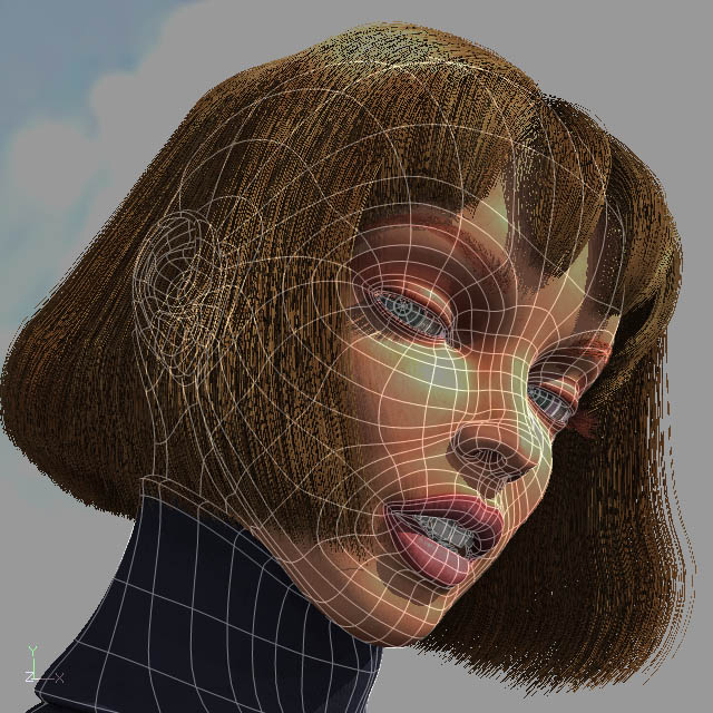
The hair are v11 hair. This is exactly the same head and hair as in my june image contest entry: The hair materials are on a separate patches inside the head. The patches have a map for the hair color with spots of lighter hairs here and there. The hair guides are positionned the way they are rendered. The hair material is applied as separate groups for the left and the right part of the hair and as 8 different groups for the tuppet. That's really all there is to it.
-
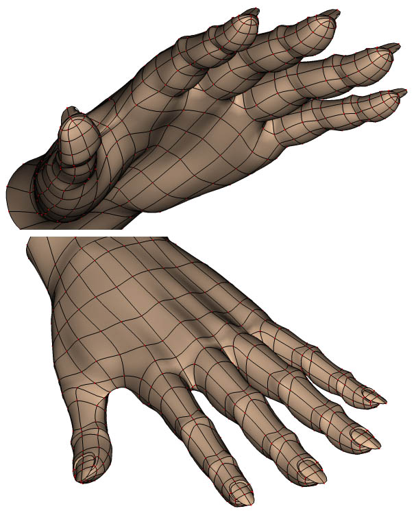
gwinkelman, Here is the splinage for the hand. I think you can see the tip of the fingers quite clearly. BTW, I picked the fingernails splineage trick from Jim Talbot. Thanks Jim.
-
I checked the first Jack clip and the last one. The last one definitely reads much better. Especially the hold on the giant foort shadow. Very nice. And good timing too.
-
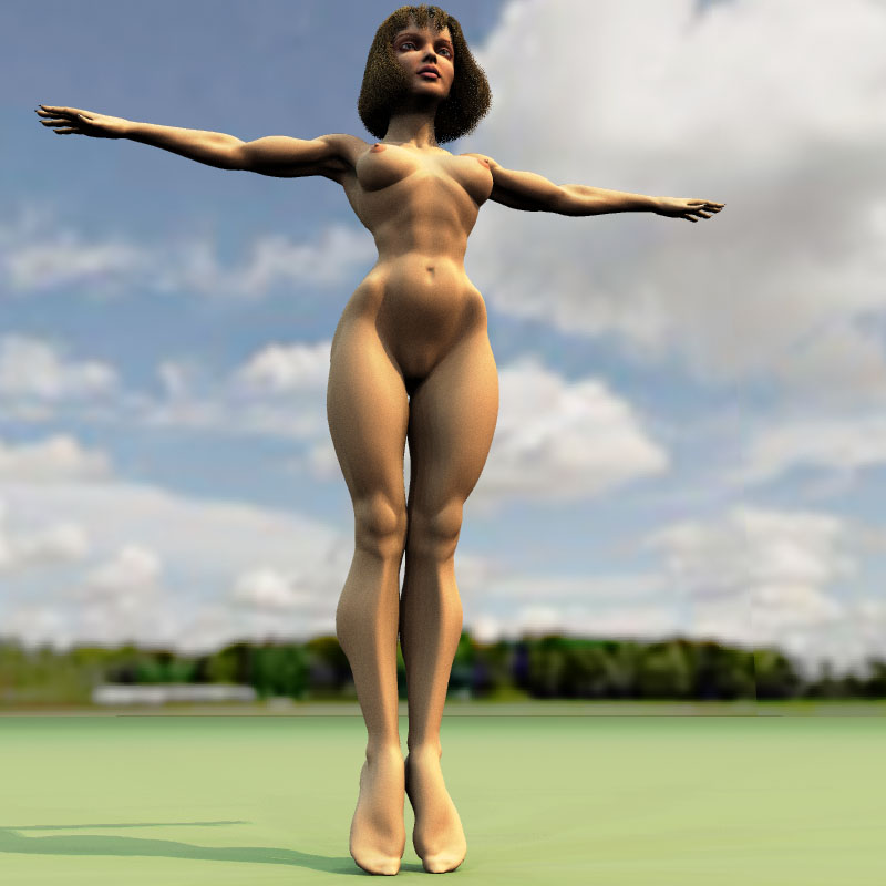
Thanks everybody for all your compliments. Here is a low POV. Does she looks so petite from this POV?
-
It's also the point of view. The camera POV I mean. From this POV, she looks rather small and the legs looks too thin too but they aren't I'll try to post a low POV. You are right about the "tiny-little bit". Really, proportions can be that subtle. In numerous times, I just tweaked that "tiny-little bit" to get a proportion just right. That's how it is.
-
-
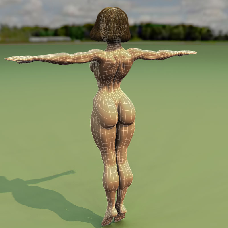
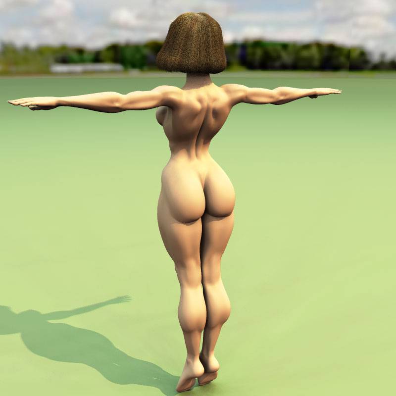
Here is the back view. I'm not quite satisfied with the tricep on the arm yet. More tweaking to do there. And I will smoothen the musculature on the back too.


