-
Posts
3,827 -
Joined
-
Last visited
-
Days Won
31
Content Type
Profiles
Forums
Events
Everything posted by largento
-
Still working on my Vulcanine set. It's coming along pretty well. I cheated some of the set to make it a little more impressive (the actual set was kind of cramped.) I'm fairly certain they used forced perspective on the far end of the set. I want to interact with that area, so I kept it full-sized. Most of what I have left is either background stuff or little details that need to be added. Over half of the film takes place on this set, so it's worth putting in all the effort (plus, it's fun.)
-
He's hilarious! Very cool.
-
It would be a challenge, Gary, but all of my efforts are going towards my Amutt Time project... and there is sooo much left to do. Can't let myself get distracted by something shiny and lose sight of the goal!
-

new model-debating if it'll be a caricature or realistic
largento replied to ruscular's topic in Work In Progress / Sweatbox
Haha, that looks great! I really dig how you modeled his hair. I can sympathize with having to wait for 3DPaint. I keep hoping I'll see a post on here that they've finished the Mac version... -
Wow, it looks like you've already put a ton of work into that! Be a shame not to do anything with it. I'm guessing from the look of it that it's very accurate, too. Maybe you could use it to suggest a safety poster or something (show fire exits or something like that.) I probably won't do anything more with this. It was supposed to be a quickie and although I do think I gained some knowledge from the process, it did take me away from my main project for the whole weekend. I could see running the camera down the line and having each of the figures doing the one action they are in the middle of, but there would be a lot of steps that would have to be filled in to actually show any kind of continuous motion. The truck is from the Extras DVD.
-
Hey thanks, Wade. No, no animation. Sorry if I gave the wrong impression, it was just a static graphic for a presentation. The expectation was that I'd just illustrate nine little boxes in black and white. That's why I was worried that they'd think it was over-done and reject it.
-
Thanks, everybody!
-
Thanks, John. The danger of using a Dead Puppy is that the client might like it. Then you're stuck with it. The assembly line graphic went over well (even if people kept calling Thom an alien... because he's green... Go figure.) I did end up doing a couple of different renders to get it as "clean" as I could.
-
Yeah, pro software is expensive. But when you get into the system, it's not *as* bad. $199 may sound like a lot, but compared to $599, it's not quite as steep. The Adobe buy-out was good news for me, since it allowed me to upgrade my Macromedia studio to CS3 and I ended up getting to add Illustrator CS3 and Photoshop CS3 Extended for what amounted to an extra $100. That was a seriously cool thing. I hadn't realized that Macromedia had already abandoned Freehand even before the Adobe buyout. Apparently the last version they'd worked on was like 4 years ago, so even if the buyout hadn't happened, Freehand was already dead. I kept up with Freehand until Freehand9. It did help me to upgrade to a Macromedia bundle (I also had Flash), which got me here. I wish my first version of Freehand had only been $60! I'd have to check but I think the first version I bought of it (3.11, I think) was $400! I remember I took out a bank loan to buy my first computer along with Freehand and Pagemaker. The software cost more than the computer!
-
Thanks, guys! I've got my fingers crossed. Ken— Thanks for the tip on the neck. Now that you say it, it's painfully obvious (well, painful for Thom... especially in the 3rd one over.) These are all the steps, so there's a Thom doing each one of them. Several of the steps seem to have multiple steps in them, so I've just sort of picked parts of them to show. It's more of an overview of a process than a how-to. The steps will be written below each Thom. Vern— You are so right, Vern. I'm convinced that most clients aren't happy until the design looks bad. Have you ever heard "Stan Freburg Presents the United States of America?" There's a great bit where George Washington comes to Betsy Ross to see the flag she's designed and immediately starts questioning it and suggesting trendier colors. Betsy sings a song called "Everybody Wants to Be an Art Director" that's hilarious. I don't know if they actually want things to look bad or if they want to make endless revisions and only stop when they realize that it looks like crap... and then they don't want to go back, because it will be admitting they were wrong. A former creative director I had passed on to me this very valuable tip. He called it the "Dead Puppy." He worked on mostly broadcast stuff and he said that the client always wants to feel like they have some input in it, so they're always going to change things,no matter if it's perfect. He said they used to purposely put one item on the set that didn't belong (that's what they called the "Dead Puppy.") That way when the client came in, they'd immediately zero in on this obviously wrong thing ("What's this Dead Puppy doing on the set?!" "Goodness, you're absolutely right about that. We'll get rid of it right away.") and leave the rest of the stuff alone.
-
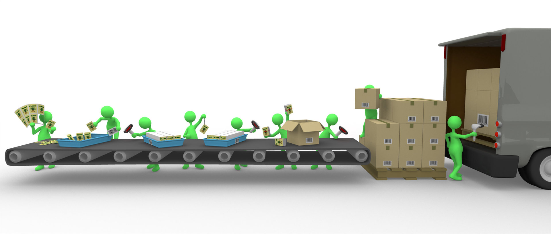
I was charged yesterday afternoon with doing a graphic for a presentation. One of those "Step 1, Step 2, Step 3..." type of deals. My other work was slow, so I asked the boss if I could go home and do it in 3D. It's overkill for the job, but I thought it would be fun to do and foolishly believed I could knock it out in a couple of hours and get off work early. I finished it around 10pm last night. So that didn't work out exactly as planned, but on the plus side, putting together a complicated scene was a great learning experience. I had a fairly rocky false start, but learning from that, I started over again fresh and tried to do things in a more organized, smart way. (I used a lot of action files.) The boss won't see it until Monday, so I won't know how it goes over until then. I'm hoping they'll really like it and I can use this to get them to buy A:M for the office. (This same strategy worked a couple of years ago to get them to buy Flash.) I really hope it works. The more I play with A:M, the harder it is to go back to doing flat stuff. Worst case scenario is they think this is way too much, tell me to go back and do it the old fashioned way, and I'm out a Friday night. Even if that's the case, at least I got some more experience working with A:M. ...and my Friday nights aren't very exciting anyway. Obviously that's Thom with a new paint job and the truck came off of the Extras DVD (that saved me from being up much, much later.) The little picture on the tag is a render of a plant model off of the Extras disk, too (although it's so tiny it could have just been a blob). Everything else was hastily modeled by me.
-
Rodger, do you take less of a hit at render time by having multiple instances of an object as opposed to having pasted multiple copies into the model? (Like using symbols in Flash?)
-
Thanks, Robert. I hadn't even thought of that. That makes me think that I should break up my set into even more pieces than I originally planned to. Now I'm curious about these Action Objects... EDIT-- That was fast! I didn't even have time to finish asking the question. :-) Thanks, Ken... Something to think about... especially for the more complex sets.
-
I'm in the process of building a set and it occurred to me to wonder if I should assemble all the pieces of the set into one model file that can be dropped whole into a cho, or should I keep the pieces of it in separate model files and then assemble all of those inside a cho file? The elements will all remain static (nothing will need to move around.) Will it make a difference?
-
That *is* subjective, Bob. My current experience is that the more time I invest into it, the more enjoyment I get out of it. The first time I picked up A:M on a whim (a few years ago), I wasn't really interested in investing the time and my enthusiasm dropped off. At the beginning of this year, with a different mindset, I decided to give it another go and really invest the time and effort. Now I'm having a blast! A:M is the only 3D app I've ever really used (I've opened a couple of others, become disoriented and confused and closed them), so I don't think previous experience is required in the least ...and my impression is that a lot of the people on these forums call A:M their first 3D animation app, too.
-
Looks like a cross between Bill the Cat and Opus! Coolness.
-
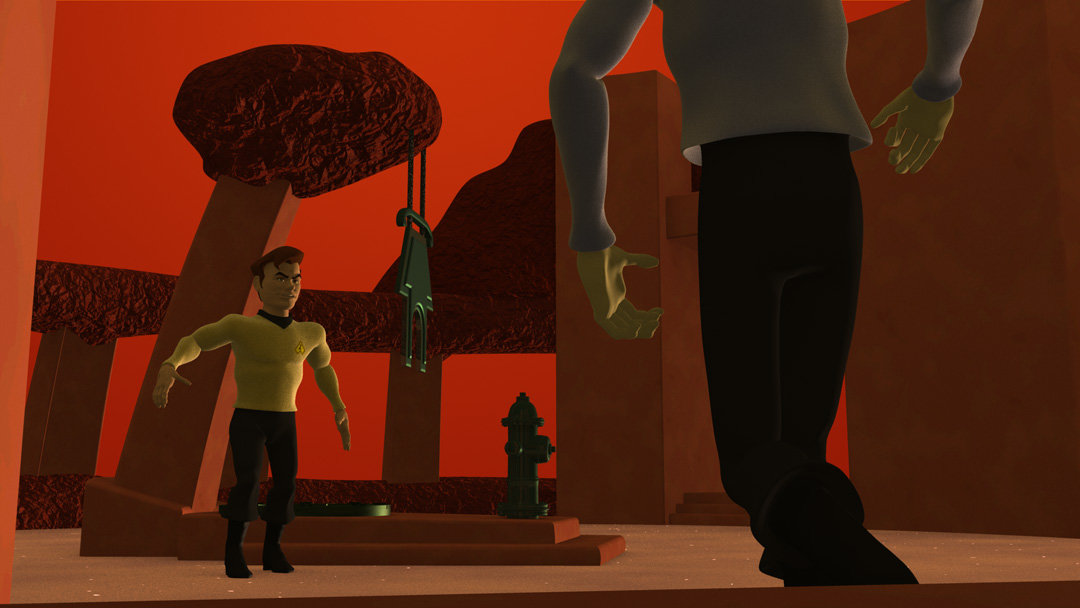
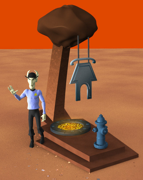
I'm still jumping around. I've been working on creating the Vulcanine Set. This is the centerpiece of it. The set is circular with some pillars encircling one half and two entranceways with a stone wall in between them on the other half. It's funny, they clearly didn't build the stone wall between the two entrances for the show. There isn't a single shot going in that direction. So, I'm just guessing that it's a stone wall. :-) Of course, since this is VulCANINE, there's a lot of dog stuff. The symbol that's repeated around the coal pit is the chinese character for dog. :-) I couldn't find any blueprints or plans for this set (although I thought one of the books I did had a rough overview of it), so I'm just having to guess.
-
Cool, T-Dogg! This is the first time I've seen this. It was fun being able to see the progress through the whole WIP. And who doesn't love the old Batmobile? It does look like to me that the wheels are smaller than they should be, so I took the liberty of superimposing the original roto image from your first post over your latest version to check. Can't wait to see the finished piece!
-
I'm really sorry to hear this. It's an inspiring piece of work. Sets the bar really high. I hope you do the short, though.
-
I'll have to think about that, Mark. The way they are now looks like my drawings. I may change my mind, though and play with them. So you can say "I told you so" then. :-) I'm uploading a 2nd transporter test. I think this one works better. I was getting a "matte" line on the other one, so I used openEXR frames this time and got a better alpha channel. I also adjusted the timing of the beam a little... and I thought having him remaining frozen at the end detracted from getting the full effect, so I animated Spott a little after he materializes. I haven't really done any animation before, so be kind while ripping it to pieces. :-) The movement is only 20 frames long, so there's not a whole lot of it. My thinking was just that I wanted to create a contrast to the freeze frame of the transporter effect. It at least succeeds in that regard. Since it's the first time I've ever made one of my characters move, I'm pretty excited about it. :-) For some reason the frames rendered with a black spot on Spott's tunic. It's not shown up before, so I think it's just a fluke. betterbeam_glo2.zip *EDIT* I've replaced this one with yet another version. I'm probably putting too much thought into this, but I do want it to look good. This new one is basically the same as it was, except that I've given the sparkles a glow and then duplicated the sparkle layer and offset it by one frame, which fills out the space a little more. I also adjusted the brightness on the "frozen" frame so that there's a more dramatic switch at the end of the effect. I may have gone too far, but I think it's okay to make it look a little better than the original, as long as it still "feels" the same.
-
I like it! The movie version of the Enterprise is my favorite ship of them all.
-
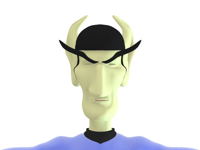
Thanks, Mark! You're right about Spott's eartips. How's this? I'm still working on rigging him. I used your posable install for the Squetch Rig and have most of the body CP's weighted. (I felt like a dope when I found out there was an easy way to edit the weights... I was trying to do it with the "Has Falloff" properties... d'oh!) I've been using David's Squetchy Sam as my go-by to see how things are set up. It's been slow-going, but I'm sure that it'll be faster once I've gone through rigging a couple of characters. I think the Squetch Rig is really going to up the quality of the characters. You guys have done an amazing job!
-
This might be helpful for you, Wang: http://migrate.hash.com/forums/index.php?showtopic=22803 The first part of the first Squetch Installation video tutorials has a section where David Simmons goes over the basics of bones. I'm still learning myself. There's a tremendous amount of things that you can do with bones. Even if you do not plan to use the Squetch rig, there's still a wealth of information passed on in these videos.
-
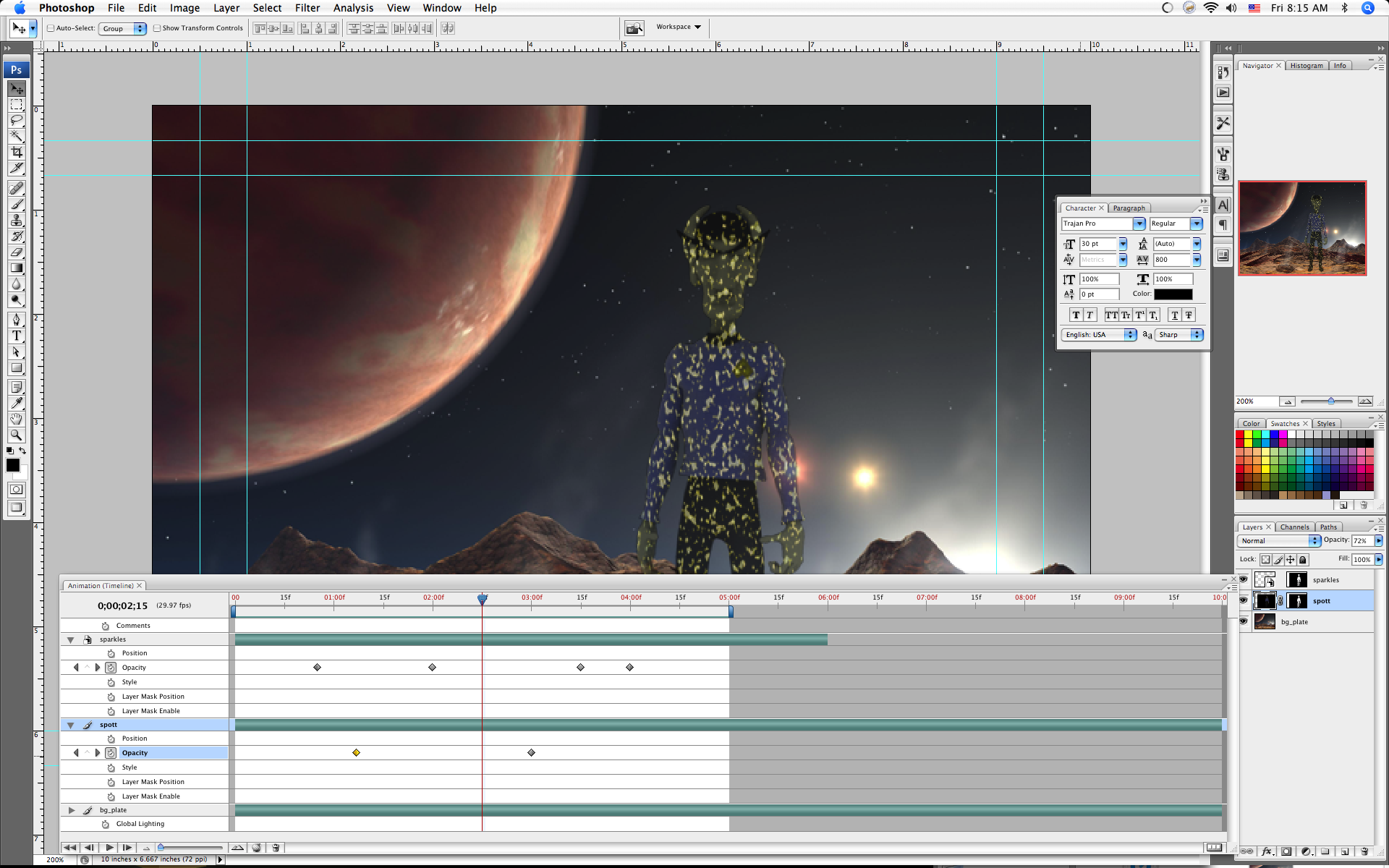
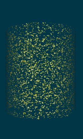
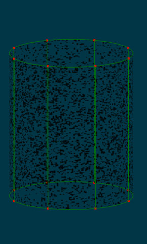
Well, I figure one of the plusses to having so much work left to do is that I can jump around some. :-) Seeing the new video stuff that Photoshop can do now made me realize it would be pretty easy to create the transporter effect. It was really easy. I'm sure I'll be able to improve on it down the road, but I think it's a good start. I've attached the quick 5 second video as a zip since the m4v quicktime file is so much smaller and the quality is so much better. transport_test3.zip Here's a screengrab of the file open in Photoshop: You can add video as layers and treat them basically like normal layers in Photoshop. In this case, I created a sparkly image which I brought into A:M as a png file and mapped to a cylinder as a cookie-cut decal. Then I made a cho and animated it rotating 180 degrees. That gave movement to the sparkles and since you could see through to the back of the cylinder, you've got sparkles moving in two directions. I duplicated the frames a few times to give me 6 seconds of video. I brought the quicktime movie I made from the animation in as a layer, and resized it so that it filled the area where Spott would be standing and set the layer style to screen. I used the mask created by the alpha channel from my render of Spott to mask off the effect and then animated the opacity of both in the timeline. The background was just an image I'd grabbed off of the web awhile back.
-
I'm assuming that you would only see any animation in the close-up of the keys in the air and that shot would have to be in slow-motion. I'm not thinking your average off-the-shelf video camera is going to do a very good job of capturing that with the level of detail you want. I would think you'd make a replica of the fob to use in the normal speed shots (which will be blurry) and then do the entire keychain in CG for the slow-motion close-up. But this is coming from a guy who had, before this post, never heard the term "key fob" and had to look up what it meant. :-)


