RS3D
*A:M User*-
Posts
142 -
Joined
-
Last visited
-
Days Won
2
Content Type
Profiles
Forums
Events
Everything posted by RS3D
-
Good job. I really enjoyed watching the video. It is hard to get a good sense of timing for comedy and I think you did a good job on it.
-
Yes. The A:M license file. I can never seem to remember how that works. Thanks for the help.
-
I purchased the latest update for A:M and ran the installer program. Hash sent me the access code after they processed the payment. The installer appeared to do something because the settings got set to the default conditions. I expected that the program would ask for the access code and do some process to renew the license, but that has not happened and now the system says that the license expired. What am I missing? It is probably something pretty basic because I have updated the system in prior years without any problem. Does anyone have have an idea of what I should do?
-
The timing looks good. I was looking for some kind of sound when their fists met. But I know you said it was not quite done yet.
-
I really liked the animation. I especially like to see little extra touches that animators put in, even if most people will not notice. An example is the finger roll on the bad guy's control stick toward the end. It shows the depth of thought that you used to lay out the scenes, etc.
-
found train car by kamikaze3557 and added a PS idea
RS3D replied to johnl3d's topic in Tinkering Gnome's Workshop
I hit the 'video' caption near the bottom of your post. That is a lot of animation in 1 1/2 minutes. It is like watching a greatest hits collection. -
I enjoyed watching your animation. You did a good job co-ordinating the two characters in the action. Most important, It held my interest until the end.
-
Thanks for the input Robcat. The collapse of the book and candles together is supposed to show that her whole lesson is not working because of her being a novice who is just learning the necessary skills. As for the reading times, I agree, but I think the whole animation feels a little rushed. I could go on making improvements in just about every area including modeling, lighting, animation. etc. It is definitely not a monument to good animation, but I accomplished what I set out to do and I learned a lot about putting together a whole mini-story instead of just a scene. As Rodney pointed out, working with real characters is a lot of work, but I also think it is a lot of fun. I am going to work on something a little easier next like doing a semi-truck model.
-
Here is a final-full rendering version of the animation. It is very compressed (77meg down to 11meg), and the quality suffered a little, but it seems to be viewable. Thanks again to everyone who responded with suggestions, feedback, etc. Book0_830a.mov
-
Here is another update to my animation. This one has the entire animation (27 seconds) with a sound track added. I took out the reflections, shadows, & background and carpet images to get a better focus on just the animation in the various scenes. I wish I knew more about using the camera for highlighting various aspects of this animation. So much to learn, so little time. HermioneLesson.mov
-
I completed blocking in the different scenes for the total animation and now I am going back and tweaking the individual actions. Attached is the latest book summoning scene where I tried to implement some of RobCats suggestions along with stronger poses. Any feedback will be appreciated. BookOnlyMove6.mov
-
Here is another update on the animation project. I worked mostly on getting the various props, effects and camera locked down to fit the time budget for each segment. I still need to replace the right hand/wand combination and do a lot more work on secondary motion, anticipation, etc. You really have to concentrate on key framing everything in a project like this. So far, I have done it all in one choreography. BookOnlyMove4.mov
-
I made another update to the book summoning section. Following Robcat's advice, I put more secondary and directed movement in the character. I checked a Harry Potter movie and they use the wand as sort of a weapon or in a kind of violent way. They usually have a pretty good grip on it. The hand model kind of bothers me because it looks more like a blacksmith's hand than a young girl. I will have to redo that part. This update includes the second camera action: viewing the book from behind the character. I allocated 80 frames to that part so hopefully it is enough time for the viewer to read the designated page in the book. BookOnlyMove3.mov
-
I added a few things to the opening 6 seconds and tried a larger, more complete animation. BookOnlyMove2.mov
-
I spent time to clean up the model to make animation easier. I am going to try for about 15 seconds worth of animation. Four second sequence of book summoning -see attached (VERY rough) .MOV. Then 3 seconds of book page reading with different camera angle, 4 seconds of candle action and then 4-5 second payoff. If someone could look at the opening animation and give me you impressions related to timing and pose selection, I would appreciate it. BookOnlyMove.mov
-
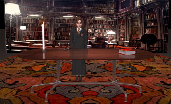
Thanks Robcat for your input. I was mainly concerned about the relative size of the girl model to the table. She is supposed to be between 10-12 years old, so the table size is an attempt to help scale the model in the scene. I stood next to a table today and tried to figure where the table would be with the girl in this scene. I added reflection to the table and that seemed to help integrate the model into the scene. I actually decided the girl model is too big, so I scaled the girl model and the candle down and re-positioned the camera (see attached). The width of the table will be necessary for the eventual action that will take place, so either I start closer and then move back of just leave the camera alone. I appreciate your help.
-
I am trying to put together an animation for the Hermione character. Hopefully it will be a spectacular feat of magic. But before I get too far along on it, I would like people to tell me if they have any problem with the layout of the scene-such as perspective, lighting, prop positioning, etc. Attached is a teaser that shows the environment for the action. candleOnly.mov
-
Vision Recumbent r-40 bike "Maybe Mature warning"
RS3D replied to ruscular's topic in Work In Progress / Sweatbox
Very nice job. I am looking for an animation on this project. -
Here is another update to the model. It now has jaw movement, teeth, a frown pose and hair mobility. The animation shows typical turnaround, mouthing the word "hi" followed by hair swishing. I hope the changes I made do not reduce the recognition factor. So if someone sees a problem please let me know. F3_1212.mov
-
Thanks robcat. I will watch for chin issues in the animation playbacks. Attached is an "eye candy" animation to see if the decals will hold up under different lighting conditions. F2_4.mov
-
Thanks to robcat and Rodney for your suggestions and observations. I really appreciate it. I will try to respond: Rodney says [i"d say the biggest difference remaining between your two images might be her upper eyelashes... or lack of them in your latest improvement. While all features are important that triangle between eyes and nose is the area to focus on. Within that area I'd say the eyelashes and tip of nose (from the front view) are in need of attention. The eyelashes appear to be largely missing and the nose should be a little more bulbous.] -------------------------------------- All valid points. At this time the model does not have eyelids and putting them in is going to be tricky. I am saving that for the last stages where I can test eye blinks in 3d. The nose issue is also tricky. As I make it wider in the front view, it tends to lose some of the curvature in the side and 3/4 view, so I am going to have to do changes in little bite size increments. ==================================== Rodney says [i will add that if you are using your rotoscope only from the bottom (i.e. splining over the top of it) then you might want to place it on top with the transparency turned up. Then as you adjust your CPs and splines you can better see where they are off from the original reference. -------------------------------------- I put the rotoscope down first and then model over it. I use the rotoscope image also as the front face decal and I can align it perfectly with the underlying rotoscope decal. This produces some distortions because I am not using a flattening procedure before applying the decal. I then go in and adjust the splinage to minimize undesirable effects] ================================= Rodney / Robcat says [in A:M, yet another alternative to the classic rotoscope would be to use a Layer, which can be rotated in any direction, but if I'm going to go that far I usually find that a patch image will work even better. Layers have the ability to adjust some surface properties that 'rotoscopes' do not... such as cranking up the ambiance setting so that the finer details (the ones that are less important) are removed. Patch images have a whole lot of other options and can be manipulated via poses, etc. Specifically to Robert's cautionary note is the fact that one can recreate the general perspective more easily by allowing for the view of the camera. If a sequence of images roughly the same size can be strung together and then the view adjusted while creating the model. But this doesn't address the issue of the 'error' the camera perspective produced in the first place when it captured the image so... This leads me to the ultimate suggestion which would be to try to use a sequence of images for reference. I'm not suggesting anyone slavishly use this reference footage to trace from but instead use it to capture the feel of the character in movement.] ------------------------------------ I am basically trying to do the things you describe in slightly different ways. Mainly by manipulating various settings in ambient lighting, image based lighting, etc. in choreography. I agree that the best way to do this project is by trying to keep several images from the movies in your head rather than trying to duplicate one image. That is why I started with a 3d animation rather than a specific image in the first post to the forum. ==================================== robcat says [i still think the chin shape is departing from the reference.] ---------------------- Which angle is giving you the problem? is the the side image or the front image?
-
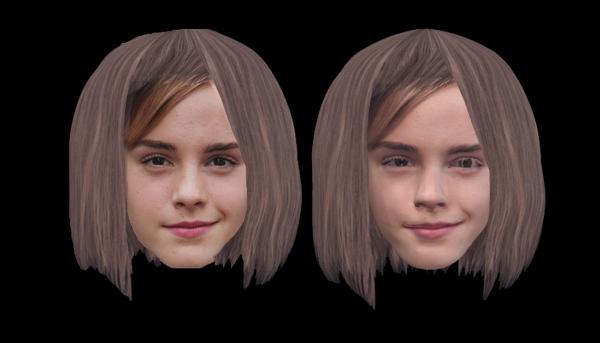
Here is another update on the Emma Watson model. I put some specular on the eyes and shortened up the area from top of head to bottom of the nose. I also changed the nose a little to get more of a button nose effect in order to get the multiple angles as suggested by RobCat. Attached is a front face comparison between the original rotoscope (adjusted for hair style) and a frame from the choreography. It looks like I am getting close, but I am still concerned that making it look like the rotoscope may not get someone to recognize the person. I made another .MOV for review, so if anyone sees I am straying from "person recognition", please let me know. F2_3a.mov
-
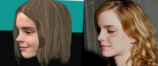
I made a few more changes to the model. I also located a photograph that shows a 1/2-3/4 shot of the head. I tried to come as close as possible in a choreography and came up with a comparison. I think I did pretty good on the mouth, forehead and eyebrow positions but it looks like I have to carefully shorten the nose some more. The eyes are just blanked out in Photoshop because the model doesn't have eyelids yet.
-
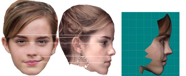
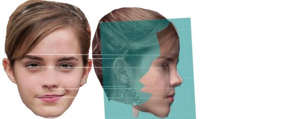
Thanks Robcat. This is the stage where I start to get nervous. Once you get a likeness, you run the risk of losing the intangible details that cause people to recognize the character. You can wind up with a more accurate model in terms of geometry, but the model loses the intangibles that cause recognition. I fixed up the two rotoscope images and placed them side by side with a profile of the model as it exists now. Then I superimposed the Hash model profile on the rotoscope. It is not real obvious from these images what needs to be done, but it appears I need a better transition from side of nose to middle of the cheek, move the bottom of the nose forward a little and experiment with the area between the eyebrows to move it forward a little. That little protrusion between the bottom of the forehead and top of the nose is kind of unique to her and it appears in a lot of other profile pictures of her. Any and all suggestions are welcomed.
-
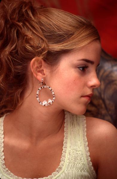
Thanks to robcat2075, markw, Rodney, mborok and ludo_si for your comments. I will keep working on the model to try to complete it. I have worked on the eyes, cleaned up some of the splinage and located a really nice left side picture for rotoscope (see attached). I have also made another .mov of just the head that I hope is better than the first one. F2_3.mov


