-
Posts
21,648 -
Joined
-
Last visited
-
Days Won
119
Content Type
Profiles
Forums
Events
Everything posted by Rodney
-
Note the filename from days gone by...
-
He be.... Jean Chrétien PRIME MINISTER OF CANADA Linkage: https://www.google.com/search?q=canada+politicians+Chretien&sxsrf=ALeKk02X40CUqhnVvdK0V8z5ufQGg36ZxQ:1587861774112&tbm=isch&source=iu&ictx=1&fir=fggDxlw7fKVcUM%3A%2CaJ9Or8oFtxZaIM%2C%2Fm%2F0k0y0&vet=1&usg=AI4_-kTjReqwOrHz20kkkbh7GiUdlGsmxg&sa=X&ved=2ahUKEwjY8v2H7oTpAhXLKM0KHUKJCRAQ_B0wFnoECAUQAw#imgrc=fggDxlw7fKVcUM:
-
I'm afraid I don't know my Canadian coinage and cannot recall the location of the discussion. I am fairly certain it was here in the forum where the truth came out.
-
Fun factoid: This guy plays George on A:M TV but... he's actually a Canadian political leader! The originator of the model created him to satirize Canadian politics but when A:M Users saw the character they automatically thought it was George Bush. So, fast forward to the making of the Extras CD and the team renamed/repurposed the model.
-
We skipped last year... which is what allowed us to get into sync with years/versions. Now we are at that once in a lifetime alignment of the stars. This reminds me of a very old conversation with Martin where he was talking about dropping version numbers entirely and just going with yearly designations. My how time does fly... that was well over ten years ago.
-
Random thought... I hope we can move to v20 for 2020. It'd be a lot easier to remember the version if it is aligned with the year. It doesn't have to have any big bell and whistle new features... just increment the release number along with the year.
-
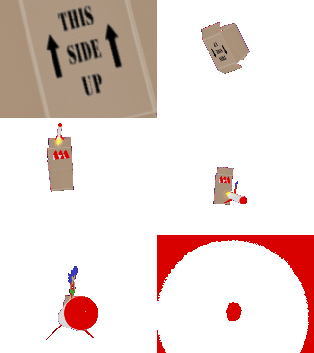
Yikes! I haven't posted here in the Tuckertown topic in almost exactly two years. The other day I thought I'd model an unfolded cardboard box and rig it so it could be folded... and ended up doing a little more.
-
Yikes. Scary stuff Robert. Since we are feature requesting.... Maybe a ball of hairy particles on his back? Virus.prj
-
Maybe he looks a bit too friendly John? Not sure how scary you want him to be though.
-
The digital download approach would be really nice. Hopefully Jason can make that happen. **Yes, notice how I volunteered Jason!
-
That easily makes the top 10 list of TaoA:M 'The Door's Stuck' exercises. Nicely done Elm!
-
I don't think the Extras DVD has been re-added to the Hash Inc Store since the store was recently updated. This might be just as well because a new DVD (or other Extras... say a USB?) might be in order. We should find a place to upload the DVD content so it can be shared freely and I'll put it on my schedule to ***start moving toward*** a new Extras release that can be added to the Hash Inc store. Aside: I'm not sure about current inventory of DVDs. Perhaps they are printed 'on demand' when ordered? Content for the Extras CD (and a smaller subset also) can be found on the Hash Inc FTP site. Extras CD: ftp://ftp.hash.com/pub/misc/Data.zip 158MB Core data for TaoA:M exercises etc: ftp://ftp.hash.com/pub/misc/LittleData.zip 7.5MB The DVD has over a gigabyte of data.
-
Posted elsewhere... Free for a limited time (as a response to the current Corona virus scare): https://creatureartteacher.com/product/fundamentals-of-animation/ Contents: In this comprehensive course, master animator Aaron Blaise (“The Lion King”, “Brother Bear”, “Mulan”) takes you through the key principles of animation. This course covers the “12 Principles of Animation” as originally pioneered by the original “9 Old Men” who worked directly under Walt Disney. This course includes 13 HD Video Tutorials covering: Squash & Stretch Timing Solid Drawing Anticipation Follow Through + Overlapping Action Arcs “Slow Ins” & “Slow Outs” Straight Ahead Animation Pose to Pose Animation Secondary Action Staging Exaggeration Appeal PLUS A full lesson on Biped (Two Legged) Walk cycle animation PLUS A full tutorial on Bipedal Run animation For anyone involved in animation there shouldn't be any surprises here BUT... if everyone has a copy of these lessons it will make a nice common reference.
- 1 reply
-
- 1
-

-
One of these days we need to have a contest to come up with a set of high quality icons that fit a series of themes... created in Animation:Master of course. Fun Factoid: Each like (or other response) given to a post increases the original posters 'reputation points' by one point. Currently there are no icons/responses that give negative points.
-
I'm in...again! :) I've learned a lot but need to learn more... and have what I've learned until now sink in even deeper. Hope others will take advantage of the opportunity. The more the merrier!
-
Hi Myron! It's been great seeing your avatar/icon appear in the forum... and your recently shared animation. That takes me back. I haven't been very active myself in the A:M Forum of late so maybe I need to reintroduce myself too! I'm looking forward to what 2020 brings and am excited to think of diving deeper into A:M again.
-
Ah, this takes me way, Way, WAY back to the good ol' days. Thanks, I needed that!
-
If you have the image sequence in the Project... - Open Project Workspace (PWS) - Right Click on Image sequence icon - Save As Animation Please see attached image of menu:
-
Myron, To easily convert a image sequence into a video (or video to image sequence) via Animation:Master: - In the Project Workspace (PWS) listing load your image sequence via Right Click on 'Images' - Once loaded into Animation:Master Right Click on the item you wish to convert (also via PwS) and Choose 'Save as Animation' - I believe the default format will be AVI but you can type in the format extension of any supported image format. Note the Compression button next to the filename (if AVI is the format). This will allow you to select the codec/compression (or no compression). Regarding rendering to AVI... You might check the setting in render dialogue that shows the codec/compression being used (similar to the button mentioned above but now in the Render dialogue). That may be why you are having trouble. Resetting that to another codec (or no compression) might resolve the issue. Aside: To convert to formats not supported by Animation:Master I recommend FFMPEG (or any utility that uses ffmpeg) as there is a very broad range of supported formats.
-

Prehistoric! Image Contest! Deadline December 20!
Rodney replied to robcat2075's topic in Animation:Master
Nice tip. Thanks Robert! -
It can help to take an approach of using an even number of splines. This will not only help in avoiding 5 point patches but also 3 pointers... as well as chart a course for dividing larger sections as they get refined into (optimally) 4 point patches. One of my favorite approaches... where the model will never leave Animation:Master... is to fully embrace 3 and 5 point patches and even leverage them in innovative ways. For instance: intentionally creating a 5 point area so that it can be capped as a 5 point patch. As a general rule, anywhere in a unibody mesh where there will be appendages (or orifices) there will be a requirement for a special patch (3 and 5 pointers being most used). In the 'embrace the problem' category: Another useful and old school approach is to hide the area in question. For instance, we might hide 'eyes' behind a pair of glasses. We might extend troublesome areas out of camera view... move them around to the side or scale... way... way down... In the case of scaling it might be possible to leave a 5 point patch area completely open and it now be seen in the final rendering. It might not be 'air tight' but... no one will know it isn't. How about the 'grid based model with decals' approach? Here a basic grid of 4 pointers in modified into a shape and details that would likely require 5 point patches... added via decals. Then there is the 'fix it in post' approach where a troublesome areas is obscured, blended, blurred or otherwise tossed out. For something like the current contest... which rightly places emphasis on using A:M for modeling and rendering... I'd say the embrace the 3 and 5 point patches approach would be the easiest approach rather than spend too much time trying to convert them into 4 point patches. There are some considerations of course with decaling and texturing and so those cases will need to be tested. If not seen in the final rendering though... you'll have more time to refine other elements of your contest entry.
-
David is giving Rodger Reynolds a serious run for his money in the detailing department. Very nice indeed!
-

Automated opening/closing of topics
Rodney replied to Rodney's topic in A:M Users's A:M User Club Banner
no posting here please.- 9 replies
-
- deadline
- lock/unlock
-
(and 1 more)
Tagged with:
-
Well, that was an adventure. I won't say all is now right but at least the Special Topics should be accessible again. A side effect of updating is that the top banner links were almost all broken so we'll need to revisit those. I've moved Special Topics under Animation:Master > Featured categories/forums for the present also. If you see anything else out of place please let me know, I know there are still a few!
-
There appears to be two issues related to Special Topics. Hopefully you'll see those resolved soon.


