-
Posts
21,632 -
Joined
-
Last visited
-
Days Won
114
Content Type
Profiles
Forums
Events
Everything posted by Rodney
-
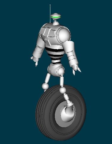
My model is a recurring character from "My Robot Movie" which was launched here in the forum back in 2003. I got distracted and have put it aside for now. The head of the robot is a 360 degree camera setup. The camera inside constantly spins creating a 360 degree panarama in multiD. The 'live feed' goes um... somewhere else. Most robots in this particular series were manufactured to perform security tasks mostly related to 'locate and report'. Once tasked they will continue to look for their target until they find it. They won't stop. Once found they will execute their next directive. In most cases that directive is simply "Report". Of course at the end of each report they recieve new instructions. There are many variations on the theme for this robot (some have legs for instances) and within the the story the more you find out about this robot the more you learn about the worlds of "My Robot Movie". Based on the data collected from the enormous amount of these sentries reporting in, informed decisions can be made. What or who is making these decisions is a subject of some debate and a story arc in "My Robot Movie". The WIP is still on the forum and most of the images are still there. Its fun thinking back to it from time to time. Thanks for reminding me of how much fun that was. My Robot Movie Note: I don't think the robot on the DVD has a camera in it. It'd be easy to set up though. Most of the models and sets I had for MRM are lost or buried. Sometimes I think of starting MRM up again but other projects always take priority.
-
As with many (most?) volunteer projects they are generally a labor of love on the part of the creator(s)/maintainer(s). I'm often amazed that these sites are maintained as long as they are... hosting costs money! Inevitably these projects fade with time as those involved find less and less time and money to devote to maintenance. Its takes a lot to maintain these resources! Links to resources that are outdated eventually are removed as well. Thats just the nature of the process. Not many new users will know that the A.R.M. replaced 'Sherwood's Forest'. As sad as it sounds, in time the A.R.M. will be replaced too. To those that have contributed their time, resources and effort we owe our thanks. To Jim Sherwood, Vernon Zehr and all those that have left their mark on A:M Users... THANKS! When will the next Jim Sherwood or Vernon Zehr appear? Excellent question.
-
There are two new areas in the forum you should definitely keep your eye on: Feature Focus and Tech Talks. They are new and information is just starting to trickle in but it'll provide answers to a lot of questions. Font Wizard information was just posted on 2 Feb! Such as Fonts/Text
-
Allow me a moment of jealousy here. I wish I could write a sentence like that about myself. It can be. Especially if you try to do it all yourself. Thats the great thing about the A:M Forum. You don't have to do it all alone. Anyone who thinks they do... is lyin' to themselves. No and Yes. The CD is a security measure to keep your investment safe. Without it there is no way Hash Inc keep keep their cost so low. Constant in/out of the CD can be frustrating. I feel your pain. There are several remedies available. You can purchase a USB dongle/hasp. It takes the place of the CD. Contact Hash Inc if that sounds like an option you'd like to pursue. As there are resources on the CD you will most likely want to access keep in mind that you'll still use it from time to time. I went the USB route several years back but felt more comfortable with the CD. Hash Inc updates their software enough that made it worthwhile for me. Adding the USB dongle just added an extra layer of complication to an otherwise easy process. I found just downloading the basic update was faster, easier and did the job. I rarely notice the CD in the drive anymore. Some people purchase another (or external) CD/DVD drive. These are so cheap these days I might just have to do that! My main computer these days only has one CD/DVD drive and that's becoming quite the pain. Make yourself at home here in the forum. Oh yeah... You've been added to the raffle.
-
The 2007 raffle is off and running again. Why the delay? I had heard the 2007 A:M flyer was going to be mailed out and wanted everyone to have a chance to enter. As this raffle is only open to 2007 users those that don't frequent the forum, see the flyer and purchase an upgrade can still have time to sign on. If you have not yet seen the flyer you can find it here: http://www.hash.com/am2007/ Pretty slick. 10 more days until the drawing!
-
Yeah but I'm secretly going to send you the model... so... Shhhhhh!
-
Oh oh, I will not mention the 24 actions that come with him then. That would just be cruel. Seriously, I wish I had your undestanding of bones and constraints Mark. Analysing the model's rigs would be so much more enlightening if I did have a more thorough understanding. I can appreciate them... use them a little too... but thats about it. I can't understand them. Some day though! The FACE and Squetch tutoirals on the DVD... those hopefully will help clue me in.
-
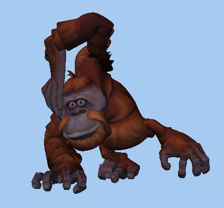
For those wanting to explore decaling there is sure a lot to explore. A decal image from the above orangutan for instance...
-
I saw Mark Skodecek post this little gem of a tip related to using Hair in the TWO character Chopfyt. I'm sure it'll be useful to others. Mark said: Thanks to Mark for taking the time to test that out!
-
Rusc, You got hit by a car twice in one month??? Comes a time when you have to make tough decisions. If the road you are traveling is filled with cars... well hopefully you get my point. You've got to take care of yourself! Wishing people won't run you over (the third time) is not what I'd call a good plan! Nice house BTW!
-
I hear ya Caroline, I understand what you are saying and context should always be considered. Getting responses of a 'very cool' or 'me too' nature is not so much feedback as it is acknowledgement. If a post has one acknowledgement then it may be best to leave it alone. Not always though. If you want to provide feedback and the only think you are inspired to say is 'cool'... that'll have to do. Some people successfully provide feedback even in these cases by acknowledging they don't have the answer and then commenting anyway. They may not provide the answer but through furthering the discussion the question is explored. New insight may be gained and the question refined. This should hopefully make it easier for those who REALLY know to respond. - Some people don't want feedback. I would say this is rare here in the forum though. - Some want only certain kinds of feedback. Its not always easy to tell what kind they prefer unless they state it. - Some want feedback from only certain people, exerience levels or perspectives. The burden is on the poster to specify or they'll get anyone and everyone responding. - Some people may simply want to inform. (A good example of this might be when someone posts a link and nothing more. Sure would like to know a little about that link before I click it though) There is however an indicative with these posts that states "No feedback required". - Projects like TWO or TaoA:M have a general 'open invitation' for feedback. (It doesn't hurt to remind people you are seeking feedback from time to time however) When in doubt its always a good idea to put in your post what you want. (sounds simple doesn't it?) "All feedback welcome!" or something similar generally will work. Any post that ends in a question should clue everyone in that feedback is desired. (Its usually best to keep questions related to each other or stick to one idea per post though) Bottom line is if we wait until someone that REALLY knows the answer it may take a while. Everyone would like that guy or gal who really knows the answer to respond right? In many cases they may just not know they are sitting on the right answer until they read it right. Discussions through feedback help that process along. Don't forget that there is often more than one answer too! Feedback is all about discussion, discovery and sharing experiences. Its not about right answers. GOOD feedback will by its very nature provide GOOD answers though. Getting right answers relies more on asking the right questions. Asking the right questions... now that is a topic for another day.
-
In any endeavor we seek feedback. We look at things from a variety of angles. We poke and prod at ideas. We test new theories. We plan for success. We hope for feedback. And when we get no feedback... that's feedback! Discovery is at the heart of the learning process. Feedback helps us discover what works. As an artist, animator or storyteller recognize how feedback is essential to success. Look for opportities to provide feedback and encourage others in their endeavors. You'll be glad you did. Best, Rodney
-
Everything you've posted are very impressive examples of your work. You may consider some of them pretty simple but the degree to which you've melded the effects work with live action etc... impressive. Intriguing.
-
Sorry! I wish I had better news for you and your toot but we've got the rest of 3.5 gigabytes to go! Oooo.... Look! Orangutan!
-
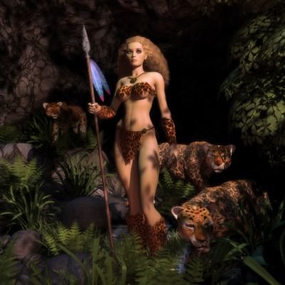
It is indeed a thrill to see Jim Talbot represented. He's been contributing resources to the A:M Community since long before the Extra CD/DVD. Similar to his Leopard Queen is another award winning project: Jungle Queen There are a lot a reasons to study the work of Jim Talbot! Taking a close look at his outstanding decal work is a must.
-
My critique in one word and an emoticon: Fun!
-
His pappa was an aircraft wheel but he doesn't talk much about him. Um... short answer 'Yes'. Correct answer 'No'. I've got one but the Extra DVD doesn't. (Long story) Thats part of the reason we are exploring here. There are some great things that have been added to the Extra DVD that I'm only now discovering. Just pick one item on the DVD you think is cool and pass it on.
-
Hash Inc is currently distributing the Extra DVD with 2007 upgrades. With over 3.5 Gigabytes of A:M resources there is a whole lot to see. I finally started looking through the content and was surprised to see my robot sentry! (eeek!) The sentry has the distinction of being one of the first models I created in A:M and as such is sure not much to look at. He's an almost entirely lathed character that harkens back to the time before I felt comfortable with extrusion. Now lathing... that I thought I understood. Still, I must admit it gave me a thrill to see that old model there on the Extra DVD. He's a bit embarrasing to look at but I'm proud of him. What fun times those were. As you explore the DVD please feel free to post questions or commentary here for all to see. As for my sentry... I'd like to use him as the star of a tutorial demonstrating lathing techniques. Maybe... "The 5 minute robot sentry"? What have you seen on the Extra DVD?
-
very cool John.
-
For reasons that should become very evident to upgrading A:M users soon... the first raffle of 2007 is being pushed back to 15 February. Those that enter in one raffle... are automatically entered in all. My apologies for adjusting the date but I have a very good reason. The main intent is to allow max participation and meet the goals I set forth in my first post.
-
Sure are. Some may have some restrictions (don't make millions of $) but all can be used in shorts and demo reels. Its usually best to credit the author of course. Patently false. No software is perfect but if I could find one... just one... of these sources I'd love to have a crack at them. I've had no takers yet and no one seems willing to provide their sources. You can use A:M forever and pass it on to your grandkids. In order for your grandkids to have the best A:M possible in the year 2070 its recommended you upgrade regularly. (Once you make those millions that'll be easy.) If you even like Maya... you will absolutely love A:M!
-
Steve, With your upgrade you'll get the latest A:M and the Extra DVD. There is over 3.5 Gigabytes of tutorials, project files and related A:M resources for you to explore. Definitely what you've been looking for in additional resources! Now you're talking. I'll be looking for that!
-
When I saw your forum name at the top of the topic I assumed you were just welcoming someone... you definitely aren't a new user. Glad to see you back after your hiatus. From time to time we all need those. I'm sure you'll be settled back in and off and running with A:M in no time. Thanks for dropping in for the reintroduction!
-
Nice job Chris. Congratulations for getting your ad placed! A:M really excels at these photo montages through decals, patch images etc. doesn't it? Thats an interesting choice for stars. (Not a critique... just observation. Works well for me.) Rodney


