

Eos
-
Posts
122 -
Joined
-
Last visited
Content Type
Profiles
Forums
Events
Everything posted by Eos
-
looks like Mr Horse of Ren and Stimpy show. Nice, can't wait to see him completed.
-
I love sword fights! can't wait to see the results! Just a comment about the image: the weight balance of your character is kind of charged to the left of the picture, also the general pose could be lots more martial and expresive (sword fighting is not jogging) i hope i can see a good interchange of steel! good work edit: why the hell did my reply appeared twice??
-
I love sword fights! can't wait to see the results! Just a comment about the image: the weight balance of your character is kind of charged to the left of the picture, also the general pose could be lots more martial and expresive (sword fighting is not jogging) i hope i can see a good interchange of steel! good work

-
POPBOT: Cornell Room and Kitty
Eos replied to patrick_j_clarke's topic in Work In Progress / Sweatbox
Hey Patrick, very nice image. Congratulations for its publishing. A question from a rookie: What kind of light source did you use? In the wireframe i see lots of objects and a hexagonal figure, and I can't tell what it is. -
I like the scene so far. I can't wait to see it finished!
-
Nice car! You should try rendering it in a Ives Skylight scene.
-
The way the left fairie is sitted is kind of unnatural. Maybe it has something to do with the weight balance. You could try moving one of the legs to provide it or bend the back a little forward. That's the only thing i see that is unusual. Too bad it didn't make it to the contest. It would have wiped our asses (wait a moment I should be thankful it didn't)
-
Thumbs up! Good render and nice texturing!
-
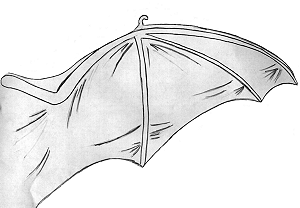
Looks much better now. The Depth of field makes him come out of the scene. The only part that has trouble are the wings, they kind of get lost with the background. Also the bat wings are actually like human arms, so you have two articulations, the arm and forearm, humerus and radius-cubitus, instead of one single rigid stick coming out of the back. I tell you this because it makes the demon guy look like he's hanging from a ceiling instead of floating or flying. Also you could consider making the wing membranes a little transparent so they don't hide the rest of the great background.
-
Thanx for the comments Yeah, just a cylinder with 90% transparency which I added a few times in the choreography.
-
I saw your last renders in CG Talk and they were impressive! How come you haven't post them here?
-
I like it! The rims look sensational now with all those reflection. That chick is meant for carshows too. I wonder if one day all the great car modellers in this forum would like to do a virtual carshow, with all their cars in platforms and 3d chicks presenting them... wouldn't that be nice! A good group proyect.
-
Nice car! C'mon man, let's see it in a background or a carshow platform!
-
Nice work! good "queen of the damned" look. I'm sure you'll find a good use for her in the next contest, maybe.
-
It looks good, and with the proper slight modifications (I agree about the lighting, the guy's pose and camera angle and the too squared bump maps), it will definitely be a nice final image. About the idea you guys have been talking about, the whether-or-not posting your contest entry before the voting, I think that this place, the Hash Forum, is mostly a community where everyone has the same rights and musts. Sure, the monthly contest is a very good chance for competition between us, and it generates excelent works and makes everyone try harder and do some effort in 3d; but we musn't forget that we are a community after all. So I appreciate the valious feedback of my work better than hiding my effort just to see if the "surprise take" will get me better votes. Personally, this is my second image contest work. The first one was unnoticed and I posted it only after the votings and stuff were done. Then, just for fun, I made a wallpaper-like image with the character and someone mentioned in the forum: "That looks better than your contest entry". "Damn!", I thought, "If I only had put the image before, maybe I would realize that before sending my image for the contest. I looked it in the AM Stills and I agreed. It lacked colors, lighting and details. Maybe for the big-experienced and self secure animators of this forum, it's better to make a spectacular and surprise entry everyone is going to enjoy. But for unnexperienced ones like me, it's better to share and learn. i enjoyed posting every single part of my work since I modelled the dragon in the WIP, and everyone made excellent crits and recommendations. Without that, I wouldn't come out with my final image that easily. Also I think that showing your effort, posting the long and hard steps you had to do before the result, is more valuable than just popping out the final render in the contest. I see the avatars of people and I recognize models they did on past threads. "Oh yeah, that's the car he modeled, I remember the good economy of patches he got", and stuff like that. Just my (so-large-maybe-nobody-will-read) two cents.
-
I think the Woodiest thing about him is the cow skin on him. If you just changed it it wouldn't look that much to Woody anymore. I would make the hair thicker so he doesn't look like he lacks of it.
-
Ooh ok, got it... 100 more posts to go... Sure Newbert, i think i'll do a small flying cycle... Hey, just another doubt... I mailed the final render to steve@hash.com but it says there that the images are going to be voted on the forum, at the stills gallery... Do I have to upload it there too?
-
That's an awesome texturing you have! I want to see it finished... About your question of texture sizes, don't worry. Your 100 kb maps are veery decent options if you compare them to the 3.5 Mb tga maps i used for my dragon. Now that's a heavy file! And it didn't break down... yet. I ended up with almost 5000 patches too. It's very adviceable to reduce the patchcount as much as one can, but sometimes you can't sacrifice some details that enhance the visual quality. So this is some sort of fight between the detail and the kind of possible danger that your computer bursts in a huge ball of fire. You're doing good, but you might consider wise to catch that chicken. Eos
-
Hey! I've just noticed that I became a master! Master? I'm just a kid with not that amount of experience for crying out loud! But I accept the name with happiness and honor... So... Where is my fruit basket? Or my toaster? A puppy? No prices? Then a date with some supermodel? No? I've always wanted to know how come some of you guys can change the title "master" for things like "A:M aholic"... Where do you edit that? Please tell me because I want to put something funny or stupid instead of master. I don't deserve that title yet.
-
Hypnotic...
-
You might consider setting the starfield as a spherical map (in which case, you need to rotate the sphere or the camera after applying the texture so the image doesn't get the map union or some stretching) or maybe, a bunch of small 3 point patches with 100 percent of ambience making a sphere. I built one long ago and it proved to be very efficient. Also, try looking for a good camera angle shot. That sideview doesn't look so spectacular. Play a little bit with the zoom and distance from the ship to the camera. Those are my two cents. That US flag is an old one, isn't it? Could it be that the future in space means some kind of time cycle to the times of the Civil War? Is the US flag going to be, eventually, just a symbol or icon to put on battleship hulls? I wonder... Eos
-
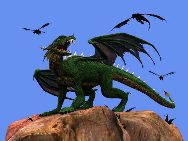
Done!!! Image created with 6 final rim lights, a volumetric light for the background, some changes in textures like the rock and a shadow on its eyes to make it look even badder, some depth of field and 36 steps of final rendering. Now he's ready to kick some ass and eat some human flesh! Good suggestion, Ben. Maybe later, though. I plan to finish the image this century, hehe. I have lots of plans for this guy, probably in animated features. The cave idea is great, so i'll keep it in mind. Expect more to come! I have to email the render for the hash contest now. Thanx for all the suggestions and crits!

-
WHAATT???? Doesn't it look evil enough for you!? Just kidding, hehe. I agree with the torn wings, so I made a slight change in the wing transparency map. I made the skin color a bit brighter so I could compensate the dark overall look of the dragon in the rest of the environment. I'm still struggling with the lights and the deadline is almost over! AARGH this is a lot of pressure!
-
Did that before putting the single keylight in a new choreography. It was completely black except for the eyeballs, because I made a slightly ambience material for them. I think its more related to the specular size and intensity maps. I made a dome of rim lights, 9 in total, pointing at the dragon from all sides, white color at 50 percent with z-buffered shadows. The result is better now. What do you think? Maybe I'll stick to make a realistic effect using lots of lights from all kind of directions instead of trying to achieve them with specular values or my failed intempt of radiosity (my computer crashes everytime I enable radiosity, even with the lower values). Unfortunately, I'll be out of service for a day or two because my PC is about to explote if I don't put windows in a faster hardrive, so I bought a faster disk and I'll reinstall it with all the programs, I'll be very thankful of any advice of how to make a spectacular lighting with this dragon guy. Thanx!

-
Thanx for the advice! I'm not particularly good on lighting so this will be a good chance to learn. I copied the choreography and made a new one with just one keylight and this is what happened. Strange, isn't it? The dragon model has its own specular size and intensity maps (same bump image), so i'm starting to guess that it has something to do. All the way before making the final render I struggled with the dragon, it looks darker than the rest of the elements no matter what i do. Any idea would be very helpful.
