-
Posts
3,827 -
Joined
-
Last visited
-
Days Won
31
Content Type
Profiles
Forums
Events
Everything posted by largento
-
I agree, David! My point is that big comic book conventions would much rather book somebody who played the 5th lead in a Hunger Games movie than somebody who has actually contributed to the art form of comics because it draws in a larger fan base and means more money for them. But these people aren't likely to be comic book fans or trekkies.
-
There's been much discussion lately about the profitability of conventions for artists and dealers. Famed Star Wars cover-painter Dave Dorman's wife posted this blog. She points to a shift in culture that makes it more about the fans than the creators. She says that the cost of San Diego vs sales left them $1K in the hole and Mile High Comics complained at the time that they had lost $10K in San Diego. Given the huge costs involved in doing San Diego, I've never been able to justify it. Even if I sold every DVD I have, I'd never make up for the dealer cost and all the travel expenses. All I know is what I've experienced, which is more and more "regular" people attending cons to see famous celebrities. Whereas it used to be that everyone was just as nerdy (if not much nerdier) than you are, now we're on display in a zoo. And after spending hundreds of dollars for VIP tickets, travel and celebrity autographs and photos, they don't have any money left over for the dealers and artists. I was pretty much factoring on convention sales as the primary way to be able to distribute my own animated projects, but I think that ship has sailed. I'm doing a very small show in November (which has a Mad Magazine theme, appropriately), but it's a tiny one in a hotel with only comic book people and a $7 per person ticket. The biggest named guest is Mad artist Tom Richmond, who is probably completely unknown to 99% of the population. It's in Dallas and an artist table is under $50, so it's reasonable that I'll at least break even. I want to do more parody movies, but with a population that expects everything to be available on the web (and everything on the web should be free), I just don't know of a way that I could ever make it work.
-
That's pretty incredible, Robert!
-
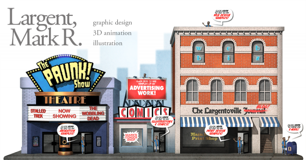
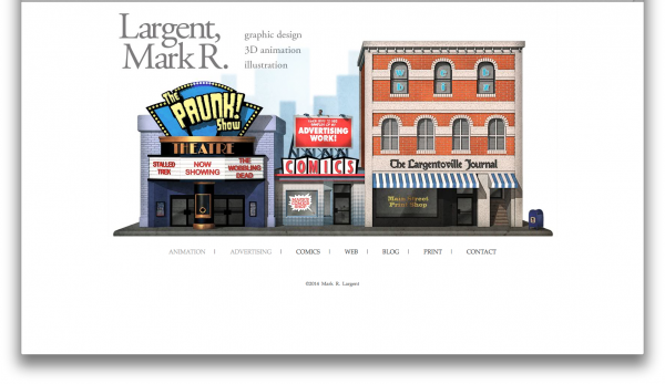
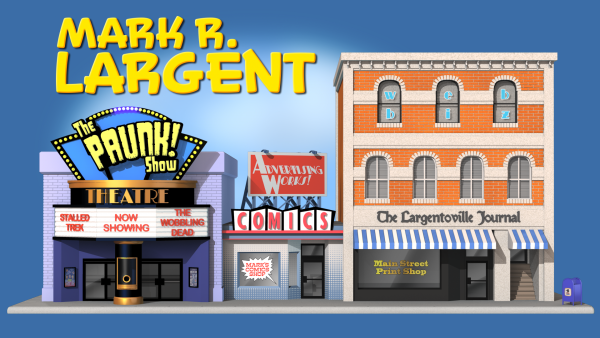
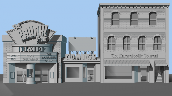
Some updated images of the main page. I found the interior pages were getting too heavy carrying the blue background into them, so I decided to revisit the first page and try to make it a little more serious. Here are the two stages of images that I made. These were then carved up, so that I could have the page work with mouseovers. Here's an example with the Advertising sign selected: I also spent some time in Photoshop, doctoring the images.
-
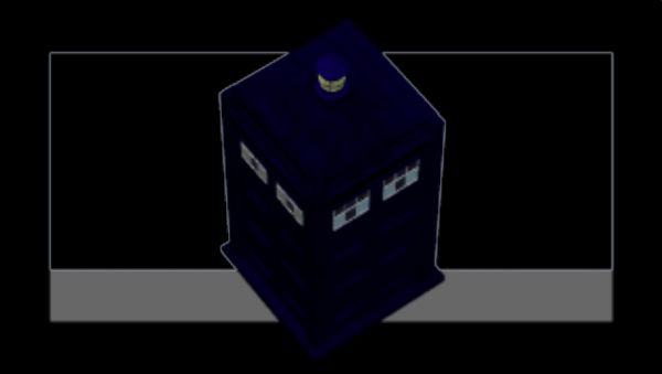
That's a neat idea, Dan. The effect isn't very strong on my computer, but it's because the blue of the TARDIS is almost black and it's hard to see any contrast. Looking at the edges, I'm thinking maybe there's an alpha channel?
-
I do have MotionArtist and should really put some time into it. It's not very intuitive. For now, I'm just using Dreamweaver to create the secondary pages. I actually joined Patreon shortly after it started. I'm subscribed to Pomplamoose's YouTube channel and the guy from Pomplamoose started Patreon (or co-founded maybe). Either way, I joined it when I saw the announcement. The problem is I'm not generating any continuous content. It would have been awesome if I was still doing the webcomic, but for right now, there's nothing being generated.
-
Patreon is definitely something to consider if I ever end up with consistent content.
-
Well, I don't know what to really expect, but got invited by Channel Frederator to join and decided to give it a go. It's a little weird that when you do it, you basically are telling YouTube to take your channel away from you and give it to someone else. Still, they give you access to some info on how to improve your channel's performance and will promote your work. (It will be nice to have that happen.) I'll report back here if I see that it makes a difference in my stats.
-
Sounds like the problem may have to do with converting the extension. Since I'm still on CS6, I was able to use the mxp file.
-
Hmmm. That's weird. The file I downloaded was an mxp file to begin with. I also used the Extension Manager to install it (I'm using CS6.) Sounds like Adobe doesn't want folks using it. :-)
-
@Matt, the coding is still necessary for interactivity, but in most cases, you can search the web for how to do something and find a piece of code you can adapt or get a decent tutorial about. I remember in the early days of the web, I would find something cool on a website, snag their html and try to decipher the code to find out how it worked. :-) For what I was doing, I sliced the image up into large pieces and made all of them buttons. I used a second sliced image as the hover over state and put it a tiny bit of actionscript to make them go to the specific url. Exporting it with the JS Toolkit in Flash did everything except making the links work. Swiffy did it. I've downloaded the extension and installed it, but have only tried it once with an old game I made. It issued a laundry list of unsupported things.
-
Everything seems to work with Swiffy, but it does create a monster html file (everything on the page is written into the html file, including the images.) WordPress is good, in that it has a lot of features that you can activate easily. It's still one of those things where I do a lot of trial and error and guessing to try to make it do what I want it to. I do feel like it does kind of hold me back, though. I feel like I can modify it enough to make it seem my own, but other things drive me crazy. I'm going all-in on HTML5 with this portfolio. If it's going to take over everything, it doesn't make sense to spend a lot of time with the old stuff.
-
Typo there! Should have said Swiffy. https://www.google.com/doubleclick/studio/swiffy/
-
I may have spoken too soon. Just found Google's "Spiffy," which may very well solve my problems!
-
Ugh. Feeling frustrated with this thing. I've tried several ways to get what I want done and I keep running into roadblocks. I tried putting it together with Fireworks. No problem. Get everything right and everything works, but only in Safari. Chrome and Firefox don't line the images up right. So, after a couple of more tries, I went back to Flash. Set everything up in there, get everything working, but here's the kicker, the JS Toolkit exports it as a canvas and you apparently can't have embedded links inside a canvas. I've been doing some reading and there may be an issue with me not having put any info in the "alt" tags, which might be why Firefox and Chrome aren't playing nice. Also something about a security feature that won't let you run javascript off of your hard drive. I feel like I've wasted two whole days just beating my head against a brick wall. Flash works fine and at this point, I'm seriously thinking about using it anyway. Chances are an employer is going to look at it on their computer rather than their personal device.
-
My experiments were less than desirable. :-) For straight animation, it seems to work pretty well, but for interactivity, not so well. There are a couple of things that may be a problem. One is that I'm back to using Flash CS6 and Adobe may not be updating the extension for that version. And two, the files I was using were created many years ago with earlier versions of Action Script, which might make them less compatible. For now, I think I'm going to use image replacement. I was planning on carving this up anyway and I'll make it so that if you hover over one of the parts, it swaps out that image for another one. I found a way to create a scalable image class in CSS that will let the main image scale to the size of the browser window. That was a huge plus because I didn't want people to have to scroll around, yet I wanted to make the image so that it could be huge on large screens. I may come back after I've built the guts of the website and play some more, but right now, I need to have a working portfolio sooner rather than later. :-)
-
I built the Wannabe Pirates site in Muse. It's easy to use, but like most apps that do that, it generates large files. I'm going to try to do it in Flash and export as JS and HTML 5. Be a learning exercise. :-) Going to see if some of my old Flash can be exported, too, so I can have site be Flash free. That Sony example is very cool.
-
That looks cool, Matt! I had originally intended to put some kind of skyline back there, but started pulling back on stuff. Now that I see your mockup, I'm thinking that's something I should go back to. I know Adobe Muse had some way of doing the parallax scrolling, where items scroll at different speeds, but I don't have it anymore. :-) I think I'm going to go ahead and do mouseover replacements, but the obnoxious thing is those don't work with touch screens. There's no way to mouseover something with touch. It's either you're touching it or you're not. The idea that's been appealing to me is have it so that when you mouseover the theater, one of the doors opens and a character is leaning out with a dialogue balloon saying, something like "click here for animation." And then if you mouseover the billboard, a guy would appear from behind it at the top, saying to click there for advertising samples. etc. etc. I did a website menu back in the olden days that used that trick, but loaded an animated gif, so that it looked like flippers that animated flipping over when you moused over them, but the limitation of colors with gifs would be a hindrance here. I used to do tons of Flash stuff at work (the first was recreating that flipper menu in Flash), but these days, nobody uses it and if someone goes to the site on a mobile device, it won't be viewable. What might work is to see if I can use some html 5 animation to reload those images in a pattern, so they cycle through all the options. I may give that a try.
-
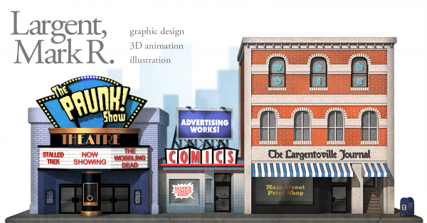
Thanks, guys! @ Matt, I was thinking about just making the white brighter, but I think I'll make it simpler to read, too. @ Rodney, that's a great idea for the business card. I may very well do that. This is going to be broken up and used as the front page/menu for my website. I wanted it isolated, so the blue color will be identical to the blue background of the webpage. I played with putting the mailbox in a few places, but ultimately, I wanted to have it at 3/4 view, so the corner became the best place for it. I'm going to have the contact page linked to both it and my name (in case folks don't see it.)
-
-
This may not help you in trying to make her look older, but it seems to me that her nose and mouth are too low on her face. Note the tiny change to the right. Looks more appealing to me. I'm 46 now and even 20 something girls look like kids to me these days. :-) I think you've done a great job of bringing the costume design into 3D. There are a lot of things I like about the design, but it occurs to me that wouldn't exposed ears be a detriment to maintaining a secret identity? Earlobes are like fingerprints ...except easier to see.
-
Another update! Now the third and final building is modeled. The bottom floor is going to be a print shop, the second floor is a newspaper and the third floor is going to be an Internet company. That will cover my print work, a blog & my press clippings and my web design. I'm going to put a mailbox in between the 2nd and 3rd building to click for my contact info. I've still got to do the sidewalk/curb/foundation that will let me separate this from the background. I'm also going to model a bi-plane with one of those banners for the upper left corner.
-
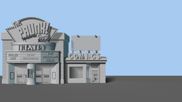
An update. Yesterday I had to switch gears and put together a down and dirty portfolio for a job opportunity that came up. I hope I can finish this soon and send them a link to it, since I'm sure this one will be much more impressive. Obviously, the comic shop will be where I have my comics work, but the billboard on the roof will have one of those "Advertising Works!/Your Ad Here!" slogans on it and will be where I have my advertising work. The last building is the big one. It's going to have three floors.
-
Yes, those imaginary inhabitants of Largentoville think I'm quite the tyrant. :-)
-
As the only person who actually *is* Largento, I alone can say that I wouldn't wish being me on anyone. :-)


