


frosteternal
-
Posts
826 -
Joined
-
Last visited
Content Type
Profiles
Forums
Events
Posts posted by frosteternal
-
-
Lathe it. No reason not to. Easy as pie. Here's how:
Set lathe to 16. The easy way to do this is hold down SHIFT and click the Lathe tool, this will pop up your modelling options.
Draw 1 two point spline on either side of the y-axis. Lathe it.
Delete one ring of points, now you have a 16 point spline perfect circle.
Rotate it 90 degrees around the x-axis. delete one half.
select and break ("k" on the keyboard) the remaining "left-over" edge.
Nudge the 2 top points just over the y-axis. All points should be on one side of the y-axis. Lathe this.
Done.
I timed myself, took 23 seconds.
I make all my circles, spheres, what-have-you this way; I am a bit wary of the primitive wizard as it has produced "funny" geometry in the past (doesn't all highlight when you choose "group connected", etc.)
-
...Anyway, I also wanted to ask, how did the job interview go?...
I think it went very well - it is a job assisting people with public-access computers. I aced their proficiency tests (not hard).
I'll find out whether or not I'm hired in the next few days. Thanks for asking!
-
no i mean make the decal?yeah, still woosey i think haha! nice model great decal!
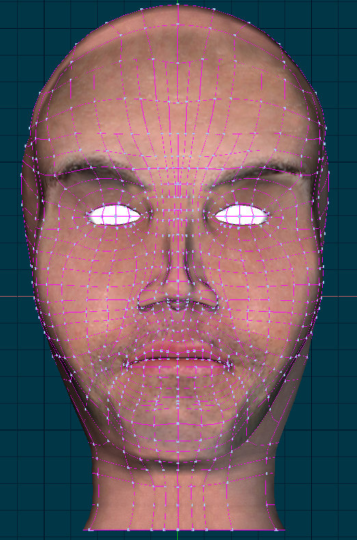
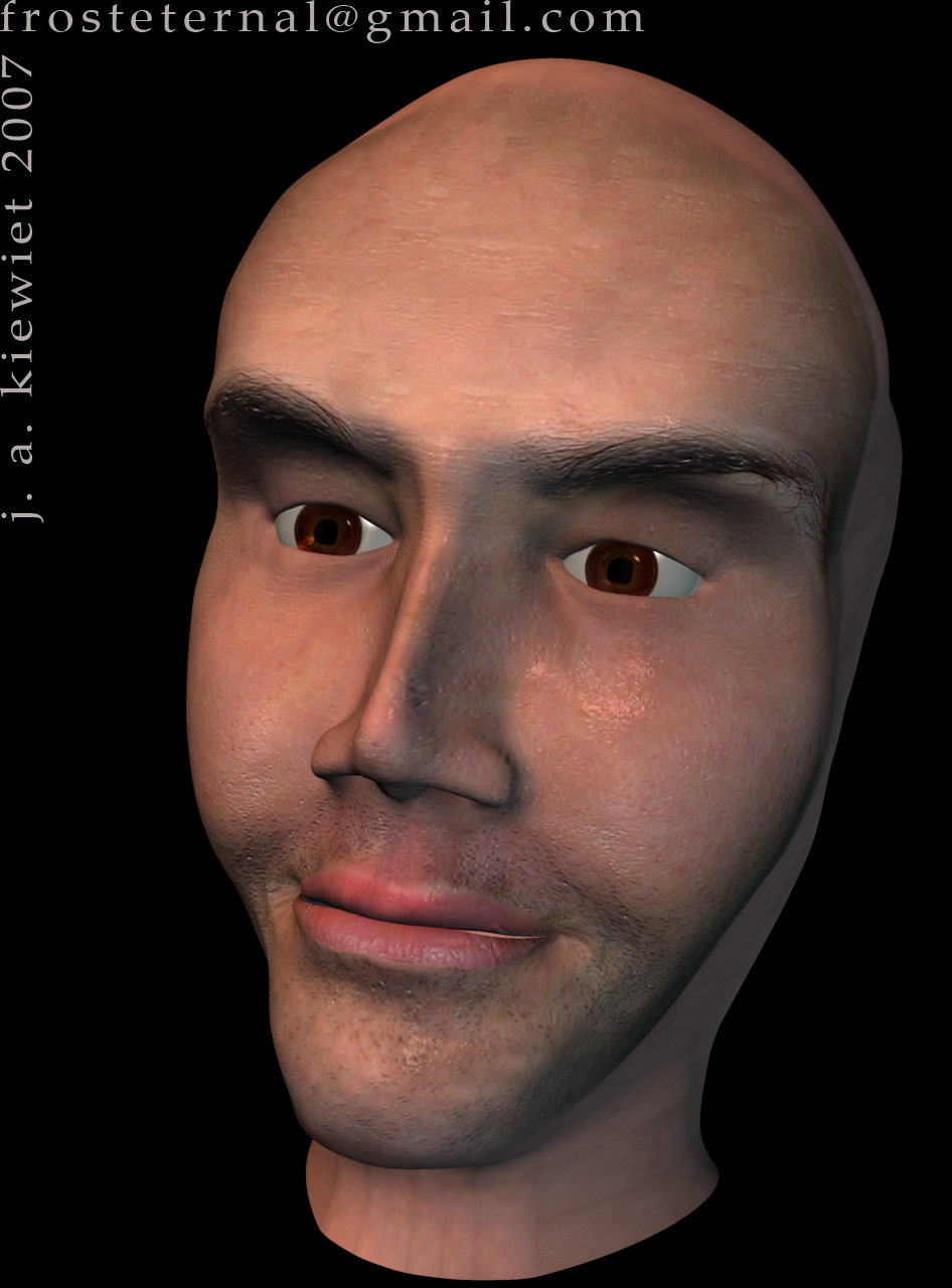
Yes, the decal was a heavily modified version of the reference photo. Here's how :
First, I cut the photo in half, and mirrored the sections, since it was not quite a head-on shot.
I used Photoshop's "Heal" tool to eradicate parts of the photo and "stretch" the face out to cover the un-wrapped ("flattened") face model. Also, I evened out the brightness, removing shadows and highlights from the source.
The "liquify" tool in Photoshop is inadequate to distort images with the precision needed, so then I used WinMorph (a wonderful freeware bit of morphing/warping software) to stretch and squish the features such as the lips, brows, and eyes so they also matched the flattened model face.
Bump and specularity maps were derived from the "un-wrapped" image as well, which contributed to the effectiveness of features such as the eyebrows, and the beard stubble. Additional profile decals were also used, with some tricky alpha channels to hide the decal seams, for the sides of the head. The hair was a pain, as I am NOT a hair-stylist, but after a ton of tweaking, I was able to generate a reasonable simulation of D.'s tousled hair. The eyes are standard DarkTree "humanIris" textures, on eyeballs with modelled corneas/lenses with transparency and refraction. (This looks more "deep" in my experience, and good eyes are ALWAYS worth a render-time hit.)
Whew. Lotta work.

-
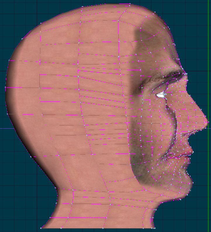
I totally agree with Vern here - you should aim to have fewer patches, not more.
One of the beautiful things about splines and patches is that you can generate astoundingly complex surfaces with a minimal number of control points.
This is what gives a patch-based model enormous advantage over other modelling techniques. Rendering, texturing, animation - these are all stream-lined by an efficiently built model.
In a world where computer power and memory are indeed, desperately finite, getting the "most bang for your buck" is key.
-
(And I only mentioned the very slight flaw, if it is one, because the rest was so good - I was too picky - apology. )
Not at all! Don't worry about it; I'm always glad to have stuff like that pointed out; it is so hard to see one's own work with a critical eye.
Be picky =)
And I'm feeling much better now, thank you!
-
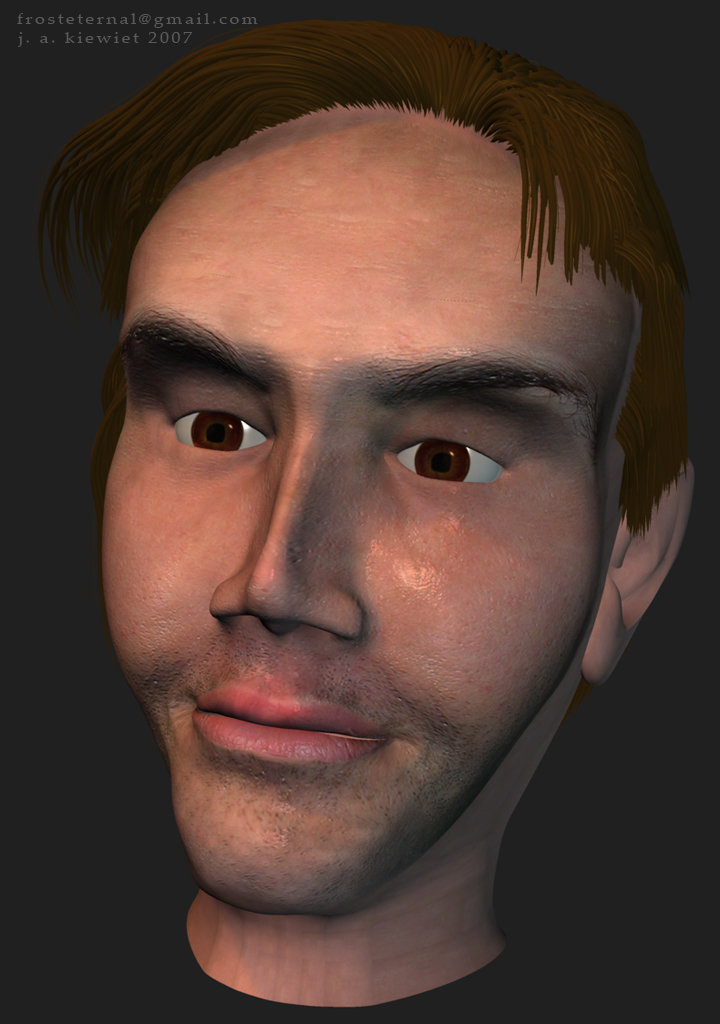
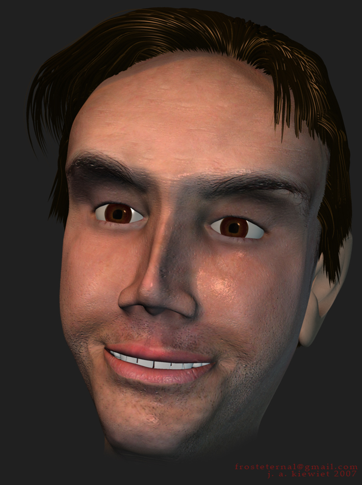
Added teeth, eyelashes, finished decaling rest of head, gave him creepy smile, changed the jaw-line to more closely match that of the subject (whom now I ca'n't look at without seeing splines swimming across his face.)
Whew.
Time for bed, long day (job interview wish me luck)

-
Looks great! So did you make the face or am i lost?
Just a little lost. =)
Yes, built the head.
-
Okay, changed the hair (at Dushan's request), added eyelashes, and some shading.
Caroline, yes, the nose pores are a bit stretched. I'll get to it. =)
-
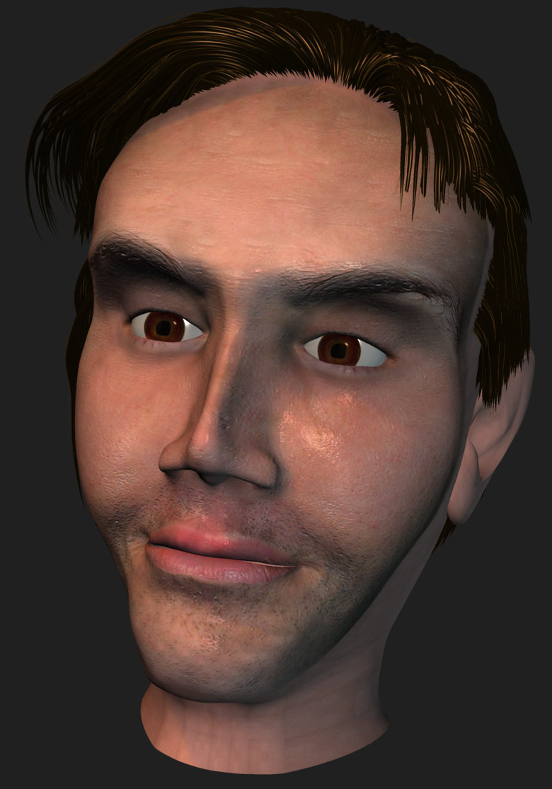
Okay, now he's not quite so creepy, with ears and hair. Neck is still way rough. Looking much more like Dushan.
Still needs eyelashes.
-
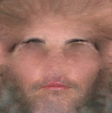
Nice work. Did you use photos for the Face decals?
The colour, specularity, and bump decals were all derived from a highly-distorted, very re-touched photo. (see below) He was VERY unsettled to see his face all un-wrapped like this!
-
I've been rather ill lately, and have not had the concentration to work on the real project at hand (our Mountain film) so I built a 3-D model of my roomate's head. It's kinda creepy without ears and hair and the neck is incomplete, but it was a fun challenge to build a realistic head for a change. (We may use it in an animated version of him to introduce his architecture portfolio in the future, but no immediate plans.)

-
Oh.. and for some reason, everytime I render to Quicktime using Sorenso 3 the sky is black? (Which is why I put the supermarket to block it out) Anyone know why? And how to fix it?
In the "Output" tab of the Render to File dialog, there is a section entitled "Buffers"; turn OFF the Alpha Channel before rendering. I believe Sorenson 3 is capable of storing alpha channels, so by default A:M will render with one. (Since A:M alpha channels are pre-multiplied with black, the sky will appear black.)
-
I need some help....
Please let me know what I can do in order to make that happen...
Sounds like you have the sound attached to the action. Drop it into the Choreography instead.
Delete the sound from the action.
Now you can loop the action to your heart's content and the song will play unmolested.
Hope that does the trick!
-
...fundamentally motion capture, and I'm driving his face with mine, but it works more like a puppet because the mocap data is driving a pose based animation set up rather than directly controlling muscle animation.
Here is a split screen with my face.splitscreen.mov
Wow. Very nice. A bit "jittery"; I assume that is due to inconsistencies in tracking those oh-so-stylish dots on your face.
I watched the split screen several times in succession, very promising, very weird to see the bug mimic your face. Can't wait for more details on "how it was done".
-
...
1) The lamp shade itself. I lathed the shade and then I added points to create the slotted cutouts (see images LuxoLampShade-Render and LuxoLampShade-Closeup for examples). When I added the points, the top-middle section of the lampshade is no longer smooth. What I'm wondering is, how would you recommend I create the slots in the lampshade to keep it nice and smooth?
...
Try transparency decals for the vent holes; they are a small enough detail that you shouldn't need to model them.
Nice job thus far =)
-
Here it is. There is no showcase thread anymore... Odd. Seeing as he is not done I will put him here.
What do you guys think?
Cute.
I like how he falls over at the end.
Nice music; he seems to be "power-walking" to it.
No real critiques here.
-
I thought about what I could do as a first project, and thought it would be good to make a movie of Jabberwocky - not too long, and I've always been a fan.
Then as I went through TaoA:M I thought, maybe just a verse.
As I finished TaoA:M, I thought, just a couple of words.
So - "BEWARE THE JABBERWOCK!"
He's supposed to be from Tenniel's Jabberwock illustration, and, yes, those are socks:
I LOVE IT!
That is my all-time favorite poem; I memorized it in 2nd grade because I loved it so much, and can still recite it to this day!
I am thrilled that you used Tenniel's illustration; it is mesmerizing and comical all at once.
If you want to really make your Jabberwock "pop", exaggerate the size of his fore-claws and feet; I think they are actually larger in the drawing, not just perspective at work.
(I admire such a faithful 3-d version of the creature, I re-designed him entirely when I did an animated film of the poem for my literature class in college, mostly for the sake of time. Golly that was fun.)
Beautiful work!
-
i think i'm done with her as the Super G model ... Made alot changes along the way .... i also think, i did the right thing by taking off the {S} logo..
Thanks for all the input from everyone .... injoy Aj2

Yikes! Done? But she has no belly-button!
My advice, give it a week, then load her up again and see if you are happy with her. I find that I need to "rest" in between tweaking characters sometimes; for instance I just recently cleaned up and re-worked my Woman/Death character, whom I had declared finished months ago. I opened her up to animate her scenes and said "ugh. she's UGLY." and fixed her.
Not a bad start however, she looks quite...super

-
He has finally reached planet Bear? And being a brave soul decides to go exploring…
However, the background seems to fuzz for the first three quarters of the flick but not the rest.
I have a horrid feeling this is going to be a pain when going to final render.
Ideas anyone?
Do I need to use Multi-Pass on this one?
I'm not entirely sure what is causing the noisy background; but it appears that whilst the background (read : camera) is moving, the background "fuzzes" or become all crawling with tiny dots of noise. (Did you render directly to a compressed format like quicktime or Avi?)
I also suspect that whatever texture you are using is too finely-grained, and might benefit from a little blur to soften the "crawly" effect. It could just be poorly anti-aliased bits of texture due to lower resolution. Try scaling up the roughness or whatever texture you are using and see if that helps.
-
Please look at this and see if it's better. Admittedly, I have some work to do in timing and animating in A:M.
How do I place single poses into a larger pose (i.e. a single finger "open_close" pose into a "open_closed fist" pose) without creating an unruly list of poses in my user properties?
You should be able to make a "open_closed fist" pose out of your individual finger poses; although I always had problems blending poses within poses. Just set the pose sliders you wish to use while editing a new pose. You should see new keys for them show up under "User Properties" under the Relationship that partains to the pose you are using them within.
I tend to take a simpler approach - I usually have a hand "tense/relax" pose for each hand, and then an "open/close" pose for each as well. I find that creating any other more specific hand poses just gets "cluttered" as far as pose sliders, so I tend to build new hand motions on-the-fly. Just my personal preference.
Also, I'm with Robcat; I prefer the first walk with the quick slap down of the foot. It's got more "snap" which for your super-stylized character looks much more lively.
-
Very, VERY nice. I can't even imagine the work that went into a piece like that, considering I've sqeezed out a mere two minutes in a year on my latest project.
The expressions on the fish are wonderful, and the sound effects and nice and cartoony.
My only critique would be the pacing, since most kids are impatient nowadays; it could move a bit faster.
Wonderful!
-
and you did the voice? I like!...
...The eyes are facinating...
...You've done really great thus far with the eyes. Its quite a challenge to properly animate decalled eyes.
Maybe a little anticipation and movement of the pupil with any added blinks...
Yeah, the voice is me. Thanks!
I might throw in some more vocal-linked blinks, as I can see a few places that would totally enhance it.
As far as pupil movement, he was rigged for it, but for some reason, I didn't like it. When I first sketched him, he was of my class of characters with staring eyes. For some reason the pupils moving destroyed his "look".
So he shall only blink, for now.
Thanks for the comments, when I re-open this project (after my main project, this was a bit of a sidetrack), I will probably fine-tune him, particularly the fingers as you suggested.
-
Did I say Dora?
(old age), I meant Daria <_> Oh okay. Yeah still, no clue. (don't watch tv/cable) I'll have to make an effort to check it out. (I'm totally media-deficient.)
-
I enjoyed it. Nice style. Not bad for a quickie inspiration.I think you got a winner. Kinda like the male version of Dora
Thanks, glad you liked it.
He's very much me, but a bit more "valley-guy/goth". I swear I'm not that dumb. I don't think so anyhow. LOL
And I *hate* ceramic garden animals. They are evil.
It just makes me laugh.
ps..who's "Dora"?


Easy way to increase cp's?
in New Users
Posted
For future reference, and a more general solution, if you ever want to just increase cps/patches somewhere on a model, I cannot recommend highly enough the "SplitPatch" plug-in by the inimitable Steffan Gross. (sgross.com) This is an easy way to double the patches in a particular area, for added detail, then just hook/5-point the results to the rest of the (lower-resolution) surface. This is, not surprisingly, extremely handy. Just my extra tip.