


LeeAnderson
-
Posts
401 -
Joined
-
Last visited
-
Days Won
2
Content Type
Profiles
Forums
Events
Posts posted by LeeAnderson
-
-
and jimmy in post number 18(and any post be for the last post i made) is just plain lighting, no radiosity. i'm a pretty good non radiosity renderer. the "nobodies home" render i did was the only radiosity one. lol did the last renders i did look like i used radiosity? if thats the case then i've done my job
 .
.Hmm...okay, I was only talking about that last one, you used radiosity on that one, right? Maybe I'm a little confused...well, I'm always a LITTLE confused, but maybe I'm REALLY confused

Lee
-
Great work Mage!
Have you ever seen the TV show "Moonlighting"? This scene reminds me of it, especially the way you have it lit now. I would imagine this as a night scene (maybe I'm wrong) about 20 stories up. You've got the cool blinds casting shadows on the wall, I like that a lot...but just as a personal choice, I would make them horizontal...for the film noir kind of look. Also, if you added strings between them, it would make them more believeable. I like the simplicity in the furniture, that looks good. As far as the lighting itself goes I have a few suggestions:
Try lighting the scene without radiosity...set it up with spotlights and some soft shadows...eyeball where the light would bounce. This would give you more control over the outcome.
As this does look like a night scene, I would suggest using multiple outside yellowish lights, at different heights and locations--and then throw in some blue for a night sky.
I hope you can get something out of this
Great work!Lee
-
Awesome stuff Al! You've really captured the style perfectly! Keep it up, I can't wait to see the rest
Lee
-
Ooh...that looks better to my eyes. Maybe go for a little bit more intense, like 75% or so. Just play around and see what you like! Are you going to add reflections? Great work!
Lee
-
Wow, Lee! That's a fantastic job! The model was cool-looking to begin with, but now it's just amazing!
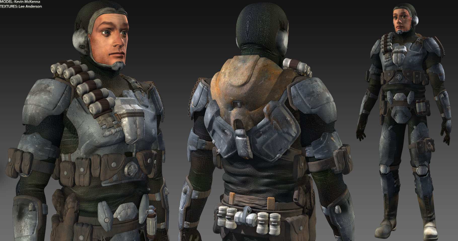
Dark Jedi, I'd totally go with the metal around the face. Makes it look like there's a face shield that goes with the armor that he's choosing not to wear. With all of the armor he's got on, it would make sense that there would have been something to protect the face and this guy is just too badass to wear it.
Thanks Mark! Also, thanks for helping me talk Kevin into the stuff around the face
I really like the idea of just a face shield--like something that clips into mask. We were thinking of a helmet....oh yeah, way too bad to wear it!Dark Jedi, Lee, this is truly amazing effect of your efforts... This is exemplary work!...(poster at siggraph... poster at siggraph)...
did someone said something?!? I thought I heard some voice ;0)
Thanks Trajce! I certainly would be up for it...I mean, up for whatever that disembodied voice just said
Kevin really needs to come in here and take some bows
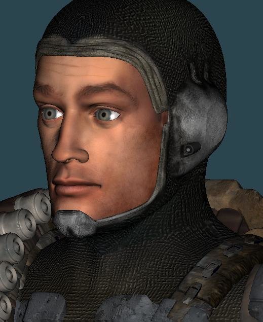
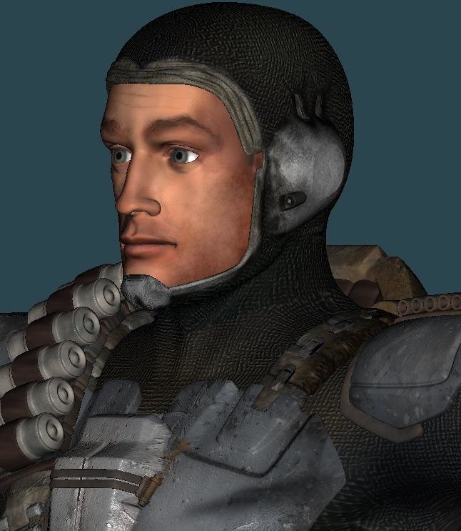
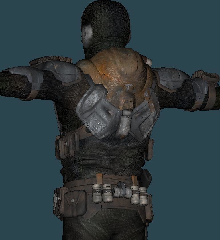
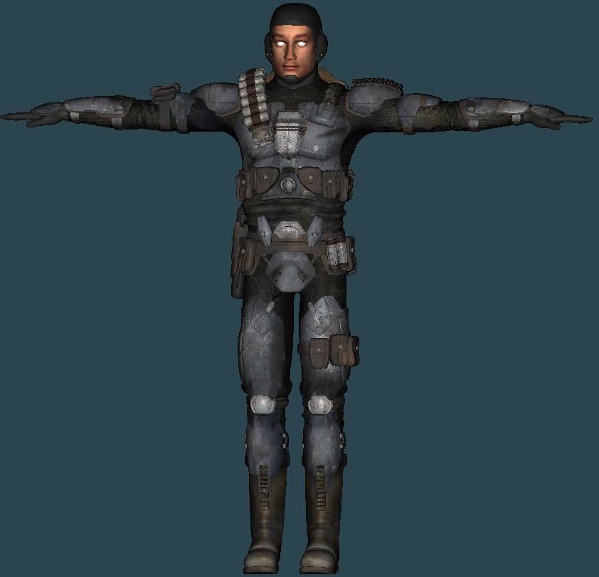
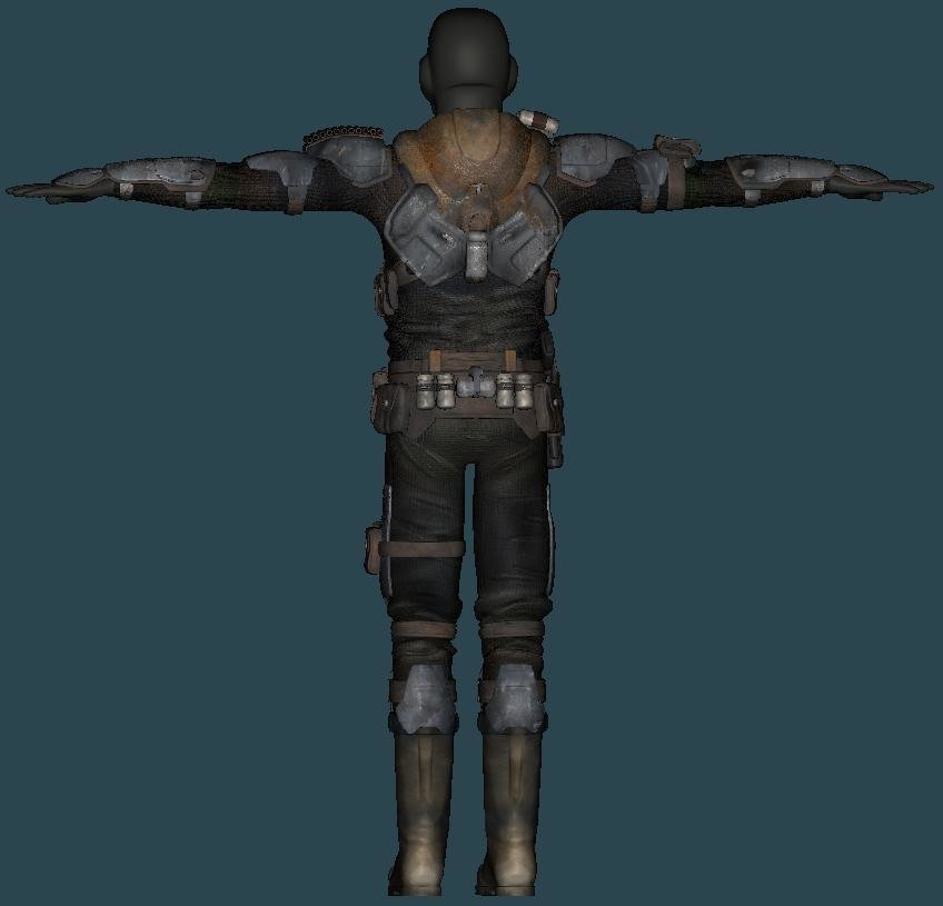
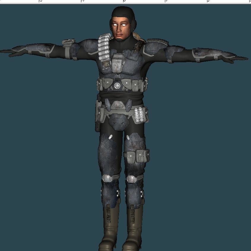
Here's the final beauty shot, yup no goggles
 :
:
Lee
-
Thanks a lot Mark!
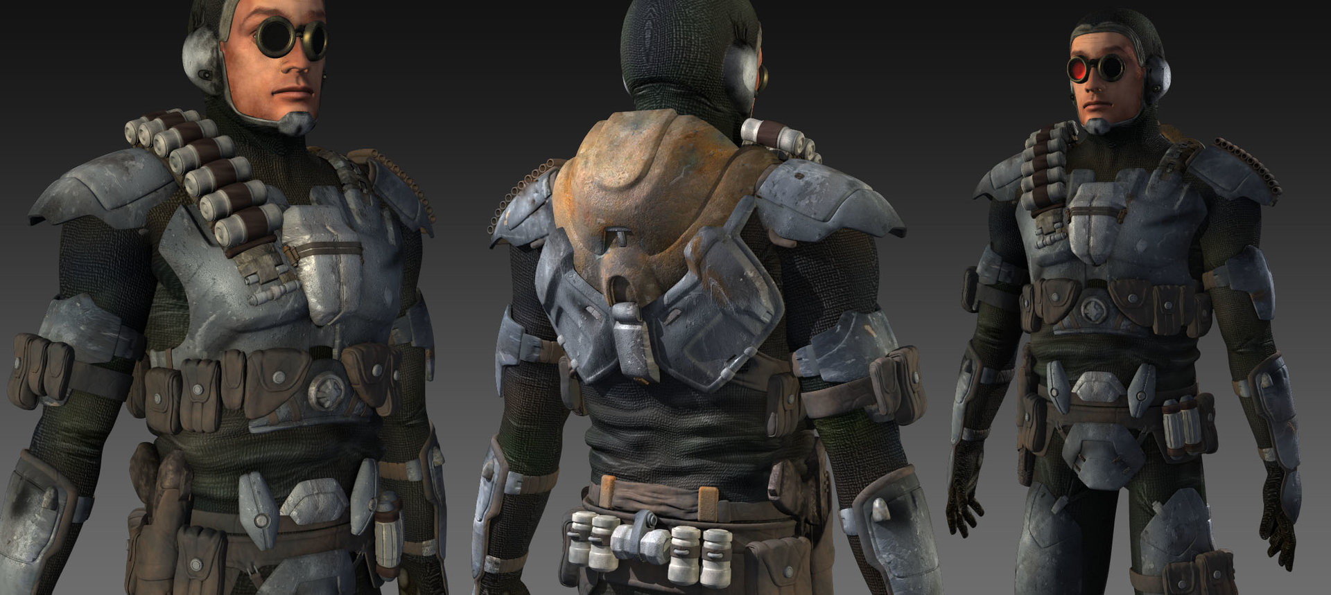
but whats up with the bug eyes?Oh, the goggles were a personal touch of mine, they probably won't be in whatever Kevin does with this.Oh also.. why is it white on his ear thingys and all arround the rim of his suit that ends at the face?Putting the cloth pattern there was way too boring. Plus it just didn't look like it fit. You can change it when I send if back if you'd like. Thanks Kevin!
Lee
-
Hey again!
This will hopefully be the last update--here are three glamour shots that I rendered last night night. I'd say it turned out pretty darn good. Oh, the goggles were a personal touch of mine, they probably won't be in whatever Kevin does with this.
Lee
-
Well I like it Lee! Only thing that seems weird is i think the thingies in the eyes (keep forgetting what their called) seem way to big

Thanks Kevin, I was thinking he had some bad puppy dog look about him, but I couldn't figure it out
Nice work Jimmy. When you going to have some animation?Thanks Ken! This is really Kevin's project than it is mine...but I believe that animation is planned some day, at least it better be
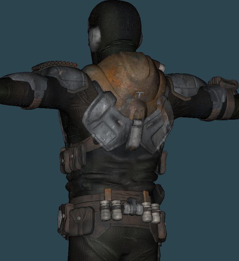
Also, are you using decals or materials?Some of each, but mostly decals. Everything except for the leather and the amunition on his shoulder and back belt are decals.
Thanks guys!
Lee
-
Here's another update
Any comments? I'm beginning to feel like I'm talking to myself
Lee
-
Almost there!
It's nice to see that mostly everything is textured... I'm on a countdown now:
1.Mask
2. Hands
3. Eyes
4. Gun
Lee
-
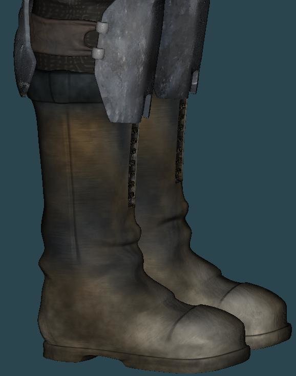
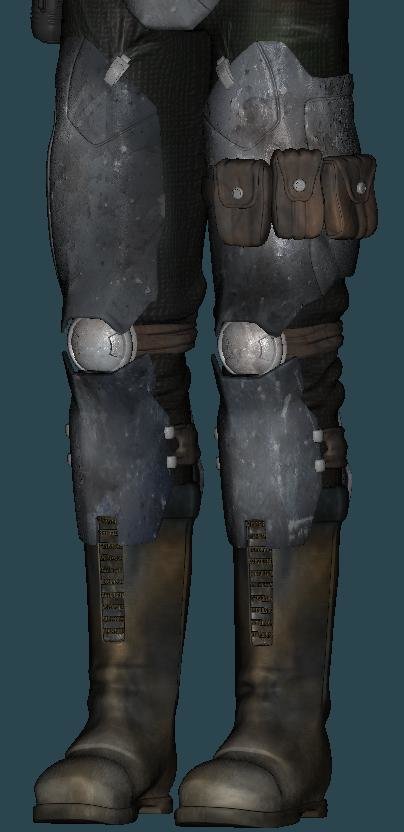
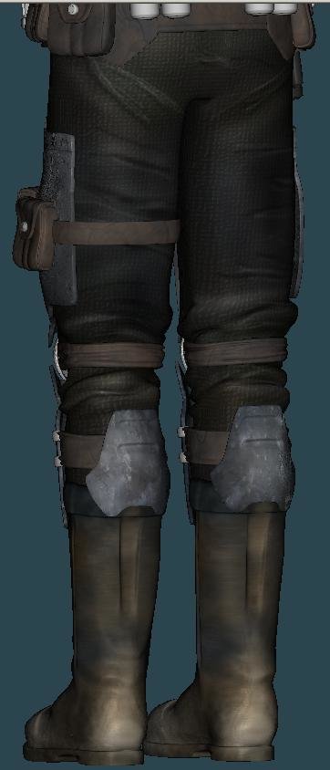
It seems that the maps you are using are low res? It might just be me, but the boots look sort of pixely.
Looks very good in general though.
Ben
Thanks for your comment Ben! The boot texture resolution is 1000 x 1000
Here's a side view if that helps
Lee
-
Thanks again Eric! And thanks for keeping interest in this thread alive
Here's another quick update-- The lower body texturing has been completed
-
That's looking great so far!
There is one big thing that stood out to me. I found myself squinting trying to see the details in the side of the head (which are looking really good). I don't know what you're thinking as far as texturing goes--but I would reccomend bringing up the black color just a little to a dull grey. Also, you've gotten a good start on the sliminess with the spec settings, however, I think the intensity could be toned down and the size brought up just a little bit, and also try adding some reflectivity (if it's not already there).
Looks like a great start!
Lee
-
Otherwise not bad t'all. Is this an existing Star Wars armour design or one you came up with?
Thanks Eric! Despite my last thread, this guy has nothing to do with Star Wars (even if he may look like it a lot). The design (and model) are original works by Kevin (Dark_Jedi).
And for god's sake, dirty up those boots a bit. Hahalol. Sir yes sir! Hey, shouldn't the guy giving commands be telling me that I should clean up my boots?
Here's the midsection textured--hopefully the whole rest of the body suit will turn out this good. Also, I added some "close calls" thanks to Eric's suggestions.
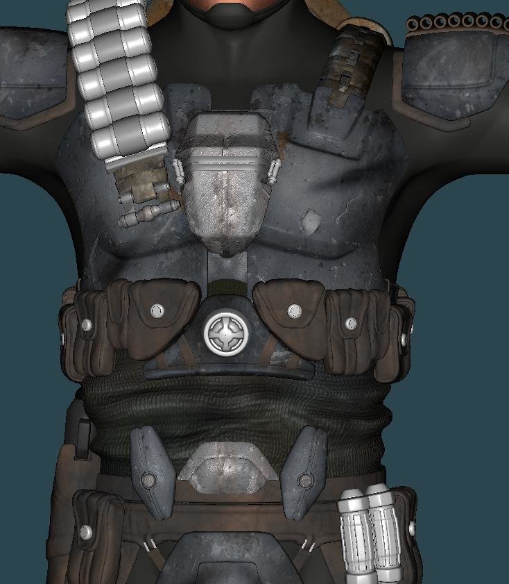
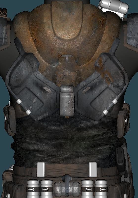
Any comments would be outstandingly amazingful
Lee
-
Thanks Eric! I mixed it up alittle bit, tell me what you think
Here's the first WIP of all of the basic armor done--crits welcome! Plus a face WIP (based off of Robert Mitchum
)
Lee
-
Thanks Caleb, Stian and Jay! It's nice to get compliments from such accomplished fellas like you!
Man Colin, how far back did you have to hunt to get that quote from me? I actually didn't rememeber saying that until it showed up. Good luck getting all of your stuff done! You're just waiting around until you can blow everyone away, right?
Dude impressive jabba the only thing i can say is his head looks a little pointed but looking awesome.Keep up the good work!!
I agree--and in the post before that it was not pointed enough...oh happy medium where art thou? I don't have that book--but I'm already set up with tons of Ralph McQuarrie art. Thanks!
I'm going to try to keep going with this project while finishing up the others that I have going. Whew!
Lee
-
That looks great--I love S pose! The real question is what is he yelling about?
Lee
-
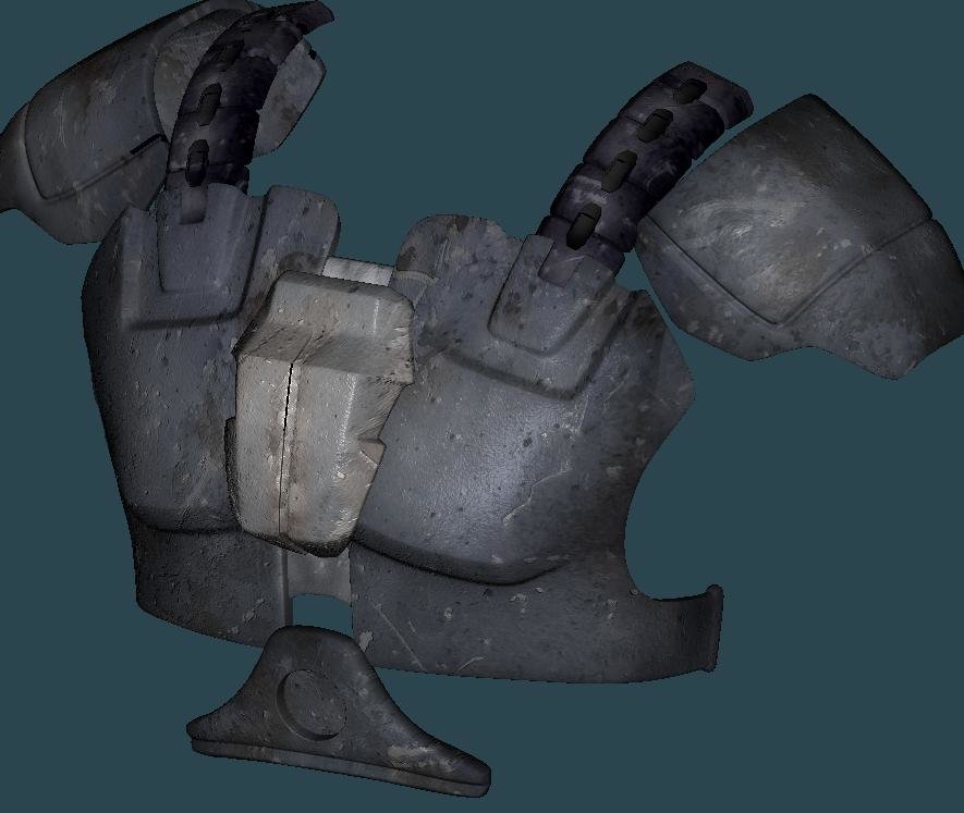
Looks pretty good as is, but I would texture the buckle(?) on the right breastplate separately. As it stands now, the texture on the buckle looks like it should be scaled down. My dime's worth.
Thanks Eric! I agree, and so did the fellow who's model this is. I'll be retexturing that soon, and seperately--it's not in this update. Btw, I would have easily paid a quarter for that
I dunno it looks good to me. Id like to see what it looks like on the trouble maker whos gonna wear it.Glad you asked! He's right here . Thanks for your comment!
Here's an update, I'm having trouble deciding whether all of the armor should be the same color or mixed.
At a 30,000 patch count, it's tough to accomplish much in a short amount of time.
Lee
-
Hey everybody, I know I have another topic that's still out so don't get too mad
Well, I'm trying to wrap up everything that I've been involved in (hence the Star Wars models frenzy) and one of the many things on the list was texturing this fantastic model. Hang on Martin, 2_08 lighting is next
For me, the goal of this project was to have a set of textures that matched the great quality of the model. This meant grabbing tons of photos and layering and layering in PS. It also meant tons of unwrapping in AM--of which a little has been done. I'm going to try to push my skills as far as they go for this one and prove to the world that AM is capable of anything...and have a little fun on the way
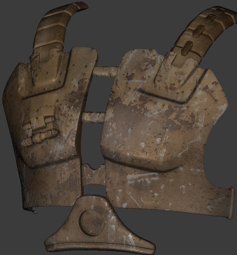
Here's the first WIP of the front armor piece, tell me what you think!
Thanks,
Lee
-
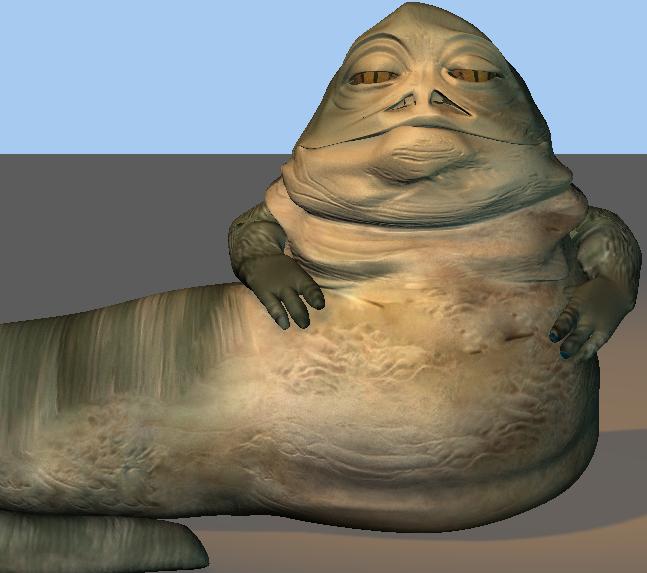
From what I can tell on this image, he's tail and his back is mostly green.
Thank you thank you thank you for that reference pic! Some things clicked in my head when I saw that--the only pictures of Jabba that I could find were always obscured by Leia in her "outfit". Ive tried to change some basic shape issues (mostly in the head)...tell me what you think
Thanks also Ken and Geoff for your compliments!

Lee
-
Thanks Caleb! I like strombolli too
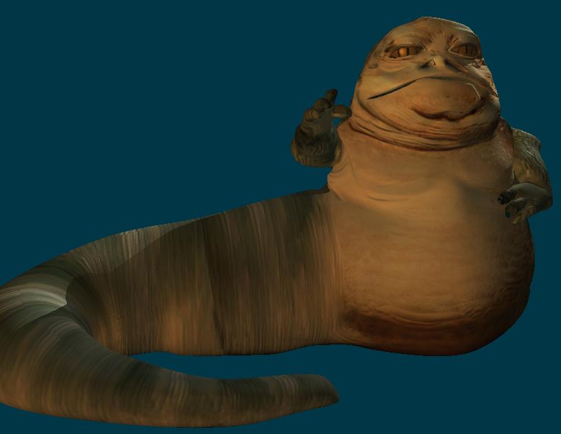
Here's the textured version--as you can see, it was rushed...use a LOT of photo reference. This one was a lot of fun--each one of these models could be improved a whole lot, but rendering resolutions are low enough that they don't need to be.

Thanks for the comments--Lee
-
Thanks Ethan!
Lee, Big Gizz needs a lot bigger hands. The first time I looked at him, I thought he had hooks for hands.Oh man, your right! I didn't even think about the size of his hands, I'll fix this right away. Thanks Matt!
I have photoshop CS2 and was wondering if maybe you could give me some tips with textures and stuf.Thank Geoff! I'm a little busy at the moment, but if you have any specifics go ahead and PM me and I'll see if I can help you out!
Here's Jabba, I think he looks like a frog too much in the face, any suggestions?

Thanks everybody!
-Lee
-
Nice work Lee!
Your a modeling animal! How are you turning this stuff out so fast?
...uh...magic? I'm secretly a wizard...shhhhh. Thanks Jirard!
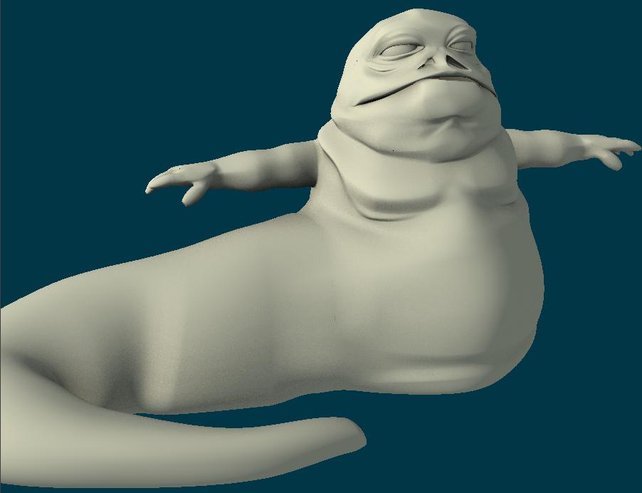
I cant wait to see jabba!Alright then, here's a WIP. In the end he'll have a lot less symmetry in the face. So far I've only done the major wrinkles, the rest will be added with decals.

Lee
-
Nice render Daniel! I like the composition. Mountains always seem steep and slippery to me and I think you've made this more exaggerated with the tilt in the camera. As far as lighting goes, I would add a backlight on PB's right side to seperate him more from the background--the moon maybe?
Lee


Stalled Trek
in The Wannabe Way
Posted
This is looking better all of the time! That last Kirk render is great! For the longest time I had a poster of William Shatner in that exact pose in my room! "Spott" is also looking great, I love those little slits that he has for eyes. I wonder if they'd look better if they curved downwards a little (like a Leonard Nemoy's eyes), that might lose the cool cartoon style, though.
Keep it up, for all our sakes!
Lee