


KNBits
-
Posts
218 -
Joined
-
Last visited
Content Type
Profiles
Forums
Events
Posts posted by KNBits
-
-
Maybe I'm wrong but I don't think you can import .psd in A:M, not directly. I suggest you save your Photoshop as a Targa file (.tga) with 24bit, or 32bit if you have an Alpha Channel and want to preserve transparency.
-
Wow that looks really good. Why don't you try some displacement to mix up the edges a little. Right now it looks too smooth.
Great job!
-
I'm not sure what look you want, but I like it a lot as is. The shape is really nice. Yeah yeah!
-
Nice concept. I agree with most of what been said so far. The water disturbance would be a must, a big must! Especially with those reflections. As for an easy idea of how to do it, I don't know. Personnaly I would try a TGA sequence displacement or bump map, synched with the water, but I wouldn't say it is an easy task. But hey, the hard work would pay off.
I don't really like the environment. As is, I find it disturbing and not really on par with the fountain which is the real focus here. The buildings as silhouette is an interesting idea though.
Lighting could also be less flat overall, and especially in the piano room. Also, I was wondering if it is possible to light the water particle (I'm not sure). If it is, I would also look at this option. Those shows are usually heavily based on the lighting concept. It would support your particle show visually. For exemple, would it be possible to color the water with lighting? (I think now it is done with particle color over time)
As Pengy said, the cam movement is sometime jerky, while the mood is smooth and easy. Are you using a path and target on this? The transition out of the window is also to harsh, almost look as a cut.
Otherwise it is great work. I think it has a lot potential. The water patern look great, kudos on that. Maybe the particle are a bit slow and linear in the movement IMO, but it does the trick. A nice case you have there!
-
ok I found the text he says, but only in french. So I'll try to translate it to english, but it won't have this poem or prayer touch in it.
Oh God!
grant me
this moment
unique and rare
blurred like a breath
invisible like a black hole
that would create
in the INFINITY
something
that can be
FINITE
like Death....
The original French text...
O, Seigneur !
Accorde-moi
cet instant
unique et rare
flou comme un souffle
invisible
comme un trou noir
qui permettrait de créer
dans l'INFINITE
quelque chose
qui réussit à être
FINI
comme la Mort...
Thxs everyone
-
That was Armenian? Sounded Hebrew to me, especially with the first word being "Elohim" (Oh God)!
You're right! Asked to the writer of the text, and he confirmed that it is Hebrew. Now I have no idea why I thought it was Armenian

Thxs for the correction!
-
The blood looks a little black no?
Absolutely. The blood used on the show is also very very dark. It was an artistic choice of the scenic guy. And we had to darken the original version at his demand.
-
you did a good job with the splatter effect. how did you do that?
we splashed a white board with false blood, and took several hi-res pict with a digital cam. Then we created a synchronized movie in a composition program, and exported it as a TGA seq.
We then applied it on the wall as Cookie-Cut map, and rendered it out as another layer with an alpha channel, so we could change our mind about it without having to do the whole render all over again.
Wish I knew French (almost sounded like Farsi though) to know what he was saying. Though I did hear him say "C'mon Margaret", or at least it sounded like it.lol. Well it isn't french, it is armenian language
thxs for the nice feedbacks
-
This is the last steps of the project that began in this thread:
http://www.hash.com/forums/index.php?showtopic=16959&st=0
Beware that there is mature content in this movie.
I put a larger version, the first on was a widescreen stamp

-
This is freaky....if you rewind the clip, there's one frame with the ravens that repeats itself about half way through. But it doesn't going forwards.
Good eye. The birds were rendering as a different layer. So when the director ask us more birds, we just duplicate the layer and make some modification to it in our composition software (scale, flip, blur, etc).
I wanted to ask about the motion blur on the man.....was that done in post with other software?Yes, radial blur set to Zoom in the composition software.
And did you use "flocking" to animate the birds or is it done by hand?They are hand animated, constrained to different paths, and use the same flappin action, but we use the Ease channels to desynchronize their movement.
Also, I was thinking that some mirages in the distance would be a cool effect if you felt like doing it.Indeed. This is part of small FX that would need to be add. Also heat distortion and smoke on the chimney (that may not be visible yet on this shot). Thxs for the suggestion
So, if that is a real person how did you handle it? Is it a static, cookie-cut image?It is a video sequence. We did pull the camera back when we filmed it, but not by that much, so we scaled it down in our composition software, and chroma-key it. We then imported the sequence in A:M as a rotoscope to sync the cam movement, but did not include the Rotoscope in the final render, so we still could act on it if needed in our compo software.
-
The only, really really picky thing I can come up with is that I think the sun's a bit bright, but only by... something very small.
You are right.
The whole show is in the dark, so at the end when this sequence play, the director wanted to get a real bright effect on the audience to contrast. We'll go tomorrow at the theater to adjust it with the video projector, but it may be overbright right now
Is that a blood stain in the pool? And are those birds real?yes this is blood. The work with blood FX was real cool on this project. A:M handle it just as we expect. More is to come in the rest of the sequence.
The birds are A:M. In fact it is the Eagle from the CD, quickly modified in a Raven like bird. We really like the flappin FX with 100 motion blur and 25 passes. It gives a nasty and dirty feeling.
Thxs for the comments and feedback!
-
This is the first 4 seconds rendered with live action sequence mixed. A lot of smalls FX aren't done yet, and we aren't sure about the final color correction, but it gives an idea where it's heading.
Though a lot of things can't be changed at this point, we'll have to do the same process with another guy on the chair in the next ten days. Any suggestions or comments are welcome.
-
Due to tight schedule, we decide to go for the render with this version. We'll eventually get back to it to render out more still. I'll get back to you with the final movie version with live mix.
Thxs for the feedback through this wip
-
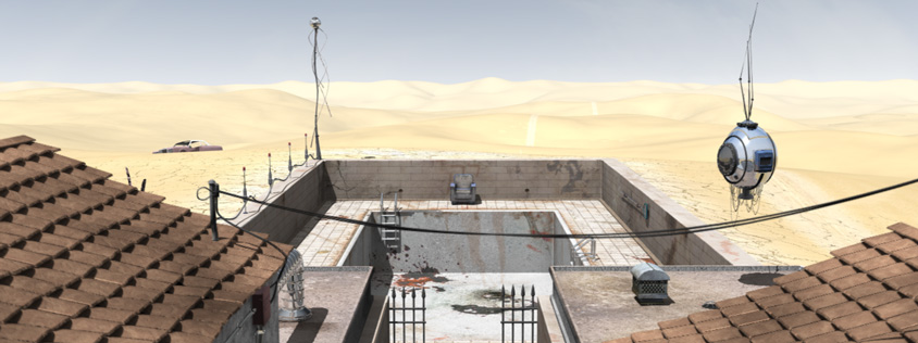
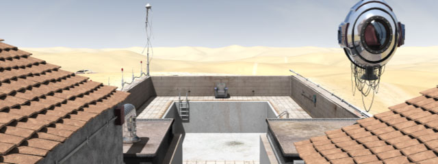
No it didn''t move. The pool is in the ground. The walls around the pool are one feet and a half above the ground surface.
The pool is at the top of a small hill, so it probably doesn't help for the eye to figure it out. But now that you point it out, yes it may be a concern. We'll see how it look with the cam movement.
Thxs
-
I also would like to know where this image is leading. Also, who is the "we" that is working on this?
It's start out as a very fast travelling out of the guy's stomach to the first picture (the entire move done in 4 sec), then the cam move in again, so the guy can have his speech up to the final. The "we" is the visual production team for this project, which involve 4 creators right now, but 2 on this particular part.
Really nice. The lighting looks spot-on. The only thing I don't like is the design of the camera. It seems a little plain-looking, like primatives mashed together.It definitely must be something wrong with the design because this isn't even a camera, but a one-person escape ship or something
 . Seriously you're right on, I didn't put a lot of work in it, because we didn't decide yet what final position it will end up in the set, and how much details I should put in.
 Thxs for the feedbacks, it's appreciated.
-
Another render, later in the camera movement.
We hope to finish the scene by tomorrow so we can start the render and begin the Live action mixing process. That'll be fun.
Take care
-
Thxs. Those images are for a theater show opening next month. The final version willl be heavily post-process.
I see what you mean for the sky saturation being a bit washed out. This is because the render show the horizon, and we've put a gradiant on the sky dome to fake distance (like the Fog effect). When the cam pan up, the blue is more saturated. I'll adjust that.
-
This is a scene we working on right now. We plan to mix live footage of a man sitting in the chair, with the camera moving in his direction. For now we still are at modeling, texturing & lighting stage, so any suggestion would be welcome.

-
Yes it's perfectly normal. It is the copy protection. Once the program is started, you can remove it from the drive, but it will ask for it again every time you start it up.
BTW, this forum (Forum Support) is for questions/problems relating to "how to use the forums".
Welcome aboard!
-
Hi Jake,
I suggest you save your project with different name each time you render new version, like Castle_001, Castle_002, etc. Each render should be named that way too, so you can later associate them to the right project (Castle_001@000.tga, Castle_002@000.tga, ...). It will help you a lot in your learning process. My last lighting project took me 55 versions to look the way I want.
I think you doing good here. The scene is not easy at all. I'm no expert, but what help me is when I get to a point when I'm not sure what to do, I turn all the light to 0 intensity, and start all over again, one light at a time. You have 3 main light source so far :chimney, lamp, and that blue to the left.
I suggest you start with the chimney, which for me is in the drive seat here. You can get a very nice mood with just that, meaning the old man will be in silhouette (it will look a bit mysterious). Set the right intensity, and then have some low intensity big width bounce lights the give ambiance.
I'm not sure what the blue is exactly. As Triath said, it look problematic. It doesn't seem to come from outside, when we look at the window, but it doesn't look like ambient night light either (too strong, too directional).
Keep it up!
-
Beautifull! The glossy effect on the inside is sweet and the translucency is perfectly set. I think, for that candle style, that you "solve" the thread
Making this available to the community is quite kewl.
-
As said before, it totally lack the 3d feel, which is nice. I read your post but cannot figure out how it is done. Part of it is because I didn't experiment with photon mapping yet. Anymay feel free to explain more about it...

-
I never done something like this so I'll try to figure how it could work. Even if it never actually happen, I think it is an interesting topic that might be useful down the road. I'll search the Forum, and for online applications that offer a structure for that kind of project.
My first thought would be to find images, and references, and create some kind of "official G5 blue print", so everybody involved would have the same guide. I say 4 persons would make this a pleasant and not so demanding task. Three on modeling and one on texturing and lighting.
I'll check this out, and maybe I'll start a topic in the WIP section.
-
Only what appear on screen is a decal, the rest is material. I like the way the "line" materal around the screen turn out.
Now, anyone wants to take a shot to a Powermac G5? Maybe we could do this as a team. It would be great to see how modelers can communicate and build a single object by working together.
orthographic camera
in New Users
Posted
Select the camera in your Object folder. Then you'll see a Perpective/Ortho setting in your Propertie Panel.
It won't show if you select the shortcut to Camera in your Choreography folder
EDIT:
Cool!