-
Posts
3,827 -
Joined
-
Last visited
-
Days Won
31
Content Type
Profiles
Forums
Events
Everything posted by largento
-
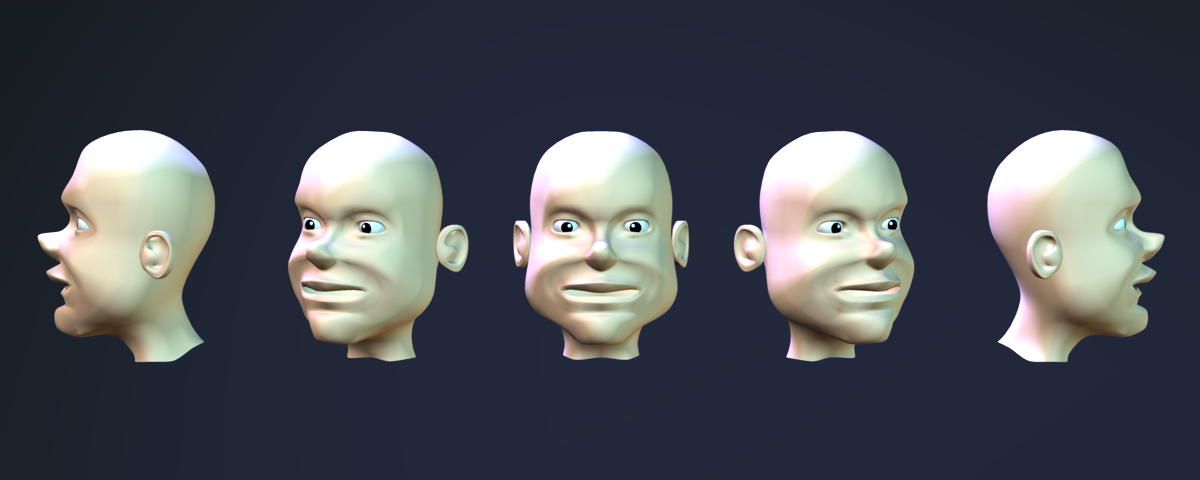
Got a bug to model another couple of characters and this is the beginning of the first one. "Nash" has worked his way into becoming Cutthroat's first mate and since I need to give Cutthroat a couple of men, Nash seemed like a perfect choice. Nash will also be the first time I'm modeling a character not based on my design... another challenge, to be sure. I must confess to wondering if I still remembered how to do this! It had been a fairly long time since I worked on my last model.
-
Marcos is giving some great advice in this tute! (where were you a couple of years ago?) :-) Continuity is THE most important aspect of modeling in A:M.
-
This is for rendering animation. You get one copy to render the first half of frames and the other to render the other half at the same time. That *is* a nice image and I think I've been behind that same guy before. :-)
-
This may be helpful to others: I found out how to make my YouTube movie display in "high" quality when embedded on my page. You go into the code and add: &ap=%2526fmt%3D18 after the two times the address appears. (You may have to put a semi-colon to separate it from other tags.) It does make a difference!
-
Thanks, Gerry & Paul! The ending grew out of trying to find a way to transition to 2D art from McCrary. I came up with the what-if-this-was-all-just-in-a-snowglobe (since obviously it never snows in Jamaica) and then remembered reading somewhere on the boards that depth-of-field could give a "miniature" look.
-
Hi Glider! I use A:M on a Mac and will share what little I've learned over the last couple of years! For speeding up renders, consider splitting them up. You can option-drag a copy of the Animation Master application folder and launch a second version of A:M, allowing you to have two copies going at the same time. More RAM will definitely help with this! Having 2 renders going at the same time can cut the render time in half! (I recently switched to a Mac Pro with 8 cores and have run 3 versions of A:M at a time.) I would at least consider getting Parallels or running Bootcamp with a copy of XP. I don't use it very often, but it's nice to have when you need to use a 3rd party utility that's only available for Windows. With Bootcamp, Windows is running at full speed. I thought I would use it more (for things like rendering), but I so dislike having to leave behind the rest of my computer to do it that I almost never use it. I focus more on making it so that my renders don't take forever and a day. I avoid most things that cause long renders and that seems to work well for me. Many of the shots in the animated Christmas card I just did were done minus multi-pass and in most cases that worked just fine and my render times for whole shots were minutes instead of hours. Also, running two copies of A:M at the same time lets me work on something *while* something else is rendering. When working with bones, keep the resolution at its lowest setting. To preview movement, switch to choreography mode (or muscle mode in an Action). It'll move much snappier. One plus side on the Mac is that A:M loads much faster than it does on a PC. If something is going wonky, it's not a huge time investment to quit A:M and relaunch it. There have been some new things that have popped up since Leopard came out, but it sounds like you've figured out the workaround for the largest one. The only warning I would give you is that intensely large rendering times may not always be friendly to your hard disk. If you're rendering for a couple of days in a row, that's near constant writing to the drive. Since swapping out a hard disk in an iMac isn't something you can do on your own, I offer the hard-learned advice to set up a Time Machine backup drive!
-
Thanks, Rodney! You are too kind! Thanks for the comment on the website, too!
-
Thanks, Martin! It's tricky with the Is It Funny Today site because they consider our comic a "story" comic. Right by where it says "Top 20 Today" there's a place where you can select "regular comics" or "story comics". Clicking on that gets you into the story comics area. Right this second our latest is at #4.
-
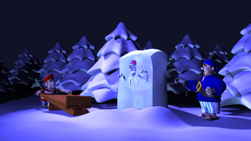
It's up on the website! But it's in YouTube quality... If you click through the YouTube page, you can choose to watch it in High Quality, which seems to be decent, but it doesn't seem to give me that option when I'm doing the embedding. Anybody know how to do that? In the end, I couldn't do the frozen in ice gag. It just got bigger and bigger and as I began animating it, I figured out that it would leave me only a couple of seconds for the "card" part of the Christmas card, so I dropped it. I hated to do it, but as I looked at it, I realized it did work better ending with the last line of singing. Here's a still from it. I may go back and finish animating it anyway for fun, but for now, I'm done!
-
Thanks, Gerry! I think maybe I should start on next year's next week. :-)
-
Thanks, guys! I am now rendering the second-to-last shot and have finished setting up the final shot! This one will be the most difficult one I've attempted, but also hopefully the funniest. This has really been a tremendous amount of work, but it's also been a great learning experience. I had thought that last year's Christmas card was a tough chore, but it was nothing compared to this year's! (Makes me absolutely terrified of next year's!) :-) I've no doubt I'm going to be up late again tomorrow night, but the prospect that soon I'll be able to relax and enjoy the holiday is keeping me going!
-
It's working great, Mark! Thanks again! Posting an update. I've added another 5 shots since last time and am getting to the point that I can see the light at the end of the tunnel! :-) Sequence_01_4.mov I'm going to do at least one more shot tonight and then I'll have three more shots to do tomorrow and the whole wrap-up. With luck, I'll have a little bit of time on Monday night to revisit some things. I'll post the final version up on YouTube and The Wannabe Pirates website on Wednesday... exactly one month after I began! :-)
-
As I'm waiting for a test render of the lip synching of the next line, I feel compelled to say another public thank you to Mark S. for the great job he did of rigging the faces with his new face rig! Thank you again, sir!
-
Cool, Chronos! Nice job!
-
Thanks, Spleen! Still toiling away. I've got six to eight more shots to go. Going to be cutting it close to get it finished on Wednesday, but I think I'll make it.
-
Congratulations, Spleen! Another one in the can!
-
Halfway Point! Sequence_01_9s.mov I am really starting to drag. The prospect of going a whole 'nother week and having to work all weekend again is pretty grim, but I think I can make it. (I think I can, I think I can, I think I can...) This goes through shot 8 and gets me through the second stanza.
-
Most places use 4K as a standard. Obviously the higher the resolution, the better, but I'm not sure how far you can go down on the low end of resolution before getting a "soft" image.
-
Thanks, Rodney! I appreciate your taking the time to comment! I think what you're getting hung up on is a perceived blank area because you're seeing the uncut footage. There is purposely extra frames at the end of the shot, because I wasn't sure exactly where it was going to cut into the next shot. I rendered out padding. When I did put the shot in, it actually ends just as he is making the turn to the left (which then cuts to Flemm at the window looking from right to left, seemingly following Cutthroat's run. I am going to do some promotional stuff to let people know when this is up on the site, but it'll just be an isolated thing. The only surplus benefit of all of this work will be my own growth in the process. The 3D will *never* be used in the webcomic. To be firm, as cool as I think the 3D stuff is, I could never see it replacing the great art McCrary is producing. No, it will not animate itself, so back to the grind! :-) I've got shots 5 and 6 finished and rendered. I'm hoping to finish 7 and 8 today. That'll get me to the halfway point!
-
Thanks, Nancy! And thanks, Rodney! You are right... time is a luxury I do not have. :-) To some of your points: 1) The snowman is the same height as Cutthroat on purpose. While watching it after it was rendered, it occurred to me that I should have had him stop for a moment in front of the snowman so that it really sold the fact that the snowman was him (the hat would actually appear to be on his head during those frames), but such is life. :-) There are many things I'd love to do, but this is all about doing the best I can while running towards the finish line. 2) The wheelbarrow does create some visual interest, but it's primarily there to help make it more identifiable when it shows up later. Having Sneeze hold up Poco would make him look like a child, fail to establish the wheelbarrow for the later scene, and just not be that interesting. 3) Not sure how much of that clip will be there, Rodney. As fun as it would be to continue the chase, the work it would require is just too great to make it conceivable. I would rather go back and animate Cutthroat's run cycle, but it'll have to stay as it is. I learned in doing Sneeze's fancy-footwork dash that I could stretch his legs in places to make his movements read better. (I'm very pleased with the cartoony effect of that little bit of animation.) Applying that to Cutthroat would have made his run cycle much less robotic. It's sobering to think that as much work as I've done, I've only finished one stanza out of four!! My hopes for finishing on the 10th are dashed. Hopefully I can make it by the 17th!
-
Here's the 4th shot! The original 4th shot was a gag where Flemm fogged up the window progressively each time he sang the word "snow." I did an early pass of it and finally decided that I didn't like the idea. So I abandoned it and started trying to come up with something new. I thought it might be a good idea to cut to outside and establish that Mr. Sneeze and Poco Boco are out there and give them some business to do. The original idea was that Mr. Sneeze would be lifting Poco up in the wheel barrow so that he can reach the top of a snowman to put on its hat. I thought it would be a chance to stick in one of the snowmen from last year's, but it wasn't grabbing me. After a bunch of playing around, I came up with the idea of having them making a snowman of Cutthroat Jacques. They have stolen Cutthroat's hat and he discovers them and chases them off. This gave me some fun business to play with and a way to include Cutthroat. The snowman sort of gets a cameo (I used his arms.) :-) This was definitely not taking the easy way out. :-) new4thshot.mov
-
Thanks! Nothing new to show today. Last night I spent some time messing with lighting for one of the earlier shots. I don't want to fall into that trap and not be able to move forward, but I'm trying to rectify having it look cold outside and warm inside. I'm hoping to be able to do 10+ shots this weekend. If I can do just that minimum, I'll be at 14 (out of 21). I leaned pretty heavy on cutting away to simple Flash stuff last year, but I don't have that "out" this time. I showed one of my co-workers what I've done so far and her comment was "You're making your snowman one look like crap." High praise. :-)
-
Cool stuff, Paul. It does feel like the shark is trying buck the boy off.


