


NancyGormezano
-
Posts
7,863 -
Joined
-
Last visited
-
Days Won
15
Content Type
Profiles
Forums
Events
Posts posted by NancyGormezano
-
-
I believe you can just use the lathe tool - no need to cfa first - that is what is causing the problem. Here's a simple example screen capture
Note that I peaked the splines before I hit the lathe
selected only one cp (any cp) - then hit the lathe tool
then I closed the top, bottom holes. Now you can decal the top and bottom with planar decal, and the cylinder part with a cylindrically applied decal
-
cute! a little more bit o' details, please sir?
I notice that the nail tips bend when they hit the floor. Not a problem for me, but there are some really picky picky people out there.
-
Just turn on post effects - do not need depth buffer This is from 18n (ssao only - using opengl3 - ie GPU) - took 1 sec processing time for the SSAO.
My settings:
16 samples
64 radius
100 distance
100 dense
100 soft
1 gamma
0 illuminance
blur effect off (should have been on)
EDIT - 2nd image is with blur effect ON, blur radius = 2, applied to image
-
 1
1
-
-
me tooo! I love your creativity & ideas. Always amazed!
-
If you are not already, now might be the time to do National Novel Writing Month
It is November ya know. From what I understand, you'll most likely not really have a finished version at the end of the month, but you'll have a version that is extremely editable.You've been thinking about this for 29 years, so those ideas should just plop onto the page no sweat.
-
As far as I can tell - there are multiple flavors currently of FAKE AO for A:M
Jenpy's FASTAO is only available in 32 bit - works in 16 & 17 only - there was no GPU version of FASTAO (it's pretty fast anyway). Did not try in 32bit 18.
Steffen's SSAO (Screen space AO) is available in ver 18 only? (64 bit only?) and works with opengl (which is slower than fastao, and is CPU version) and opengl3 (which is GPU version and is plenty fast but to me doesn't look as good, but is good enough)
And yes since ALL FAKE ao's in A:M are post - there are anomalies when applied within A:M (have noticed also funnies).
-
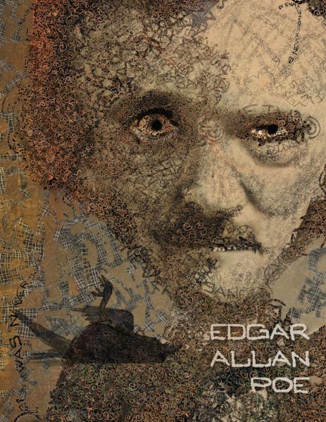
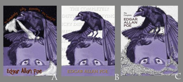
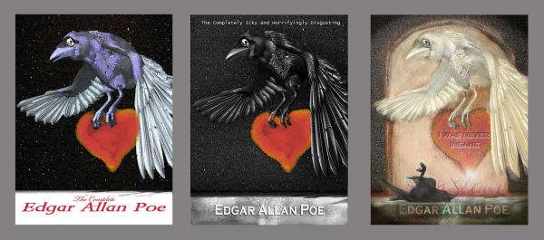
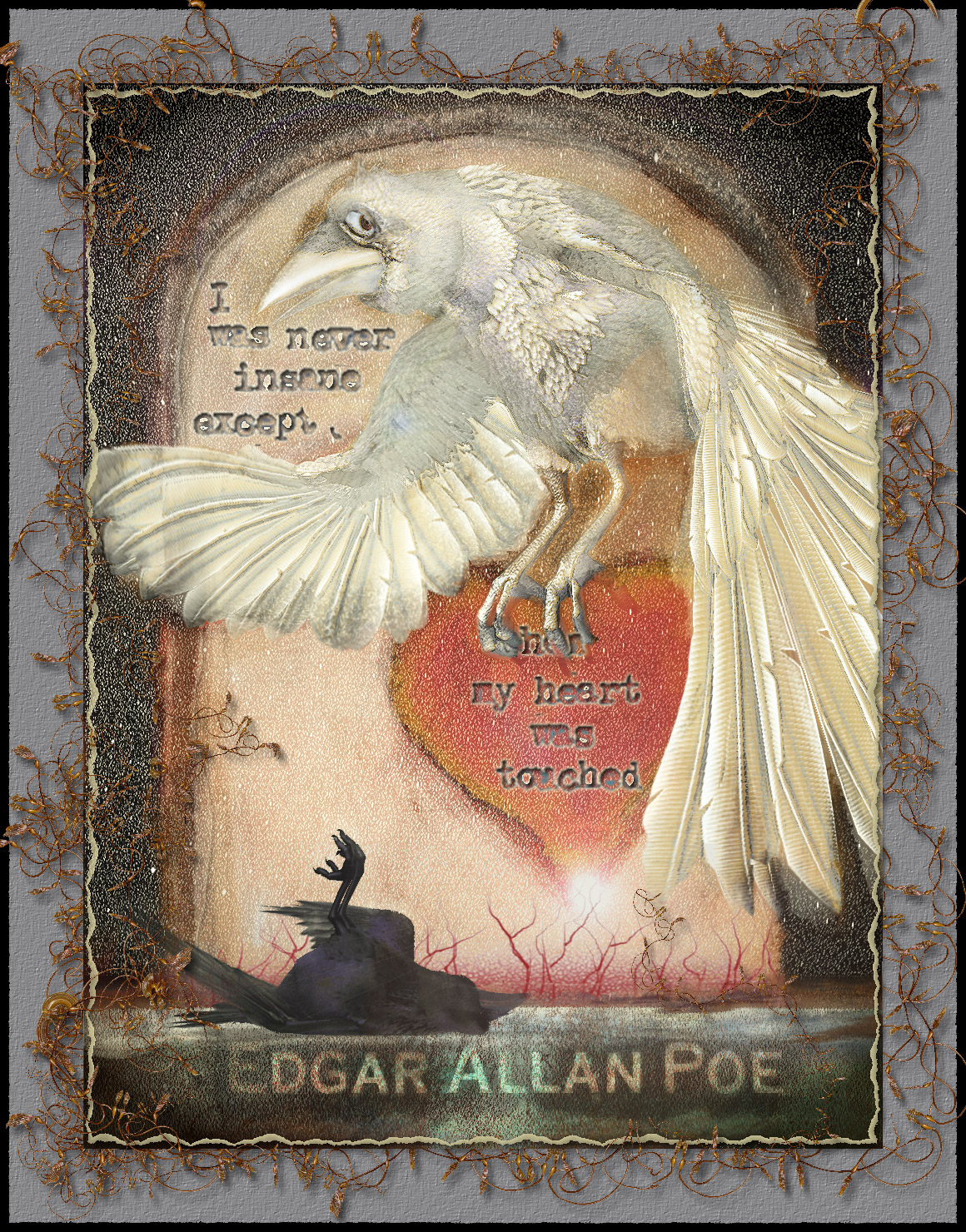
I wonder if maybe a crow is too-often used with Poe?
Yes indeedy it is. Iconic and ubiquitous. And so are portraits of Poe, as well as cats, and houses, and anthropomorphic trees. Soon also to be appearing in a future composite of mine maybe. Perhaps a book cover needs to be (use to needs to be?) instantly recognizable as to the author when it is a collection?
I'm rusty with my drawing, photoshop, painter skills. Struggling with getting back into the groove, rather than coming up with more imaginative concepts, more dynamic compositions, more interesting points of view. Much stuff, skills for me to learn, and polish. These illustrations are dive right in, stream of consciousness, experimenting, with not much thinking, filtering or planning involved.
However, I've yet to see a white ghost raven or a dead raven. Maybe I just didn't google deep enough.
-
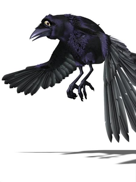
I've attached the crow model from Scarecrow of Oz - seems a pity not to have these Hash Movie models be available for everyone.
Original model by Colin Freeman. Not sure if it was modified by Holmes Bryant for variations. Beautiful model, beautiful job. If anyone thinks this is a problem...too bad.

-
Thanks Shelton, Rodney, David
More doodling (crow is from A:M). Not sure if I will process this version more. I don't feel like it has enough story elements to it.
-
I'm not using Windows. I'm running A:M on a Mac in OS 10.9.5
I just submitted a bug report.
Thanks for all your help.
oh I see. I am ignorant about Macs - but there seems to be a problem with macs and graphic cards (nvidia especially). I have no idea if this is your problem. Glad you put in bug report.
-
Hi Nancy -
I just chose OpenGL over OpenGL3 and the crash still persists.
fooey.
I don't know how macs work when you use A:M under the windows OS (which windows OS by the way?). But do you have to install the windows version as well as the mac version on your system? And do you install the 32 bit or the 64 bit?
Do you know if A:M 18n (mac version? windows version? ) worked before you updated your system via Apple's App Store a few days ago?
Do any other A:M versions run or not run currently under windows os, or mac os
-
This does not effect my use of A:M. I'm still able to work within all the windows - model, choreography, render, etc. - I am just unable to change options without receiving the error message and A:M crashing. While modeling, the lathe tool still works as 4 cross sections (as I last successfully had it set) even though in the options dialog box the number is the random string starting with 20 . . .
I would guess that not being able to change the lathe cross sections from 4 would eventually impact your use of A:M.
Have you tried changing your real-time driver? I notice it says Opengl3. Did you try option for opengl?
-
That is very, very sad to find out. Rest in Peace Kat. Seems like you've touched a lot of people. Especially your grandchildren who shared the experience of creating your animation with you.
-
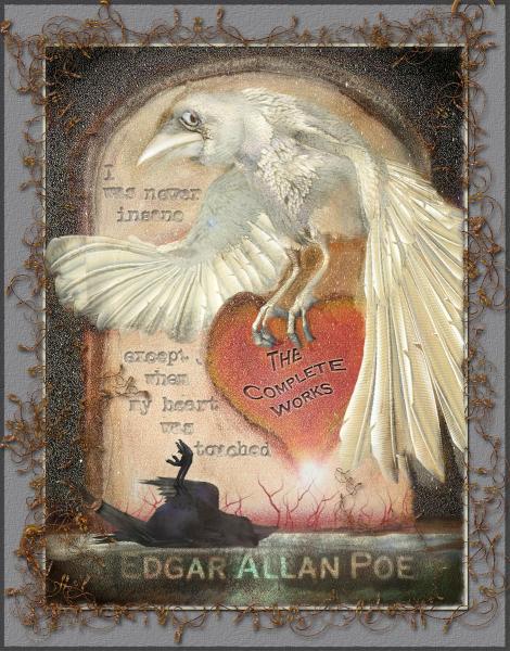
Tweaks - changed border, made heart occult wing. and the text. I hope it's more readable now.
I've also included the image/render of the Raven from A:M that I used.
-
Oooo yes...that IS wonderful!
-
The accompanying text is a bit hard to read, specifically the word 'when' which is hidden under the raven's talons.
Perhaps If there were a specific reason to obscure the word other than EAP's general appeal to insanity (i.e. for no particular reason)...
I can't help but think you'll get recommendations to change the white raven to black but there is something very interesting/alluring/enchanting about the white raven esp. given the dead raven below on the ground.
I would expect to see something like this in a bookshop.
Added: I'm a bit torn here... so I'll add it because it came to mind.
The white raven's eye looking out at the reader is interesting but I wonder if you could 'trap' the reader into the image by having the white raven looking at the black/dead raven who is pointing to the right. Then something on the right pushing attention back to the head/eye of the raven (you pretty much get this already with the reading of the author's name across the bottom then the connection with the white raven's wing position at the right).
Thanks for the feedback Rodney. I did debate with myself if it was ok to hide the "when". I have more of a fine art leaning rather than illustration, so mostly I tend to not want to be so "readable". But illustration is a different game. But I thought it had enough letters showing so that most could fill it in.
I made the raven white, hoping that it would suggest a ghostly spirit of the dead raven.
Hmmm..I'll have to think about the eye...not sure what emotion I was trying to get from this...at first I thought I wanted "worry", then sadness or "here we go again" ...Now I realize I'm not sure what I was trying to say with white raven expression.. "crazy" might be better...or...
-
This months prompt: Make a book jacket (cover) that will be used for a volume of Edgar Allan Poe Stories.
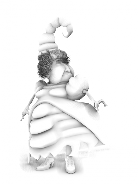
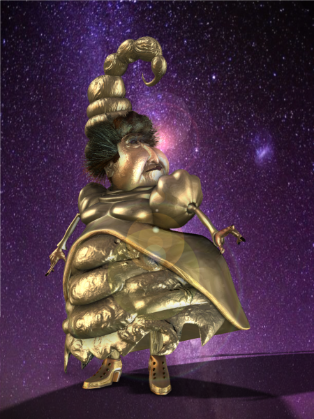
So I started with rendering from A:M an image or 2 of the crow model (from Scarecrow of Oz) - and then I proceeded to work up a variety of concepts (in photoshop) - the last image is probably what I will go with. But I might try doing at least one more concept - different altogether, more childlike, and probably including a cat.

-
Hmmmm...methinks I should go look at my innards as well
-
I have grouped a set of models and named it one
I then created a percentage pose of the one model
I edited the settings and made the poser slider 0-9 as there are nine models
I then edited the pose
at 0 on the pose slider, one of the models is visible the rest are to be hidden
at 1 on the slider the, the first model is now hidden with the rest of the models and the second model is visible
and so on and so on through level nine of the pose.
I can get the first model to show but that is it. when I hide the rest of the models they remain hidden throughout the pose. Not sure what I am doing wrong
Huh? I am not aware of how to create a pose (relationship slider?) that controls visibility of multiple models (in chor I presume? in an action?) but is contained only in one model
Where/how are you creating this pose? Enlighten me please!
However, If your intention is to easily turn on/off different models in the chor:
1) In the chor I would make a folder (rename to ONE) that contained all the models (1-9).
2) right click on the ONE folder, choose "select children"
3) While all are selected, turn active property of one of the models to OFF. All will be set to OFF
4) deselect all the children in folder, select just the model that you want to be active, turn it's active property to ON
can do above with any of the properties for the models contained in the folder/group.
-
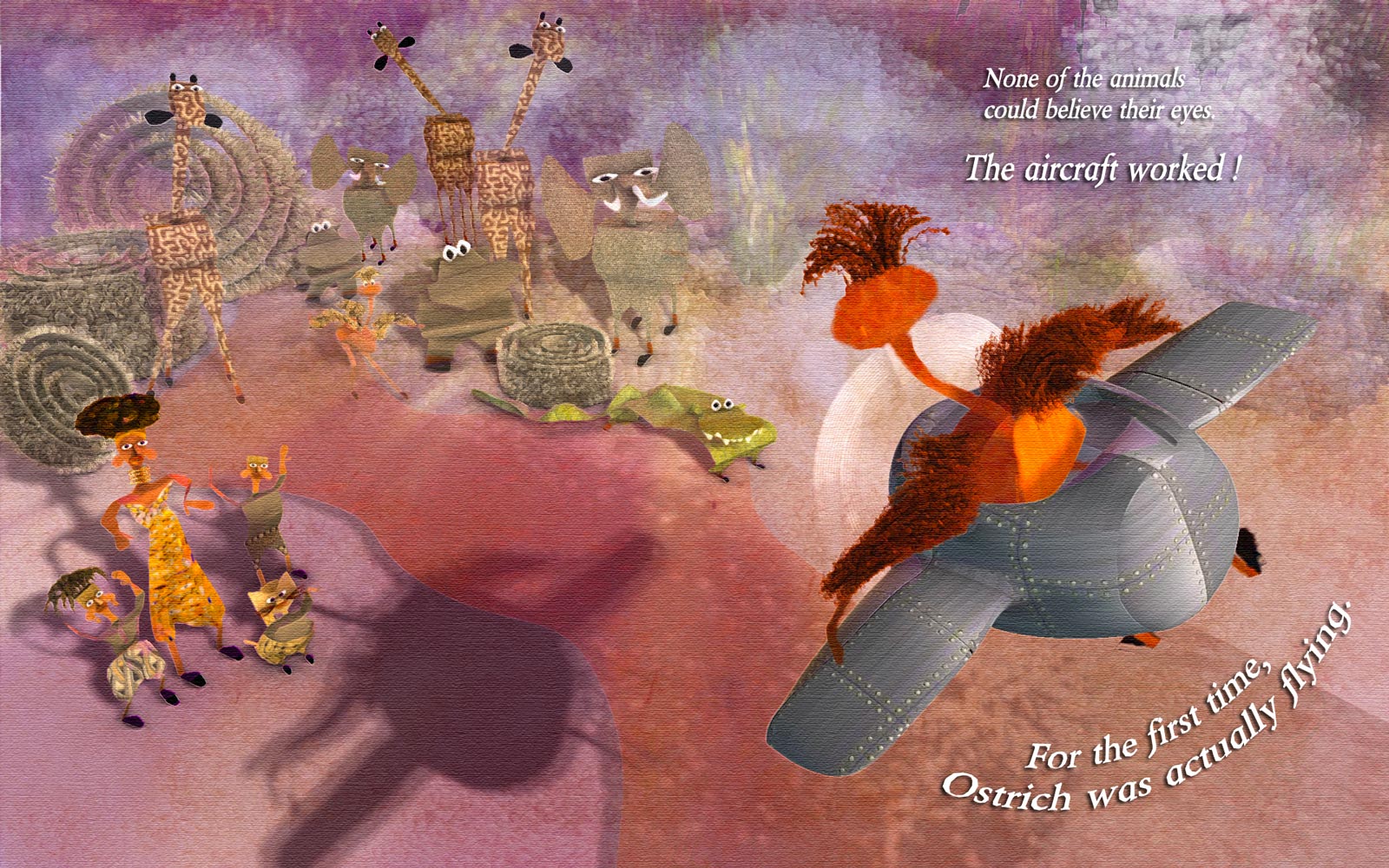
Thanks again all for your feedback!
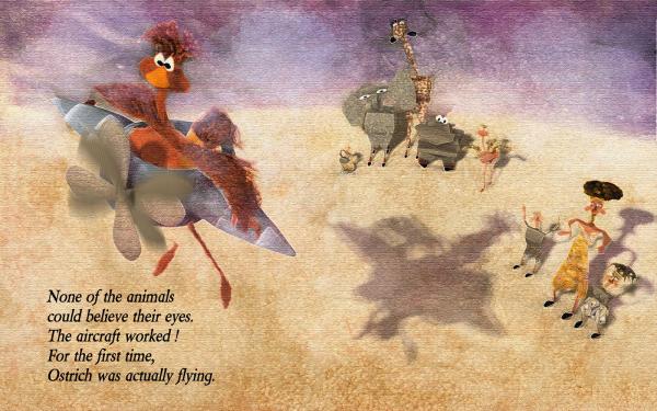
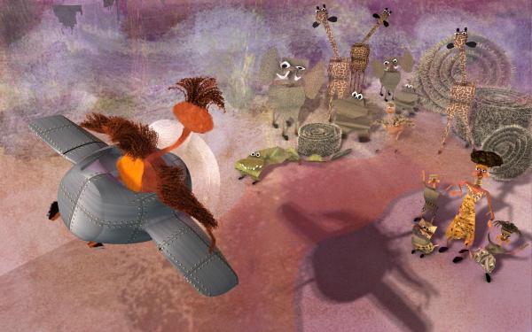
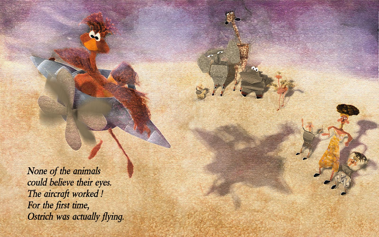
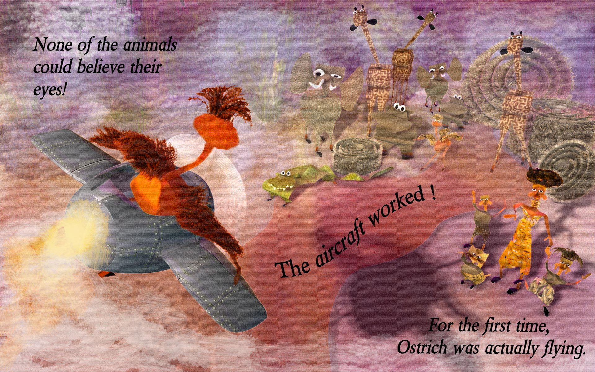
With the Ostrich's back to the viewer, it looks like she's about to strafe those animals, presumably after all the mockery she's had to endure from them as she failed to take off again and again. She's finally getting her sweet revenge!
That's actually quite a story right there.
Ah yes. heh heh. Yeah, that's why I prefer the version with "back to reader". For more interesting story reasons, only. However, have to admit, I wasn't thinking strafing (but good idea!) ...was thinking more that she was an inexperienced pilot, not yet able to control direction of aircraft, and causing some worry among her antagonists!. Should probably make the plane/pilot have some more wobbly feel, or show more posture
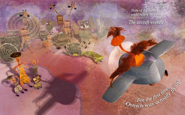
@Rodney, Robcat - But I have to agree, I do prefer the "facing viewer" version more as a stand alone image, because I prefer to see the face of Ostrich. Like I said before, I am going on the assumption that Ostrich's face has been shown in prior pages.
One of the comments made, in terms of developing portfolio, is to show the same text, illustrated 3 different ways, even 3 different styles.
@Robcat - thanks for the feedback - From what I understand, I don't think it is that important to have the text be so literally synced. Nor is it necessary that the text be aligned so perfectly to the action shown. As long as the image illustrates the entirety of the text, and contains blank space for text to be added later by "textologist". The layout of page could even include white space for text, not necessarily as an overlay on image.
Most of the images submitted didn't even have the text included.
However since I was thinking this could be a 2 page spread that spanned the crease, I am more concerned that the crocodile, currently, gets cut in the crease (directly in middle). That's a no-no for sure, unless I elongate him some.
As for text, that would be something I should find out (as to who adds text). They do have a course on "Illustrating Children's books" - over 20 hours - chock full of great info, on my queue, which will probably answer my question, or else I can ask on their forum.
From what I understand, and have observed, childrens books illustrators often add elements and back story activities in the image, that aren't explicitly stated in the text.
If anything, I would say this imagery (either version) does not have enough details, and auxiliary activity going on, eg, exhaust on plane, more detailed controls on plane, perhaps a sidekick (mouse) who accidentally hitched a ride at the wrong moment, birds flying around, etc
I hesitate to add here what I had started with (1st image, and unfortunately had submitted for contest) - UGH - but good for giggles and maybe interesting to show comparison. If I had started earlier, I would have obviously been better off getting feedback all along!
2nd image: Added some exhaust,
put text at bottom, then top left. And yes, in case anyone was wondering, those "hay bale thingies" that were added, were stolen from Rodney's/Serg's spiral, and then hairified!Edited again...put curvy letters back

-
Thanks John! Thanks for the feedback Rodney, Simon, Robert.
By turning Ostrich and plane around you've undid the improvement of the suggestion you mentioned before.Thanks Rodney - yes I totally agree -so I flipped it back. I like Ostrich facing away, and changing the point of view to be that of the animals rather than Ostrich. Less expected! I don't think this is a real story (it's a made-up prompt only for the contest), and I am assuming we have met and seen Ostrich on previous pages. In one of the courses on Storytelling (for book illustration, not animation) - it was suggested that one can choose to show the action before, during or after. And one of the winning entries for this go-around chose to not show Ostrich at all, just the reaction of all the animals. It was fabulously done, in the style of "far side comics" - where the animals were almost mocking Ostrich. All interpretations of what the story was, leading up to this prompt were totally up to illustrator. Obviously would be different if the whole story had been presented.
And yes, I've changed the text to black. Better! thanks.
In case you're interested:
Here's the video critique of the winners for this contest
As I understand it, these contests are designed to help people get pieces for their portfolio, so the prize of the contest is to get a critique, and once someone wins, they are not eligible to win again for 1 year I believe (to give everyone a chance to improve). So the winners are not necessarily the best entry, but more the best for "critiqueabilityness" as well as good entry. This is so that everyone can learn.
@Robcat - I've changed the text to flow across the pages - I like it better
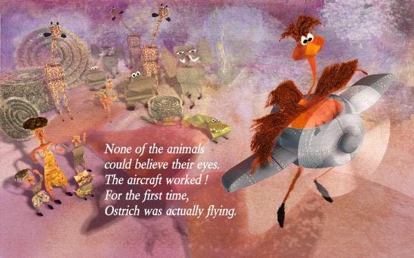
A slight tonal variation in the giraffes in the top left will make them stand out from the sky/landscape a bit moreYes I feel they were too similar in tonal value to stand out. I had used fog to blend them in A:M, but I changed it for the back animals to ignore fog. I could have also tweaked tone in photoshop. Thanks for the feedback Simon.
Here's this revision, the first image being the tweaked version in PS - In PS, I added some dabs to background, upped the saturation, added text. The 2nd image is how it came straight out of A:M
-
Thanks Robert. The text was the "given" - everyone did an illustration using those sentences, so no changing that...But I am going to work on changing the postures of the animals slightly to communicate more "worry" about Ostrich crashing into them ...and will also work on rearranging text again (going to zumba now)
-
It's important to get that critical feedback that challenges us to raise the bar even higher in our work.
That suggestion to flip the image was a great one... pointing the reader forward toward the reveals that will occur as they turn the page of the book.
Yup...And since I hadn't taken any art classes when going to school, I'm finally learning (new concepts to me) that it is better to start with small concept composition thumbnails, tone sketches before rushing into playing like I typically do - saves time, less likely to get attached to results, and less likely to be resistant to changing in the early stages, when a lot of work hasn't been done.
But for this contest, I just barged ahead spontaneously, in my typical workstyle..next one, I will "attempt to attempt" a new approach to the problem from a more planning, staged approach method, and...gulp...may even do a work in progress. (Shivers)
I changed image again to see if I could introduce some more story. I am very awkward at text, font choices, as have never studied them. Also not sure about white text.
-
I've signed up for a monthly subscription for the Society of Visual Storytelling - excellent instructors, with the most amazing excellent, creative students, & interesting courses! (I am such a noob).
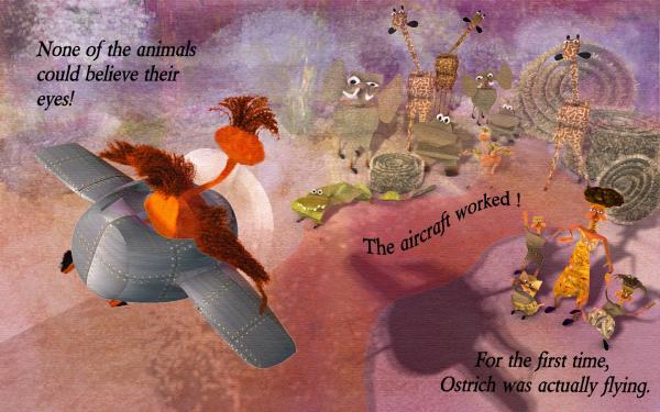
Every month (third Thursday) they have a contest. This month (October), the prompt was "None of the animals could believe their eyes. The aircraft worked! For the first time, Ostrich was actually flying."
I entered at the last moment (first time), and my entry was not finished. So I've continued to work on it .Still not done, as I don't feel like the illustration tells a good enough story. But I'm tired of it, so I probably won't go any further. Here is what I have (not what I submitted)
I used A:M of course and tweaked it further in Photoshop. My goal was to be able to get a handcrafted look, that doesn't look CGish. And to develop a more automatic pipeline.
However, this time, I spent way too much time on technique and rendering style, rather than more importantly on content (which this desperately needs). Next month's contest is to design a book cover, for a volume of Edgar Allen Poe short stories.
EDIT: flipped image so that it reads left to right - I like it better! - was suggested to me by someone on SVS forum
-
1
-


3rd Thursday November - Book Cover - Edgar Allan Poe
in Showcase
Posted
Thanks John.
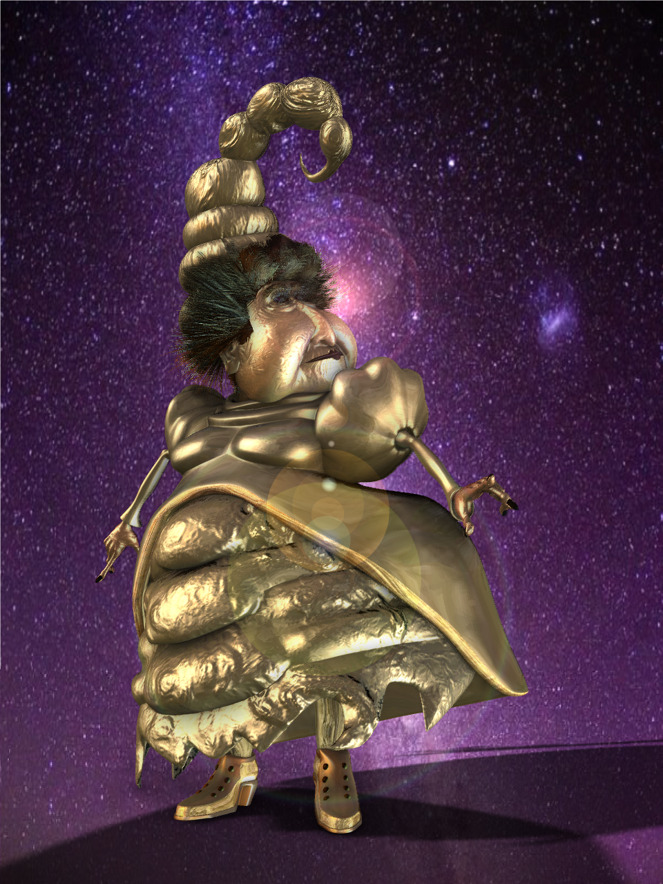
hee hee - on another thread about SSAO, I decided to hand color a SSAO render (ver18n) - I expect I will be doing this more frequently for illustration purposes and maybe even for making folded paper doll models in A:M. (Will not be using this image for this months prompt)