


NancyGormezano
-
Posts
7,863 -
Joined
-
Last visited
-
Days Won
15
Content Type
Profiles
Forums
Events
Posts posted by NancyGormezano
-
-
Nicely expressed Rodney.
I think the current 3rd Thursday approach that limits you to a single illustrated page can be more than a little deceptive. The interesting thing being that while your illustration does have to stand on it's own the page doesn't quite take into account what is to be revealed when the next page is turned nor what has come before. Many aspects of the current (isolated) illustration can gain additional clarity relative to those. In the 3rd Thursday entries that aspect still needs to be accounted for. Whether revealed or not (and I assume they never will be) there are no other pages of this story. Those pages exist only in an imaginary world where this page is taken from a real book. This is an important thing to consider because, in a way, you have to consider what will happen next and what has led the story to this point. It's that richness of missing detail that we can't see in the current narrative that is by its very nature interpretive, illusive, abstract and subjective. We simply don't know. That information doesn't exist. So we in the audience MUST create the rest of the story. We have no choice.These monthly challenges are usually flexible in letting the artist decide what format they'd like to do - as the purpose for mostly everyone (except for perhaps me) is to develop content for their portfolio's. And of course, to aim their imagery at the market they are after. Some people even do a comic strip panel. Besides children's books (seems like majority), others are after young adult market, others: editorial illustration, others: etc. But the emphasis seems to always be about concept and story.
For me, this month, I was thinking this is more of a standalone poster (rather than a page out of a book). Other times, when I think of it as a page in a book, I am conflicted as to how much is necessary to reveal in the one image, and I usually assume (based on the text of course) that some stuff has been revealed in previous pages, and some stuff is still to be revealed. I particularly admire some of the illustrations done by others where they actually cut off parts of characters as if they are transitioning to the next page - very startling and provocative!
I think there is a close connection with children's book illustration and animation, along with storyboarding and comic strips.
I think animation is harder to pull off, because of the added element of timing, and having to limit the change in motion. The viewer has to absorb it in a flash, whereas with illustration, the reader sets the timing. They can explore the added details at their leisure, and get caught up in the imagery/story at their own pace.
That could be why I enjoy doing animation as an activity, but I haven't really enjoyed viewing many animations. I always want to stop the motion to examine the details (as well as add more and more detail, usually too many, for comfortable viewing)
-
Ah! I didn't catch that part. I was thinking you just made it up.
Rodney: As I thought about what you suggested with respect to the wording, I'm now thinking that it probably would have been better to change the phrasing so that the piece could stand on it's own. As it is, it's not obvious that the words came from a fortune cookie. If I wanted that to be obvious, I should have probably added imagery to show that (like maybe a piece of typical fortune cookie paper, placed differently on the image, with perhaps maybe even the remnants of the cookie...or something like that).
So thanks for the suggestion. It takes me a while to catch on to how valuable perception, feedback, critiquing from others is. It's more important in illustration for image to be clear, as opposed to fine art (which I've typically done), which can be interpretive, illusive, abstract, subjective.
-
Ooooo...very nice! well done!
-
Added (because you know I cannot resist making at least one suggestion): The one change I might make would be in the wording of the fortune cookie phrase. Personally, I'd drop that last word 'do' so that it read, "The great pleasure in life is doing what people say you cannot." An alternative would be to change 'great' to 'greatest' so it read, "The greatest pleasure in life is doing what people say you cannot." although I lean toward the former I'd have to ponder upon that. That reads more like a short phrase cracked open from a cookie.
Yeah - I didn't like the phrasing either - however, those are the EXACT words that were written on the fortune. I actually was looking for a fortune that was even more awkwardly phrased, in a style typical of bad translation that many times comes with the cookie. One that makes one go: "huh?". No such luck.
Sad fact: My husband has been collecting fortune cookie papers FOREVER. He has a jar stuffed full, that must contain, and I do not exaggerate, a zillion, at the very least. It took me a couple of hours to settle on one. There were many other candidates. And I didn't go through them all.
And I like your story. And I can also picture your family members rolling their eyes once again when it comes time to open the cookies.
 . I can't tell you how many times I've dreaded opening fortune cookies because I know my husband collects them. OK...ok, already... This ONE time it paid off. But I'm not telling him that.
 -
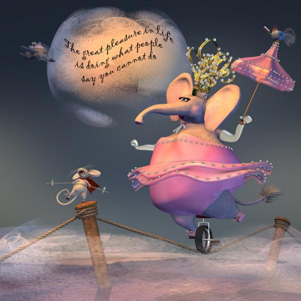
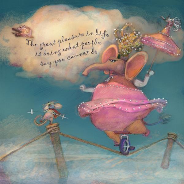
This months assignment was to illustrate the text found in a fortune cookie of your choice. My fortune cookie said "The great pleasure in life is doing what people say you cannot do".
So I rendered out a version in A:M and then hand "painted" the image in photoshop, to get a more scribbly, spontaneous feel. Here's both versions before and after PS.
(EDIT: adjusted levels on hand rendered to bring out the highlights, tad more contrast)
-
 3
3
-
-
Fascinating. It was unclear to me (in your article) where A:M is running? on your phone?
-
I don't have win10 but I googled "how to turn off gestures in windows 10". I got:
- Open the Control Panel (icons view), and click/tap on the Mouse icon.
- In Mouse Properties, click/tap on the Device Settings tab, and click/tap on the Settings button.
- Check (enable) or uncheck (disable) the Enable Edge Swipes option, and click/tap on OK.
- Click/tap OK in Mouse Properties.
Many other links come up - hope this helps
-
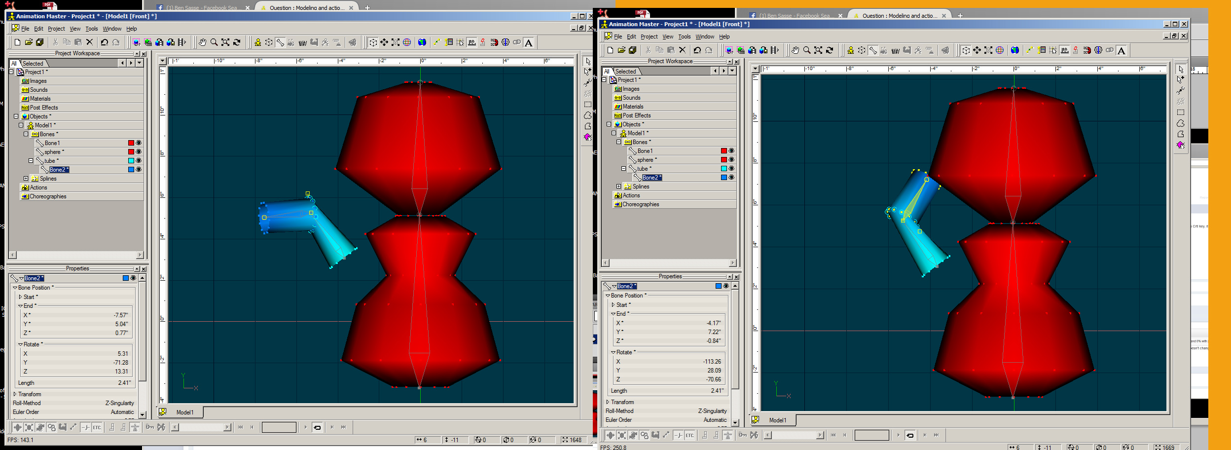
Can anyone tell if the 3 controls in the 'Spine' tab do anything?
-Steady Head
-Steady Chest
-Steady Pelvis
I get no reactions when I activate these.
I haven't tried the saucy rig for a long time...and do not have a model handy to try, but I'm guessing that what these controls are supposed to do (similar to 2008 rig) when they are turned ON, for example is to keep the head oriented the same, eg looking forward or however it is set (when moving the chest). Similarly the chest would stay oriented the same (doesn't change) when moving the pelvis. As for steady pelvis? I dunno.Maybe when moving the feet?
Turning those options off, would mean that the head would turn when the chest turns, chest would turn when pelvis turns, pelvis turns when the feet change, I'm guessing.
But I have no idea if the saucy rig is doing it correctly.
-
HAH! great!
EDIT: these are hysterical, LOVE them. Thanks Simon!
I have visited the mountain gorillas in Rwanda at Parc National de Vulcans in the early 1980's (before any of you were born, of course) - and it really was like that! surrounded by gorillas, within inches of me.
One particular lovely lady gorilla was admiring my silver gloves (had to wear gloves because of the stinging nettles), and she reached over, touched my hand, and then sniffed her fingers.
I was at first panicked, as I thought she was going for my camera. Then I was in love, as I realized she just wanted to know where she could get a pair of my shiny gloves.
-
Ah yes - now I see what you mean - The cps are still weighted at 50-50, but the rotating in bones mode doesn't take that into account.
-
I want to say, % of weighted don't work. A CP whish as 50% BoneA and 50% BoneB, if you move it with Crtl key, it will be 100% BoneA and 0% with boneB.
I am not finding that - I have cps weighted 50-50 tube/bone2 and I rotate bone2 in bones mode and the weighting doesn't change (16b/32 - did not try in 18)
It also doesn't change if I rotate tube bone
EDIT: just tested in 18p/64 and the weighting still holds
-
I gave it a try but CP weighting isn't in effect when you move a bone in the model window.
I imported a weighted/boned arm into a body model and the arm weights came in - I could also manipulate the arm hierarchy without disturbing weights - so I am not understanding this comment.
-
Ah yes constraints, (smartskins too?) are a different story - but the weights should be available ?
The relationships should also come in when importing the "part" model, and yes constraints might have to be reset after.
But I agree, doing it in an action that could directly change the model would be nice.
But I'm guessing that's a whole other type of "mode" that would have to be indicated (eg like bones, modeling, action, relationship, new mode, etc)
-
Hi Malo
I totally understand why this would be a good thing. And I too have always wanted a one-time instant "translate to" , and "orient like" command in modeling/bones mode.
I do not like creating and modifying models via export from an action because in the past, many things did not get exported correctly - like hair, decals, etc (not sure this is still problem).
However, what I currently do, when I am modifying an existing model to create a new model, or wanting to add geometry (and bones and relationships) from an existing model, is to
1) Import the part model (eg arm) into base model (eg body)
2) go into bones mode and select a bone, and then use the "translate", or "rotate" or scale modifiers with the control key pressed, until the part is in the correct place.
Doing it in bones mode will translate, rotate and scale the bone along with the geometry .
-
yay for you!
-
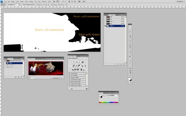
If png works for you - great !
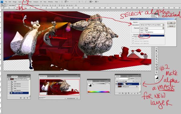
But for your education about using tgas and alpha channels - in PS and/or other editing programs.
In order to use the alpha channel generated by A:M, in for eg PHOTOSHOP, you must create a new layer with the same contents as the background (duplicate background), hide the background then
1) select the alpha channel and then on the new layer
2) make the alpha channel a mask for the new layer, to eliminate the background (black). You will see "clear" pixels
then you can create new layers, below the masked layer and you can have any other background color or image show thru.
Will work just like a png. Except the masked layer will not have deleted any information from the original - the background (in this case black) with still be there, just not be shown.
A:M is not having a problem in ver 17. That is how it is supposed to work.
-
I downloaded VLC and can now view it - I don't think Mac people can view avi's? not sure. - so whatever you did - vlc seems to work
In what app did you convert to mp4? was it vlc?
-
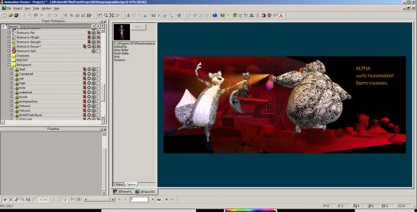
Using tga format and alpha channel will allow showing varying degrees of transparency (I think you can do same in png probably?) Rendering tga in A:M will look black coming out of A:M, but when you bring it into PS (or some other editor), and look at the alpha channel under channels, you will see black, white, grey imagery.
It's working in A:M in ver 17. I think you probably are not understanding how alpha channel works?
1st image is coming out A:M, 2nd is the resultant tga brought into PS
-
I like the new look of your characters, interesting!
But I also found the old ones more endearing and lovable and huggable!
-
I'm not able to play this either in qt or windows player - what did you use?
well - correction: I can play it, I just don't see anything in qt - all black, and in window player - I see garbled pixels.
-
Very nice. I could tell that was a fox right away.
You've got a very distinctive style, I hope you win.
Thanks Matt, Roger, Steve, David!
It would/will be very hard to "win" in these competitions for me. The people entering their work are mostly professional illustrators, who are INCREDIBLY good and amazing. I am at the bottom. My stuff usually gets critiqued as to not clearly showing what is going on in the story.
I'm learning that Style is not important. Pretty is not important, for children's book illustration. Having a clear focal point and showing the "story" such that it is instantly and easily understood is #1. Composition #2 Rendering style # 3 (or lower). I'm still at the "i jes wanna make purty pichurs" stage. Probably because I love textures, colors, abstraction, and want people to have some mystery in figuring what the image is about. This is not what children book illustration is about. It/I might be more suited for editorial illustration, and personal art.
Usually they choose 1 winner, and as many honorable mentions as they feel like. There are no definite "rules" (they change on a whim) as to winning, and who gets to be critiqued that month.
Mostly the benefit to all is that we get to watch the critiques of different entries - including the winner (in a gotomeeting, and then posted later on youtube). As the instructors say, these competitions should be used to create a portfolio in one's own style. I'm just doing this for fun and learning. I have no intention of trying to do this professionally.
The entries chosen to be critiqued are not necessarily the best, but are usually chosen so that their critiquing will be helpful to the most people. Ie they make more common mistakes.
The winner, and honorable mentions however are personal preferences by the 3 "judges" - Jake Parker, Will Terry, Lee White. Each excellent teachers, artist/illustrators. And after they get done critiquing and making changes, one can see that in most cases they definitely made an improvement to the piece.
-
Thanks Simon.
With these contests - it's not always clear if one should even put the text in (many leave it out), but from what I understand, it's always a good idea to leave space for the text, to be filled in by a "fontographer-typographer" later.
However your point is taken. If I 'm going to add the text, then I should do a better job of positioning it, for a more pleasing use of space. And don't get me started about fonts. I suck at choosing a font and am completely ignorant about what would make a font a good choice or appropriate (other than readability). A lot of the others will do hand drawn lettering, always blows me away!
-
Thanks Rodney. Your critique/feedback is spot-on
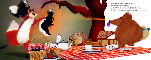
Yes it is confusing as to which is Lucy. It is supposed to be the bear spraying the skunks. I wasn't even sure that these critters would be recognized as skunks! Nor that the bear looked like a bear!
The confusion probably comes from the fact that when I first started doing this, I was working on a composition that had Lucy being the fox/cat/character. (supposed to be a fox, but I think it's not clear that it's a fox in this version, looks more like a cat).
I had the story in a different setting - a picnic, where Lucy/fox's weapon was the skunks and she was using them to scare away the bears from her picnic spot.
And then I switched to an indoor scenario, making the bear Lucy, who was spraying the skunks. And yes I put the hat in hand to indicate that. And Yes, I too, feel I should have made the bear more feminine looking and showing the face more.
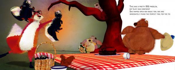
Here is a previous version of the picnic scenario - done in a simpler style (Flat shaded with fakeao only) - which I am now liking better.
I just don't know when to stop experimenting, adding detail. And again, I probably should have gotten feedback before proceeding and changing course.
EDIT: added the transitioning version where I switched, making the bear be Lucy at the picnic, and she is now spraying the skunks
-
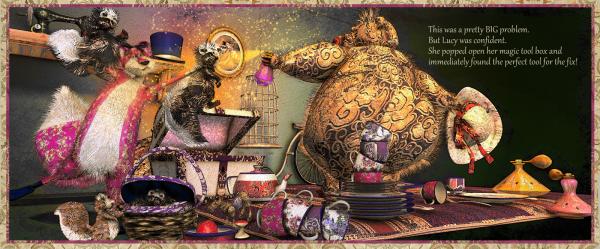
This month's entry for Society of Visual Storytelling
The prompt: "This was a pretty BIG problem. But Lucy was confident. She popped open her magic tool box and immediately found the perfect tool for the fix."
Done with A:M with post processing in photoshop and corel painter to add paper texture, sketchy style and stars.
-
1
-


Plug in wish list
in Animation:Master
Posted
okie-dokie I'll bite:
what is this? Can you show a sorta maybe example-ish image