


UNGLAUBLICHUSA
-
Posts
637 -
Joined
-
Last visited
Content Type
Profiles
Forums
Events
Posts posted by UNGLAUBLICHUSA
-
-
<_ perhaps his next alias can be a-hole guy just irritates the hell out of me....so he must very happy. well back to check other topics...hopefully they are about a.m.>
-
 I have a nice ATI card collecting dust for about a year now, I could never get it to install no matter what the ATI support site said to do...something with GART drivers I guess, cause I got black screen on boot every time...I hate ATI.....
-
-
-
 Thanks for the reply, I visited the radiosity forum earlier this morning and printed all the threads for later reading (and downloaded the attachments). The volume of actual "how to" info on radiosity alone, there could probably make a booklet the size of Art of Animation Master. Yikes, give me my old super 8 and some platicine clay back - I think this is going to be some serious work.
-
 Yves, when you said "I just wanted to mention that you really don't need radiosity for that sort of render". It got me thinking, when do you want to use radiosity? Are there some "key" factors that would benefit from radiosity? Thanks for any input.
-
Any chance of some wires on that side view, the shaded view doesn't seem to have more than a subtle change that I could see. Looks great in shaded mode though!
-
Damn, I have been trying to get my nose/cheek area looking right for 3 days now and here you just hand me the solution on a silver platter. Kudos & golf claps 2 u Adam (and thanks)!!
-
<_ o.k. you convinced me bad idea.>
-
I would like to suggest an option similar to the ignore button. Lest say you want to start a thread but don't want a certain 'mini-Morpheus' wannabe, derailing the thread as he tries to free our minds. In your personal preferences section, you could add names to a list to "block user from posting to threads I start". How 'bout it?
-
Wow, as far as matching perspective - my opinion is that you have got it right on the money. This gives me some ideas...he he!

-
 Jim, I hope you don't mind me standing on your shoulders (see my quote below).
I have been studying your work to find ways to improve my own and I especially like your aistocratic "Lady" character & "Bluejean Baby", both are Very inspiring. I also hope you don't mind if I employ some of the spline layout I have seen you use as I do my own female character. Keep up the fine work.
-
Actually Jon I thought it was for the reason that it would then be illegal for them to post the images without the express written consent of the copyright holder. That might in some way be another good reason. Steve, can you chime in here and settle this.

-
It hardly seems innapropriate to not follow a non rule.
I posted mine, not to get votes (I don't see how that would get votes anyway) but to get feedback. Maybe I could have waited, but I worked on it (off & on) for a month and feel a little eager. Maybe someone who knows how to post a "poll" can get a concensus & ask HASH to have a rule implemented.
Until then, I say "No rule - no foul".
In some other forums it is "good form" to post your project from doodle to final render as you go along, like say "The Machineflesh Challenge" or "Grand Space Opera Challenge". That way seems prefferable to me and is how I went along, but if someone wants to go straight to the showcase thats up to them too.
Just my 2 cents.....
-
 Darn, another image thats going to whip my ass in the contest, good job!
I would only suggest adding some puffy white clouds, but thats a very small thing.
-
 I think you will get more votes than me, heres my crit for what its worth:
1. Love the textures (materials), the crackled ground, rusty drum, ruined walls.
2. Nice sky effect and fires.
3. Lighting is dramatic.
4. Abdominals seem squared, I think this might be what Ken was referring to, if you can round the edges that would be nice. Also, on well defined abdominals you will find that they interlock (stagger) somewhat - check out some bodybuilder pics to see what I mean.
Good job.
-
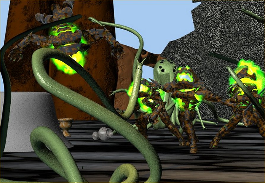
Ken & Joakim, thanks - I guess I never noticed the vase..and I should have blocked the shot differently thats true, my focus has always been on the juggernaut #3 from the left who is pushing foreward, I think I should have moved him farther foreward, lowered the camera and forced the perspective some. Good crits.
-
Well I did enter, even though I am far from satisfied with the result. Just doesn't seem to be enough time to do things the way I wan't, that and I am still learning how to do anything other than Model in AM (I think I can do that). Here is my submission and my own critiques,
1. Background image on large patch behind scene (of mountains & clouds) does not show up.
2. Bump map on ground does not appear, only the separate color map I used for the bump shows.
3. The pebbly dark grey "stuff" to the right is actually 2 stucco houses, I don't know why this older texture (I thought I deleted) still was applied, makes it look like a jagged grey lump.
4. Brown rocks don't look "rocky" enough.
5. Light grey plug shaped item to the left was supposed to have a smoke emitter - couldn't get it to work, no way - no how, green fire emitters on the juggernauts worked just the way I wanted.
6. Ran out of time, wanted to add more juggernauts & Sqwid's.
7. Scene needs to be lit darker with the key light positioned lower.
Next on my list is to not enter the next contest, but instead read up & experiment to learn how to get the effects I wanted to achieve this time. I wanted to enter this contest as a personal milestone, not to win.
Constructive criticism is welcome on this particular piece, if you see where I could have done better (that I already know) please explain how so I can improve my skills- thanks.
-
Although I plan on entering, I agree that you need a tad more light. Perhaps some light from about knee level and close by...think flashlight under the chin on a dark night how it accentuates the features. Good luck!
-
...and mr SQWID in all his bones mode glory:

-
<_ nope no scale issue...in the meantime i have been feverishly working on opponent for juggernauts mighty malevolent>
There are some problems though, in the quick preview screen grabe I took, the hooks are quite obvious, I don't know if they are supposed to dissapear upon a real render or not (anyone have the answer?) but where the tentacles join the main 'body/head' there are some hard edges and gaps.
I'm sure most can agree with me on how frustrating it is to know what you can do but not having enough spare time to do it.

-
So these eggs have EGGSTREMITIES?
-
Can't seem to get the skeleton to work correctly...so I am making posed individual Juggernauts by manually manipulating the sections of armour. Here is a screen capture of the choreography in progress...

-
 AAAAAIIIIIIEEEEEE!!!!!!! I scaled down the texture, smartskinned the piss out of the lames, ran him through the Setup Machine....but now a simple move of its hand sends its upper arm parts flying away from the body...will try to work more on this 2 nite..in the meantime here is the adjusted material:
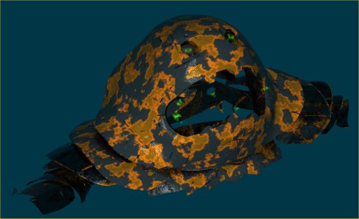
Wacom tablet or optical mouse?
in New Users
Posted