Pitcher
-
Posts
99 -
Joined
-
Last visited
-
Days Won
5
Content Type
Profiles
Forums
Events
Everything posted by Pitcher
-
It promises to be even better in May. The librarian will show us how to actually operate the printer ourselves. Before May, we have had to give her our .stl and let her run the printer for us. That was nice, but I will be happy to learn how to run the printer myself.
-
robcat2075, don't worry, I understood what you meant. The problem with the picture is solved now, and I know that flipping normals is important for 3-D printing and texturing, too. I guess next time, I'll try flipping normals as one of my "go-tos" for solving problems. It will be like rebooting a computer. Thanks for all your advice in how to use the patch image method and how to rotate images, and so many other things. Thanks to Fuchur again also. If you haven't looked at the 3-D printing page in a while, I printed the model of the Sphinx at the library one more time and took pictures. There still are some imperfections, but I think it turned out a lot better. I also made significant changes to the model. Have a good weekend!
-
All settings are the same. I'll check Normals again. Thank you both. Fuchur, you know my failings. Good guess! (I have never found any use for flipping normals until we did the 3-D printing. My pictures all worked. Apparently, normals are a key to textures, 3-D printing, and who knows what all? I wish the normals were all born pointing the right way. It takes a lot of time to flip normals. I think the count on the picture above is over a million patches.) Thanks! Is there some control that can lighten or darken the images used in texturing?

-
I posted it on the link you provided. Here is where it is:
-
I'm not sure where I'll be on Saturday at noon. I'll try to be there, but my schedule is very fluid. That's one reason why I leave messages usually, rather than chat.
-
Done.
-
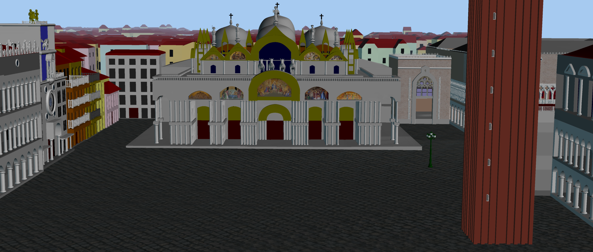
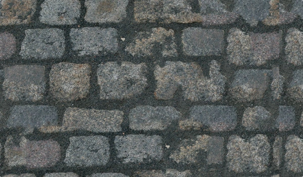
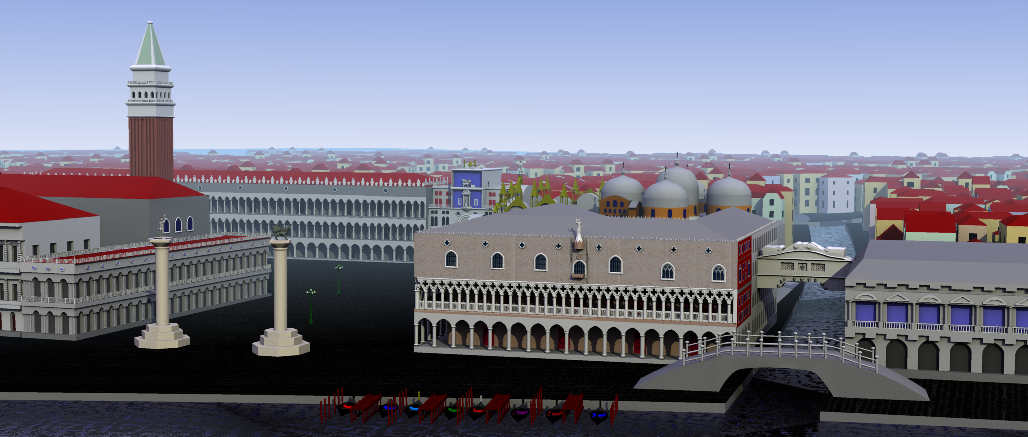
For whatever reason, the program had the cobblestone pattern going one way to the left of the canal that the Bridge of Sighs spans and another way on the right side. I could not rotate the pattern to the right until I split it off from the one on the left and rotated it. I gave both the same properties, but for whatever reason the texture on the left ends up much darker than the pattern on the right. I am using Version 18 of A:M. I am also interested in knowing if there is a control for darkness of a texture and where that control is. Here is the example I am describing:
-
Thanks, robcat2075. I'll look forward to learning more. I'll go ahead and leave a question. For whatever reason, the program had the cobblestone pattern going one way to the left of the canal that the Bridge of Sighs spans and another way on the right side. I could not rotate the pattern to the right until I split it off from the one on the left and rotated it. I gave both the same properties, but for whatever reason the texture on the left ends up much darker than the pattern on the right. Here is the example I am describing:
-
Thanks, pixelplucker!
-
When I started out in using Animation:Master, part of it was because I liked the movie Shrek and wanted to learn how to do 3-D animation. Another part of my motivation was making a movie to tell a story. I can't afford to hire actors, buy cameras, etc., so I thought it would be great if I learned how to build the actors, sets, and props and use the cameras and lights in the software to make a movie. One of the things I really like about 3-D is building the environment or set and then using it like a real location. I have experimented with using flat pictures in a rotoscope fashion, as background but as I moved my characters, the background did not look real (in the sense that it looked like a flat picture background). I took a small free course in visual fx offered by Hitfilm (about 6 lessons) online, and one of the techniques was to place what looked like cutouts in different locations in a 3-D environment and project a 3-D motion visual onto the flat cutouts. That seemed to give more of a 3-D feel to the movie, but there seemed to be quite a bit of set-up required to make it work properly. I thought that building the 3-D environment itself might be better in the long run. Once I have the environment, I try to place my characters, cameras, and lights in a variety of ways to see how it looks. I guess I have a poor imagination, because I cannot figure out how it's going to look until I do all of this. I have a general idea beforehand, and I may even have sketches, but without moving characters, lights, and the camera into various positions, I don't know which I'm going to like the best. The pictures I have made so far to illustrate my books are in choreography files, and can be used as starting points for camera and character movement and zooming in or out and panning and various transitions. I hope to one day, if I live long enough, go back to my choreography files, improve the quality of pictures (even though they might still have a cartoon style) and create animated movies. I started trying to animate my own stories so that I would have some content to provide motivation and experience that would call forth the need to learn more technique. All of this is to explain that although I am very slow in getting to know a lot of the ins and outs of the animation program, I do have a general strategy in mind for accomplishing a goal. I really appreciate the huge amount and quality of help I have received on the Forum, and although I might not use every lesson in helping me to approach my goal directly, I am learning techniques that I will be able to apply in some small way to my project. For example, I have admired for years the way artists use texturing, and I am very impressed with how closely 3-D artists can simulate reality, especially in special effects in movies. I have been very glad to learn what I have about using textures, even though the style of my work is mainly cartoons. For example, I made a picture of dirt and rocks that had fallen down a cliff. The dirt did not really look like dirt enough to communicate what it was. The rocks did not really look like rocks. I plan to use some dirt texture and some rock texture on those items in my picture even though the rest will remain cartoony. I may even do something to the texture image in Photoshop that pulls it back slightly from hard reality to make it communicate substance without looking photographic. It's just a style choice for these projects, although, as I said before, I really admire the ability of 3-D artists "to make it look real."
-
I guess it's no surprise, but other than producing some semblance of Venice that looks like a reasonable cartoon background, I don't really have a strategy. I try to make buildings that have the general form of the originals. I put them together on a model of land and water in a similar way to how they appear in reality (although I understand that there are many, many concessions to limits of my skills and computer capacity. Then, I make adjustments until I can't stand to look at the model anymore. Then I leave it alone for a long time and probably come back to it and make many more adjustments after I have learned a few more techniques. Since this is my hobby, I don't have a lot of time pressures. My projects get a little more complex as I go along. I started out with a one road town with buildings that are similar to those found in Brenham, Texas. There were other small towns. Then, I made an imaginary modern (but not completely modern) city. Then, I made the Giza plateau (simplified), Medieval Athens (not really authentic, but more authentic than a normal cartoon), and now Venice. When you said "strategy", I thought you had in mind some sort of approach learned in art school or computer school. Other than art lessons I had at the Museum of Fine Arts-Houston as a prize for winning fifth place in an art contest in fifth grade, I never took art. (It occurs to me that I did have a semester of art history in college.) Other than teacher in-service on how to do a few things on the computer, I never took a computer science class. I guess my "strategy" is trial and error, with a huge emphasis on error.
-
What is a strategy?
-
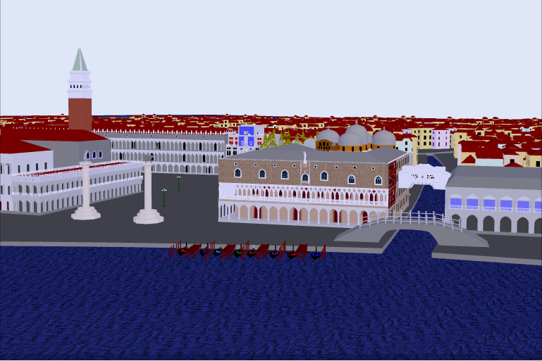
Here is the version in the square with regular lighting and cobblestones:
-
You're right. It's also like a mosaic. I was just trying the cobblestones to see if it might look old. It seems that even in 1600 or so it might have had large tiles laid out with geometrical designs. It always has to be complicated. I just found some charcoal gray tile. I'll post it here when it renders. I probably should note that the reason I am adding a land texture is really focused on the views inside St. Mark's Square. The texture will spill out into the view from the Grand Canal, however. I did the tile. It looks almost like the land I made with no texture. It's not really worth the bother of rendering. In the first couple of passes, about the only difference was some striping due to the uneven color in the texture image. I'm making this note sometime later. The tile is really starting to "grow on me" in the picture of St. Mark's Square from the Grand Canal. Later in this strand, robcat2075 says something about using a different strategy in large spaces and small spaces. I might start thinking about using the tile for this view and the cobblestones for the view inside St. Mark's Square. I really like the pattern of the texture inside the Square, but just the hint of the stripes might be enough pattern for the picture below (and it is a little lighter and shows the shadows better). I'll have to consider whether that is the kind of thing artists do, or is that just wild and crazy?
-
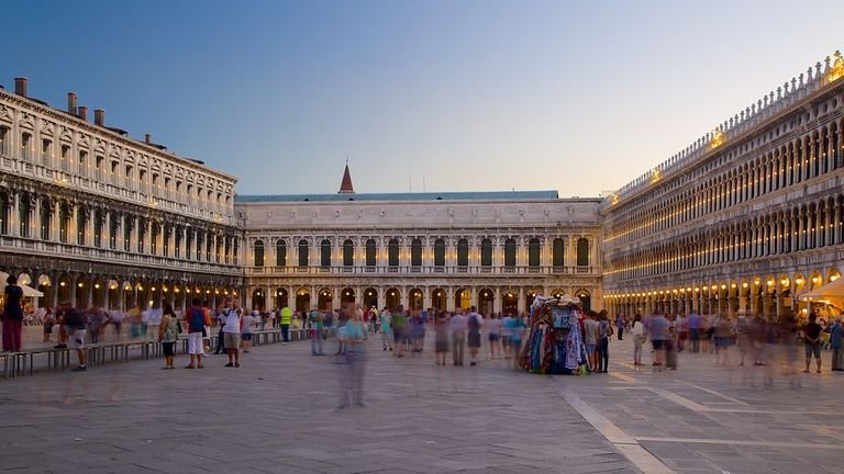
Here are some pictures, but they are not very close-up. You can also see the painting on page 1 of this topic.
-
I used the following:
-
I'm trying it with a different texture image. I'll post it here when it renders.
-
I don't understand what you mean by "reference for those areas". I really don't care about having individual cobblestones from this distance, but when I move closer, cobblestones would be nice. I always have the idea of using the same models for close-up and distance shots like you would if you were in a real life space. I agree that the stripes are not ideal.
-
I deleted a picture here accidentally and no longer have it.
-
robcat2075, you are always ready for anything. I really like your explanation and contest picture, and I learned something.
-
I'm sure you are right. I will check all of that. It seems that no matter how many times I try to save the settings, they go back to default. I know that when I did the patch image, I set the patch to Normal. I checked about Normal again and found that it had gone back to Color. I also know that on the properties of the water group I set the reflectivity to 1%. There seems to be more than one place to make settings sometimes, so maybe I am making my settings in the wrong place. Also, on the reflectivity, I have been reading lots of science books. According to them the amount of reflectivity has to do with the position of the light source, the position of the viewer, the position of the object, the intensity of the light source, and whether the viewer has his/her eyes open. I just started the render again at Normal and this time with 1%, and it was drastically different. I now have turned up reflectivity to 35%. We'll see what that looks like. I'll post it here in a few minutes. I think this is the best yet. I probably could increase the reflectivity a bit, but the water finally looks more like the real water. Thanks for your help, robcat2075!
-
Here is the picture with no transparency and 1% reflectivity and an even water pattern.
-
I tried the reflection at 2% and then at 1%. With all the pattern of the water and the reflections of the building, it looked like a confused mess to me. I stopped part way through the renders. I'll go ahead and do a complete render with 1% and show it to you. I used a very dark color as the base color for the water (0,0,128). Whenever I use this decal, it gets light like this. I'm attaching a screenshot showing what the picture looks like on the Shaded setting.
-
Hi! I restructured my model of the land and canals by cutting away the water and making a plane with an even grid to intersect the new model. Originally, my model was 2 level on the large canals and 1 level on the small canals. My restructure made the entire land model 2 level so that each canal would have banks. After doing that, I tried robcat's approach again with the patch image. I tried a little reflectivity and a little transparency. I left the transparency, but the reflectivity was a little too much, so I removed it. Here is the picture:
-
I'll have to give it a rest for a little while. I tried two or three different ways today. I have another way in mind that might even out the mesh, but it is rather work intensive. I think I'll take a break for a day or two and then go at it again. Next time when I have something like this to model, I have an idea how to do it where I will have a more even grid for the water. I think the patch image approach would work very well in an ocean scene, but if there is land and canals or rivers, the modeling needs to anticipate that type of approach. Thanks very much for your ideas and help. I think that the picture has improved immensely.