-
Posts
821 -
Joined
-
Last visited
-
Days Won
2
Content Type
Profiles
Forums
Events
Everything posted by thefreshestever
-
all right, thanks... i´ll do that and let you know if it worked... looking forward to the new update
-
and another question: at which point should in reset compensates?
-
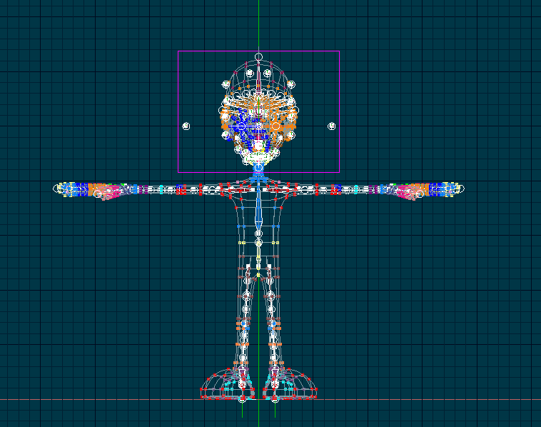
i just finishes mtpeaks step-by-step thread for the squetch rig posable installation wich is made unbelievable easy to understand, thanks for that... now my problem is after i finished the last step and auto-assigned my cps, everything looked fine in the modeling / bonesmode window... then i created a new action to test it, and the bones were placed different, the whole skeleton got bigger and deformed my character... i downloaded his latest version, called "Rig_Along_With_Me_Final_Update.zip" and replaced my install_rig.hxt file before i started. screenshots attached, anyone an idea what´s going on?
-

please take a look at my project
thefreshestever replied to thefreshestever's topic in Work In Progress / Sweatbox
thanks to all for the probs... but i don´t think that i´m that good at animating and storytelling as i am at modeling, unfortunately... i like your ideas about adding some "black humor" (nice word-play here, he?) maybe kind of family-guy ill humor.. hey nancy: by the way, i am german if anyone has some great ideas don´t hesitate do write them down here, i´m looking forward to it. -
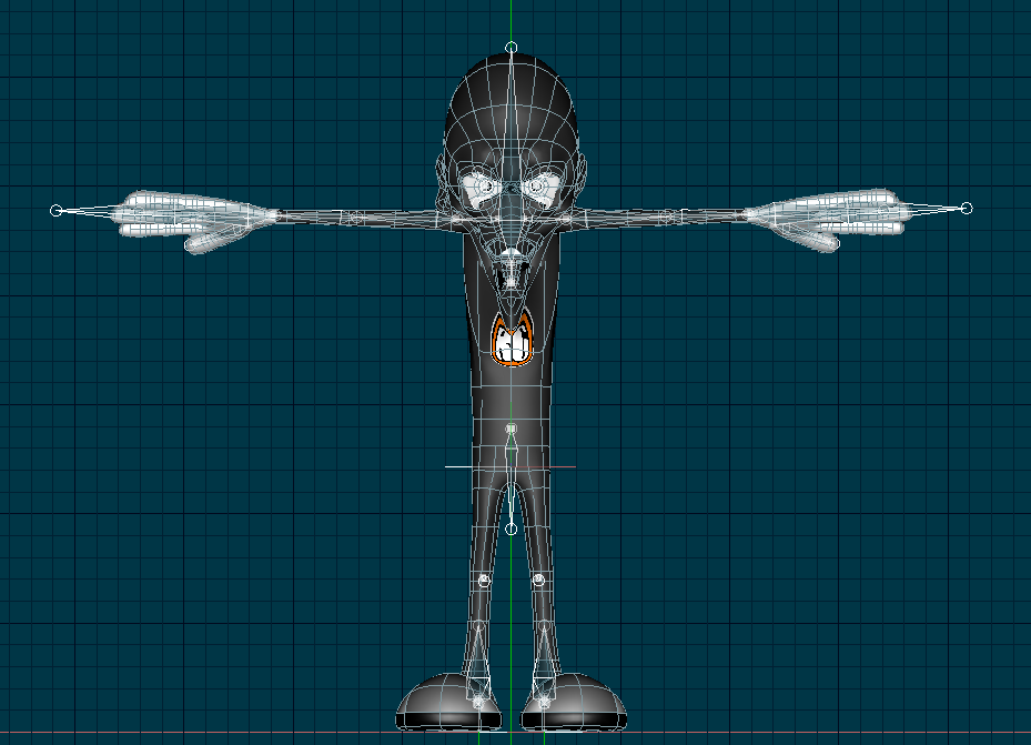
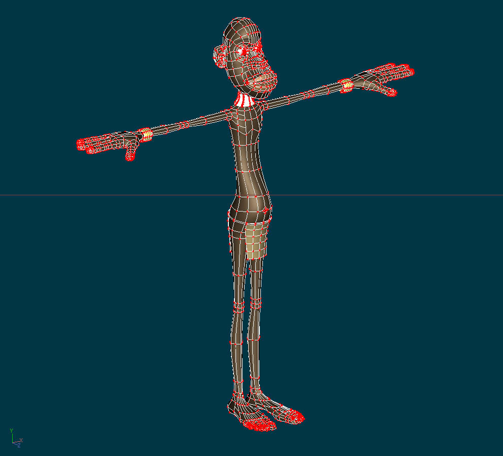
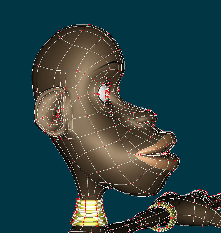
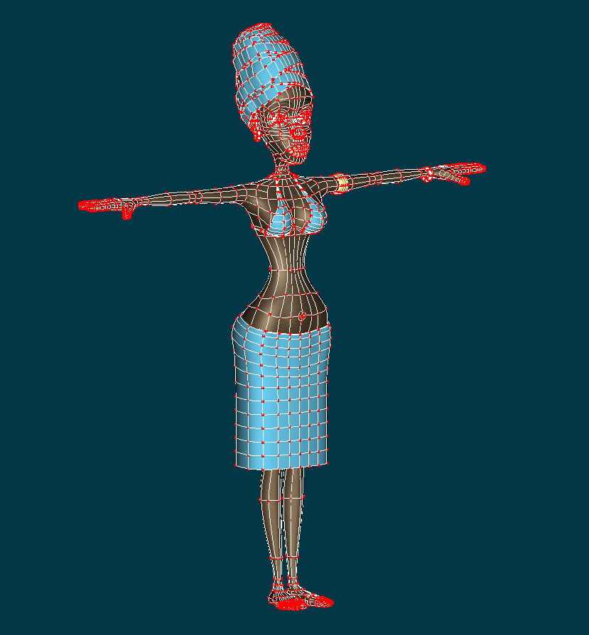
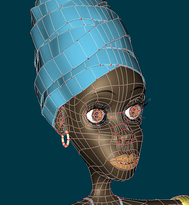
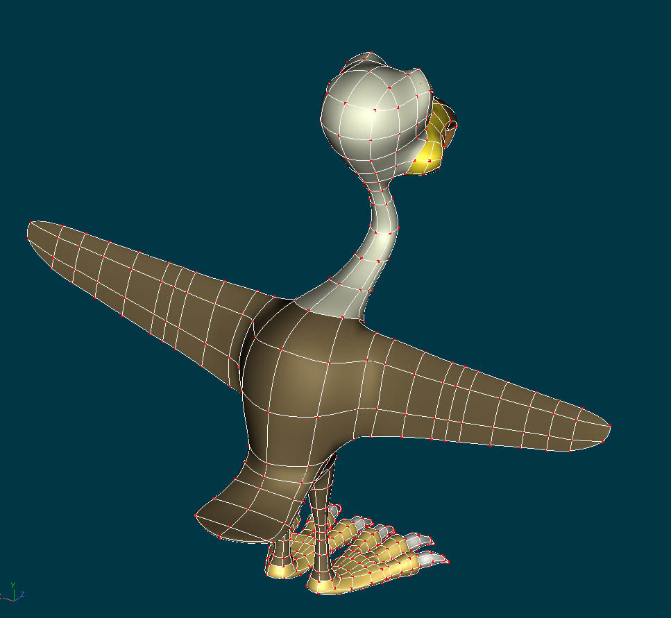
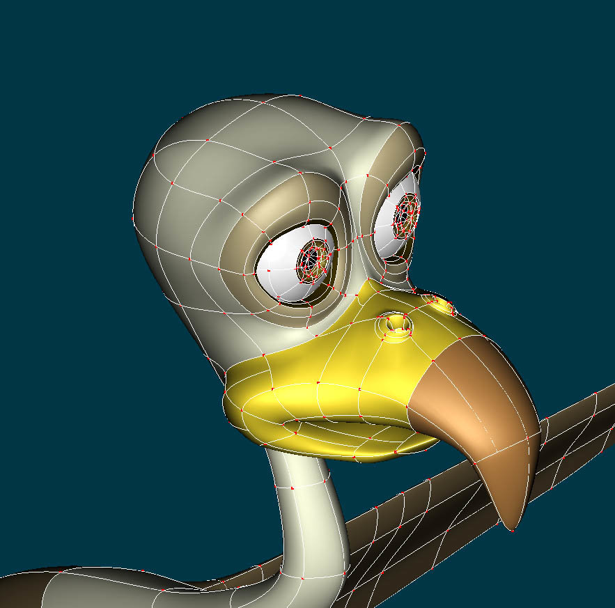
fantastic... very stylish! would love to take a look at a shaded wireframe shot...
-

please take a look at my project
thefreshestever replied to thefreshestever's topic in Work In Progress / Sweatbox
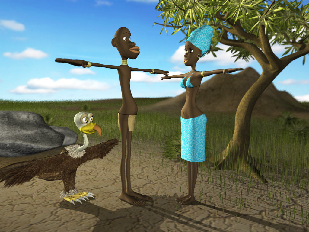
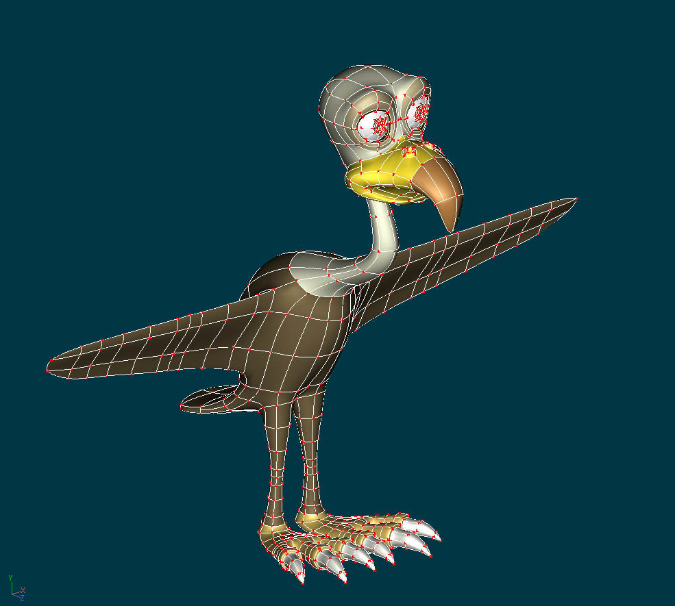
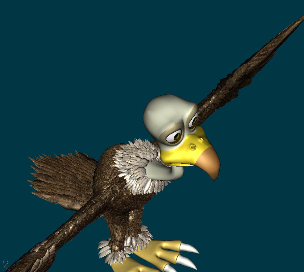
Hi again thefreshestever First, I forgot to say that I found your characters very well modeled, and look forward to seeing what you are going to do with the story/setting. I love Africa. I love the African people. I've been to Africa 4 times. And I'm also a birder - so the vulture (which is excellent) also jumped out at me. I love the landscape. I really hesitated to write what I did - because I too feel that a lot of things are taken too seriously. Since you are sort of new to the forum - you don't know that I can be really off the wall (and also unintentionally offend people). And I can be very outrageous at times (ok, a lot or most of the time), and some people won't like it. I find I have to tone myself down when posting or I might be banned for life. To maybe put it into perspective: I have found that it's usually ok to make fun of ourselves - or to poke fun at our own tribe, religion, country, family, mother. But if someone who we don't know from outside that tribe, country, religion, family makes fun, people quite often take offense. They could find it prejudiced, bigoted - even if that wasn't the intent, or feeling behind the work. It's up to you to decide if you want to take the chance. I am probably of a different generation than you (ok...I am an old person). The male character looks very much like a character resembling those from a "black face" minstrel show (very offensive to older african americans today if done by white folk) - or civil war slave depictions...or the illustrations in little black sambo - a childrens book. Or resembling a monkey ...I believe my older african american friends might take offense at your male character. But I really don't know. I think you have a great idea in showing it to your friends and asking their opinion - because their opinion would be more valid than my guessing. I would be curious to know what their parents thought of it as well. I truly hope I am wrong. I am a firm believer in comedy - It's much more preferable than taking one's self seriously. Nancy no problem nancy, everyone is allowed to say his opinion here. maybe you´re right about the age thing, i guess it really makes a difference if you ask younger or older people. you got me thinking... and thanks, i´m really glad you like my characters. by the way, my name is sebastian... -

please take a look at my project
thefreshestever replied to thefreshestever's topic in Work In Progress / Sweatbox
seriously, i have no idea... any suggestions? i don´t even know if the outfit of the girl fits to the half-naked guy, tribe-wise... the idea for that only came to me when asked myself: what kind of nature-shot can i do without having to populate it that much with grass and trees ... and the answer was africa... This is potentially touchy. The caricature nature of the characters might be a bit too stereotypic looking in an unflattering way. It also depends on your audience (is this for a class? private project ?). It also depends on your story. If you are not of african descent - you may end up offending those who are. It depends on whether you want to be sensitive to that. The physical exaggerated depiction of the man's face is probably the more potentially offensive. I am not of African descent. So my opinion is one of an outsider. The landscape reminds me of East Africa - particularly the savannah type areas - rift valley of Kenya, Tanzania. or even southern Africa areas of Zimbabwe, Namibia, Botswana, South Africa. The loin cloth outfit of the guy could be from the bushmen (!kung or San bushmen) of southern africa (but without the neck rings) - the woman's headdress could be from western africa - but her top & skirt is not familiar to me as to where to suggest where it comes from. The San or !Kung bushmen women today typically cover up more (I believe). But I don't know what they really wear "when not being photographed". I find the masai (or maasai) tribe particularly interesting looking - they are found in Kenya in areas that look like your landscape. But they wear different, colorful outfits and probably would mean too much change for your characters. (do a google on masai and then look at images). The masai women would wear neck rings made of colorful beads. If this project is mainly for you as a learning experience - then don't worry about it. If it is to be shown to a class (of mixed cultures) or published elsewhere - you may want to research a bit more on how you want to caricature the people. This is only my opinion. thanks nancy, but isn´t caricature about stereotypics? what do you really mean with offensive? if i´d do a white character with a long big nose and stuff would you find it offensive? would you ask if he´s from the netherlands or belgium or from somewhere else? sorry, but i really can´t get your point... by the way, it´s for no one else than me, just trying to have some fun... don´t get me wrong, i really wasn´t thinking about that stuff @ all, but i think if anyone doesn´t, the world would be a better place... this really isn´t something serious, just comedy, everything should be allowed, or am i wrong? i have some african friends, maybe i should ask them what they think about that, but i can´t imagine they would have any problems with that kind of caricature, i´ll let you know if they do... -

please take a look at my project
thefreshestever replied to thefreshestever's topic in Work In Progress / Sweatbox
thanks.. seriously, i have no idea... any suggestions? i don´t even know if the outfit of the girl fits to the half-naked guy, tribe-wise... the idea for that only came to me when asked myself: what kind of nature-shot can i do without having to populate it that much with grass and trees ... and the answer was africa... -
looks pretty good, i like fat cats, have 3 of them myself but if you ask me i would reduce the horizontal splines at the body a bit, seems a bit more than you need... i would eld up some splines from the face with hooks on the neck or something like that. greetz...
-

please take a look at my project
thefreshestever replied to thefreshestever's topic in Work In Progress / Sweatbox
thanks, i´ll surely try to save grass population wherever i can, but i think the characters will walk a bit through the landscape, so there has to be good looking hair-grass everywhere near the camara-position, i guess i have to fiddle a bit yeah i did the dust foot step in the manual, for a little bit of dust that works pretty well, but when in try to cover a wide range of ground with it it doesn´t really look good, even if i add some extra turbulence etc... greets... -
hi @ all, here are some screenshots, renderings and a short qt-movie from the actual project i´m working on. please tell me what you think about the characters, lightning, etc, i´m sure you can find some critical points i haven´t thought of yet. i have a few questions: 1. the forces setting: i want to have a slow breeze flowing through the grass and the tree... the movie is my very first attempt with forces, i know it´s much much too fast etc... but i was wondering if anyone of you could give ma advice about the settings on the force and the hair-materials. sure, i could figure it out by try and error, but maybe some of you guys figured some good settings out for the effect i want to achieve and i can save some hours of my precious time ... 2. rigging: i want to rig the characters with the squetchrig (would be my 2nd try, the first one didn´t really work out ) the question is if you guys who have experience with the squetchrig see any problems with the splineage of my characters, maybe there´s a splinering too much or too less to get good results... 3. the terrain: at the moment the terrain is´n very big (it seems bigger than it really is in the rendering), but i need to get it bigger. problem is that the grass population slows down my rendertimes enormous, the picture you see here took about 17 minutes (big render, 1024x768 with 16pass... think that´s ok, but if the terrain get´s much bigger it will be much slower too...) does anyone have some tips and tricks to improve the render times on big grass-populated landscapes? 4. dust on the ground: i tried to add some dust to the ground, that it looks more like a real savanna, i tried volumetrics (experimented with dust and mist, but couldn´t get them look good), i also tried out sprite-emitters, but i couldn´t get them slow enough in the movement... how would you do that? i can´t get no sleep anymore because of all this questions in my head, night by night im sitting on my couch with my macbook thinking: "let´s quickly try this one out before you go to sleep", and then i look at the time and it´s 4.30 am.... dammit! so pleeeease help me! thanks ahead to all... windtest.mov
-
There have been a lot of fixes and updates since that version...and I'm not sure I have that one anymore, I'd have to do some digging to see. It won't be very much longer until the next release, that one is going to make the rig stable for a long time (barring any problems that are found) and will allow me to put together an updated installation tutorial. There isn't a set timetable, but it will be done as quickly as free time permits. thanx, i´m really looking forward to it, you´ve done a really great job with that rig...
-
hello @ all... i´m trying to rig a character with the latest version of the squetch rig with the help of the video-tutorial... almost everything worked as in the video until i installed the rig, the bones that were displayed then were totally different ones than in the video, and i just couldn´t figure out which to hide and unhide before auto-assigning them... on the legs for example i saw many little bones instead of the thigh and the calf bone as shown in the video... i know there´s no updated tutorial yet, but is there any chance to get the squetchrig-version (04_25_2006) used in the tutorial? i think it would be much easier for me if i could follow the tut step by step for the first time, otherwise i guess my head will explode.. thanks...
-

I suck at modeling and i need a alien
thefreshestever replied to animation man hi's topic in New Users
are there already other models in your movie? very important stylewise, you don´t want to have your alien in a different style than the other models, the amount of detail in fact would matter... maybe you can draw the face a bit more detailed, and add a picture from front view too... all right, i have to party now , more tomorrow... -

I suck at modeling and i need a alien
thefreshestever replied to animation man hi's topic in New Users
looks like much much work... i like the body, but i think the face is a bit more neat and funny than scary, maybe it´s the big eyes... i don´t have the time to model the whole thing for you, but maybe i can help with a few tricky bodyparts, i´m not that bad at modeling... -

I suck at modeling and i need a alien
thefreshestever replied to animation man hi's topic in New Users
alien is not very specified, no one knows if aliens exist an how they look... no, just kidding, but i think it helps if you post a picture here of something similar to what you´re looking for... -
dammit... so simple... i´m asking myself why i didn´t think of that by my own... i tried so much, defined all my groups new etc... but the deflectorgroup was always beneath the bodygroup... i mean i didn´t know that this is relevant, but i could have tried this... thanks, you saved my day!!!!
-
thanks, but i already did that... i also copied the whole body-cps into a new model, deleted all the groups, defined them new, copied it back to the other model etc... still the same... tried it with mac and windows version... once i did that all seemed to be fine, i could drop the deflector material on the group and my skin was still colored... but when i closed the document and opened it another time my body was white again... kind of random here... i don´t have the deflector and the cloth on one group, otherwise my cloth simulation wouldn´t work at all... the simulation works fine, exactly as i want it to be finally... the only thing left is the skinolor on my deflectorroup....
-
hello again... why does my deflector material deactivate other materials on the group? i have a group, the body of my character, it has a skin-material on it... then i created a group for the deflector material, containing large parts of cps of my body group... when i drag the deflectormaterial on my deflectorgroup this part turns white, its no longer skin-colored.... please help, it´s drivin me nuts....
-
ok... i found the problem.... i almost lost my mind the last 2 days... the 2001 skeleton of my am:15 mac version is defect!!!!! i tried the one from my old v12 cd and all worked fine!!! i´m interested if someone had this problem too...
-
sorry for bothering you all again, i wanted to start an experiment with cloth simulations, i have a character with shorts on that should be cloth simulated. i created two materials, one cloth and one deflector... i put the cloth to a group of the pants except the belt-area, the whole body of the character except the head is the deflectorgroup... the whole pants-group is attached to the pelvis-bone. when i start the simclothsimulation in my choreography, all cps of my pants exept the beltsection and the one splinering of the clothmaterialgroup snap to one position!!! i attached some screenshots, maybe someone can figure out what did wrong... thanks agan...
-
i just upgraded to v15, and now i have 2 problems: i was rigging a character, done that a 100 times before... when i switch on my ik-arms setup in the action the right arm of my character stands curiously out to the right (bild14), when i turn it off and on another time the arm is in the right position, but the elbow-bones are now placed at the shoulders (bild15 & 16)!!!??? something like that never happened before... has anyone an idea whats up there? my second problem is that when i use the skin-shader it affects the white of the eyes of the character, they go hyper-white, no shadows on it at all!
-
thanks, but where do i find the "jitter option"?
-
An hour and a half for one image? I have a theory on speeding up your render...seems to work for me. Try this: (Always good advice to 'Save As' before trying something new...) As you noticed, there are two places where you can set your hair emitter's density- one in the main material hair property window and one each in the individual emitter's property windows. I've recently had great speed in renders by reducing the individual emitters density to the lowest value possible- which I believe is .01 (if you set both to .01 you will have a 50-50 ratio of the 2 emitters, but if you set one to .01 and the other to .02,.03,.04 etc you will have a primary emitter and a secondary emitter.) Now this will make your hair quite sparse, so in the main hair property window you will compensate- set that value to 400% or 500% or 900% (experiment) Now- try a render frame and see if you notice an improvement in render time. I hope you do! ALSO= How can you make it look more natural? Have you set the surface attribute to Muhair yet? Muhair gives the overall hair a 'pantene-sheen' that is quite natural. To do this- In the individual emitters 'Surface' property window scroll down to 'Diffuse Render Shader' and click the setting for MuHair, and do the same to the setting below which is called 'Specular Render Shader' (Set to Muhair) There are lots of new settings to dink with but for starts leave the default settings be and see if you like the hairs new look upon render. (Don't forget to specify in the render properties window to turn Render Shaders to 'ON'...under 'options') This will cause a little extra render time but the visual is worth it. Good luck! I like your character! thanx, i´ll try that out with the percentage settings... i don´t have a shader called muhair to choose in the render shaders menue, is that a new feature? i´m working with a:m 12, maybe i should upgrade..
-
thanks... it looks a bit more realistic if you make it a bit transparent at the tips additional to make them thinner... sure, that may be a reason for the long render time... i´ll check that and compare.


