-
Posts
2,579 -
Joined
-
Last visited
-
Days Won
1
Content Type
Profiles
Forums
Events
Everything posted by ypoissant
-
I just edited the instruction, a few posts up, for the setups for a skyfilter and a skymap concerning some important shadows and reflections options.
-
The skin plugin makes its calculations from the current surface diffuse color hue value. This surface diffuse color must have at least a tiny bit of saturation for the hue to be decidable and thus for the plugin to work. This means that if you set your surface color to any non-saturated colors such as white, black or any neutral grays, the plugin will not know how to shift the colors and will revert to default red blood.
-
Last time I tried, I didn't have any problem changing the blood color. I made a green blod head for demonstration purpose two weeks ago.
-
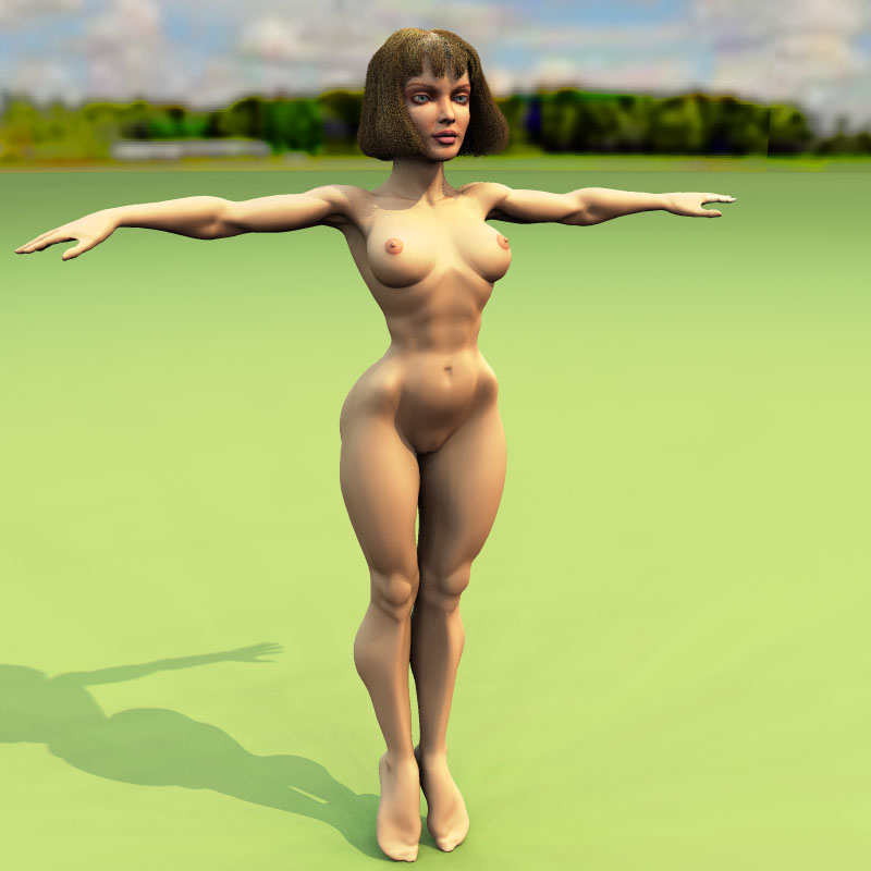
Yes, the original model was based on the Arora girl. And yes, the feet are in that position because of Arora. They will be placed flat soon. But I wait till the last minute because it adds elegance to the pose with the feet pointed down. You observe several difference from Arora though. The biggest difference between Jame's taste and mine is the size of the hips. There are other more subtle differences but the hips is the bigest. And from that, the size of the thighs too. This said, I really dig the attention to the musculature in James figurines and I plan to attempt adding muscle details with displacement maps eventually.
-
The "shd" extension is the normal extension for shaders. Just drop the file in your "Shaders" folder. And BTW, I'm not the author of skycast. I just did a few skylight rigs which I posted on my web site for downloads. The author of Skycast is John Henderson (JohnArtbox).
-
Yes. It is basically as simple as this indeed. Actually, I use two domes. One for the sky filter and another one for the skymap. The skymap is sized a tiny bit smaller than the skyfilter. There are a few things to take care though: 1) For the skyfilter, you can set the transparency to 50% as you say but you can get better results by setting the transparency to 100% and the index of refraction to 1.01. The transparency is computed differently when the IOR is not 1. Also, the skyfilter casts shadows but don't receives shadows and don't cast reflections. 2) For the skymap, set the ambiance to 100% and the diffuse falloff to 2000%. If the diffuse falloff is not adjusted, the skymap will be completely washed out by the skylight lights. Also, the skymap casts reflections but don't cast shadows and don't receives shadows. 3) For the skyfilter to act as a filter, the skylight light must be set to cast more than 1 ray. I set mine at 2 rays. If the light cast only one ray, then the shadow is comnputed with shadow falloff and the filter fades off before reaching the models. 4) By using the 20 lights skylights with 2 rays cast and 9 passes, I actually cast 360 random rays in the scene for each rendered pixel.
-
Yes. When I launched a render yesterday (going to bed) I was reworking the hand. I had the 4 fingers done but the thumb was still to do. I finished it today and I'm also done with the arms. There are 3 major problems with the thumb: 1) The thumb itself was turned 90° from its normal position. That is it was rolling 45° in and up now it rolls correctly 45°in and down. 2) The thumb was too long. 3) the "meet" between the thumb and the index was too long too. I mean it should have receded quite more into the hand.
-
Here is an explanation I wrote on the "Naomi" Wip page: I basicaly use this technique except that instead of using a bluish skylight light, I use a skydone with a mapped sky which serves as a color filter for the skylight. Apart from that, the negative sun light technique is used exactly as described. And I use my 20 lights skylight rig with 2 rays cast and 9 passes multipass. As for the skintone. That's quite another story. Except for the face which have a whole set of maps (color, specularity size and intensity, bump, etc.) the body is only flat colored. The subtlety in the skintone comes from two things: 1) the blue-yellow lighting setup and most important, a skin plugin that I wrote which does this red transition between the light and the shadow side of the surfaces. I've attached the skin.shd plugin for everybody to download and try. (Note to Mac users: I'm waiting for the people at Hash to come back from vacation to get a Mac version of the plugin. My first intention was to wait for the two versions to be aailable before offering it for download. But since I mention it here, I might as well post it.). Skin.shd
-
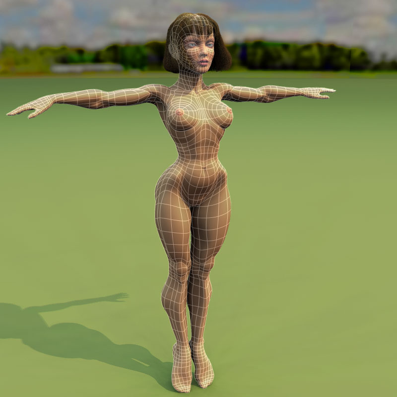
Thanks all for your appreciation. Here's the wireframe. The other side will come tomorrow. As for the "before" model, you can take a look at it here.
-
The rework I just did is without rotoscope. I only looked a my numerous anatomy books and other photos references and went with my own feeling of the anatomy. However, when I originally modelled her, I was greatly inspired by Mike James (Azimuth Design) sculpted figurine. There is one figurine which is rather straight posed and photographed from full front but there are no other full side or full back views of her so I kind of rotoscoped the front view but I had to go with my own anatomy knowledge for the rest of the body. This said, I've since completely redid her with my own proportion preferences. Well, I drew a lot of splines schemas on paper for different models before. I first tried to model every muscles with splines but the model turned out over 10000 splines and was nearly impossible to animate. Then as I did other models, the mesh layout refined and gradually decreased in size and became more elegant. That is several years of learning process I'm describing here. I'm still not quite satisfied with the current mesh though. In fact, I'm never really completely satisfied and I always try slightly different mesh layouts for each new model. The reason is that once I've finished a model, then I start to see how I could have done something otherwise by examining peoples around me, tehir face, their body, their expressions and their postures. Then a different approach for some particular area of the model starts forming in my mind and I try to apply that on the next model. When I model, I just go with the flow. I work with transe music to help in getting a rythm in my modeling task. When I started modeling, I tended to work in front, side, top and bottom views only. But I don't do that anymore especially with fast computer and accelerated graphics cards. It never produces good models. Instead, I constantly turn the model around to look at it from all angles as I model it in shaded wireframe mode.
-
For a first head since 1 week, that's quite good. You note that there are a few errors in the mesh. If you want advises on the mesh, I suggest you post a shaded wireframe. If you plan to address the mesh issue, I also suggest you do that before adding bones and more importantly, poses.
-
I have a couple weeks in front of me with a lot of available time so I decided to resurect an old (year 2000) model I had started but got diverted with skylights and never finished. Here comes the new revised edition. The head is completely new with v11 hair. The body is considerably reworked with about half less splines and smoother musculature. The anatomy, although quite exagerated, is more believable too. I am currently reworking the hands. Next, the arms need rework then dressing and eventuelly, I'm ready for rigging. C&C are welcome.
-
Yes, I understand what you mean by the natural lighting. The outdoor sunny lighting look comes from the bluish surrounding light that comes from the sky and a yellowish light that comes from the sun. The easiest way to get this effect is with 3 lights: 1 yellowish sun light (I like to use a bulb for that) 1 bluish skylight light 1 bluish negative sun light (I like to use a bulb for that) The main idea is to set the bluish and the yellowish lights at the exact opposite spectrum on the hue weel. You could use a straight yellow sun light or to get a warmer light lean a tiny bit toward orange and to get a hot light, lean more agressively toward orange. The saturation is maximum and the lightness is about 80%. Once you have selected your yellow for the sun, you now set your skylight light and your negative sun light to the exact opposite bluish color on the hue weel. Again maximum saturation and about 80% lightness. Of course, as you mentionned, you have to reduce the skylight light intensity. First I turn OFF the sun and the negative sun lights and adjust the skylight light intensity so that I still have nice shape shade definition but rather with about 1/3 or 1/2 the normal lighting intensity I would use with the slylight alone. Now here is the trick: Turn ON both the sun light and the negative sun light. In choreography, on the negative sun, add translate and orient like constraints like the sun. On the Negative Sun attributes, set the intensity to minus 10%. Then adjust the (positive) sun intensity to get a nice bright light with clearly visible shadows. Some overexposure can help convey the feeling of the sunny day. The negative bluish sun trick is to help enhance the bluish shadows vs the yellowish lights. The negative sun will remove some of the blue shades coming from the skylight where the yellowish sun should hit. By playing with the sun vs negative sun intensity, you can enhance this effect even further (but don't overdo it). My goal, with such a setup is to approach the lightings achieved by some painters (the Hildebrandt brothers or Maxfield Parish are notable examples). Another critique, is that the background you've choosen is rather monotone with the regular brick pattern. You could get better result by taking a photograph of a backstreet and blurring it almost beyond recognition. Beside, the bricks are rather large compared to the model in front.
-
Nice, simple and efficient head mesh.
-
Great simple and effective model and I want to compliment you on your fine animation skills. Your animation is tightly timed and snappy with the right expressions and body postures. Very good. The only part that don't work for me is the gesture that goes with "Or I'm completely crazy". I understand that you used video reference but this gesture might be related to what will follow which we don't see in the clip.
-
Either your light does not cast shadows or the model does not receive shadows. Check those properties for your light and your model and on their shortcuts as well. This is not related to where the decals are located. Select the CPs you want to align on X=0, Set the group's pivot X position to 0, Set the group's X scale to 0.
-
Wow! For a first head in A:M, it is impressive. This, obviously, is not your first 3D head though. How long is your experience in 3D and animation? And welcome aboard.
-
You've worked hard and the result is nice as a whole. Does the shading comes mostly from lighting or from texturing? A good rule of thumb for the size of the forearm as it goes into the upper arm as it folds is to get it as wide as the bicep part of the upper arm. Right now, even though it is better sized than the previous post, it is still too tiny. The reason is because the forearm brachioradialis muscle attaches quite high into the upper arm in order to have a lever effect when it raises the forearm. I don't really have a problem with large hands, especially if you go for a styliized body look, because the large hands can be used more efficiently for expressive effects. This said, to my eyes, the large hand effect is given from the seemingly long fingers. I think the valleys between the fingers on the palm are too advanced into the hand (Sorry for the wording. This is a situation where my english fails me). Compositionally speaking, I would position her more toward the left of the image. A good rule of thumb is the golden proportion which is 3/8. And add a blurred background, another quick trick to enhance your render.
-
Your modeling style is special, elegant and efficient. I would like to look at a tutorial about how you proceed. Beside. tutorials on modeling mecanical objects and specifically cars are not numerous.
-
Excellent job. I also agree with the comments about the nostril. And the ears need more details too. I think those are the two most disturbing features on your model which break the illusion of reality on an otherwise quite realistic model.
-
You may attach a file in the WIP forum. Provided it is less than 1Meg in size. The Wip forum have this capability in order to help people share files and make suggestions from that. The field for doing this is just below the "Post Icons" when you write your post.
-
Since v11, reflections are handling Fresnel correctly.
-
Nerrazzi, You've built a very nice car model. You're a good modeler. I remember your superhero which was built like a car and I like the way you approach modeling. Too bad you shutdown your web site.
-
Emilio, That's a nice model. I've just seen your post here. Now I understand your plugin idea. I hope you plan to use photon mapping in your cathedral when finished. This would be a nice environment for it.
-
The stainless steel look is based on reflections. The chrome material should be a good start. However, stainless steel is rougher than chrome. So you will have to use soft reflections to get a good result.


