


robcat2075
-
Posts
28,280 -
Joined
-
Last visited
-
Days Won
407
Content Type
Profiles
Forums
Events
Posts posted by robcat2075
-
-
Just a general thing... it needs some "keep alive" motion during the "holds" to avoid that frozen-rock-solid look some parts get.
But there's some very good stuff going on here!
-
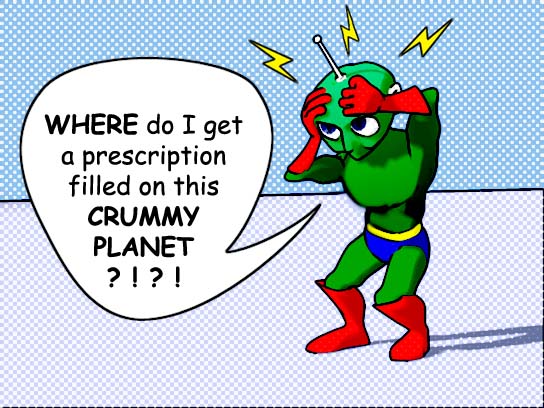
...if there was no caption I would think he was using his mind powers on someone...
You're right. I guess as a minimum, the lightning bolts were the wrong symbol. Quick band-aid fix:
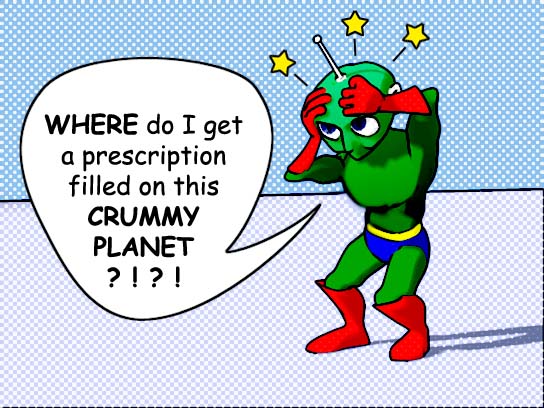
Thanks, Zack. I may have to cave-in and give him eyelids, too.

-
This is a "get well" image I made this evening.
I was never satisfied with the pose. He's supposed to have a migraine.
Any suggestions are welcome.
-
I have PowerPoint2000.
I couldn't import the few MOVs I tried either. I suspect it is rather like Windows Media player can only play MOVs that were done in old QT codecs like Cinepak.
Since you're only wanting to display in PPT and not trying to compress them for the web here's what I'd suggest>
AVI in DiVX codec. It's free, it compresses well with high quality if you set it right.
Get the codec from www.divx.com
I just tried it and I'm able to import and Play a DiVX AVI in PPT.
But for the web, I think Sorenson QTs are best.
-
Ok, I don't understand the question. I thought the whole point of WM was to transfer weighting and smartskinning done on a lo-res proxy (because that's easier) to a high-res version.
If you use the High-res version as your lo-res proxy... how does that simplify anything? If you're going to weight a high-res proxy ... why not just weight the original high-res model?
And as far as making a lo-res proxy... how about just deleting spline rings from a copy of the original until you have the bare amount to define the shape of the character?
-
I like the bodies.
How about tapering the legs so they are thinner near the top?
This would be stronger "design-wise" , more flexible in animation, and reduce the visual conflict of them not being actually attached to the body.
-
Since it's an igloo, maybe the walls should be more bluish to suggest ice and snow?
What's that on the right? A tree trunk in an igloo? A lava flow?
-
Darn, I missed the print deadline!
Oh, well... How about if her head was on his shoulder? and nudge her torso out a tad.
That would get us closer to the () arrangement. Not that that is gold or anything, but I think there might be too many parallel elements right now.
Another idea: how about changing the frame from landscape orientation to "portrait". It's vertical composition, a vertical frame would strengthen it.
-
Looks very cool!
the color map and bump map are related, right?
Too bad we can't render materials like that once, then "bake" the result on as bitmap textures... that would speed things up, wouldn't it?
-
I agree, it's a fine looking image.
But I haven't seen any yellow pages printing that will do it justice. "Logos" are rarely photorealistic because they need to survive almost any printing process and expecially need to survive conversion to B&W.
Color yellow page ads are expensive, too.
Successful logos also tend to be very simple in design. I can't think of a successful one that isn't.
If you really need a logo, I'd go with something more "design" and less "photo."
You seem to have the art skills to do that, this might be the basis for developing something more graphic.
-
I enjoyed looking every one of them.

This is a tough topic because, frankly... WHAT are you going to do that hasn't ALREADY been done?
I see a lot of variations on familiar themes, and there's a lot of great technical work going on here.
What I don't see is story telling. That's what it would take to put a "Christmas" image over the top.
We tend to think of stills as just a slice of time, but it doesn't have to be that way. Norman Rockwell was a master at getting a story scenario across in one image. In his better stuff you could instantly identify character types, conflicts, moods, and you had a real sense of what had just happened or what was going to happen. That's why his work is practically the gold standard in commercial illustration.
Some of these hint at story, but they are also the ones that most mine the past.
Having said that, I realize all these works were done on a budget (time!), and may not represent the artists' full intents.
Merry Christmas to all the artists! And a 3D New Year!

-
That looks promising!

I don't do any facial stuff yet, so I don't have much advice. One thing I notice is that a feature (like an eyebrow) will sometimes travel to a new pose and stay absolutely motionless there, which appears odd.
But I think that is something you'd refine out as you made more passes at it.
A lot of that wouldn't even be noticed if this were a full body shot with "acting" and all that.
-
Its a nice shot!.
How about moving the tall candle to the left or right so we can see the flame against the dark sky rather than the white window frame?
-
I think more R&D is needed. While they are more intimate in the new pose, the humanoid appearance isn't reading well.
Perhaps something with two curves drawn together like two parentheses:
)( or maybe ()
It's a tough problem. But I know you can do it.

-
That's fabulous news! Knock'em dead!
Has it changed any since the version you put up in July?
-
Not a tut, but some Q&A about "ease" with "actions"...
http://www.hash.com/forums/index.php?showt...indpost&p=48709
There are numerous other threads that can be found by searching on "ease."
-
It looks good, but I must be missing something in the Cog tutorial because when i move a shoulder up high like that the rib area comes way, way out to the side, even on the finished sample.
-
Yeah, it sure does seem to be bouncing fast, but I don't have tennis ball here to test. Maybe you based this on a video example?
If you're going for VERY realistic, a tennis ball wouldn't elongate on the way down, however...
Richard William's "Animator's Survival Kit" book has a spot where he talks about this very exercise and how you can "cheat" reality for a better effect. Great book.
-
Cute shot!
If he zig-zagged instead of coming straight down , we'd get a better view of his pedaling action.
Is he on a path constraint of a surface constraint?
-
Thanks for watching and making comments!
Well, my hope was that he would appear to be listening during the pauses, then reacting to what he heard. But if it just looks like arbitrary poses strung together then that wasn't successful.There were 6 distinct pose related actions with not much going on between them.
You're right. The one thing I changed between the contest version and this post was to make him glance at the phone, but that was a bad idea. Indifference was better.It might have been nice to make him more casual when answering the phone,
Don't they say "If you blink, you lose"?(Although I'll never understand why you didn't give him eyelids.)
The file was too small... or too big?Oh, and don't be so stingy with the compression!
Working toward my diploma from the "Make'em See It In The Back Row" school of acting.I love overacting! -
Well, if you're just looking for "problems" here's what strikes me initially...

-When he drops an arm down to his side, it seems to jump into place rather than ease in.
-The transistion from shot 1 to shot 2 is an awkward jump cut because he's suddenly changes the phase of the walk cycle he's in (from "left foot forward" to "right foot forward") and because the change in camera view is too slight.
-Likewise from shot 2 to shot 3 in the position of the right arm doesn't match up.
These are things live-action filmakers go mad getting to match up because they really have to capture each shot separately and make them fit in editing. But for animation we can more easily do this as one performance in one chor with multiple cameras and get perfect "cuts". I think doing this in 3 chors is over-engineering it.
-I don't see any action/reaction between the masses of the arms and the body, particularly when he tosses the object. The result is a rather stiff appearance to the action. My hand is small compared to my body but when I swing it out my body is still nudged in the opposite direction, and my body comes back when I swing my arm back in. His hands are huge in comparison to his body.
The whole piece is really about the arms it seems, so you want to make them great.
-many of the head motions have a linear quality to them, making for a jerky effect. There's also an odd jump right at the beginning of shot 2.
-A head that huge would benefit from some anticipations on the big moves. That would take experimenting, it might mean a completely different performance for the head.
This would be a difficult character to animate because the proportions are so extreme. The limbs are so short in comparison to the hands/feet that "successive breaking of joints" is going to be tough to fit in there, but that would be another thing to implement if you're going for broke on this shot. (I realize this is a character you were assigned).
But I think this will be an effective sequence.
I do miss the part about the loofa sponge, however.

-
From the four-hour Animation Showdown, my finest achievement in grotesque overacting so far:
Fated Phone Call! (QT 217K)
bonus animation:
Dig (QT 85K)
See if you can tell where my four hours ran out.
Suggestions are welcome.
-
I'm a person who spent years dabbling with hand drawn animation and not making much headway. The revision and correction cycle just took too long.
I've been character animating with A:M for a year now. Although I'm still just a dabbler, i feel like I've made real progress because of how easy it is to experiment with changes and because of the instant feedback (via the "shaded mode" playback).
Make sure you have a fast computer. Going from a 500MHz pc to a 2.6 GHz made all the difference in the world for me.
-
First question: what is the difference between choreographies 'path constraint' Versus 'actions' Versus translating the objects in the choreography.
The path constraint is well-named. It's not technically an "action" although it does produce movement. If you draw a spline in the choreography window, a path constraint can make an object follow that spline exactly. For some purposes, this might be easier than translating (moving) and keyframing the object at various points in the timeline.
You use the "ease" settings in the constraint's properties to adjust how fast the object travels along the path.
This thread talks about other uses of ease.
An "action" is like a self-contained bit of animation that you make outside of your chor and have ready to use whenever you need it. The actions you make are listed in the PWS just like your objects and materials are.
If you already have character in your chor, you can drag an action from the PWS onto the char and he will do that action (you may have to slide the "red bar" that represents that action in the character's timeline to make sure it's happening at the time you want.)
From what i understand actions are repeatable (blinks, etc) where choreographies are for non repeatable actions (some walk cycles, and manual lip synching).I am wondering what are the advantages and disadvantages of each method, and any tips on which method is best used for certian types of animation.. IE what would you use actions for.. what translation animations are good for, adn when you would use path constraints.
Path constraints are great for mechanical things, like flying logos, camera moves, spaceship flight paths and maybe that bouncing ball. I think they're too perfect for most creature movement.
I find myself using "actions" less and less. An action that looks good from one angle may not look good when reused and shot from another angle. Someone from Anzovin said it's VERY hard to make actions that look good from all angles and I agree.
I get better results by doing everything fresh and making sure it looks good from the one angle my camera is at for that shot.
I think beginning A:M users get too wrapped up in trying to reuse actions and not wrapped up enough in just making good ACTION. Repeated actions look very robotic very fast.
On the other hand, some repeatable "motions" like blinks and hand openings can be implemented as pose sliders. I find those to be real time savers, and very useful.
There are exceptions to everything I've written above.

Philosophy section?
in Forum Assistance
Posted