


robcat2075
-
Posts
27,777 -
Joined
-
Last visited
-
Days Won
343
Content Type
Profiles
Forums
Events
Posts posted by robcat2075
-
-
That's a pretty decent model, especially with only one ref pic. Yeah, some more details would make it even better.
But how does a fire truck fit into a SW fanfilm?

-
Geez, that's wonderful stuff. The tongue is a cute detail.
-
Your materials look great!
Do you suppose when people say A:M's renderer is lame it's really because they see a lack of sophistication in the surfaces?
I do wish I could drive values of my materials with decals though. I can do it in LW. . . but AM. . .Since decals can drive hair properties, it wouldn't be a big leap would it?. I hope you've made that feature request.
-
Yes, that is an interesting idea.
Bass players always seem to be leaning into their basses. The head tilt is good. Do more like that with the rest of the body.That would give this more weight. Right now he's too stiffly balanced on his feet. Turn the bass a bit too so it's not so frontal and flat.
How about a more discernable woodgrain on the bass? And beat it up some. You never see a bass that isn't scratched up from being carried all around and bumping into things. The pegbox at the top is a bit skimpy.
And how about if he was bowing it instead of playing pizzicato? The bow could be an integral part of his arm.
The carrot is a very funny touch.

That's a fun shot. Thanks for showing it!
-
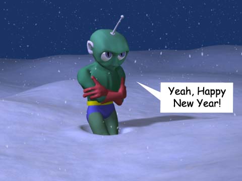
I love the last one, with the snow!
Thanks. For all the snow fans, there are stereoscopic versions of this shot in the "Stereo" forum
http://www.hash.com/forums/index.php?showt...indpost&p=71545
Robcat,You are officially an animation genius!
Thanks Rodney! I knew those MENSA people had to be wrong about me!
-
"Mechanical" is another one that lures out the heavy hitters.
You might want to look what they came up with the last time it was the topic to get a sense of what is done:
-
I think I voted for this, primarily because you were one of the few to avoid the "men in tights" cliche. Not that men in tights are easy to do, but the topic was "hero" not "superhero". There is no shortage of real historical heroes (Harriet Tubman, George Washington, Charlemagne...) that could be drawn upon. I was really hoping to see real humans, not fictional ones.
Lindbergh is a fair choice. A flawed hero but he qualifies.
The Lindbergh story is "tired and worn"? That is typical of a culture that celebrates appearance over achievment. Even his horrendous political dumbness is worth knowing about.
Better for the image if we could have seen him but... the man and the plane, maybe too much to do in one month.
Good ocean, maybe too uniform in texture.
Not enough time to render the better engine? A month wasn't enough?
-
I agree it may be a bit busy, but #1... I think "Dustin Productions" should be way more prominent. That's you... why hide it? I know, it's in your URL... but still.
And I would have some of your work (your best single image) be visible right off the bat, instead the text pitch. The work you've shown here looks good, make it start working for you
Why two "home" buttons and two "contact" buttons? Just one each. And isn't "e-mail" part of contact?
Your category buttons are so small. Rethink the lay out so they can be bigger and have a bit of a teaser graphic on each one.
I might take Colin's note about reducing the color scheme all the way to all-gray, and let your portfolio graphics that show up in the window be the central splash of color.
Anyway, just my brainstorming thoughts.
-
By "diamond" you mean the dark creases at spline intersections?
First guess... spline continuity error. Splines need to cross each other like an X at CPs, not meet and then turn right angles away from each other like ><.>
Break up the splines and connect opposing spline ends first.
In one case you have more than 2 splines running throught a CP. That's always bad. The tricky part is figuring out how not to do those.
-
That was cute! That's a very amusing caricature of Pavarotti, including the comb-over.
Actually, he should look so good!The lip synch seemed to get better as the film progressed.
Critique? Too long to get to the punch line, but I don't think the cartoon police will come knocking.
Good job!
-
Congratulations! That's a cutey.
Mr. White Diamond better have good stuff on his demo reel to follow that!
-
I saw this without any fore-knowledge of the production details, so I was impressed with the visuals and just presumed that the sound track had been "borrowed" from a CD.
Then the credits rolled. I was stunned that it was an original recording. It was that convincing.
I had listened to the demos on the Garritan site before this and wasn't knocked over by them. Jeff Lee has done some very clever work in putting the sound track together.
Good work guys!
-
congratulations on modeling your first character!
I imagine him having scaly skin. A bump map could simulate that, or if you wanted to go crazy, v11 hair can do scales I think.
-
That looks wonderful! Great looking characters. Repeats to all the good comments above, especially the "render" quality.
The only misgiving I had was some initial confusion as to whether the first voice was the fish's or the boy's. I think this is because the fish is more prominently located and his mouth is more active, drawing my attention away from the boy. It wasn't until the voice appeared "out of synch" with the fish, that I started looking elsewhere for the speaker. edit: and on my mpg player at least, the first frame stays frozen for an instant, losing all motion of the boy's mouth entirely.
I think if you could just have the yellow fish not "talk" until after the boy finishes "...good or bad" you could eliminate that doubt entirely. I don't think this would hurt the scenario since "talking" isn't mentioned until the dad's speech.
Still, a fine looking shot! How much time to put it together?
-
Not enough entries?
(Does that mean less than four?) I was sure we'd have at least a dozen singing bars of soap trying to upstage each other on this one.
That shows how little I know.Fine character!
A character like this could be done MUCH bigger in terms of his gesture and acting. Definitely more "snap" and the anticipation that goes into that. I'd also like to see him doing his various motions (like scrubbing) in time to the music to show his enthusiasm for it. There's alot you could do with that.
I just barely caught the idea that someone else was in the room. Maybe some different camera work to guide our attention through the rippled glass to make sure we notice.
I'm curious about the small scale jitter I see in his motion. What rig are you using?
An ambitious concept! It' s easy to sit here and comment on it but I don't think I could have done it in the timeframe allotted for this contest.
-
Thanks for your positive comments.

I made this to send as an "e-card" to friends and relatives, but I don't know that they actually look at it. You can also see productions for 2002 and 2003
I patched it together in After Effects. I suppose most of it could have been done with A:M layers, but I'm more familiar with AE and I needed to do color adjustment on the Christmas tree shot. Also, A:M doesn't give access to the audio compression in Quicktime and I needed that too.What program did you use to edit?
Yes, but I grew up in Minnesota. Hideous winters.Your freezing guy is ... so cold. You live in Texas?
Hopefully the Animation Showdown will come back and he will have more.I love your character and his many adventures. -
Wonderful Gemfire Robot! Serious shoulders on that guy.
I see him battling Joan Crawford for shoulder pad supremacy. She could play the "crush, kill, destroy" part in your movie.
-
I just tried it but the file that downloaded was only 6K and wouldn't unzip. Maybe the link is wrong?
-
-
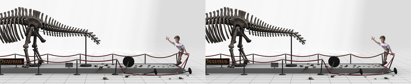
Isn't it fun to finally make things move?
Now, how about if you rigged it so the stem was flexible and the glass could hop around?
-
Yup, they're big. And pointy. Very National Geographic.
-
The concave depression between the eyes is the thing that bothers me most. There really is no creature built like that. Even creatures with protruding eyes don't have a valley like that.
I know, you're gonna say "he's a new creature that happens to be shaped that way" but since he seems to follow basic conventions in every other regard (he's a symmetrical biped) that feature doesn't quite seem credible. Find a way to raise that area as a continuation of the bridge of the nose.
But for a first character, I think you've demonstrated substantial splining skills. I don't think you'll have trouble making mods to him. By all means, rig this guy and do some animating with him. Making them move is the fun part.
-
I think the expressions on the green guy are pretty good, although as others already noted, the noses are so big that the eye and mouth work is getting missed.
If you were going to tweak it more I'd start thinking about "action and reaction" amongst the body masses. It would be tough to make big arm gestures and still have the torso remain unmoved. Another time the arms will gesture forward... and the torso will go forward too! Not impossible for a person to do, but unlikely.
But I think this is a good first lipsynch outing and I look forward to seeing what you do in the future. With smaller noses.

-
Those of you on far-flung planets with slow connections might want to look into a "download manager"
one example of a "free" one, there are many others you can search for.
They allow you to stop/resume long downloads. It doesn't work with all sources, but worth a try. Of course, you have to download your download manager first...

transcoding to MPEG would not get a smaller file size (without drastic loss of clarity); these QTs are done in a special codec optimized for this sort of screen capture content. You can actually read the fine print onthe screen.
Short animation to critique
in Work In Progress / Sweatbox
Posted
What's a .rar file? I don't have any app that can open or play it.
Post it in quicktime. You'll get more replies.