-
Posts
2,579 -
Joined
-
Last visited
-
Days Won
19
Content Type
Profiles
Forums
Events
Everything posted by Simon Edmondson
-

It was a dark and stormy night.
Simon Edmondson replied to Simon Edmondson's topic in Work In Progress / Sweatbox
Rodney Thank you for your help. I will try your, and Nancy's, suggestion about the png format. Do you have a preferred codec and format for final output ? regards simon -

It was a dark and stormy night.
Simon Edmondson replied to Simon Edmondson's topic in Work In Progress / Sweatbox
Nancy Thank you once again for your help and apologies for my misunderstanding about the testing proceedure. I have never really used the render lock mode. Tend to test them by rendering the scene with the settings in the panel, scratching my head as they go through about what to do next. I've not tried the PNG option but will give it a go. I have always used the Targa option because it was less compressed than the jpg's and, even so, I still get a lot of banding when assembling the stills in Final Cut Pro. Do you have a favoured codec when outputting your work in their final form ? I used Apple Prores but not having a lot of luck with that. Regards Simon -

It was a dark and stormy night.
Simon Edmondson replied to Simon Edmondson's topic in Work In Progress / Sweatbox
Rodney Thank you for your comments. I was referring to the multi pass option in the render settings.The examples were of each of the different results found with varied passes, from 1 -16. Nancy had mentioned a couple of weeks ago that she had found some differences between the test renders and final output and my observations confirm that. It also seems to vary on the render as the separate passes go through. Its a bit disconcerting. The first one looks as you expect, the next goes darker, the next brighter, darker, brighter and so on. The final result looks like none of the passes as they went through ( I'm guessing because its an accumulative effect ? ). This morning, as I was editing my last post, I noticed there was a difference between jpg's and TGA renders. Even though non of the other parameters have changed. and Scene_Four_16__pass130.tga A puzzle ? The shadows are turned on. The sun ray lamp has no shadows and uses a rim light with volumetric on, and a fill light at 20% intensity, with no shadows. The other five in the scene do, four z buffer and one raytraced. I'll try your suggestion re the walk this afternoon. I was thinking about it last night and wondered how I might do that. regards simon -

It was a dark and stormy night.
Simon Edmondson replied to Simon Edmondson's topic in Work In Progress / Sweatbox
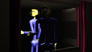
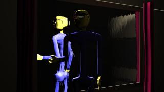
Not happy with the walking as yet. I had use four frames gaps to try to make it more languid but that didn't work. So converted to three frame gaps and think it looks a bit stiff. Any thoughts as to how to improve ? Also. When rendering the sequence some artefacts seem to appear at around 05:05 in the sun lamp area. can these be avoided ? V15j. OSX 10:68. regards simon Scene_Four.mov I am having trouble with inconsistency of renders too. This is something Nancy pointed out a few weeks ago but, this might answer rob's observation about it being very dark ? When I do a test render the results don't match the final output. Is darker than the the test. this is two pass Three Five 16 If I watch the render going through on screen the results vary enormously with some pass's lightening and others darkening the scene... ? -

It was a dark and stormy night.
Simon Edmondson replied to Simon Edmondson's topic in Work In Progress / Sweatbox
What I did notice is that the paperback edition is approx $28.00, but the KINDLE edition is $44.00 ???? wha? Why would kindle edition be so much more? Now, that seems crazy. Nancy Thank you for the tip. I've just hit the credit card for that and two other titles. Almost as strange as the discrepancy on the Kindle edition is that there are people offering second hand copies for more than people offering new copies ! Plugging away. simon -
Pardon my intrusion but may I make a suggestion ? Instead of using the 2D to 3D as you have it at the moment, could you use your 3D characters in front of the photoshop screen to look as they were preparing the illustration as it was being done. Then at the end, have the 'name tag' show an illustration of the other characters involved, with the web address across the bottom of the screen ? Does that make sense ? two pennies worth. simon
-

It was a dark and stormy night.
Simon Edmondson replied to Simon Edmondson's topic in Work In Progress / Sweatbox
Gerry Thank you for your reply ( no apology needed at all ). http://www.amazon.com/Human-Figure-Motion-...M/dp/B001PPZ6BM This is the ref work I mentioned. When I bought it some years ago it was a lot less than that but, I hunted it out in the dark recesses of the studio ( garden shed ) over the weekend, and it has a lot of useful files on it. In little 1 second clips. The only down side is that the mov files are a bit low in resolution. But I'll try it and post the results later. Thank you for your help. Regards simon -

It was a dark and stormy night.
Simon Edmondson replied to Simon Edmondson's topic in Work In Progress / Sweatbox
Gerry Thats a very kind offer, for which thank you very much. However, I went to bed last night thinking about ways to get the material needed. I had intended to build up a kind of reference library of poses using some actors that I know and more technical references to feet movements and general body movements could readily be a part of that.. If I make them for me, do you think they might be of use to others on the forum ? I'd be happy to share them if they could be of use. regards simon -

It was a dark and stormy night.
Simon Edmondson replied to Simon Edmondson's topic in Work In Progress / Sweatbox
Gerry I understand what you mean .I have some ref material elsewhere I think, I'll see if I can find it tomorrow. I bought a DVD a few years ago that was a kind of update to Muybridge, I think I know where it is. I don't wish to sound like I'm trying to duck the suggestion. I live in a fairly rural area and by myself. I'll see what I can sort out. regards simon -

It was a dark and stormy night.
Simon Edmondson replied to Simon Edmondson's topic in Work In Progress / Sweatbox
Heres the next stage. Tried to incorporate earlier suggestions in this one too. Regards simon Disc.mov -

It was a dark and stormy night.
Simon Edmondson replied to Simon Edmondson's topic in Work In Progress / Sweatbox
Thank you Gerry and Rodney. I'm working on the next stage and hope to have the whole thing done over the weekend... But I've never been good at time management ! regards simon -

It was a dark and stormy night.
Simon Edmondson replied to Simon Edmondson's topic in Work In Progress / Sweatbox
Gerry Thank you for your help. I did revise the stand up and the hand movements. It leans forward slightly to start, then back again as the centre of gravity changes.. Is that what you meant ? regards simon Scene_Two_000.mov -

It was a dark and stormy night.
Simon Edmondson replied to Simon Edmondson's topic in Work In Progress / Sweatbox
Thank you for your help. I was hoping to edit my last post but, it didn't render in time so, just back from exercise, here's the camera view. Sorry about the mixup. I was trying to avoid twinning but, from memory, there is not a lot of difference when kneeling down and I tried to vary the pelvic position to get some variance, Perhaps not enough ? Also, think the right handposition after the top goes up might be a bit wrong too.. Just corrected that (?) regards simon Scene_Two.mov -

It was a dark and stormy night.
Simon Edmondson replied to Simon Edmondson's topic in Work In Progress / Sweatbox
It is building up to a punchline ( or thunderclap ) but the flatness is because I rendered the view rather than the camera by mistake. I'd spent so much time working in the left side view that I forgot. It is a chaise long being unfolded. regards simon -

It was a dark and stormy night.
Simon Edmondson replied to Simon Edmondson's topic in Work In Progress / Sweatbox
Scene Two ( six seconds worth ) Any feedback welcome? regards simon Scene_Two.mov -
I don't know if this is appropriate, if not my apologies. In the comic I mentioned the other week, 3D World, there is an article this month on using game engines as a means of making content in real time and how that is done to make films with ? It mentions particulary a package called Cinebox which has been developed between Intel and Dreamworks ( although I may be getting that mixed up with another product of the same type. ) I am far from being a technical bod but it struck me when reading it this morning that it might be a way for you to get your project done and out there ? The essence of it, if I understood it, was to model the settings and characters outside of the package, import them in using the software development kit and it would render out in real time using the game engine. I'm sure the article will be online if you are interested. If not, my apologies. regards simon
-

It was a dark and stormy night.
Simon Edmondson replied to Simon Edmondson's topic in Work In Progress / Sweatbox
Maybe even more cartooney representation of lightning? (google lightning cartoon) Nancy. Thanks for the link. Its those sort of shapes I want to use but, for this one, the sort of lighting in the tests. While the frames are rendering on this, I'm storyboarding an idea for that style of lightening. Happiness is getting so involved and excited by what you are doing and learning you forget other things... like eating ! regards simon -

It was a dark and stormy night.
Simon Edmondson replied to Simon Edmondson's topic in Work In Progress / Sweatbox
I like the "art" look of that lightning. It's not realistic lightning, it's like what you might see in a stop-mo film. Rob Thank you for that, it has clarified my thinking on it. The Splene ( Gene ? ) very kindly provided a very impressive model of some lightening, far better than any I could do myself. I did a little test with it ( Lightening.mov ) but, its actually too good for what I want. As you can guess from the figure, I'm trying to keep it as simple as I can. The others in the series I hope to make might make that more obvious. I've mentioned it before but, the simplicity of the early Pink Panthers is what I aspire, to and I've been slightly diverted by the excitement of learning new techniques. regards simon -

It was a dark and stormy night.
Simon Edmondson replied to Simon Edmondson's topic in Work In Progress / Sweatbox
The Spleen Thank you very much for that. I shall try it this afternoon. regards Simon -

It was a dark and stormy night.
Simon Edmondson replied to Simon Edmondson's topic in Work In Progress / Sweatbox
Don't know if this is appropriate place but, following Gerry's suggestion I tried You Tube and found this, http://www.youtube.com/watch?v=qISi5SpfylA...feature=related ( contains a fair bit of swearing though ) On the same page there was this link to some high frame rate slowmo shots. Some are quite beautiful in their visuals, http://www.youtube.com/watch?v=rU7iYYpSrlo...feature=related Now back to the lightening. -

It was a dark and stormy night.
Simon Edmondson replied to Simon Edmondson's topic in Work In Progress / Sweatbox
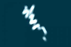
Gerry Thank you for your suggestions. I was thinking about it overnight and here is a first stab at it this morning. I know lightening doesn't last two seconds (?) but it was just to make it more visible. Lightening.mov This is a single image using the same model and setting. Its all done with material settings and lights. A bit rough yet but, was this the type of thing you were suggesting ? regards simon -

It was a dark and stormy night.
Simon Edmondson replied to Simon Edmondson's topic in Work In Progress / Sweatbox
Your lightning bolt effects aren't working for me. I think it would be a static shape that would just glow sharply and suddenly. That's one approach, anyway. Gerry I must away shortly but, How would you adjust the glow that strongly ? I was just playing in my excitement at the shapes and material settings. I'll have a proper go at it tomorrow. regards simon -

It was a dark and stormy night.
Simon Edmondson replied to Simon Edmondson's topic in Work In Progress / Sweatbox
Lightening_Wire.mov Heres a quick pass at an idea for lightening. This is a wire to give idea of movement, This is a first go at making it glow. 100% successful as you can see ( joke ) Lightening.mov Nancy The one you prefer in the larger res is the original ceiling but with the light in the new position. Perhaps I should experiment with the light position a bit more ? Unfortunately I have to go off to bed soon. ( drat ) the morn awaits. regards simon -

It was a dark and stormy night.
Simon Edmondson replied to Simon Edmondson's topic in Work In Progress / Sweatbox
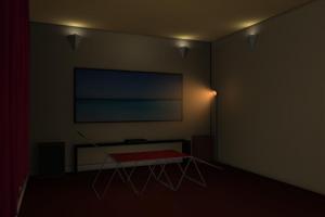
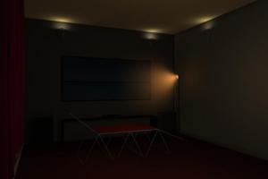
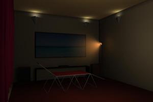
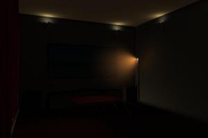
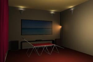
I thought it best to check on the same frame so, here are the results, With the ceiling No ceiling Black ceiling I'll have a bash at the lightening bolt in a short while. regards simon -

It was a dark and stormy night.
Simon Edmondson replied to Simon Edmondson's topic in Work In Progress / Sweatbox
Gerry Thank you for your suggestions. I must admit that I prefer the one with the ceiling, ( possibly because of the literalist within me... ) I'll see what I can do about a lightening bolt but it may get comped in rather than placed within the scene. On a trivial note, theres a UK musician called Jake Bugg recently had a hit with a song called "Lightening Bolt". Terrific performance. Will try for the bolt tomorrow. regards simon


