-
Posts
21,649 -
Joined
-
Last visited
-
Days Won
119
Content Type
Profiles
Forums
Events
Everything posted by Rodney
-
Thanks Ken, I don't consider that bad news. I appreciate the dose of reality. It is too bad that the Unity/HAMR connection isn't feasible. Could you help my understanding of what you mean by proprietary? When you say 'proprietary' do you mean 'exclusive to Hash Inc' or something more akin to 'code that cannot be shared'? I suppose to me the first implies the viewer code can be shared/licensed by Hash Inc while the second suggests it likely cannot or will never be. To narrow the field of my specific interest let's say this concerned only the code to the HAMR viewer. If the folks at Hash Inc wrote that then I guess I'd have to ask them.
-
Yes, nice improvement! That's a really fun character. (I'd say scary but... I like fun better) That sounds familiar. I believe there is a workaround to that but I can't put my finger on it at the moment. At a guess try saving first before you copy/paste. (That can't hurt... especially if you save with updated/incremental filenames)
-
Nice! I am very impressed by your talent. That isn't anything new to say though... keep on impressing us! I'm looking forward to your approach to the bat-belt but even moreso to a bat-pose from here in the future. I know... I know... I'm trying to be patient. In the interim can I suggest that her gloved fingers be tapered just a little? They appear a bit stubby at the ends and looking at my fingers... I most definitely shouldn't have sexier fingers than Batgirl.
-
I hesitated to respond because there are two basic ways to respond to your situation. The first would be to solve your current issue. The second would be to suggest an alternative approach. Both of those have been discussed here. Briefly, if following your current course of using models as bubbles it might help to think in terms of a starting point, a middle and an end. The end is why your bubbles are returning to the diver. Something... perhaps a keyframe... it set to make them animate that way. So my suggestion there would be to first animate the starting position... then set the end position and with those in place work out the performance (this is the classic animation approach... two key poses... a breakdown... inbetweens) I think this would work out nicely but I perceive you'll want to more fully investigate the Timeline and Keyframes. The other methods would be (as suggested) particles (spriticles... blobbies... flocking). That last one would allow you to use a model. The standard approach will be to use particles sprites (spriticles). This is one of the reason I wish more A:M Users would throw caution to the wind and start posting here in the forum. (I wasted the first few years of using A:M trying to go it alone... in isolation,,, so I can sympathize) But we hope that everyone doesn't have to reinvent the wheel. We've got A:M... we want to create cool stuff with it... and yet we often don't take advantage of the best information available. We wont find everything we need in a book.. we won't find everything in a tutorial... we won't even find everything in a class or course on modeling/rigging/animation... although supplementing our learning those resources certainly can certainly help us along the way. We will find the information we need by interacting with others of similar interest and... barring the ability to meet others locally in person... this forum is the place to be. We won't always know the 'best' answers (only you can determine that) but working together most problems can soon be relegated to history.
-
I recall another interview being posted with Will that covered a lot of the background of Tar etc. but I don't recall seeing his interview with M dot Strange and Jimmy Screamerclauz. My apologies if it has been posted elsewhere already: (Note that this is all audio although its on youtube) Disclaimer: The video starts out with some harsh language but that is mostly only at the intro... then after the interview. Will keeps them in line during his interview. Of interest, the interview is somewhat relevant to our discussion here on feedback at CG Society. It also covers some of the history of the TWO project etc. Nice interview Will!
-
I've been thinking about how the Salt video referenced by CGIPadawan over at CGSociety applies and for the most part (as Will suggests in his response) it doesn't. There is one place where it does and that is in the pivotal shot that delivers the big twist at the end. Hopefully I can explain this adequately so it makes sense. The flow of the camera and cuts all work well up to the point where the last hyena is displayed and delivers his line. I'll track this because I don't think it particularly spoils the story for anyone who hasn't yet watched (but seriously... if you are reading this and you haven't watched the video yet... go watch it!!!): Intro - From the map camera descends on Tar (nicely executed BTW) - Tar walks - Cut to Hyenas - Back to Tar and Entry into the fray - Hyenas attack - Tar does his thing - Hyenas hit the ground - Tar moves on - Finale It is the setup of the finale that doesn't match with regard to camera movement in that if we try to match the position of the hyena with one that hits the ground in the earlier shot none of them are in a similar position. This plants a tiny seed of confusion in the brain because the hyena is very obviously one of those hyenas and yet his placement onscreen suggests he isn't. There are several things that could 'fix' this continuity 1) a moving camera during the fight scene that moves around the scene until the angle matches that of where the hyena is oriented on the ground. The second approach is less ideal in that it would be to flip the shot left to right which would more accurately align the shot to match the hyena that got his feet swept out from underneath him followed by a hit to the face with a massive club. Note that I only assume that hyena is the same one that delivers the final dialogue at the end. At any rate... that seems to be the aspect of the dissection of the move Salt that specifically applies to 'Marked for Death'. If CGIPadawan's primary suggestion is that building up to and delivery of that critical final line of dialogue isn't crystal clear then that is a relevant critique. The problem being that he doesn't actually say that in his critique. If the crit was meant to suggest the short needed to be clearer and yet the feedback itself isn't clear, the irony in that isn't lost on me. -
-
There are some really nice pics in there!
-
Very nice Robert! Edit: Looking closer it may need a displacement material that echos the main material to break up the smooth contour at the edges. I'm wondering if you could simply duplicate the material but then adjust the displacement setting... layering in the materials.
-
Well said Nancy. I missed what he said the first time through so it's good that you identify that in your feedback. After several views I'd forgotten I had initially missed the big payoff.* His dialogue is essential in revealing the twist in the story you missed, so that certainly explains why you missed it. So, yes, it was very important. *I also have a vague memory of reading a storyboard or script of the short which might have aided my understanding. Not sure if I am just imagining that.
-
Do you need the tracks to appear in the ground or the actual treads (machinery) that turn? I will assume both. There are several approaches to making the treads There is only one really decent approach to making tracks in the ground IMO.* Robert Holmen outline one method for animating tank treads from simple patches using displacement maps. That might be the way to go in some instances. The benefit to this approach is that the rotation of the treads doesn't even have to be animated as the map itself can accomplish that. That leaves just the turning of direction to be animated. Here's his topic on that subject: http://www.hash.com/forums/index.php?showtopic=37807 As for tracks in the ground displacement can handle this as well. The trick being to view the ground plane from underneath while the treads (actual geometry would be ideal) appear through the ground. Here's a tutorial that describes an approach to making tracks in the ground (footprints in this case) and it also talks of a plugin/script. The script isn't required but was the focus of that topic. http://www.dotnet.se/aaver/FootPrint/Tutorial/ There are some other similar topics in the forum. If you are wanting to set up an actual tank tread that rotates that also can be done. *An alternative way would be to use Boolean cutters to cut tank tread shapes out of a ground shape.
-
Feedback is an interesting thing... it'd be nice if we knew better when to give it and when to hold it in reserve. I think it is safe to say that Will knows those areas that could use work. The other side of feedback of course is to actually demonstrate how something can be improved... and correct me if I'm wrong here (I'd be glad to be wrong)... you aren't likely to get that level of feedback from folks over at CGTalk. I think folks are more likely to get that here (in the A:M Forum) although we need to help folks break out of the shackles of disdaining feedback first. For those that desire to grow a fan-base... you need those that follow you to voice their opinion. Just because an opinion is shared doesn't mean you have to agree with it or implement it in your work. In fact, in cases of plot and story it might be best to avoid suggestions of those types altogether. In other words, use that type of feedback as a barometer to gauge whether a story is too predictable. But... here's the secret to giving and/or not giving feedback: If the individual asks for feedback then it can be assumed they desire feedback, otherwise they are simply sharing their work with you. Will's posting of this episode of Tar falls into this latter category because he didn't solicit feedback. Lack of such a statement can be construed as a signal to everyone to focus on the entertainment value... to sit back and just enjoy the show. Was it entertaining? Did you like it? To which I can honestly respond to Will.... "It was too short!" and "I want to see more." With this in mind I could go back and watch episode one with an eye for feedback that focuses on the characters, the story... where I think/hope Will might be taking us on this journey. The feedback wouldn't address technical issues, suggest tweaks to animation or suggest alternatives to artistic choices. I might then be inclined to say, "I love those hyenas. I wish they would have had more screen time" and "I want to see more of those guys!" and "I thought they might be nastier." (to which we hope Will might answer, "Hehe, there is a very good chance you'll see more of them in a future episode... but not those particular ones 'cause they are vulture meat." and/or "You haven't seen the last of them." To which I'd respond, "Right on!". And then I might make a mental note that we didn't see all of those guys actually die. Hmmmm.... And then I might add, "What else have you got up your sleeve?" "What other characters from the world of Tar will appear in the future?" And perhaps most importantly, "How long do we have to wait until the next episode?"
-
It was automatically done by me. Sometimes I see something worthy of a few extra moments of my time and adding relevant tags to your topic was most definitely worthy of my time. Of course it would be even better if such work could be automated.
- 3 replies
-
- Forum Assistance
- tags
-
(and 2 more)
Tagged with:
-
Nicely executed. I sure wouldn't want to be the one to mess with that hippo. Congrats on getting this completed!
-
Hey, I remember that well. That was a defining moment for displacement maps.
-
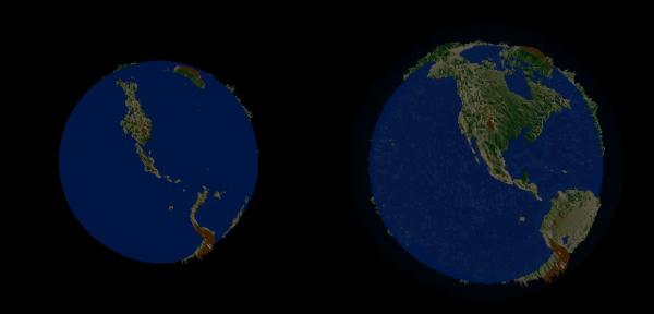
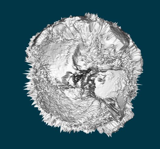
...and yet another test combining .STL with a regular model. In this case the prop is based on a STL file of the earths solid mass (minus water) and the water (and atmosphere) via splined spheres. (it's hard to see the atmosphere in these screen shots) The basic idea being that the water can be animated (rise/fall, change transparency, animate) without effecting the underlying prop. I've added a shot of the STL prop as well which is courtesy of Thingiverse (Thanks to Alan Folmsbee for that model) The various height colors are added via a spherical material with gradients.
-
Here's a still from another of today's tests. I tried to get some flying snow from a fractal sum based material.
-
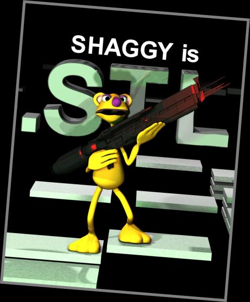
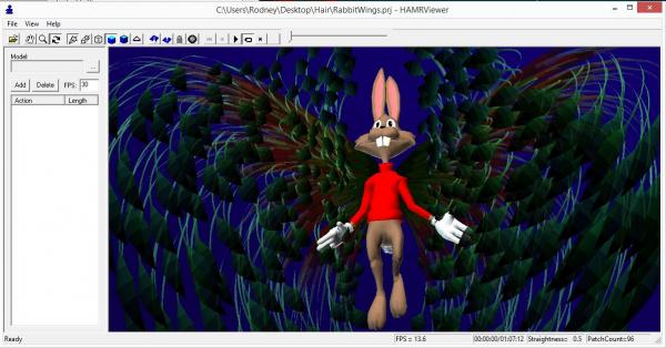
I didn't get an entry in for the Sci Fi contest but am thinking about posting some WIPs from that effort. I might just use that idea yet in another contest so in the interim am posting this here: I put this together today after being inspired by the Sci Fi contest. (I wish I would have moved in this direction for the contest!) We should have those contests more often. I was pushing the image toward being a mock movie poster starring Shaggy but how many will read that title as 'Shaggy is Steel' rather than 'Shaggy is .S T L' (the former being the correct reading in this case)? To confuse matters even more... Shaggy isn't an STL file... the spaceship that Shaggy thinks is a gun is. Can you hardcore Sci Fi fans recall what movie the spaceship is from? The .STL file used here was downloaded from http://www.thingiverse.com/thing:402270 ( Thanks to Tobz for the file) (Most files posted at Thingverse are covered by a Creative Commons license) Of late I've been playing with combinations of A:M Props and regular Models and having fun with that. (My initial contest idea was inspired by an .STL file) Thinking of the STL files as solid objects and spline based models as soft objects or even tissue aids in my approach to modeling and layout. It's all in my mind but the props 'feel' heavier and less 'alive'. Aside: A downside of using .STL props is that they aren't recognized by HAMR. But... particle hair is.
-

Image Contest SciFi Image Contest Winner
Rodney replied to Jason Simonds's topic in Contests/Challenges
The new aviatrixes for winning are out. Wear them proudly! -

Image Contest SciFi Image Contest Winner
Rodney replied to Jason Simonds's topic in Contests/Challenges
Congrats everyone! -
-
Here's a possible point of interest concerning Topic tags... I note that several folks are using the Topic Tags which is a very good thing. When clicking on a tag anywhere in the forum other topics with that same tag will be brought forward. Its a useful way to categorize and retrieve information. This does beg the question however about the usefulness of one of a kind unique tags that are more than likely to only apply to that one instance of using said tag. It may be that folks are using the tags in a similar way as the old subtitles, which have gone away. But note that as those will likely be unique to only that one post or topic, it isn't a particularly good use of tags. Tagging can (at least theoretically) help others find other information in the forum related to your tags.
- 3 replies
-
- Forum Assistance
- tags
-
(and 2 more)
Tagged with:
-
All my favorite artists are caricaturists. (I received my Wobbling Dead DVDs too! Thanks Mark!)
- 3 replies
-
- Largento dabbles in 2D
- caricature
-
(and 3 more)
Tagged with:
-
Even sounds still play in the HAMR viewer (as included in the A:M Project). Tres cool. I did have my first crash with the viewer due to trying to get the sound to play via a mouseover. That might relate to setting the sound to play outside of the extent of the range of the animation. Not sure. Added: The sound will play with a project but not as a consolidated .zip file. I assume that something is broke there so the sound doesn't get properly referenced after consolidation.
-
Hard to go wrong there! Alan is a motivational speaker on creativity too: (The following is well worth a listen)
- 9 replies
-
- soundtrack
- music
-
(and 3 more)
Tagged with:


