

Bill_Y
-
Posts
260 -
Joined
-
Last visited
Content Type
Profiles
Forums
Events
Everything posted by Bill_Y
-
To close out this topic for those who might only read this forum, Duel was released Today. Here is the official announcement.
-
Here is another sample of how things are coming together. shot1B_0000.mov
-
Thought people might be interested in how the trees are going to look animated. This is a test of wind effecting a tree. leaf_test08.mov
-
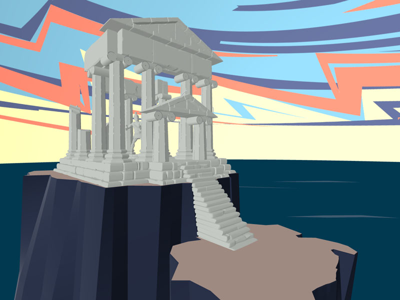
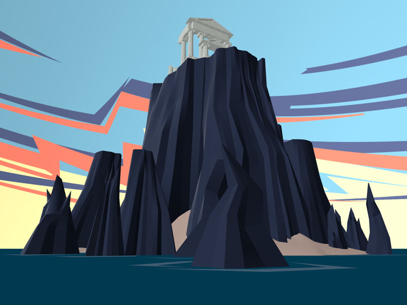
Thought I'd show one more image of the temple area. Again it's not finished, but will give you a basic idea.
-
And just so people know that is a 3D set.
-
I thought people might like to have a look at the scenic island where the Duel transpires. This is missing some of the vegetation and other such nurnies, but should give you an idea of what the setting is going to be.
-
This is a WIP for the next mastering materials volume. Thought people would be interested in seeing a face made of 95% materials. There are only 4 image maps used and 3 are for hair control. The last is for an environment map.

-
Darn I missed the animated showing. The effect in the images looks pretty sweet. I'd love to take a look at the animation.
-
Try adding a little specular to your hair as it will add a little sheen to each hair. Currently the hair color looks pretty good, but with out a bit of specular the hair looks flat. Also it looks as if you might have a bit of ambiance in your hair, and thus it doesn't look like there is much fall off happening on the left side of the character's hair when compared to the rest of the character. Removing or lowering the ambiance will also help add a little more depth to it. As a last suggestion I would try doing a render with the hair casting shadows as in this last image their are none,a nd it also might be contributing to the "flat" look of the hair.
-
actually, Thats a mistake. We didn't do this animation. This was done by one of the other animators on the paw island project if I recall correctly. We did do 3 in house test animations of KeeKat, but this isn't one of them. I'm looking to see if we can find the tests some place so that thy could be added to A:M films.
-
Well if you would like a suggestion then I would say that the front of the ears aren't flush with the side of the head; however, it's kind of hard to offer more suggestions with out seeing the wireframe.
-
Just to let you know the Alpha channel issue was fixed in v11beta8. So if you want to get the nooks and crannies on the edge of your J.D. label it shouldn't be a problem any more.
-
Strangely I have an affinity for using paths to make my selections... ;P
-
Bias handles in their free state can be either a blessing or a nightmare. There are times where being able to adjust the magnitude, alpha and gama all at once can be very useful, but most of the time I find it much easier to work with one aspect of the bias handles at a time. There are hotkey's that you can hold to lock out certain aspects of the bias handles, but for the most part I find my self adjusting the bias handles by simply dragging on the attribute I want to change in the properties panel. Magnitude adjusts the weight of a specific handle Gama most of the time adjusts the spline in and out agains the surface Alpha most of the time adjusts the spline back and forth along the plane of the surface There are times when alpha and gama can reverse their roles, but most of the time this only happens around 5 point patches If you want to see what these attributes do better, lathe your self a sphere, select a point, and start playing with each of the values. It will become a lot clearer what they do, and they shouldn't be feared like the black plague
-
Sounds like good advice IF you plan your model a bit, or have some experiance under your belt this can be avoided, but it's also prety good advice. Ok Buzzer is going off on this one. You shouldn't touch your bias handles till you've got your model fairly well shaped with the CP's, but bias handles are always worth tinkering with if you feel comfortable with them. They can easily save you from wasting splines in areas that don't need them. Sure there once was a problem where it was difficult to animate bias adjusted CP's, but seeing as thats no longer a problem then there is no reason not to play with bias handles.
-
Wow Jim, This guys is really looking good. The hair has great form to it, but looks a little flat specular wise. The ears specular also seems a bit hotter than the nose and forehead area, but the eyes! Wow! They say so much tired yet wise and concerned with almost a hint of arrogance. Good stuff. I'm guessing since "Mighty Mouse" he's porcelain all the way.
-
Vern's explanation is quite good, but I'd like to share my idea on how to think of channels. A channel is best thought of a a gray scale image that represents something other than gray values. typically there are 2 types of channels most people will deal with Color Channels and Transparency Channels. When you are dealing with an RGB image as Vern pointed out you are dealing with 3 color channels a red color channel, a green color channel and a blue color channel. How many values of gray are available per channel is dependent on the bit depth of the image. A typical RGB image has 24 bits of data which when divided by the three colors turns into 8 bits per color channel. 8 bits can only represent 256 values, thus each color channel has only 256 values of gray. A 48 bit image typically used for film is usually made up of three 16 bit per channel RGB values. An image isn't limited to only 3 color channels though, a typical image used in publishing houses are made up of Cyan, Magenta, Yellow, and Black color channels. In some circumstances publishers can use even more color channels than these to represent special colors know as spot colors. The primary thing that all color channels have in common is that when they are displayed together on your screen they will mix their channel information with the other color channels to make up the final color image you see on your screen. Also know that despite images having various different kinds of color channels they will all be converted to an RGB representation of the final image on your monitor because a monitor can only display RGB information; however, other mediums such as printers can use these channels so the key thing to remember with color channels is they are only limited to the colors of the device that is going to reconstruct the image. Transparency channels are different from color channels in the respect that their gray values represent levels of opacity. White is typically thought of as opaque, and black is typically thought of as transparent. By picking gray values between black and white you can vary how transparent or opaque any part of an image is. Some people call all transparency channels alpha channels; however, the alpha channel is a single transparency channel that can be saved along with the typical RGB information. When dealing with an 8 bit per channel image this adds an additional 8 bits of channel information to the standard 24 bit RGB file. This brings the total bit count to 32 bits, and is typically referred to as an RGBA image. In film when they add an alpha channel to an image it adds an additional 16 bits of channel data to the existing 48 bits bringing the total to 64 bits of RGBA channel information. Photoshop deals with 8 bit per channel information quite well, and it has some functionality with 16 bit per channel image work; however, it looses it layering functionality when it is in 16 bit per channel mode. This is where programs like Cinepaint step in. They tend to handle high channel data with layers better than photoshop, and carry a much smaller price tag as well (Free). Vern mentioned layer masks. All these are are Transparency channels that are assigned to a specific layer in photoshop. Also note that the photoshop format is one of the few formats that supports an unlimited amount of channels per image; however, if you have to many channels your image will be so large that you may have trouble opening it.
-
Yeah, I knew you were going to get weird artifacts around the decal given your prior image. There currently is a problem with alpha channels on transparency maps only trimming the areas that are pure black. You could have made a gray scale image and done a semi-hack to make the black look more like the underling material, but the problem will go away all together when the alpha problem gets fixed. (And yes for any one wondering the problem was reported with a sample project)
-
You need a transparency map in addition to your color map. This will prevent your decal from accepting the transparency from the materials on the bottle.
-
I can tell just looking at the image that most of the normals in the nose are pointing in the wrong direction. The 5 pointers might be pointing out, but some of the other patches aren't. All the patches surrounding 5 pointers have to all be facing in the same direction as the 5 point patch or the ones facing in the opposite direction will cause the black creases at the edge of your 5 point patches. Remember you might also have to save and reload the project after you flip the normals to get it to render correctly.
-
Ah.. I might have botched up my advice.. I didn't have A:M open when I wrote out the process, and so didn't check to see if it was black or white that was needed for transparency in A:M. Having used dozens of different programs over the years you have to deal with slight variances in each. Now your new image is looking much better; however, I think your making a small mistake when thinking about the bottle. You seem to think the bottle is tinted a hue of amberish brown. When in actuality the liquid inside the bottle is causing the hue shift. The bottle it self is a clear glass. So to get the effect you are after you will want to select the inside of your bottle, copy and paste it into the same location as the bottle it self. You can set the location offset an objet pastes to in the options panel in case you didn't know.Next your going to want to cap off the top of this copy so that it is the equivalent of the liquid inside the bottle. This object you are going to give a separate amber colored transparent material. Note that this should not have the fernel effect, as the bottle already should be handling this. This should also have a different index of refraction then the glass did. I would try around 1.6 or 1.7ish to start. Give this a shot and see how it looks.
-
I'm sorry about my late contribution to this thread, but I've not had my email machine up and running for a while, so didn't get Rodney's request. When modeling Keekat, I was given a maquette (small clay statue) of the character. His mouth was wide open, and in all the reference images I was given his mouth was also almost always wide open. So I decided that to maintain accuracy I would model him with the mouth open and enough splines so that his mouth could be closed, and we could get plenty of other "smiley" expressions out of him. The revision of Keekat you see now is many generations away from the original mesh. His original feet were more like that of Bugs Bunny in design. After feedback and other reference I made them into what you see now. There was one point where his tail went from thin state to a more club like tail and back to thin again as they felt the club tail was to "aggressive" looking for the character. The same thing happened with his teeth. No teeth, teeth, no teeth. I can't take credit for the eyes. The original eyes were designed in a different way. The final eyes were created by I belive Jeffrey Dates while he worked for Real F/X. They were a much simpler solution for toon eyes than any one at our studio had thought of using for the project. The nose when from a capped extrude to a distorted sphere to preserve the specular better. It's these kind of revision reworking that people often don't realise can happen. After the model was "finalized" for its basic look I went back through and adjusted bias handles (At the time thought to be a "No no") to help keep the character looking clean; however, care had to be take to ensure that splines weren't going to pop in poses because of this. David Boutilier did the original facial poses, and ensured popping wouldn't happen. Raf Anzovin and Robin Johnson handled most of the rigging set up and smart skinning of Keekat. The rigging of the Paw island characters is what eventually led to the development of the setup machine. We used an interesting technique to eliminate the axis issues with smart skin at the time, and it's still probably the best solution for people using older versions of A:M. instead of relying on one bone for smart skin rotation we created a second smart skin bone thats roll handle was set at a 45 degree offset to the original smart skin bone. This bone was used to coerect the overshooting that would occur when two of the original bone axis were moved in equal amounts. It would be difficult an not very useful to describe the entire process out; however, to try and explain this in a easier fashion, most smart skin movement happened on the x and y axes. If we draw a square on a piece of paper we can see that the distance from the center of the box to the edges there is a uniform distance. Now if we drew a line from the center of the box to the corners we would see a uniform distance as well, but this one is much greater because it is the intersection of the x and y axes added together. Now take another box of exactly the same size and place it at a 45 degree angle to the original box but with a shared center point. With these two boxes overlapping you can see that drawing a line from the center of the boxes toward either boxes corner now runs in to the other boxes side first. This is exactly what the second smart skin bone did. Instead of giving us 4 locations to evaluate smart skin from it gave us 8. Not perfect circular uniformity, but closer than a square... Funny... the old smart skin was actually trying to fit a square peg into a round hole. As far as surfacing went, Brian Prince (At the time from Eggington) did the surfacing. The base model for Keekat was later adapted by William Egginton for use as Allie another Paw Island character. This shows that some models can be recycled in some circumstances. After the Paw Island project fell through. The Keekat model found it's way through several versions of A:M, and I'm pretty sure has seen a few more rigging incarnations than Mike's, but I'm not 100% sure. I know the base A:M rig has changed several time, but I'm not sure if any changes happened after Keekat was added to the collection. I hope this helps people out, if there is more information people would like to know please feel free to ask.
-
Thats a really nice model, and the hair.... <<Shudder>> Gives me chills think it's all hand layed. Here are some suggestions on what catches my eye. The forehead seems very spline sparse which calls into question how you plan on handling wrinkles when her bows move up? Secondly the smile pose is very nice, but when I compare it to the non smile pose I notice that there isn't any nostril wing movement. This is one of the most often over looked aspects of peoples faces. With out nostril wing movement the lower face will always some how seem dead when animating. There is something not reading quite right at the base of the neck where the neck muscles join the chest. I can't offer any suggestions with out seeing this area from different angles. My last comment is more of a nit pick than any thing. I personally think the eyebrows look to groomed. I get the feeling you want them to look plucked, but even when plucked there is usually a bit more straying of hairs around the edges; however, I'm also wondering if the reason it is reading this way is due to the general darkness of the brows at the edges. When the hairs of an eye brow get closer to the edge there is less overlap, and more of a skin tone to the hairs. As it stands the hairs at the edge are reading just as dark as the hairs in the middle of the brow. This creates the perceived hard transition, and is probably why I feel it looks to well groomed. All things a side, this is still a great model.
-
Ok, Here are my suggestions: First you're bottles shape is pretty good; however, there are a few things that look a little off. Where the neck transitions into the base of the bottle there is a fairly sharp edge. This is probably from having to many horizontal splines. You might try removing some and using the bias handles to smooth out the transition. The drip guard seems to transition into the neck a bit to smoothly when compared to the original image. If you reduced the magnitudes of the vertical splines where the drip guard and the neck meet it will help resolve this. You also might want to play with the bias of the drip guard to round it out a bit more. Between the Cap and the drip guard and between the drip guard and where the neck transitions into the body the neck seems to bow outward a little in the real thing. Lastly I have to also ask if you have physical thickness to the bottle, because with out an inside to the bottle the glass will never render correctly. Over all a great start though. As for the materials, if you are using a gradient combiner to simulate glass you are going to want to do a few things. First set the edge threshold to 50 to start (You'll probably want to tweak this a bit once your done). This will cause there to be an even amount of both sub nodes applied to your object. The key to making a glass like look is what is done to these two sub nodes. For the time we'll assume that these subnodes are both plain attributes. For the first attribute under the gradient combiner set the color of the object to black, and the transparency to a very high value around 95+. This makes the viewers angle of the object transparent. You are also going to want to pick an index of refraction to suite your object, and add a whitish specular with a low size and a high intensity. I would start with 1.5 for the index of refraction and adjust it from there once every thing else is done. lastly set the reflection to some where between 0-10. This can be changed later, but even if you don't want reflection in the center of your object you must set it to 0 in order for the rim reflection to occur. I'll explain more when we get to it however. Next you need to set the second attribute under the gradient combiner to black with a much lower transparency value. 50 will probably work. This will cause the rim of your object to be more visible than the center of the object which is what happens with glass. Next you are going to need to set the index of refraction and the specular values to the same as you set it in the first attribute. Note that if you don't set the index of refraction then there will be an odd transition between the two values because they are different and are getting combined (you could play with this if you wanted). Now comes one of the most important and over looked aspects of glass. Set the reflection of the second attribute to some value roughly between 25 and 50. Glass has a fernel effect on it where not only does it become less transparent towards the edges, but it also becomes more reflective. A lot of people don't realize that when using combiners that a value of not set is not always the same as having a value of 0. So to prevent problems if an attribute of any combiners sub nodes are being use, then you need to set the equivalent attribute in the other subnode unless you are aware of what you are doing, and like the effect. As a not the reason I refer to the two attributes below the gradient combiner as sub nodes is that they don't have to be attributes, they could be series of combiners with their own sub nodes. An attribute is only one specific type of sub node.