-
Posts
4,676 -
Joined
-
Last visited
Content Type
Profiles
Forums
Events
Everything posted by HomeSlice
-
Thanks George.
-
Is there a "Rig Along with Me" thread somewhere that I'm missing? I know you had planned to start something like that.
-
Got it. Thanks.
-
Geeez, this thing's development cycle is like a whirlwind. Amazing job guys. You Rock! Do I need to do my CP Weights and Smart Skinning Before or After I run the install rig plugin? Thanks.
-
Thanks for the great explanations Matt and Yves.
-
Hi Dan, This is several months after your last post.... oops. When you say you are not using specularity, do you mean that you are leaving specular intensity at "not set" or are you setting specular intensity to "0".? Thanks.
-

Flock of lights or models with flares
HomeSlice replied to johnl3d's topic in Work In Progress / Sweatbox
That's great John. I've been playing with flocks this week, but didn't come up with anything as cool as this. -
That's out of control. Awesome example.
-
hey it works! cool. Do you have transparency set for the windshield? Transparency *should* work in the web viewer. Anything that works in AM's realtime render mode should work in the web viewer, but the windshield looks completely opaque to me. If you have set the windshield to be transparent, could you upload your HAMR zip file to AM Reports (under WEB HAMR) so Ken can take a look at it?
-
I got the same error, I think that usually means there is a reference to an image or something in the project file that wasn't included in the zip file. It would work on T_Dogg's machine because the image (or file) exits on his machine in the path specified by the project, but when he uploads it, that particular file is no longer accessible. I think Ken Chaffin said in the HAMR forum that the next release of the web Viewer will fix that issue ...somehow.
-
Sadly, at this early stage in the plugin's development, only IE on Windows is supported. However, I think as soon as the kinks are worked out of the IE/Win plugin, Ken Chaffin will start working on a Mac/Win plugin for gecko based browsers like Firefox. That's probably not going to happen though for several months.
-
Hey T-Dog, The HAMR model looks great! I got a pop up that said "error loading string 4303" but the model loaded anyway. It's not supposed to have wheels and an interior yet, right? When the scene loaded, The view was from under the car, looking up at it, and the perspective view made it look real funky, so I changed to orthogonal view and zoomed out a little and was able to view it just fine. It's looking great so far. I'm not sure what the error message means. Can you send the project zip file to AM Reports? The more data Ken C. has, the more stable he'll be able to make the plugin.
-
Thanks Yves. I'll remember that.
-
That last discussion on the general AM forum about AO kinda scared me off, so I was trying to find a solution that didn't take quite so long to render. But I'll take your suggestion and try AO with a yellow Sun light tonight before I go to bed. The renders above used Yves' 8 light skylight rig(each light casting a 1 ray shadow) plus a three point light setup(1 orange kleig, 1 light yellow sun key , 1 purple sun fill) and each fram took @1hour to render at 1024x600
-
It looks like a great start for a Roman aquaduct. Make a Roman-esque hilly landscape with a bunch of shrubs and maybe some olive tree groves. Include a Roman road and pop this guy in there. Great start!
-
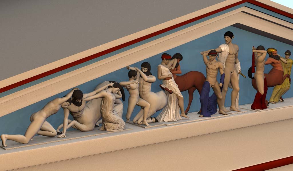
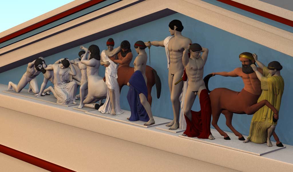
Thanks! It's many different models assembled in the chor. I create a seperate project file for each figure group, which usually includes two or three figures. I create seperate models and assemble them in that project's choreography and pose/tweak them there. Then I import the chor into this larger chor of the whole pediment. The clothing are seperate models too, and aren't animatable because I modelled the folds and contours and had to use custom splinage for each piece of cloth.
-
Hi, I'm working on the Temple of Zeus in Olympia, Greece. The following pictures are from the West Pediment. I think I need some help with the lighting. It's supposed to be fairly realistic but I'm not sure what else to do to it. Not all the figures you see have been textured yet. I'm working on that too. Suggestions would be most welcome. Thanks.
-
I love what you're doing. This thread is tailor made for the work-in-progress forum though. In fact, this thread could be a template for how a work-in-progress evolves into a completed piece.
-
Here is a screenshot of the place in the Property panel where you can swap your model in the chor for another model. At the very lease, both models must have the same bones and bone naming convention. If the first model uses an animation rig, the replacement should have the same rig installed.[attachmentid=12459]
-

FADE DECAL ON MODEL TO REVIEW SOMETHING
HomeSlice replied to johnl3d's topic in Work In Progress / Sweatbox
Why not copy the geometry of the green area and place it just above the current green area and set it's pivot to the top edge. Make a cookie-cut decal in a paint program where the alpha channel has a feathered edge on the bottom and apply it to the new geometry(as cookie cut). Make a pose where the new geometry is scaled to 0 on the x-axis at 0% and scalled 100% on the x axis at 100%. Then for the fade, animate the percentage pose from 0-100 in the chor. -
That's a really cool clip Anders. Thanks for posting it and the project file.
-

Greek Statues: Textured and Colored!
HomeSlice replied to HomeSlice's topic in Work In Progress / Sweatbox
Hi Mr. Gougousis, I just checked the URL http://www.holmesbryant.com/east_ped/ and it seems to be working now. I may have gone a bit overboard on the coloring, but I couldn't find much information about it. Perhaps I was just looking in the wrong places. I found a few scant paragraphs that talked about the possible coloring of some portions of one or two of the sculptures based on chemical analysis. Other than that, I used a drawing by Peter Connolly, artist and author of The Ancient City, and a fragment of a painted 6th century BC statue found on the Akropolis as guides. If you have some web links or names of some publications that give good information about how the statues of the Akropolis, or of Classical Greece in general, were colored please give them. We are trying to get a grant to finish the reconstruction of the whole Akropolis and I would like to make things as accurate as the available information allows. Thanks for your comments. -

Greek Statues: Textured and Colored!
HomeSlice replied to HomeSlice's topic in Work In Progress / Sweatbox
Cool cover Rodney! Thanks. I'm not as exhuberant about self promotion as I should be, but if you want any pictures for the Digest, just let me know what they are and I will Happily send them. -

Greek Statues: Textured and Colored!
HomeSlice replied to HomeSlice's topic in Work In Progress / Sweatbox
I think the lighting is spot on, as in feels not like it's outside but actually inside a museum (or shot in a controlled studio). Thanks Greg, I was actually going for the "shot in a studio for documentary purposes" look, but after reading Pablo's comments I was wondering if I had made the right decision. -

Greek Statues: Textured and Colored!
HomeSlice replied to HomeSlice's topic in Work In Progress / Sweatbox
Thank you Mr. Baker Sir! I was not involved in any of the research or writing of the book. My area of activity included reconstructing the figures of the east pediment under the direction of the author, designing and building the Flash presentation (there is also a basic rich text editor right in the online presentation hidden behind a password protected doohicky) and allot of editing of the text in the presentation. As I worked with the author, it became evident he has done a heck of allot of reading and research, but sometimes he has trouble presenting his conclusions in a way that leads the reader from one piece of evidence to the next. He didn't change the text I edited, so I guess he likes it :-)


